Artist Thomas Hutton redesigns Pacifici booth at Marmomac in Verona

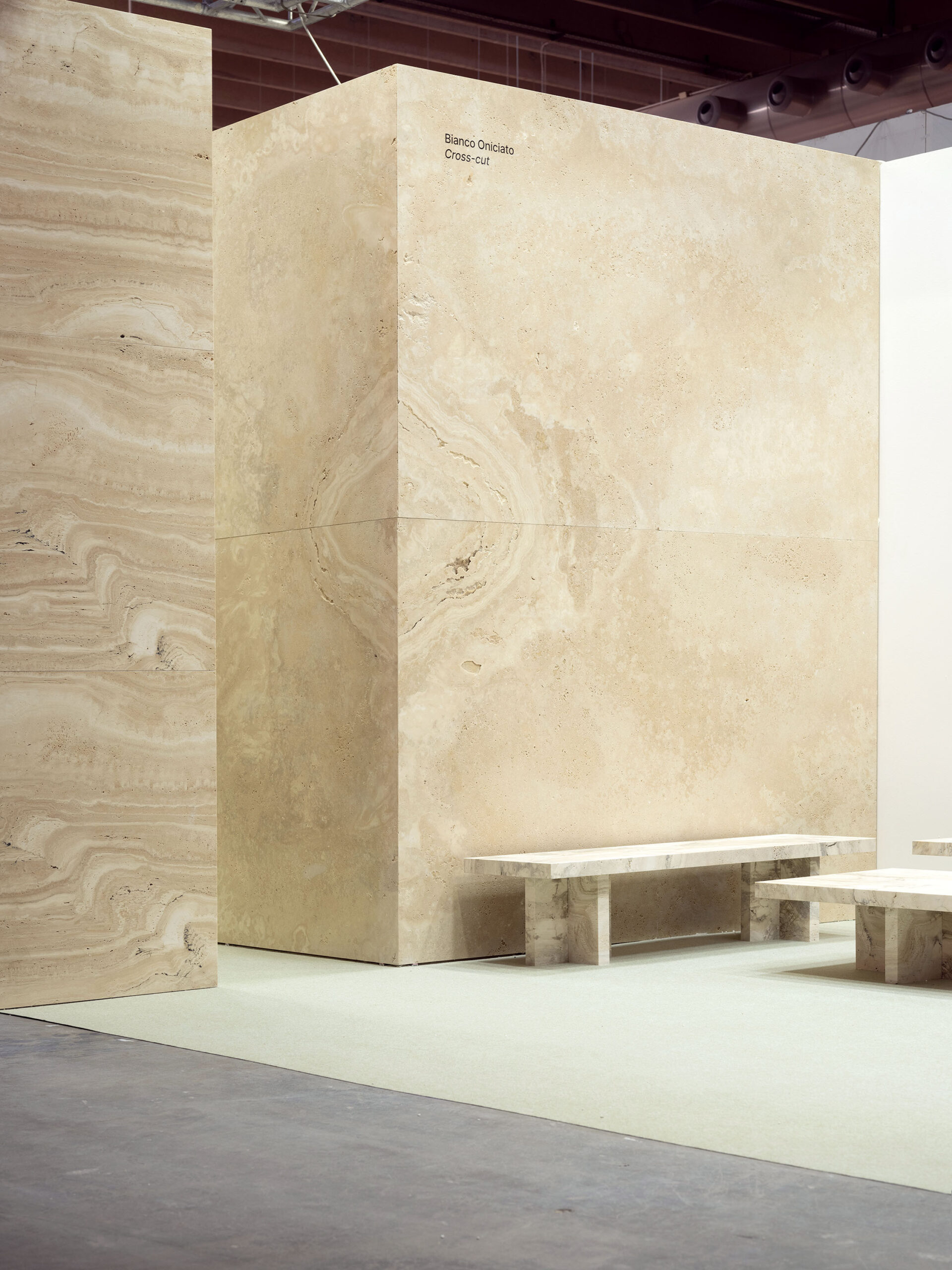
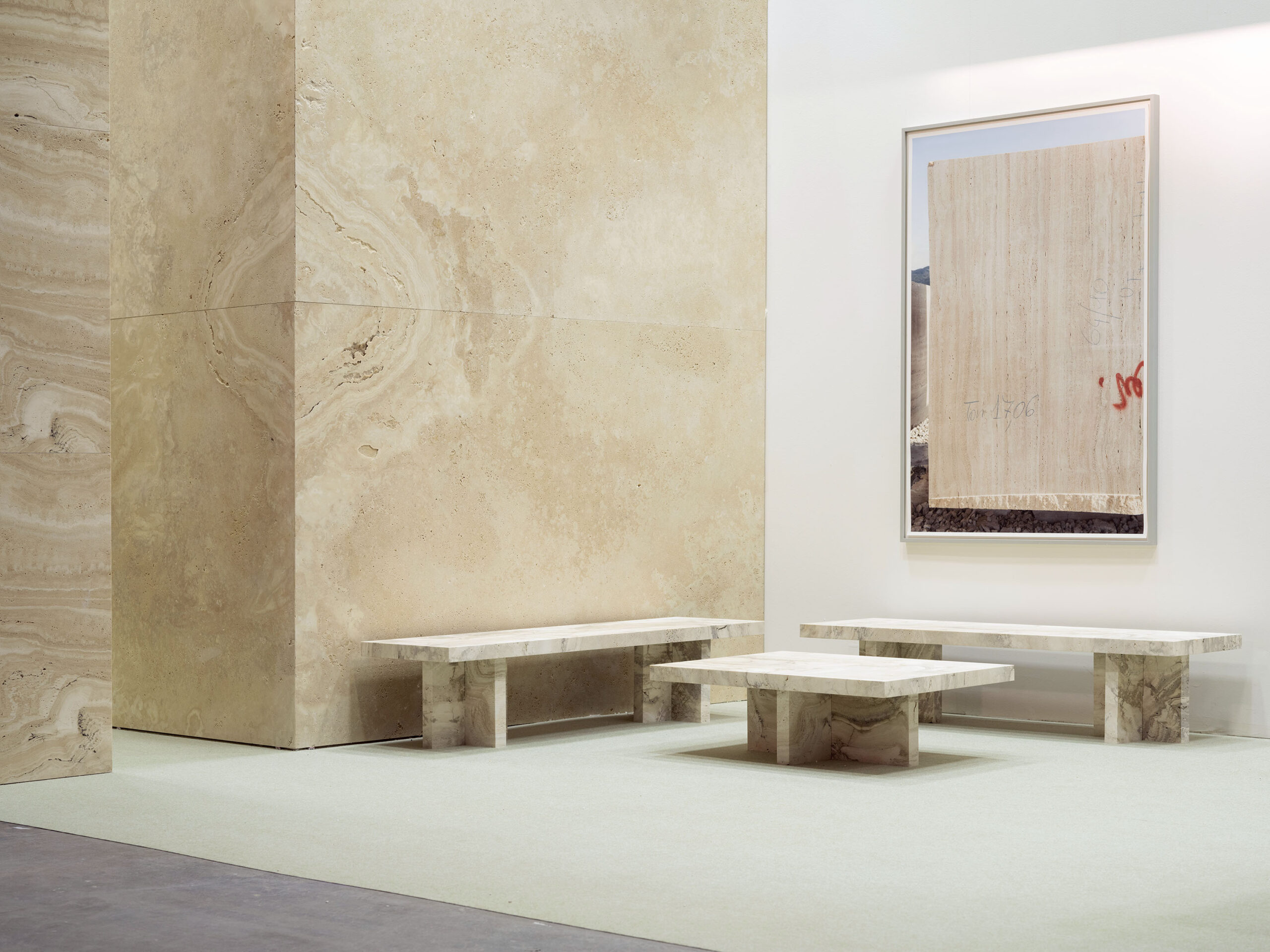
British sculptor and architectural designer Thomas Hutton was invited to reimagine the Pacifici booth at Marmomac. His response was to open up the space and to demonstrate the quality of the material by using the scale and simplicity of the block and quarry wall as an organizing principle and design concept. 

For the long back wall he utilized the horizontality and seamlessness of the vein-cut Caesar. For the two block walls he used 45-degree edges to create seamless corners and give an impression of mass, utilizing the expressive movement of Bianco Oniciato in both cross-cut and vein-cut. 

Once the space and material had been determined, a collection of furniture was conceived especially to populate the stand and show how travertine can be used on a domestic scale. A three-meter working table, a desk, a pair of benches and a coffee table were fabricated using Roman Classic and Wild.

As a final touch to the stand Hutton included one of his lamp sculptures, made from Egyptian alabaster and peperino tuff from Viterbo.

Where Modernity Frames Tradition: The New York Times on OMA’s New Court in London

Micheal Kimmelman – The other day I caught up with New Court, the London headquarters for Rothschild Bank, designed by Ellen van Loon and Rem Koolhaas of OMA. Opulent, context friendly, almost stealthy, it’s an “adult building,” as one of the architects who worked on the project half-jokingly put it.

Meaning that it’s not what you might expect from Mr. Koolhaas, who has been heard recently lamenting “the rat race of extravagance” driving trophy architecture before the market tanked, when he was such an emblematic and influential figure. As it happens, New Court was commissioned before the crash but took years to be finished. So like Mr. Koolhaas’s mantra, it’s neatly tailored for a changed climate.

London has a case of what the late critic Ada Louise Huxtable once called Skyscrapers Gone Wild. She was talking about the “supersized, contorted, totally out of context” towers, resulting from a cocktail of new technology and mad money, competing for height and attention, from which this city had once proudly abstained. I looked around town with Ricky Burdett, who teaches urban studies at the London School of Economics. He showed me 122 Leadenhall Street, nicknamed the Cheese Grater, an office building by Richard Rogers going up not far from New Court in the heart of the London financial district. I wondered aloud what Rafael Viñoly could possibly have been thinking when he came up with the top-heavy design for the building that has been nicknamed the Walkie-Talkie, close by.

Across the river, atop London Bridge Station, the nearly completed Shard by Renzo Piano – London’s tallest building – loomed over the skyline.

Neighborhoods are changing too. The master plan for the Olympic Games last summer entailed creating what’s meant to be a prosperous new center in the historically downtrodden East End. Olympic Village is being turned into mixed-income housing and parkland. (James Corner, of Field Operations, who worked on the High Line in New York, is designing part of the park.) As with the Shard, we’ll have to wait to see how it works after it’s finished.

David Cameron, the British prime minister, and Boris Johnson, London’s flamboyant mayor, announced with some fanfare last month a plan to invest $80 million in the construction of a civic center for Tech City, as the blocks of East London near the Old Street Roundabout have come to be called. “There goes the neighborhood,” was the lament of some die-hards in that scrappy start-up community, who feared the area had lost its cachet if government planners wanted to horn in on what has been a bottom-up development.

Their real cause for concern ought to have been the suburban office-park-style building in the drawing that the prime minister and mayor unveiled. A better plan, to upgrade the grievous roundabout itself, should emerge as the project evolves.

The most dramatic transformation is to Kings Cross, long a crime-ridden, impoverished district where the St. Pancras and Kings Cross railway stations converge. Across 20 years or so the area has been changed almost beyond recognition. To complement the renovation of St. Pancras a few years ago the main concourse of the Kings Cross terminal has recently been refurbished with a swooping, pseudo-Gothic ceiling designed by John McAslan. Google plans to put its London headquarters next door. Luxury and subsidized housing have arrived or are arriving nearby, along with commercial development.

The Argent Group, a British developer, is behind this multibillion-dollar makeover. It has stuck to good urban strategies: mixed use, slow growth, pedestrian-friendly streets, sensible restoration alongside new construction, and an emphasis on active and ample public space. A spanking new granite plaza with fountains opened last month outside the Central Saint Martins College of Art and Design, which in 2011 moved into a six-story, 19th-century granary, ingeniously retrofitted by Stanton Williams, the London architects. The design navigates strict conservation guidelines to devise a spare, sleek, soaring interior that doubles as school and new public square.

The development around King’s Cross is gentrifying a former brownfield, which is what some of the Shard’s old-time neighbors fear. That building, a mountain among the pubs and housing blocks, will change the real estate picture in the area. It’s hulking and unimpressive at street level. But adding density at a rail hub makes sense. The prospective mix of offices, apartments, restaurants and a viewing platform in the building, to rival the London Eye, should add jobs and revenue to the area; and the station, which serves 300,000 commuters a day, has been cleaned up and attractively refurbished as part of the project.

And from afar the vertical faceting of the Shard’s facade reduces the impression of bulk. The crystalline effect is subtler than many Londoners feared. The building almost evaporates in certain soft light, its crown dissolving into a mesh of attached screens – a move Mr. Piano tried unsuccessfully at The New York Times building, where the clunky flat roof looks unfinished. Here, by extending the tower so that it tapers to a sharp point, the screens serve the desired purpose.

More than 30 new skyscrapers are rising or soon will in this city. For centuries the dome of St. Paul’s was the highest monument on the skyline, until the National Westminster Tower in 1980. Then came Norman Foster’s Gherkin. Now the race is on.

This is partly the consequence of a vigorous policy by Ken Livingstone, the former mayor, pursued under Mr. Johnson, promoting high-rise growth, focused around mass transit. The policy has brought international architects to the city for the first time in a big way. But many of the projects have been waved through the approval process by a complacent planning system, Rowan Moore, the architecture critic for The Observer, wrote recently.

“Is there anything special about their detail?” he asked. “Is there consistency or integrity in their overall concept? Do they create handsome new public spaces at their base?” Which gets back to New Court, OMA’s 226,000-square-foot headquarters for Rothschild. At 15 stories, it’s no skyscraper, but it is taller than the buildings immediately around it, the tower cutting a profile far more distinguished than, say, the Walkie-Talkie.

The Rothschild family has occupied this same site on St. Swithin’s Lane, an ancient alleyway not 10 feet wide, since 1809. New Court replaces a smaller headquarters from the 1960s, which replaced a Victorian one. Behind the building St. Stephen Walbrook church, by Christopher Wren, an architectural landmark from 1680, had been obscured from view by successive Rothschild offices for nearly 200 years.

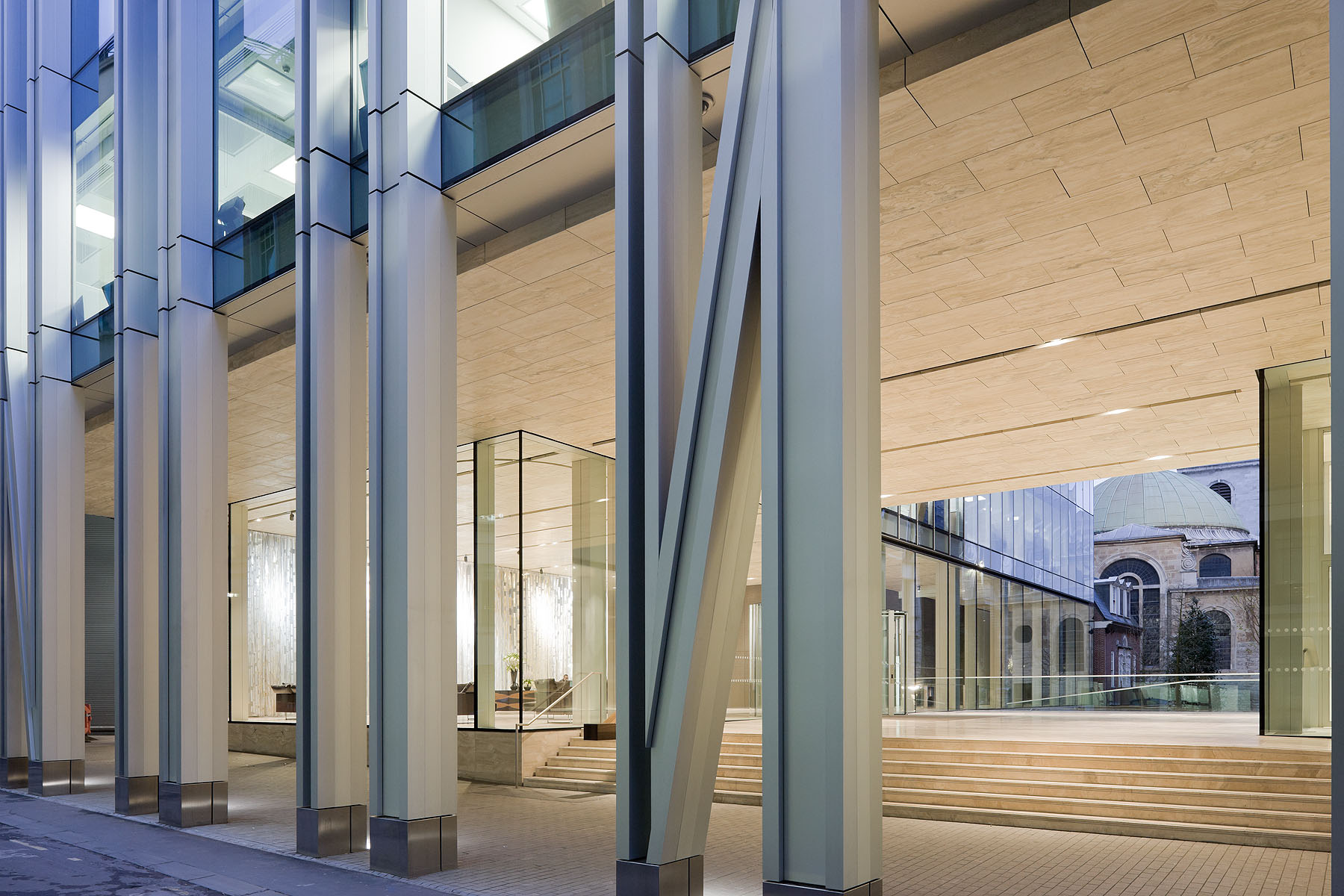
OMA’s big idea: cut a passage through the middle of the site, raising the new building off the ground to reveal the church, with a quasipublic plaza that links the covered forecourt of the bank with St. Stephen’s graveyard.

The plan is ingenious, elegant. Now a glass and aluminum colonnade defines the street edge, with a broad portico and pedestrian passage behind, framing the church view. The plan brings transparency, surprise and civic grandeur to a narrow lane; and by revealing Wren’s building, it invents a pas de deux, the Rothschild tower nodding to the tower of St. Stephen.

Among the luxury details: bespoke textiles in private meeting rooms, a timber desk and ornamented curtain in the lofted lobby, and a ground-floor annex for the Rothschild family archive, with hand-carved oak cabinets and old master art. There’s none of the rough and tumble associated with OMA. Everything’s smooth, sleek, a poetry of linked volumes.

I said quasipublic earlier only because while you can now see St. Stephen from St. Swithin’s Lane, you can’t get to it. A gate between forecourt and churchyard is locked; bank guards discourage the curious. So, unfortunately, an architecture of openness meets the architecture of paranoia that has reshaped cities like London and New York for more than a decade.

https://www.nytimes.com/2013/01/10/arts/design/a-rothschild-building-in-london.html?_r=1
David Chipperfield. Architecture as a practice, on display in Vicenza

Domus interviewed Sir David Chipperfield on his latest exhibition, hosted at the Basilica Palladiana, where projects still underway aim to illustrate the power of architecture. With a video by Francesca Molteni.
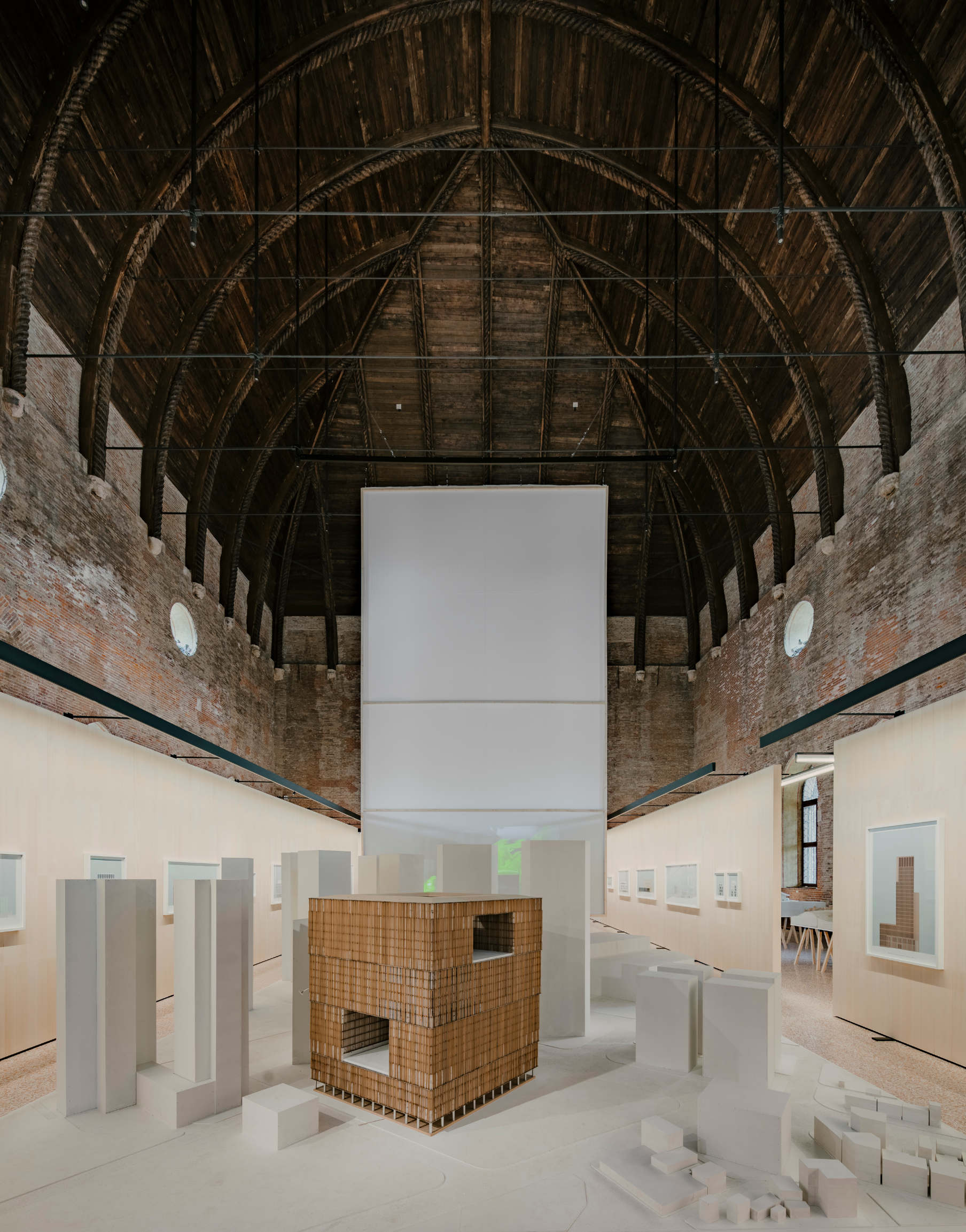
The exhibition “David Chipperfield Architects Works 2018” was organised by Abacoarchitettura, a cultural association for architecture. Hosted at the Basilica Palladiana in Vicenza, a selection of 15 current and recent projects by the practice are shown at varying stages in their development, exposing the range of activities that takes place in an architecture studio today.
Domus interviewed the British architect as to the reasons why he and his office chose to present yet-unfinished projects. During the conversation, he referred to his project for the Fundación Rede de Innovación Arousa in Galicia, Spain as an opportunity to redefine his craft in response to current priorities, namely the establishing of an active relation between architecture and society.

Giulia Ricci – Your exhibition shows how architecture as an artistic practice can have a close relation to the social realm. How did this initiative come about?
David Chipperfield – It was an invitation. Architects are always nervous to make exhibitions, because it is quite difficult and takes a lot of energy from your daily routine. We are meant to make projects, not exhibitions. If an artist is invited to make an exhibition, she’s enthusiastic, but it is not the same for architects. So, when the question came from Vicenza, we didn’t want to separate our work from the making of the exhibition. That’s why I wanted the different teams to present the projects they are currently working on.

GR – It was surprising to see that the projects on display are still being worked on.
DC – We chose to not make an archive exhibition or a presentation exhibition. We excluded the possibility of presenting completed projects that are already known. Instead, we wanted it to come closer to the practice of architecture. We decided to display what we are doing, so that the result would be more fluid. We tried to transform it into an opportunity to talk about architecture as a practice, and not about architects.

GR – David Chipperfield Architects is based in London, Berlin, Milan and Shanghai. For the exhibition, each team presents its own production. Do you see a difference between them?
DC – I don’t see the studios as so different from one another intellectually speaking, but they do produce different projects. For example, if we work in Germany we get a German project. If we work in Korea we get a Korean project. It depends on the assignment. It is more a matter of context then a matter of team.

GR – The relationship between form and society is an important focus of this initiative. How do you manage it in the design process?
DC – The aim of the exhibition is to explain that there are moments of our production where we need to be very formal and experiential, while others are more societal. The concept for Valentino retail is a material experience, while the Galician project is only societal. It is about how a physical environment should be. Architecture occupies a territory at the crossroads of society, form and experience.

GR – Tell us more about your project in Galicia – the Fundación Rede de Innovación Arousa.
DC – My family and I have grown very fond of the region – we have had a house there for 25 years. That’s why I decided to finance a non-profit organisation working for and with the communities. This project is not about architecture as the subject but about a rearrangement of the territory. Some of the key points are traffic control in the urban centres; changing the laws concerning building on green land; and the redevelopment of empty houses. Action aimed at the administrative framework of the area is also included. It is necessary to reconsider the boundaries and relationships between mayors of neighbouring towns and bring up a discussion on sustainability, beyond the logic of political parties. We are currently on our way to develop a relationship with the local institutions. There is a need to control traffic, water quality, sewage, pollution, forestry and fires. These elements bond municipalities together. Water is not interested in administrative boundaries, so the administrative mechanisms must be reconsidered in order to be more effective in changing our environment. This is not about a single building or a nice square.

GR – What’s your approach as an architect towards sustainability? Is it a difficult word to use today?
DC – Yes, I think that we do not know how to talk about sustainability. The important thing is that even if it has vague meaning, it has a general understanding. Politicians are interested when you say the word sustainability, because it has societal power. If you consider the meanings represented by the word, you’ll find many issues that are close to us as architects: density, urbanism, good mobility, the intelligent control of traffic. As for social sustainability, I think it is opportune to have social housing in the centre of the city. If all the functions are spatially separated – the city centre as a museum, the office district, the residential area – the city becomes unsustainable. Social sustainability is about proximities, about the design of a rich, complex social and spatial structure.

GR – How would you define the role of your practice in society?
DC – The Biennale I directed in 2012, “Common Ground”, was an attempt to convey the idea that architects must establish a better relationship with society to become more useful. I wanted to demonstrate the power of architecture instead of the power of architects. We cannot only be designers of monuments, we also have to be designers of society, to engage with it and help it. The next generation has to change this relationship. It must become more flexible. The work we are doing in Galicia is not about architecture, but it can only be done by architects; it is about mediation and negotiation. Indeed, if the architect wants to regain the role of his craft in society, its societal power, he must engage with society.

https://www.domusweb.it/en/architecture/2018/06/08/david-chipperfield-architecture-as-a-practice-on-display-in-vicenza.html

Microsoft makes CIBC Square, Toronto their new Canadian Headquarters

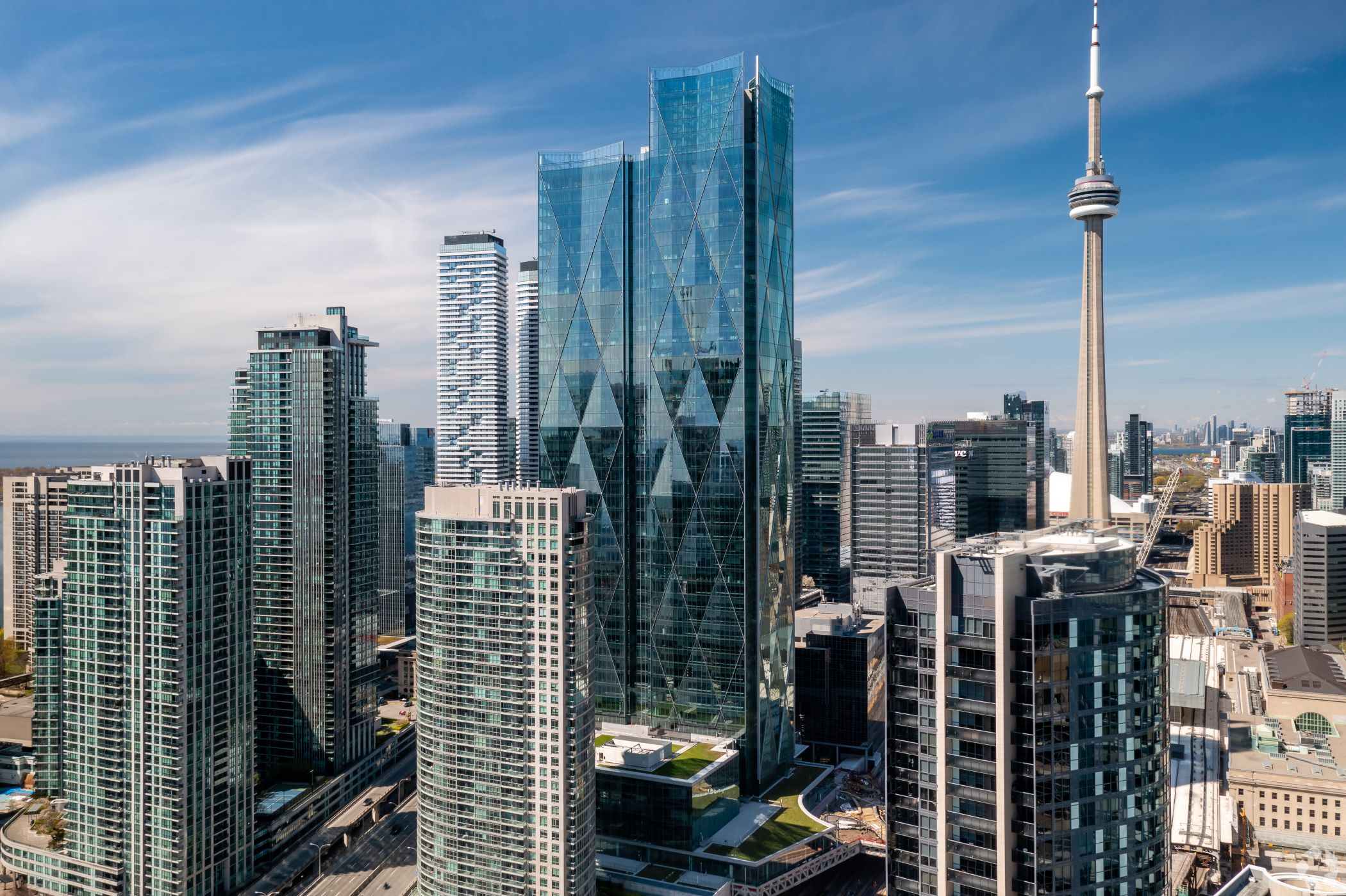
It has been announced that Microsoft will make WilkinsonEyre’s CIBC Square, Toronto their new Canadian Headquarters. The move from Microsoft is one of several to both expand size and move into emerging markets.  Microsoft will occupy 132,000 ft2  over four floors at 81 Bay Street, accommodating approximately 15,000 employees. In addition to Microsoft, the building will also serve as Headquarters to Canada’s fifth-largest bank, Canadian Imperial Bank of Commerce (CIBC), extending Toronto’s financial district towards Lake Ontario and creating a ‘campus-style’ development on Bay Street.  
Located in the heart of Toronto, the tower at 81 Bay Street is the first phase of a grand-scale, mixed-use development that is dedicated to enhancing the wellbeing of not just its own occupants, but people in the surrounding area. The master plan provides twin 250m-high towers positioned on opposite sides of a rail corridor and linked at high level by a sky park.
The scheme is designed to elevate surrounding public realm areas through providing a new city bus terminal for Metrolinx, a new public park and connections into Union Station. The construction of 81 Bay Street began in June 2017 and is due to complete in 2020. The overall development with CIBC as the anchor tenant is due for completion by 2023 with Wilkinson Eyre currently working on designs for CIBC Square’s second tower, 141 Bay Street. 

https://www.wilkinsoneyre.com/news/microsoft-makes-cibc-square-toronto-their-new-canadian-headquarters