Art Gallery of New South Wales – Sydney

The John Kaldor Family Gallery – Art Gallery of New South Wales

The John Kaldor Family Gallery is an exciting space: flexible, functional and eloquent.

Architect:
PTW Architects


Client:
Art Gallery of NSW

Location:
Sydney

Year:
2011

Repurposed storage.

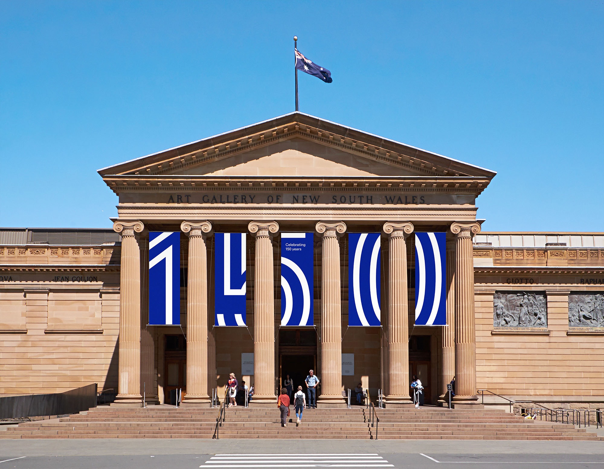
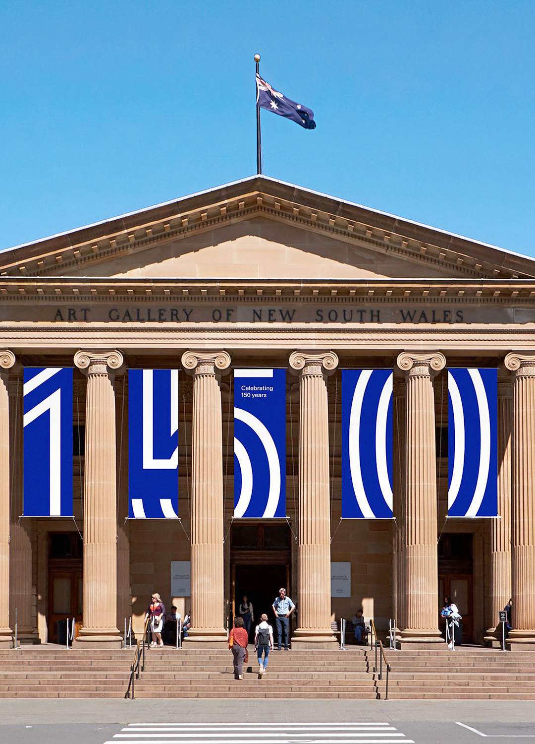
Established in 1871, the Art Gallery of NSW is the leading museum of art in New South Wales and one of Australia’s foremost cultural institutions. The Gallery showcases international and Australian art in one of the most beautiful art museums in the world and aims to be a place of experience and inspiration, through their collection, exhibitions, programs and research.

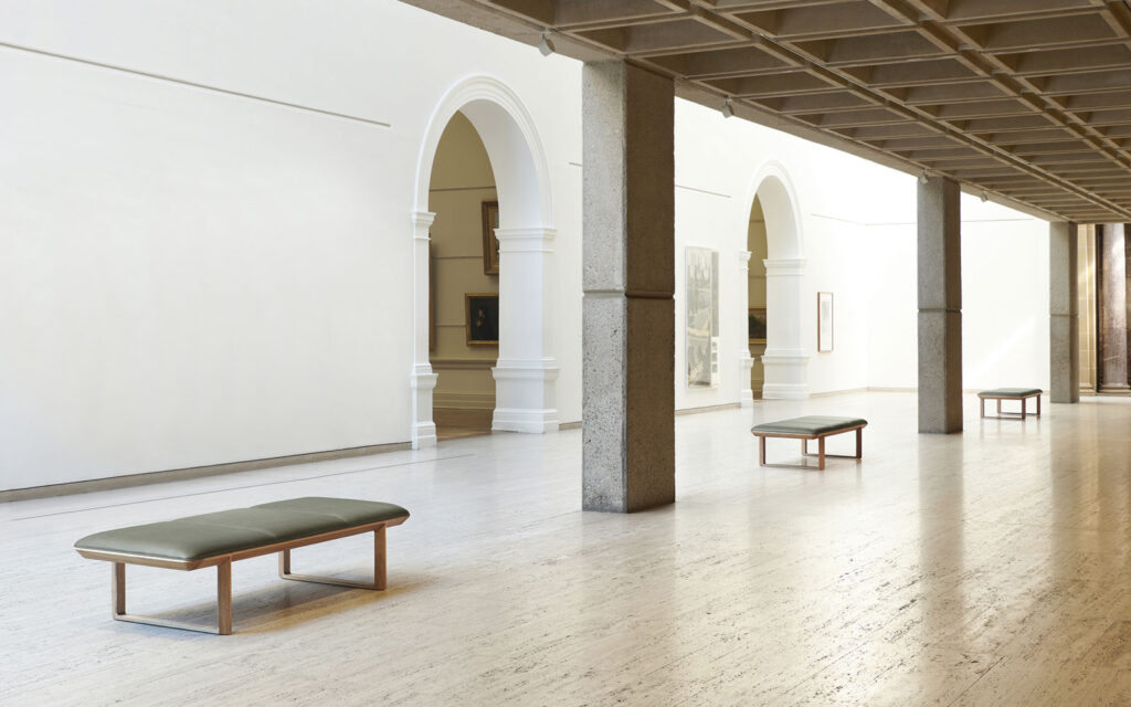
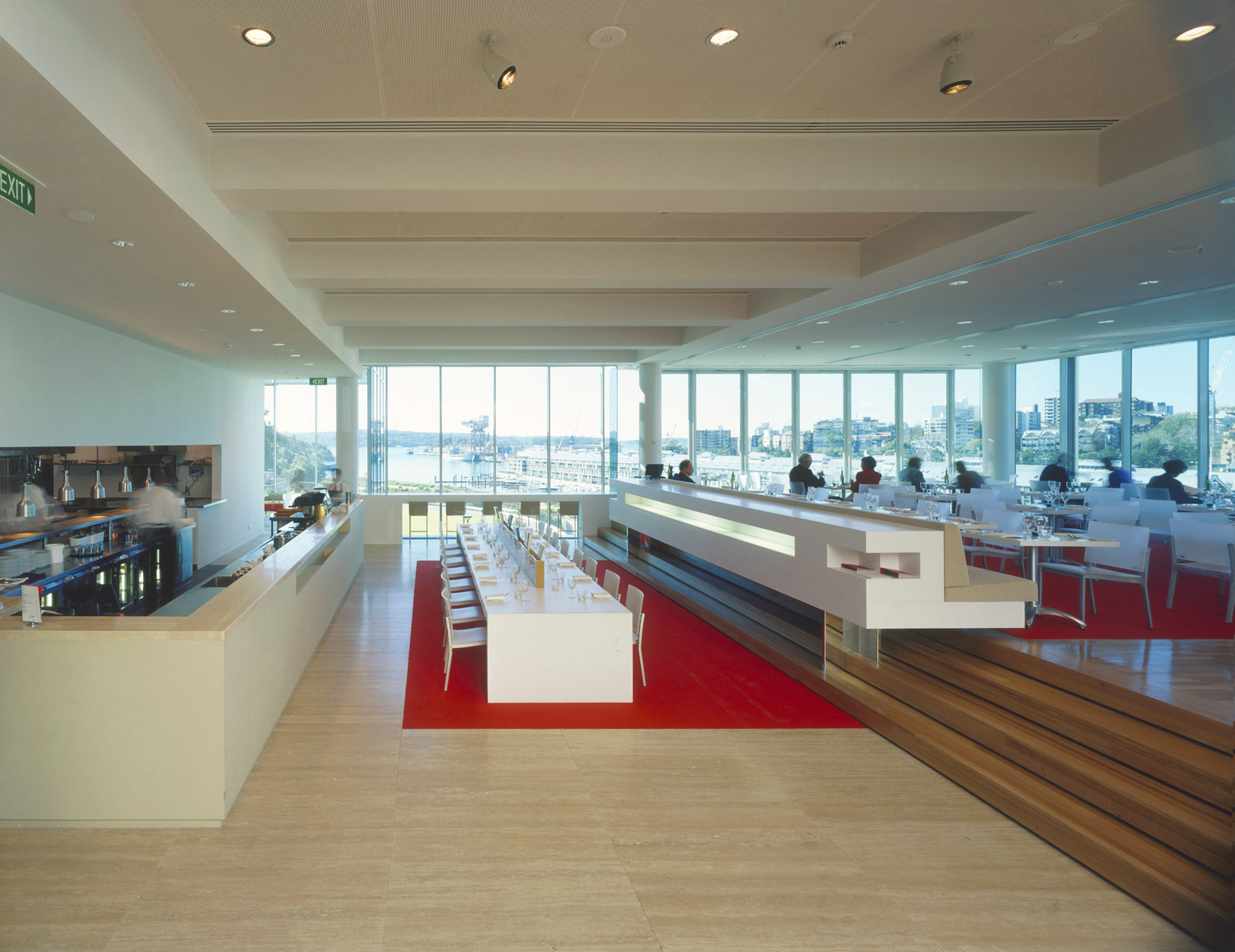
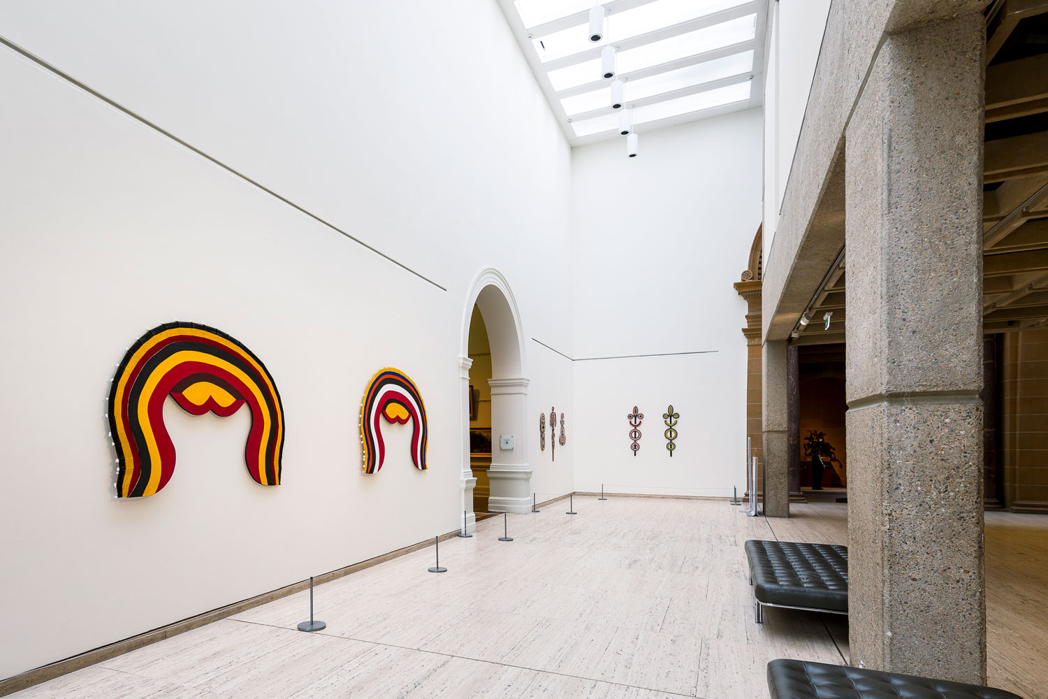
Director Edmund Capon’s last major building project at the Art Gallery of New South Wales was the transformation of basement storage into a new floor of 3,300 square metres of exhibition space, designed by its original architect Andrew Andersons from PTW Architects. The basement was repurposed when the state government provided funds to enable the Gallery to build a collection store offsite. The new gallery spaces were opened in May 2011 by Premier Barry O’Farrell. The inaugural hang in the John Kaldor Family Gallery showcased John Kaldor’s gift of over 200 international works of art.
It adds a huge dimension and it gives a really strong panorama of the art of the last four decades.

In 2008 John Kaldor and his family announced their intention to give the John Kaldor Family Collection to the state of NSW. This was the catalyst for the government to provide funds to the Gallery to build a state-of-the-art offsite storage facility to allow space within the Gallery to display the collection.

This extraordinary gift, together with funds generously donated by the Belgiorno-Nettis family, enabled the re-development of the Gallery’s old storage area and existing display space to create an additional area of approximately 1200 square meters of new exhibition space. This floor now comprises the John Kaldor Family Gallery, a suite of contemporary and modern galleries, a dedicated photography gallery and a study room for the Gallery’s works on paper collection.
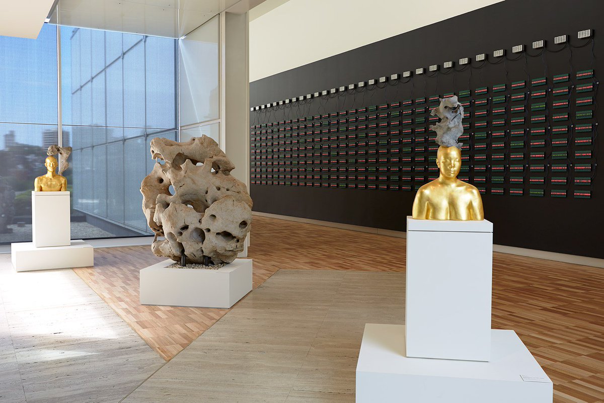
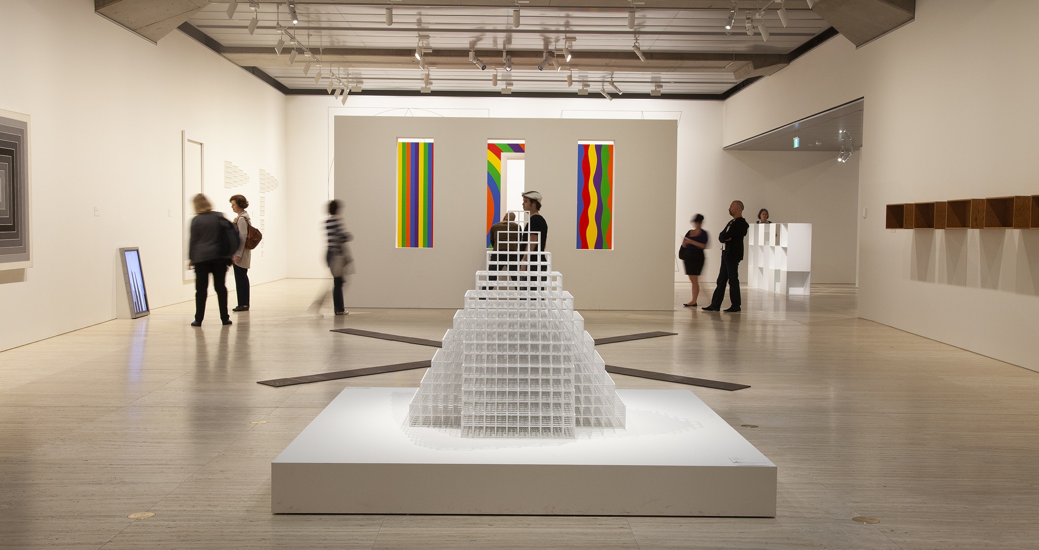
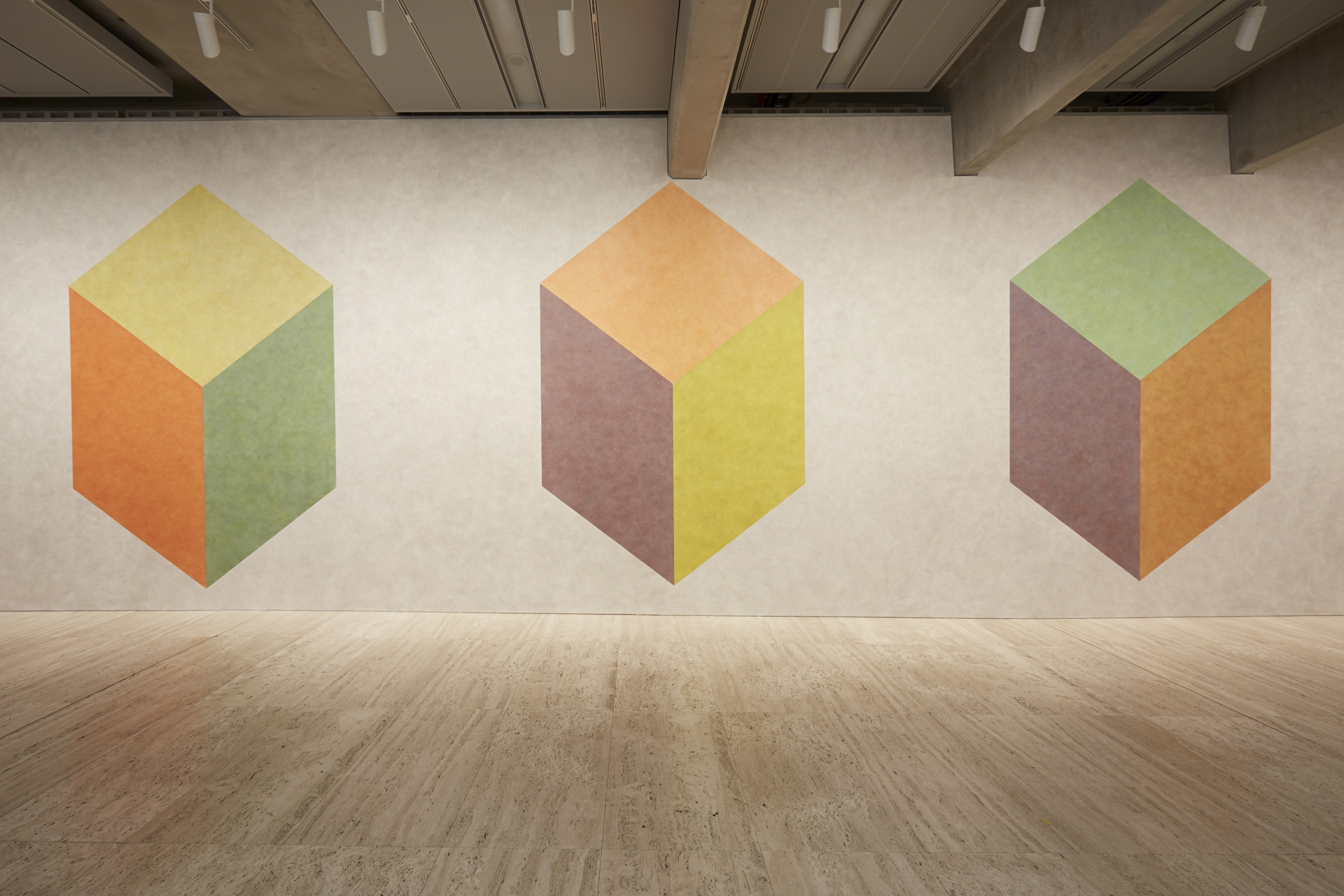
Continuity of materials as travertine, exposed concrete and white plasterboard walls provides harmony with the existing building.

Continuity of materials as travertine, exposed concrete and white plasterboard walls provides harmony with the existing building, while new materials and technology demonstrate a sympathetic evolution of the architecture since the building’s construction in 1968.

Fundamental to the design concept was the desire to increase the perception of greater height within the gallery space. Elsewhere in the building the concrete grid creates a ceiling plane at about 3.6m high. By extending the display walls to the soffit of the flange of the precast “T” beams the reading of the space was increased by a metre, creating a more appropriate setting for contemporary art.
Torre Iberdrola – Bilbao

Torre Iberdrola

Torre Iberdrola is the new focal point of culture and business in Bilbao.

Architect:
Pelli Clarke Pelli Architects


Client:
Promotora Vizcaina

Location:
Bilbao

Year:
2011

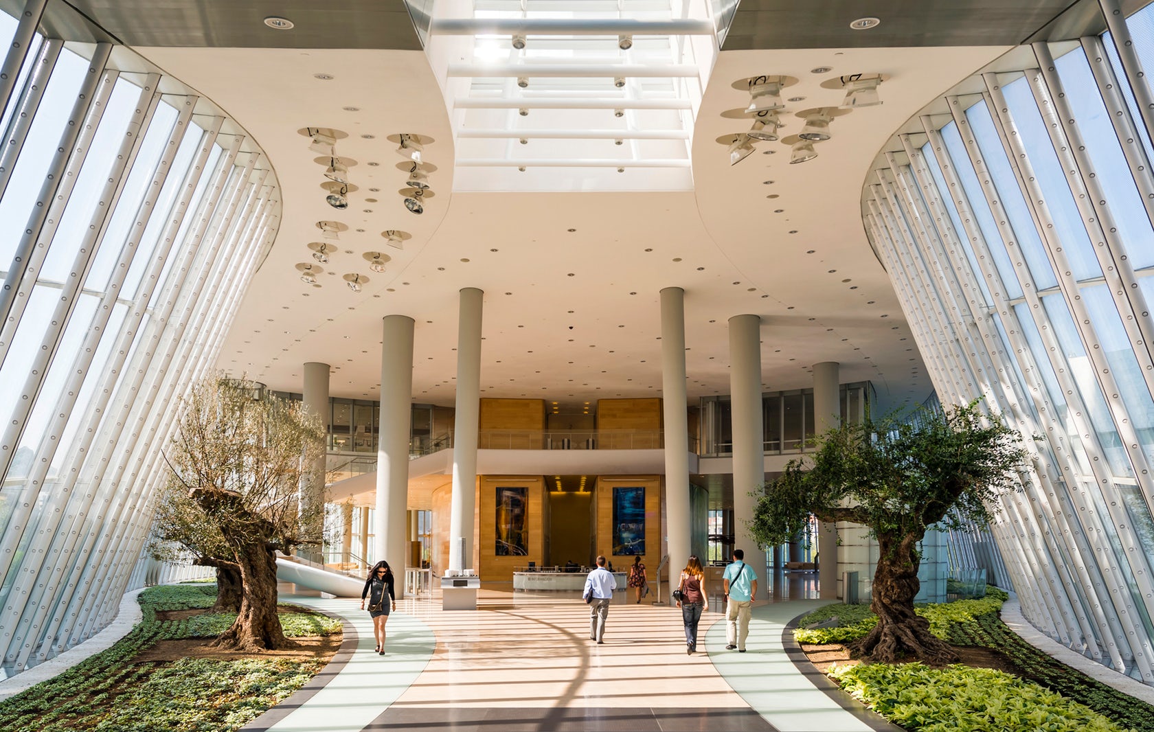
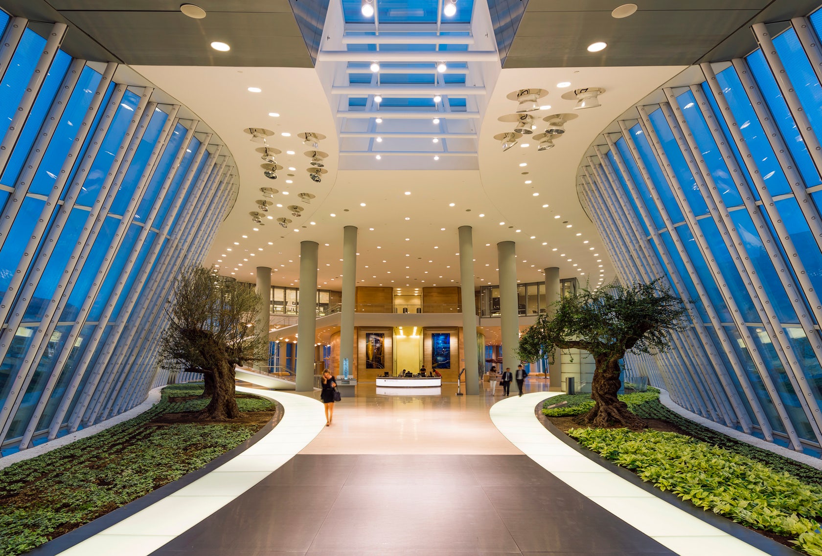
Designed by prestigious Argentine architect César Pelli, Torre Iberdrola is the latest milestone reached in the process of transformation undergone by the city of Bilbao.

Torre Iberdrola, designed by prestigious Argentine architect César Pelli, is the latest milestone reached in the process of transformation undergone by the city of Bilbao and the central feature of its new financial centre. The tower, built as Iberdrola’s headquarters, is the tallest building in the Basque Country and the city of Bilbao, and the eighth tallest building in Spain.

The tower was built in Abandoibarra, a former industrial area located next to the Nervión river that began to be renewed in the early 1990s and where other emblematic projects such as the Guggenheim Museum Bilbao and the Euskalduna Conference Centre and Concert Hall have been built. Standing 165 m (541 ft) high along the river, the Torre Iberdrola, which plays the main role within this development, has become the new finance and business icon in Bilbao and contains approximately 50,000 square metres of rentable space.

A sustainable building.

With a height of 165 metres, this elegant office building has become a work of art in tertiary architecture and a reference for its design, technology and sustainability. In the construction of Torre Iberdrola, state-of-the-art technologies in the fields of sustainability, security, facilities, etc. were used, making it a role model amongst buildings throughout the country. Coupled with its high-impact design in the form of a triangular prism are its use of the latest advancements and the highest-quality materials.

Torre Iberdrola possesses the prestigious LEED CS 2.0 Certification (Leadership in Energy and Environmental Design) awarded by the USGBC (Green Building Council of the United States), which evaluates and acknowledges those projects which make use of the most environmentally friendly practices and are therefore the healthiest and most environmentally responsible and have the most profitable structures. To achieve this, it took into account the regeneration of the area around the building, access by public transportation, parking capacity, bicycle parking, best use of spaces, etc.

A perfect combination of design, technology and functionalism.

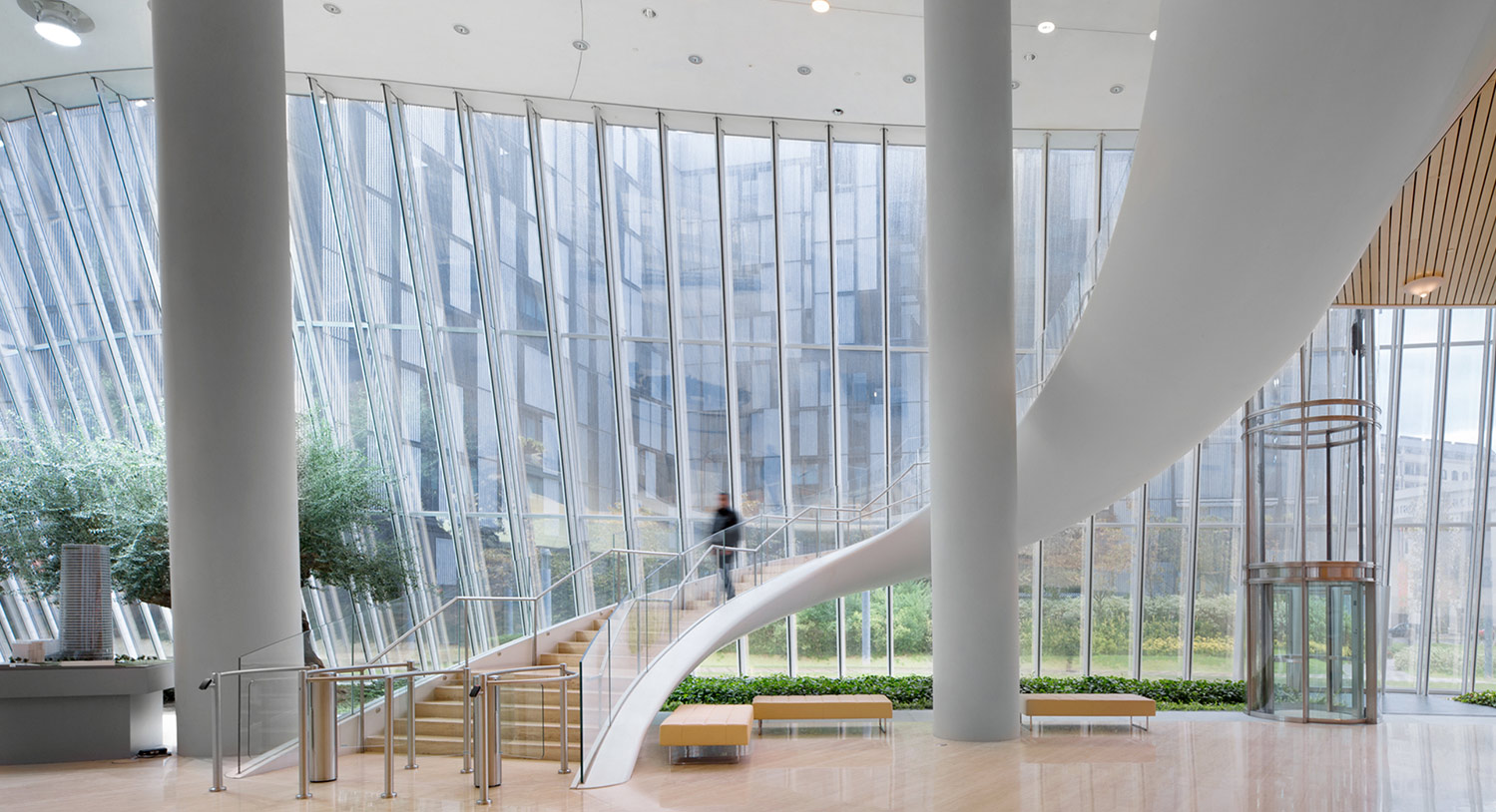
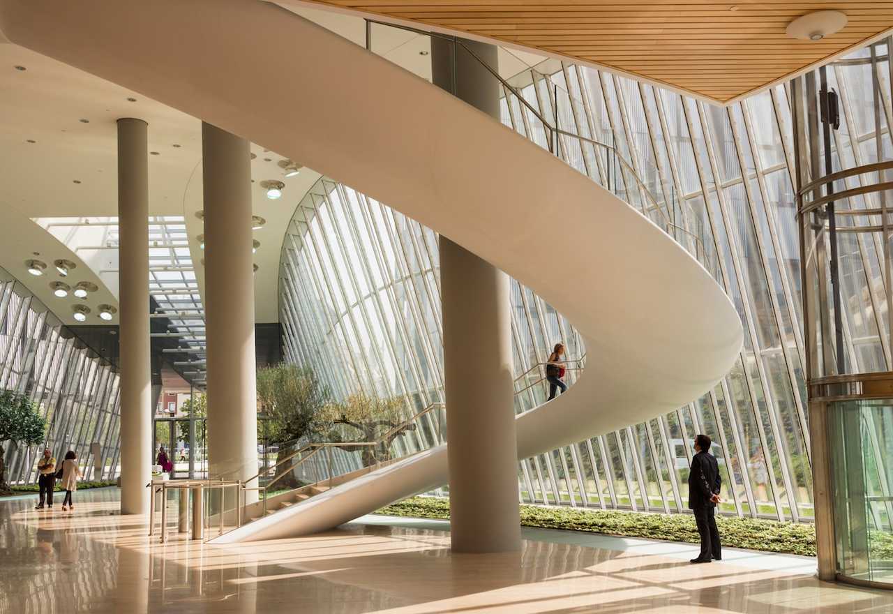
The hall hosts an elegant architectural staircase its logarithmic spiral shape designed to look like a sculpture smoothly connecting the ground and first floors. The shape and the materials used all contribute to the sense of lightness and sinuosity. The staircase is composed of a suspended, curved steel structure covered by glass reinforced plastic and runs from the ground floor to the first floor. All cladding appears as a single, continuous element without any visible joints. Even the low iron curved glass and the stainless steel handrail are connected to the steel structure without visible securing elements. The steps are covered by Travertine marble and illuminated by LED spotlights. The stairs and the tower itself have been designed considering the sustainability requirements envisaged for LEED certification.

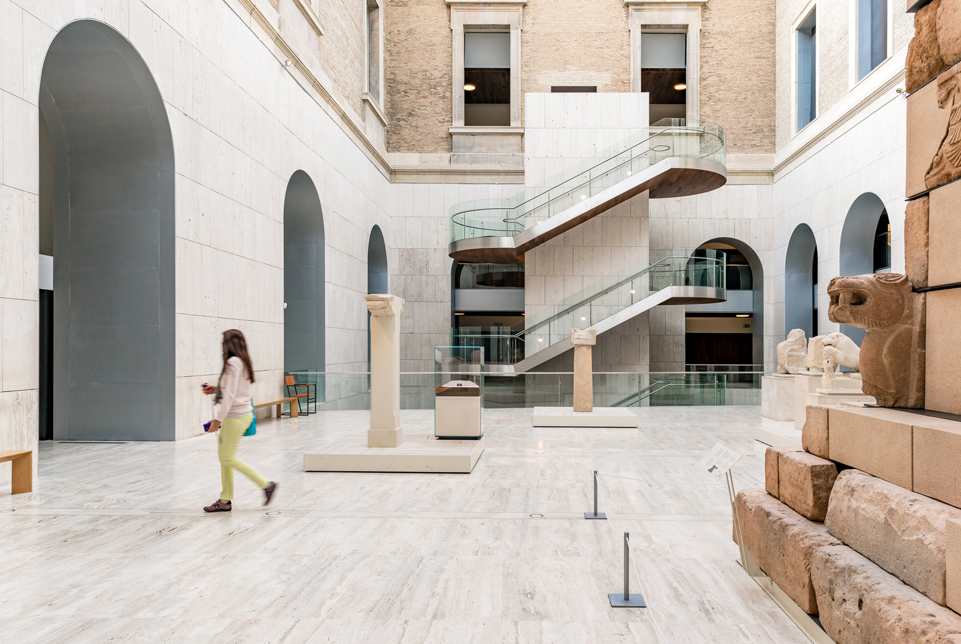
MAN Museo Arqueologico Nacional – Madrid

MAN Museo Arqueologico Nacional

Frade Arquitectos renovated and remodeled the Museo Arqueologico Nacional of Spain.

Architect:
Frade Arquitectos


Client:
Ministerio de Cultura de España

Location:
Madrid

The new MAN in Madrid joins the olympus of the Spanish capital’s cultural references.

The new MAN in Madrid joins the olympus of the Spanish capital’s cultural references.

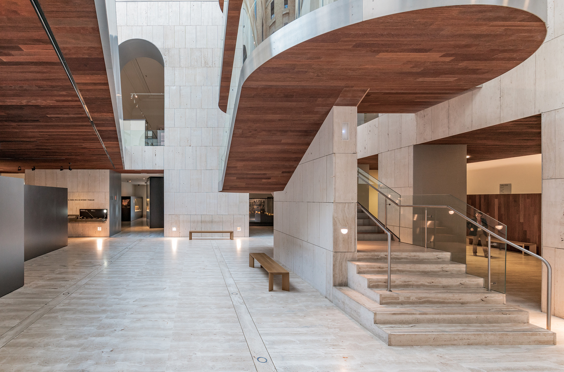
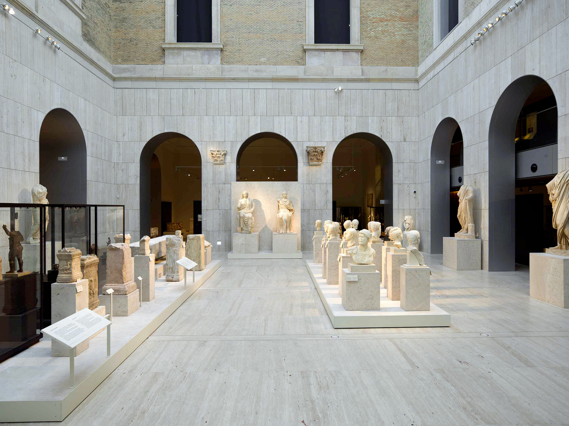
The new National Archaeological Museum of Spain in Madrid has gained back the identity of the 19th century edifice that had been built by Francisco Jareño, while taking on the personality pertaining to a bona fide contemporary museum, thereby joining the olympus of the Spanish capital’s cultural references. The successful transformation owes to six years of works and a carefully tackled project of Juan Pablo Rodríguez Frade, who has resorted to an efficient palette of materials: travertine and wood.

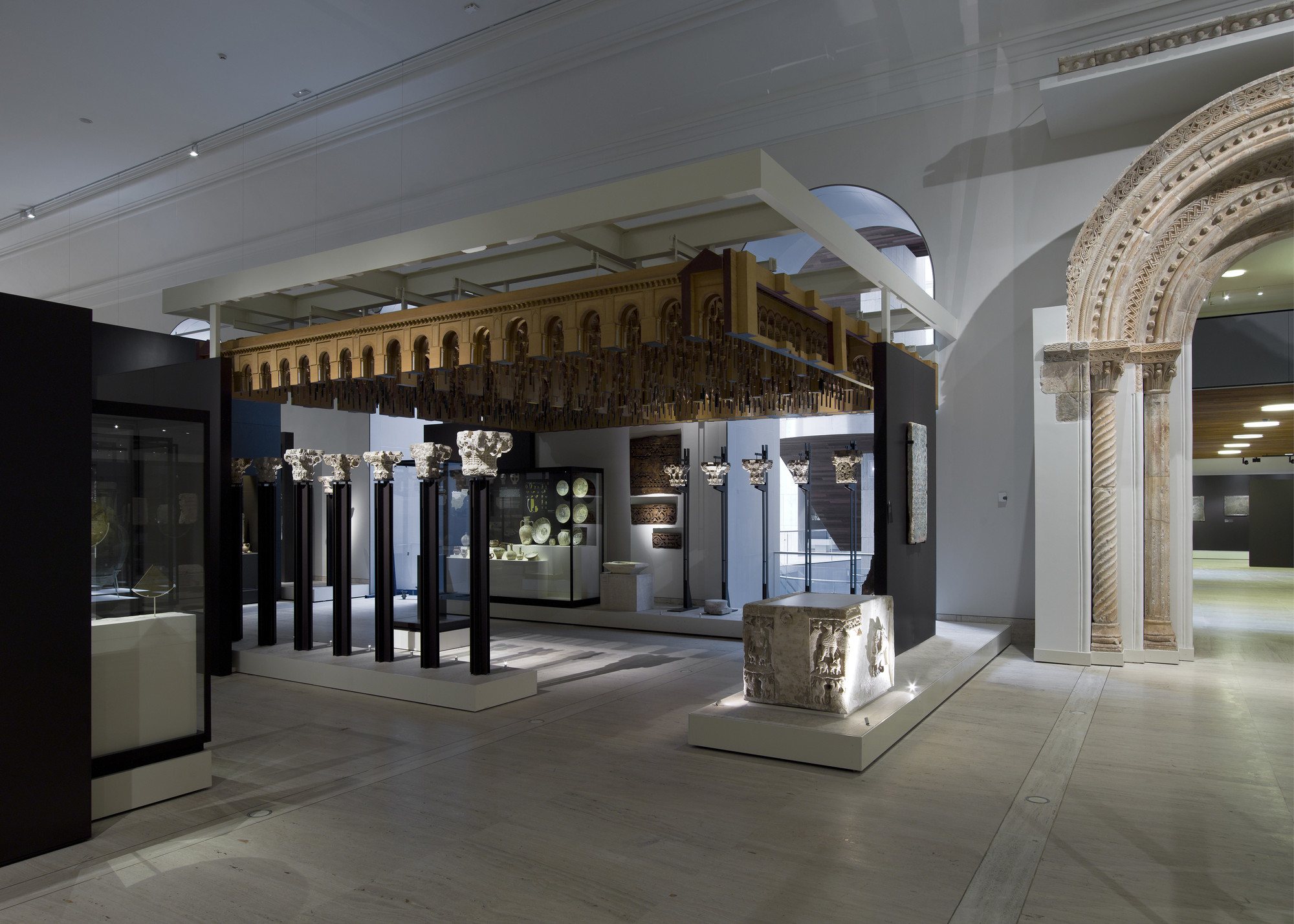
The intervention has effectively expanded the institution’s exhibition galleries from 7,000 to 10,000 square meters, facilitated natural lighting, and altered the composition of the entrance in order to enable visitors to follow, as they could never before, a clear-cut chronological route that goes from Paleolithic art to the 19th century through 13,000 archaeological treasures and 20,000 years.

The museum today retains features of the old design but also improves its architectonic value.

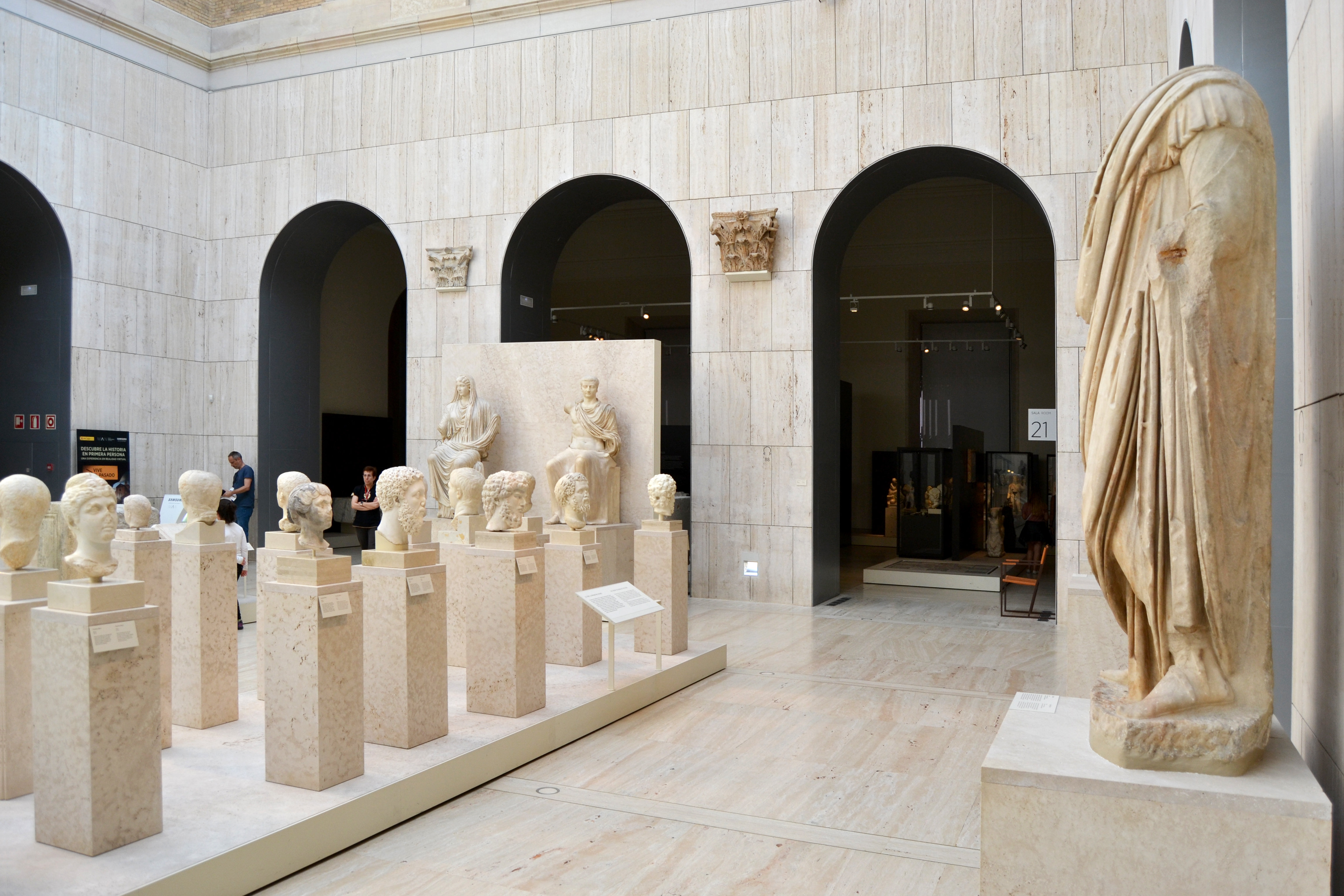
The Spanish studio Frade Arquitectos renewed the Museo Arqueologico Nacional in Madrid to improve accessibility, spatial efficiencies, and 10,000 m2 of exhibition areas, all the while retaining elements of the original structure. The neoclassical building was constructed in the 19th century according to a design by the architect Francisco Jareño. The museum today retains features of the old design but also improves its architectonic value in terms of communication and aesthetics. The project respects the old building in architectural terms and develops a new museology design trying to adapt it and link it to both the historical and the new features of the current museum.

The main concept consisted of maintaining the emotional character of the historical building whilst bringing it into harmony with the requirements of a 21st century museum.

The Museo Arqueológico Nacional, founded in 1867 by Queen Isabella II, specialises in historical artefacts from the Iberian peninsula and is supplemented by an Egyptian, Greek, Roman and Islamic collection. The permanent exhibition displays around 13,000 exhibits to the general public. In addition to the Lady of Elche, a copy of the Altamira cave with Stone Age rock paintings and the reconstructed mausoleum of Pozo Moro from the 6th century can also be seen.

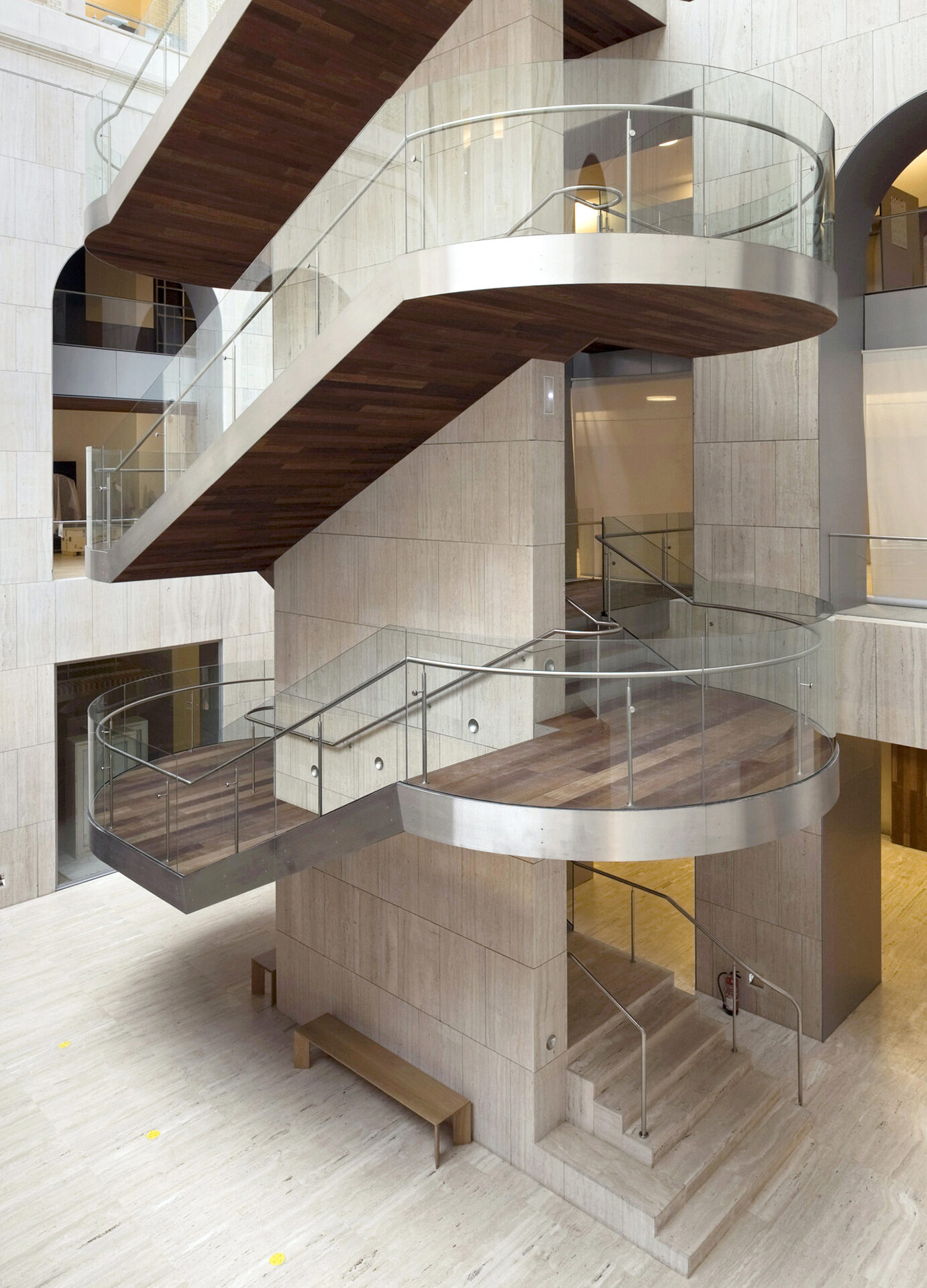
The main concept consisted of maintaining the emotional character of the historical building whilst bringing it into harmony with the requirements of a 21st century museum in terms of communication and visual appeal. As a consequence, the recently covered inner courtyards equipped with stairwell towers are used as exhibition spaces, and large-scale objects can now be observed from a variety of angles.

KUA2 University of Copenhagen – Copenhagen

KUA2 University of Copenhagen

Arkitema is behind the recent extension of Københavns Universitet Amager, Søndre Campus.

Architect:
Arkitema

Client:
Bygningsstyrelsen

Location:
Copenhagen

Year:
2014

KUA2 is a new, central section of Copenhagen University, Southern Campus.

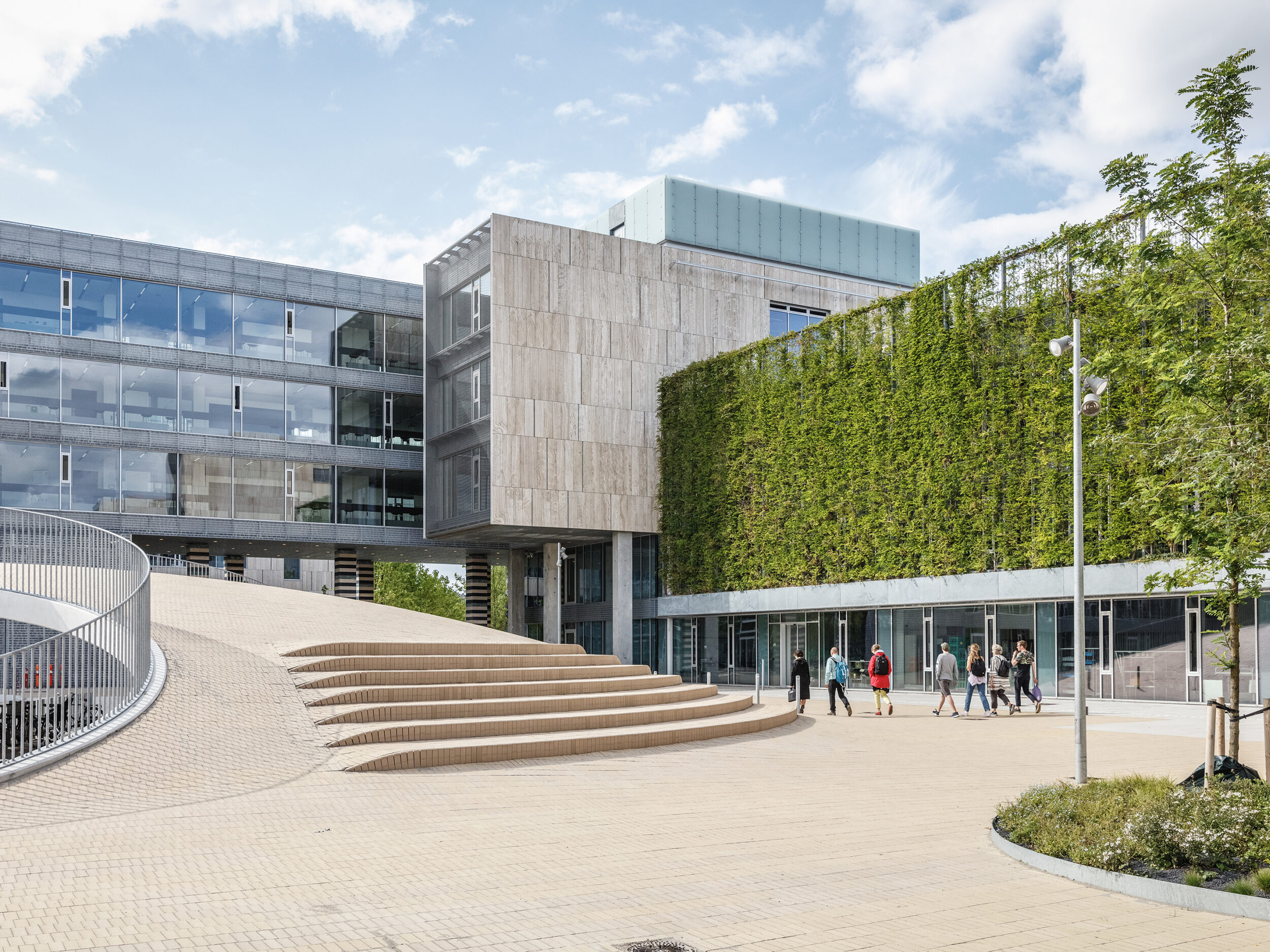
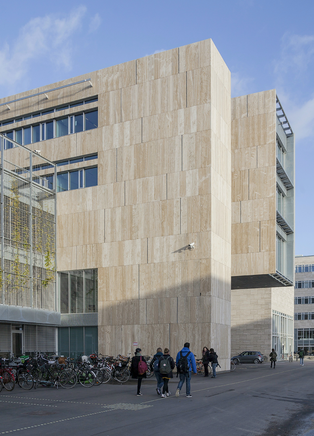
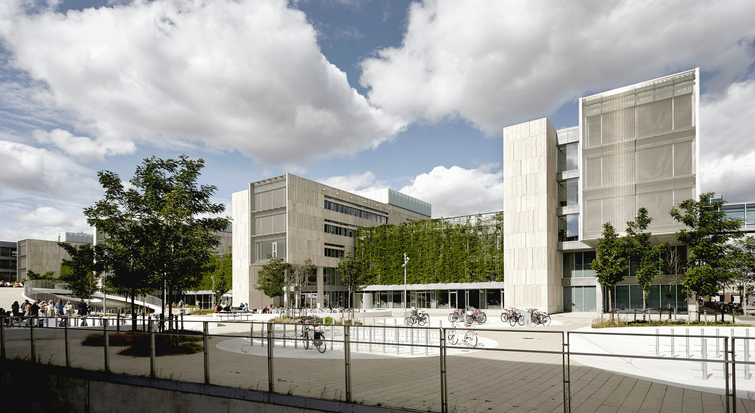
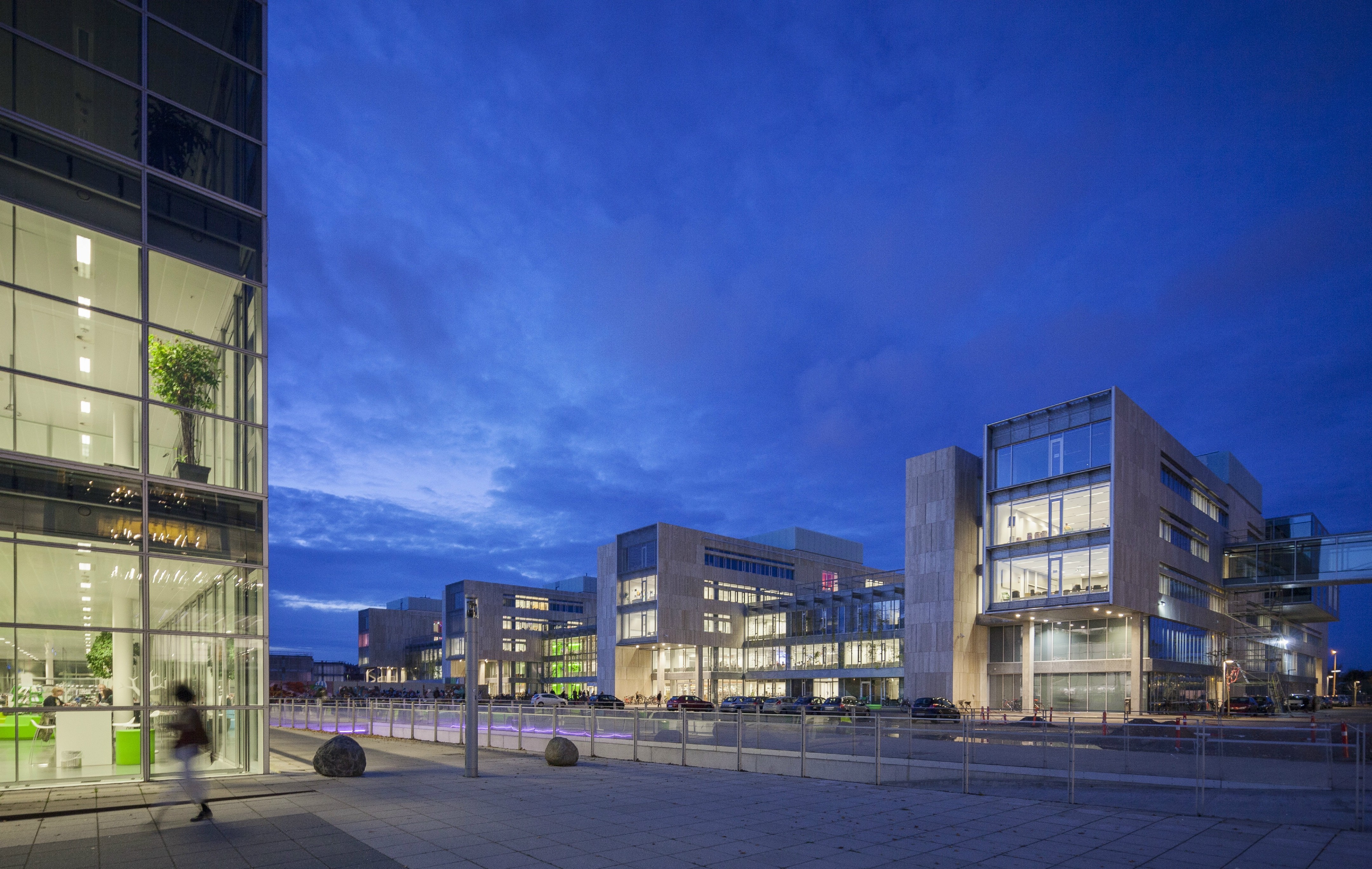
Built between 1972 and 1979 to a Brutalist design by Eva and Nils Koppel, Københavns Universitet Amager, was originally only built as a temporary home for the Facility of the Humanities. As time progressed became a permanent solution and it was instead decided to expand and modernize the complex. In 1997, KHR Arkitekter won an architectural competition for the first phase of the expansion, KUA1, which was completed in 2001 and consisted of a series of long, six-storey buildings with a pale, travertine cladding.

KUA2 is the result of a first prize in an invited architectural competition. Arkitema designed the second phase of the expansion reusing structural elements from the original KUA buildings but adapting them with a cladding similar to the one used on KUA1. KUA2 is a new, central section of Copenhagen University, Southern Campus. The project is part of a trilogy, which includes faculties of the Humanities, Law and Theology. The new section forms a new organizational center for the Humanities and the Southern Campus as a whole.

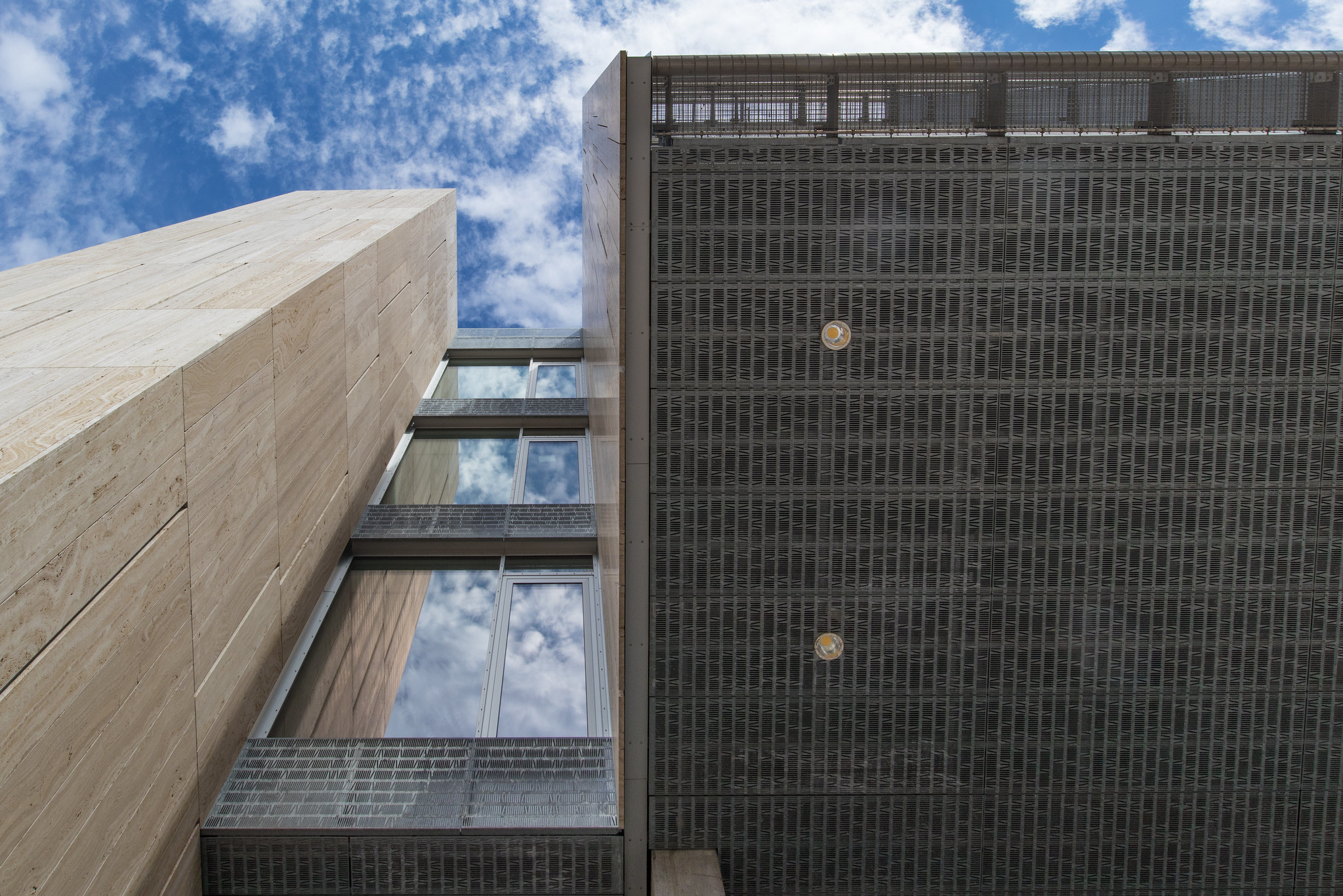
The architecture is dominated by the north-southward super wings, which are covered with the “logo-material” of the university: travertine.

Originally, the university’s construction containers in Amager were not meant to be a long-term solution. But as the university grew, a more permanent solution was needed, and it was decided to transform the containers into new, unifying university buildings for several faculties. One of the challenges was to realise this goal within the framework of the “temporary” container building, which got to be more than 30 years old.

Today, Søndre Campus, which the area has since been named, houses a vibrant study environment for students, teachers and scientists. The project was partly a transformation project, which involved maintaining the beautiful and simple travertine-clad façades on part of the original buildings that were once the University of Copenhagen, Amager.

The vision of the project was to create a basis for the future development of the Humanities, focusing on a dynamic and open 24-7 study environment. Furthermore it was important to create an optimal workplace for researchers and teachers, with optimal and flexible opportunities to organize scientific work and education

A dynamic and open 24-7 study environment.

The simplistic exterior is followed by a warm, more organic interior that is also characterised by high-quality and textural materials. Inside, a dynamic and open study environment is combined with good working spaces for scientists and teachers from three faculties. In the large common atria, students meet to work on joint projects in flexible niches, small lounge areas and around small tables, which – thanks to wooden flooring, light-coloured furniture and sweeping flights of stairs – signal a pulsating learning environment.

In all aspects, the project boasts sustainable architecture: Socially, economically and resource-wise. It provides research environments that promote interaction between people, reuse of existing concrete structures, and buildings that are effective and easy to operate.

Hony Tower – Shenzhen

Hony Tower

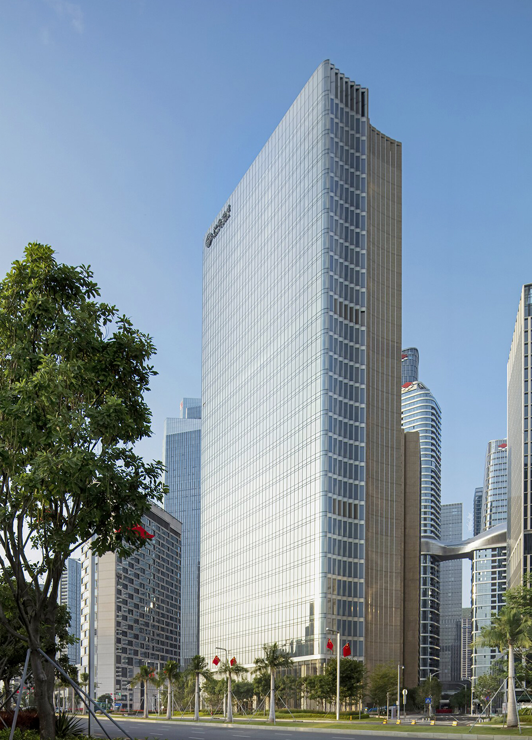
KPF architects designed the new flagship building and headquarters of Hony Capital in Shenzen.

Architect:
KPF

Client:
Hony Capital

Location:
Shenzhen

Year:
2020

Hony Center’s sophisticated design matches its innovative Shenzhen neighborhood, introducing two glass and stone towers anchored by lush greenery.

Spanning two blocks in Qinghai Harbor’s Financial District, Hony Center’s sophisticated design matches its innovative Shenzhen neighborhood, introducing two glass and stone towers anchored by lush greenery.

The 55,000 square meter tower facing Guimiao Boulevard serves as the private equity firm’s new headquarters. On the other end, at the intersection between Guiwan 5th Road and Financial 8th Street, the residential tower extends 25,000 square meters. The two buildings are connected below grade by a parking lot as well as bridging for the subterranean subway system.

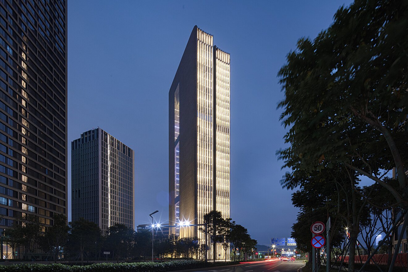
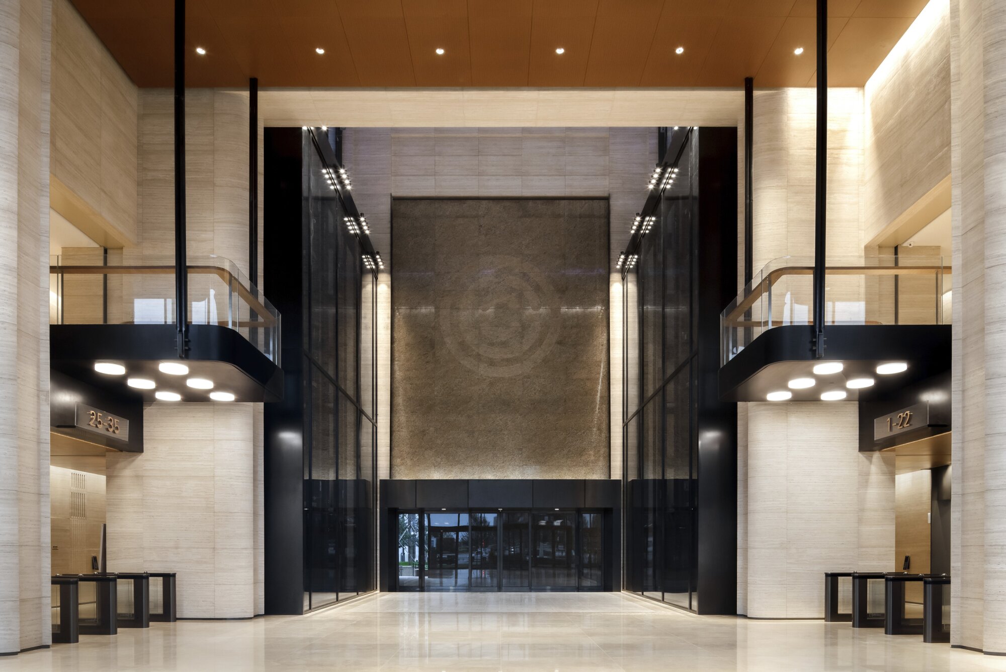
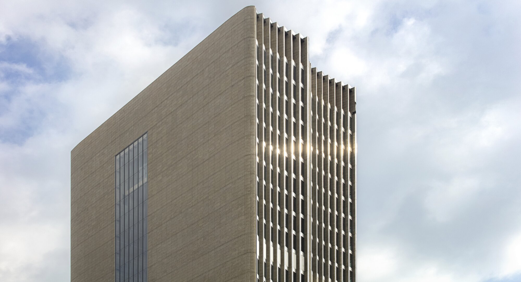
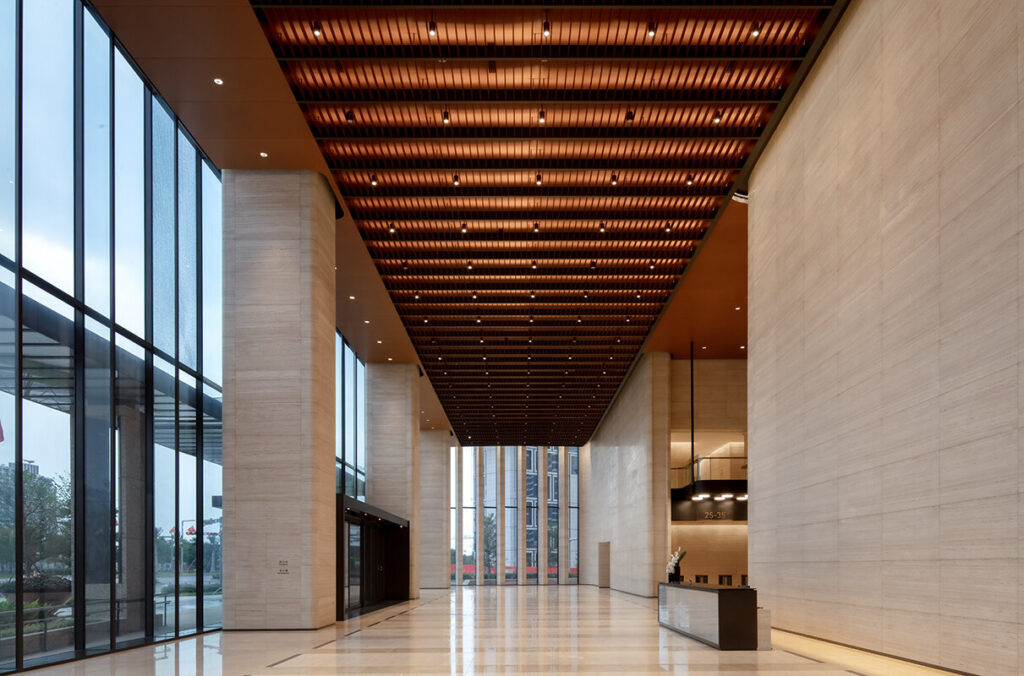
The base of Hony Capital’s headquarters welcomes tenants into the office space through a three-story lobby, which elevates and animates the development. The tower features two slim facades on opposite ends – one glass and the other stone. The glass allows ample natural light to fill the office space, while the juxtaposition of stone exists on the opposite end of the material spectrum, resulting in a lively and varied character. A column structure provides a highly flexible work environment.

The building structure creates a light, open, almost weightless effect.

The building structure is made up of an unusual combination of an external stone core and a stone framework. The stone frame supports a series of glass boxes which form the main body of the occupied space. This ingenious approach creates a light, open, almost weightless effect. Each floor stretches 4.5 metres, floor to ceiling, as standard and appears to float in the air. Additional architectural flair is provided by the curved, undulating form of the glass facade at the North West and South East elevations.

At the North East corner of the development, the 30-story residential tower is rotated to align with a north-south axis. A sliding bar motif and a sympathetic wall expression draw the two towers together to create a dynamic composition. This liberates the northwest corner of the site to become a generously landscaped public green plaza.

The KPF-designed headquarters for Hony Capital was honored with an Award of Merit in the 53rd annual IESNYC Lumen Awards.

The headquarter project was also recognized for its clever use of lighting design to emphasize the tower’s warm-toned façade and use of contrasting materials. The project’s lighting design was done in partnership with Tillotsen Design Architects. Lighting on the façade varies to create a unique effect that changes based on one’s viewing angle. On one building, lighting strips on the glass certain wall create the illusion of a golden stone tower at night. On the other side, vertical lights to accentuate the tower’s northern stone façade.

The Illuminating Engineering Society of New York City created the Lumen awards in 1968 with the purpose to recognize the world’s most innovative lighting designs.

The Getty Villa Museum – Malibu

The Getty Villa Museum

An archaeological dig around a restored Roman imperial house.

Architect:
Machado Silvetti


Client:
J. Paul Getty Trust

Location:
Malibu

Year:
2006

The renovation of the Getty Villa Museum was commissioned to the Boston studio led by architects and academics Jorge Silvetti and Rodolfo Machado.

As an educational center and museum dedicated to the study of classical arts and cultures, the Getty Villa serves a diverse audience through exhibitions, conservation, scholarship, research and public programs. Through an extensive international search and competition, Machado Silvetti was commissioned by the Getty Trust for the master plan and design of the proposed expansion.

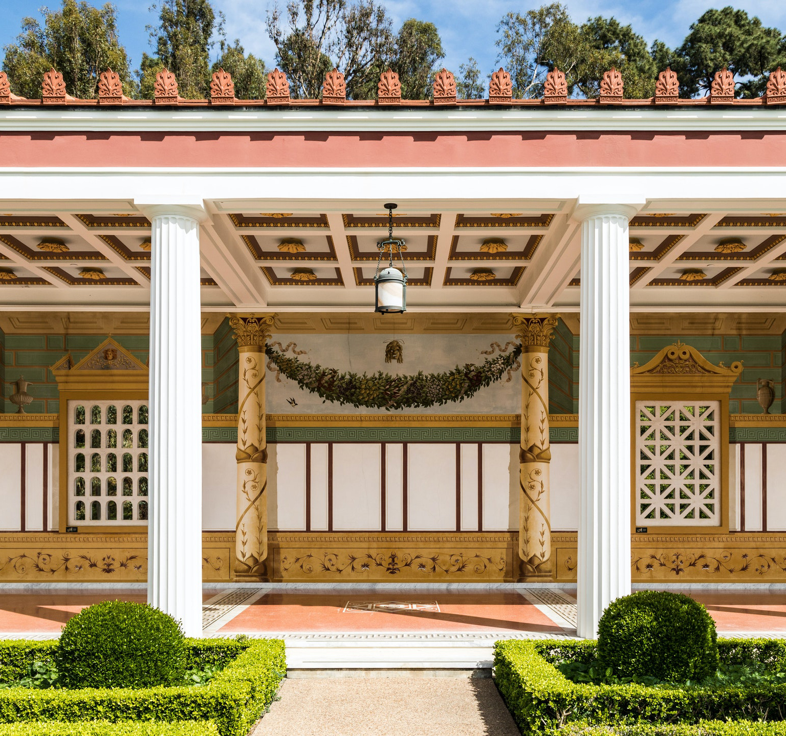
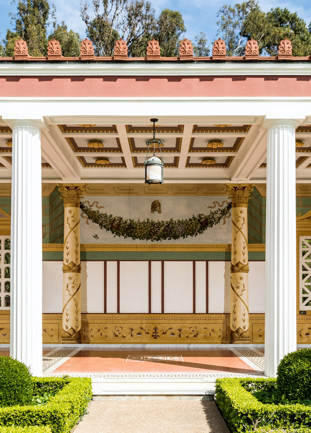
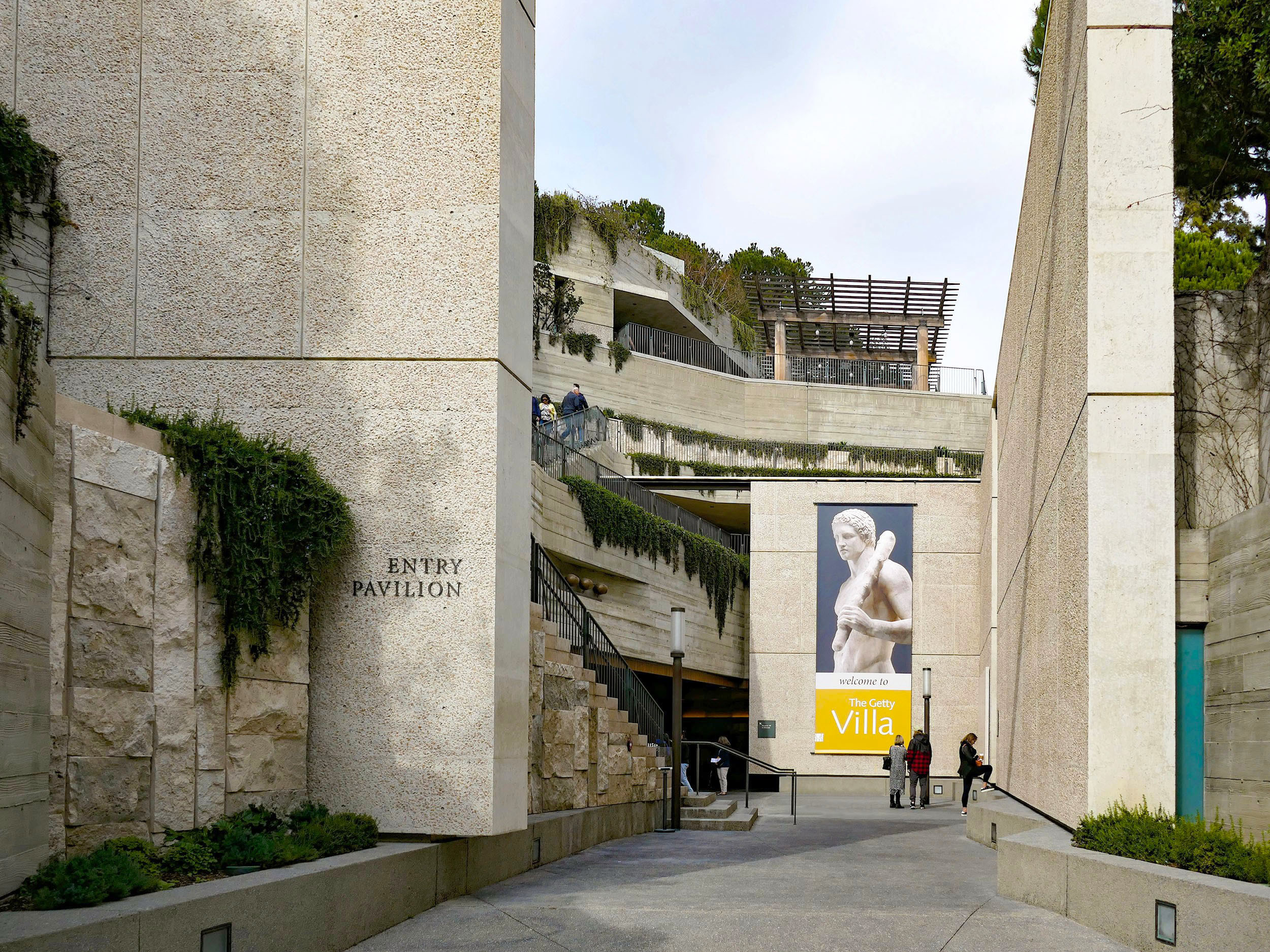
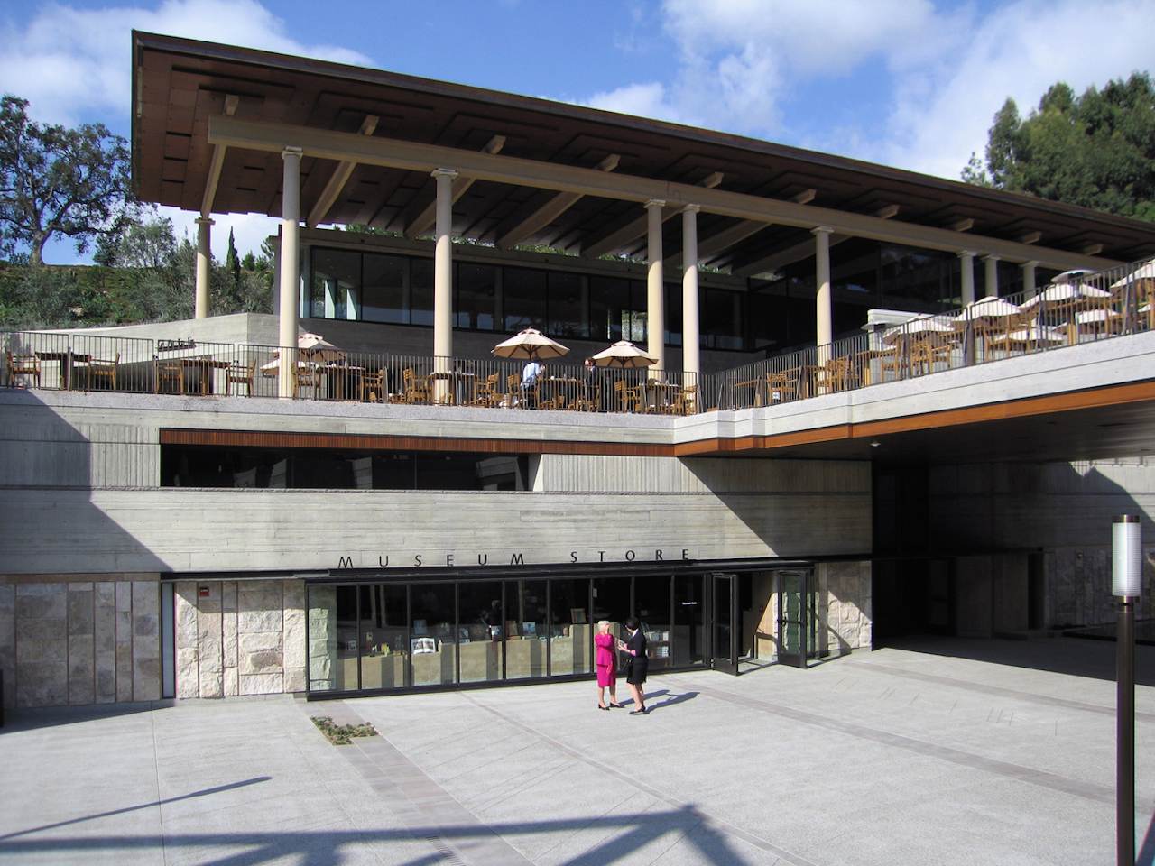
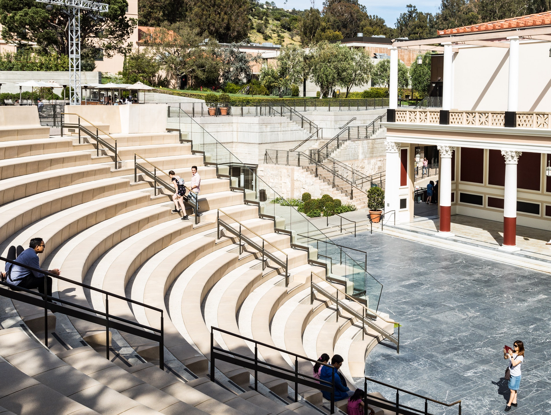
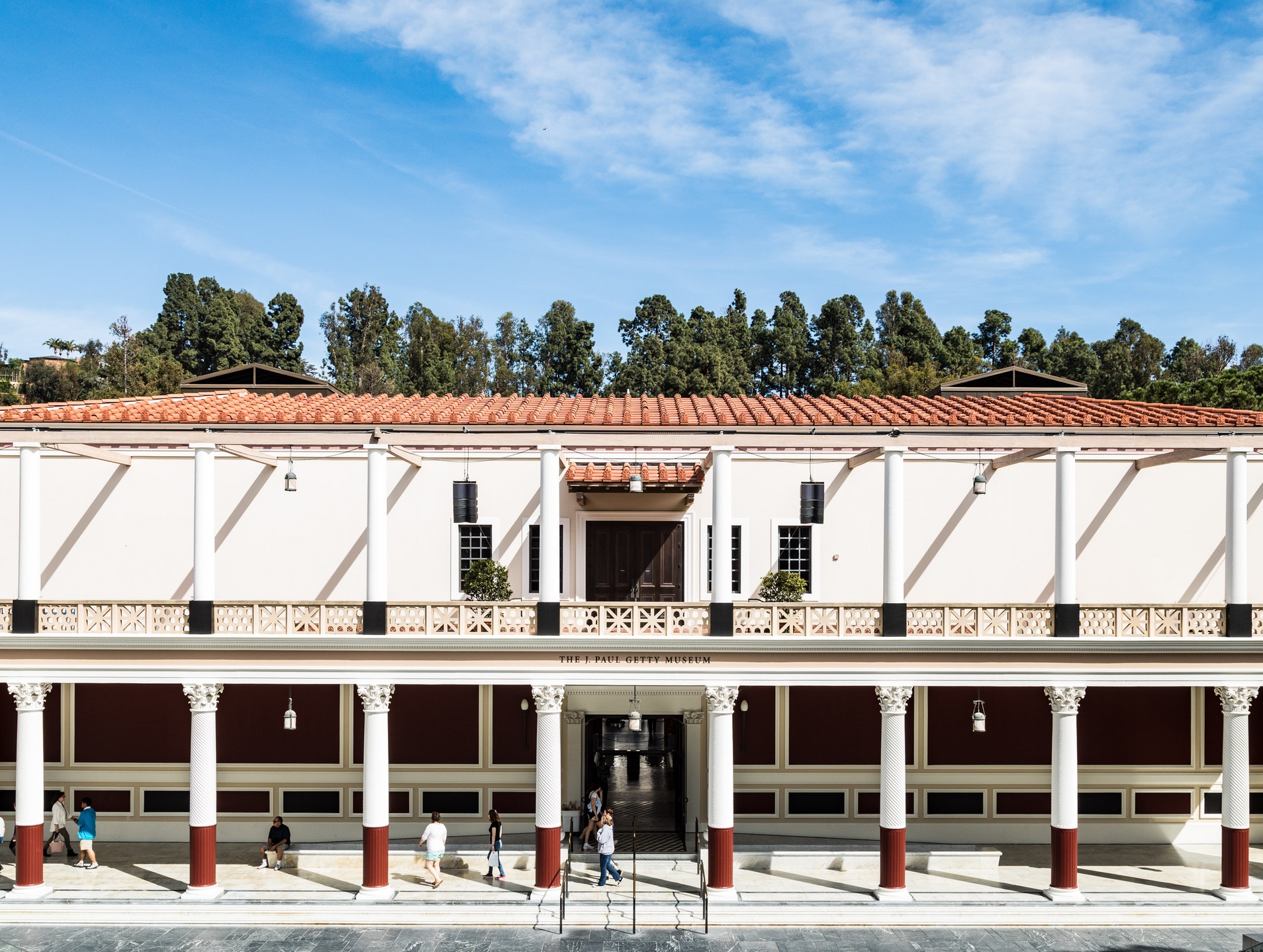
The project includes the remodeling of the existing J. Paul Getty Museum – a re-creation of the Villa dei Papiri, a first-century Roman country house buried by the eruption of Mount Vesuvius in 79 A.D. – to house the permanent collection of antiquities; the transformation of Getty’s adjacent ranch house into a research facility and library; and the construction of new support facilities, public areas and gardens. New components such as the Entry Pavilion, the Fleischman Theater, the museum café and store, conservation laboratories, a scholar’s library and educational facilities are strategically integrated into the new gardens and outdoor spaces, setting the original villa as the visual centerpiece.

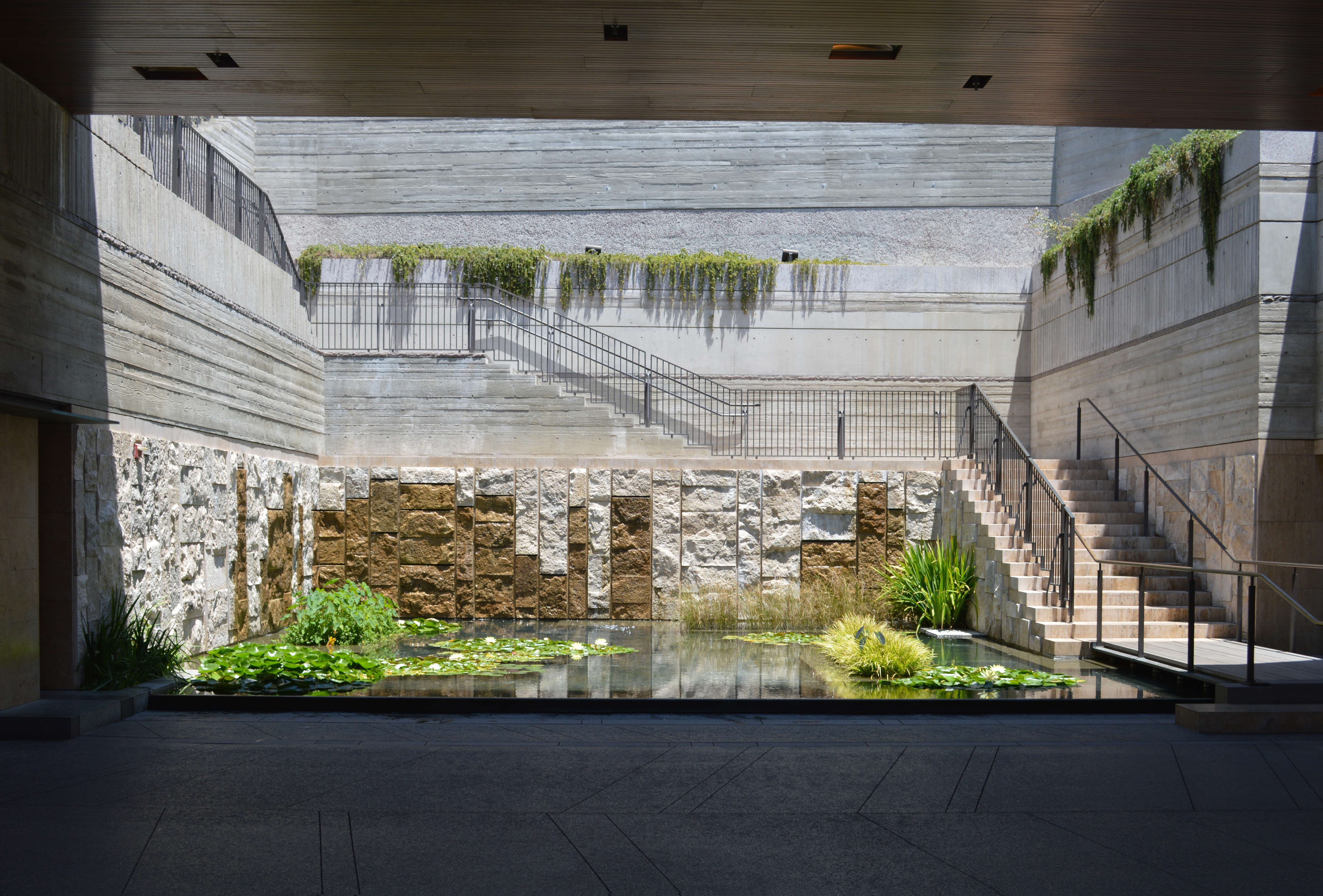
Bronze, glass, travertine, and wood-formed concrete echo the Villa’s original materials.

The new architecture neither contrasts nor emulates the existing classical Museum structure, but offers a fresh image for the revitalized institution through a unified landscape setting for the variety of disparate existing structures, new components, expanded gardens and public spaces. What had originally been a set of unrelated buildings and pathways is now a coherent and harmonious environment and experience.

The overall organization of the site uses the imagined idea of an archaeological dig around a restored Roman imperial house, employing materials different from those of the Villa itself to suggest geological layers revealed in the imagined excavation. Images of descent, excavation, multiplicity of ground planes, exploration and discovery began to mix and fuze with the project, and the sense that the Villa could actually be put in “quotation marks” as it were, became a prominent concept of the design. Machado Silvetti’s intervention became an infrastructural framework for framing the architecture of the Villa as part of the collection.

To ensure the integrity of the original architecture would be preserved, the renovation incorporated modern designs that harmonize with the Getty Villa’s original style. For example, wood, bronze, glass, travertine, and wood-formed concrete echo the Villa’s original materials.

Why not show Californians what an especially attractive Roman building would have looked like, with its gardens, fountains, even details such as the lamps and appropriate flowers?

The New Getty Villa is a replica of a 2000 year old Roman villa that once overlooked the Bay of Naples near Pompeii. Started in 1972, the Villa came into the world surrounded by controversy at the time of its opening. While the idea of a replica is not a purely architectural issue, the very history of museums and of art provided Machado Silvetti with certain arguments and rationales for understanding and intervening in the Villa.

Replication is at the very heart of western art. After all, the owner, ideator and funder had said: “Why not show Californians what an especially attractive Roman building would have looked like, with its gardens, fountains, even details such as the lamps and appropriate flowers? Many contemporary museum buildings have failed while attempting less than that.”
IFC International Finance Centre – Shanghai

IFC International Finance Centre

The Shanghai IFC ranks among the largest commercial developments in the Pudong Lujiazui District and serves as a new landmark for the area.

Architect:
Pelli Clarke Pelli Architects

Client:
Sun Hung Kai Properties

Location:
Shanghai

Year:
2011

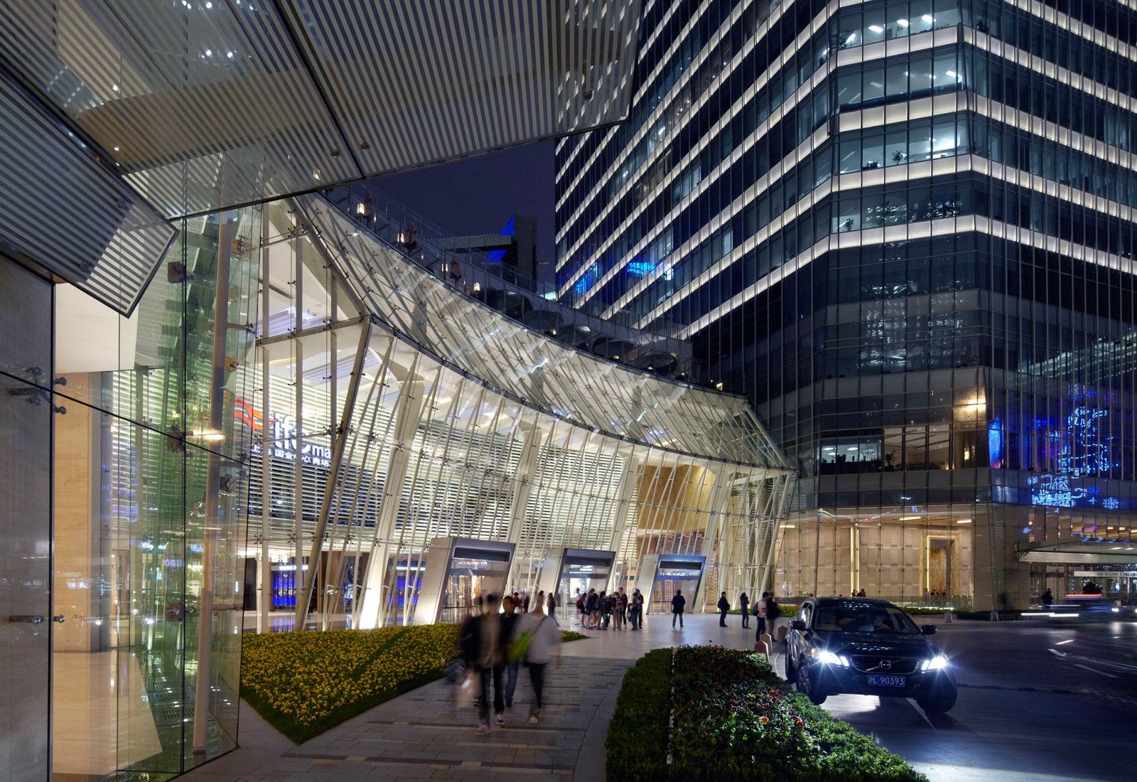
Designed by the critically-acclaimed architect Cesar Pelli, the distinctive diamond-like forms of the development stand in luminous splendour.

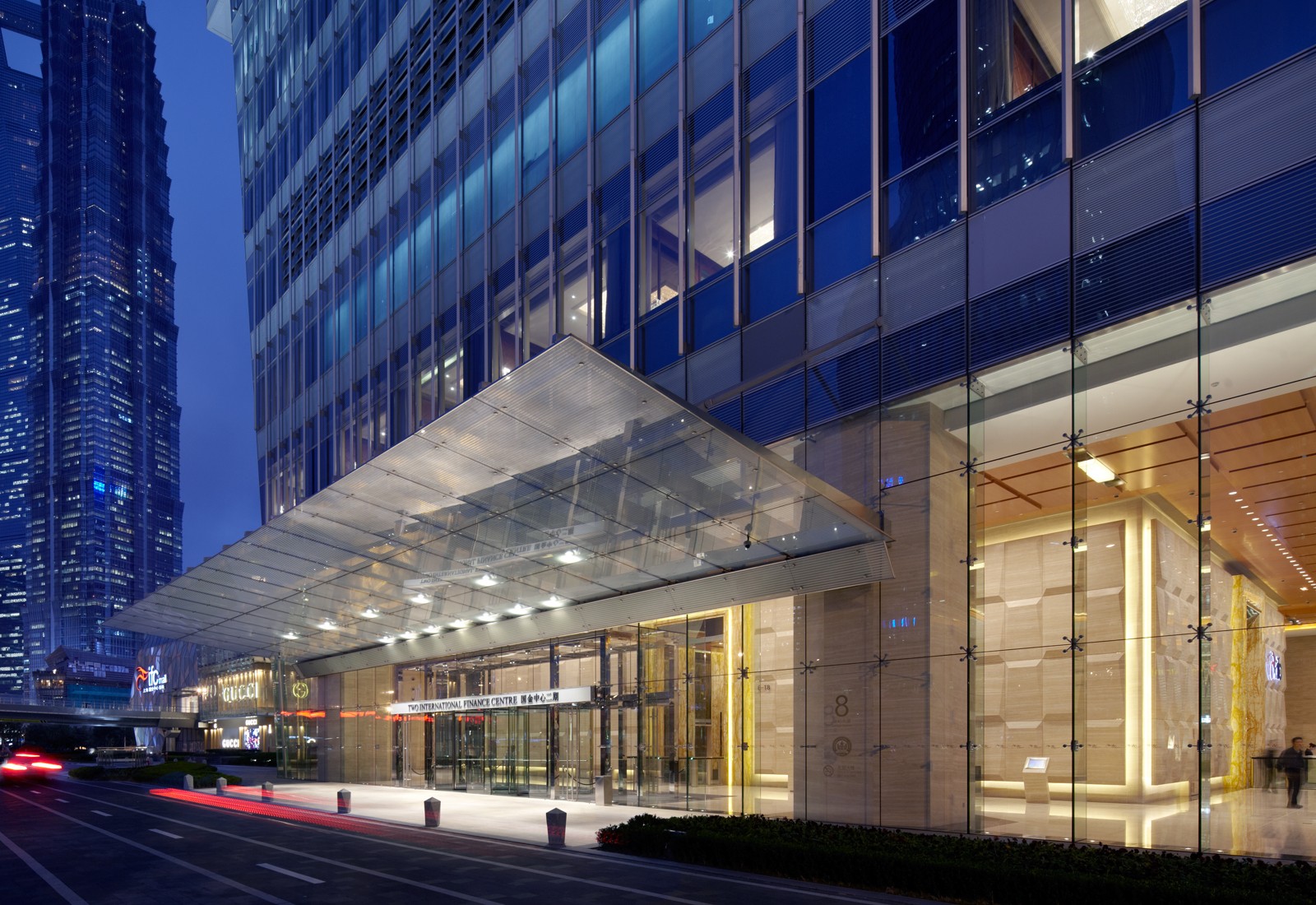
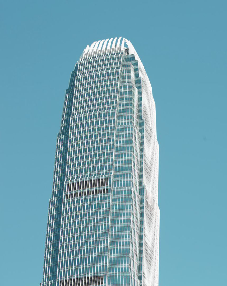
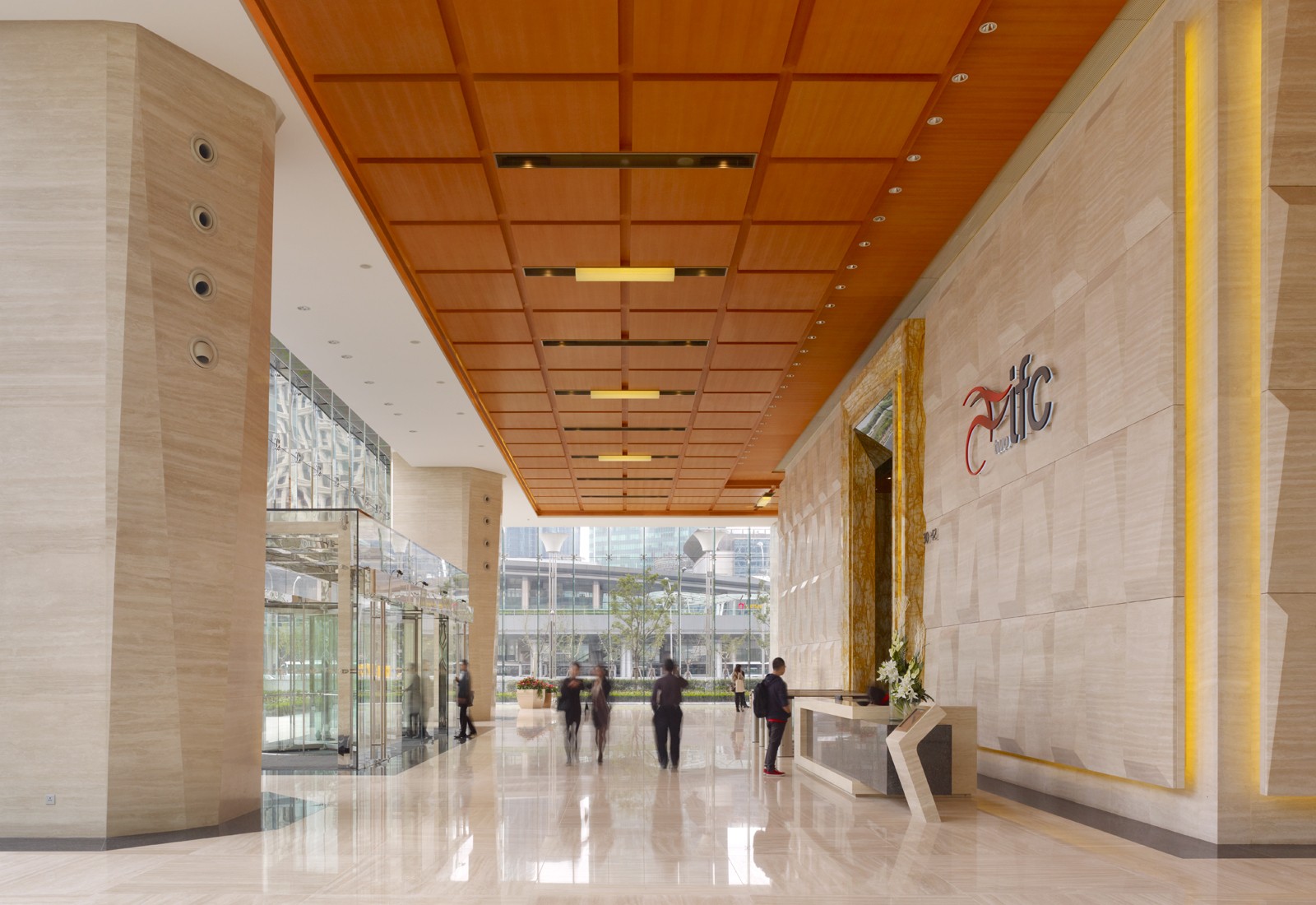
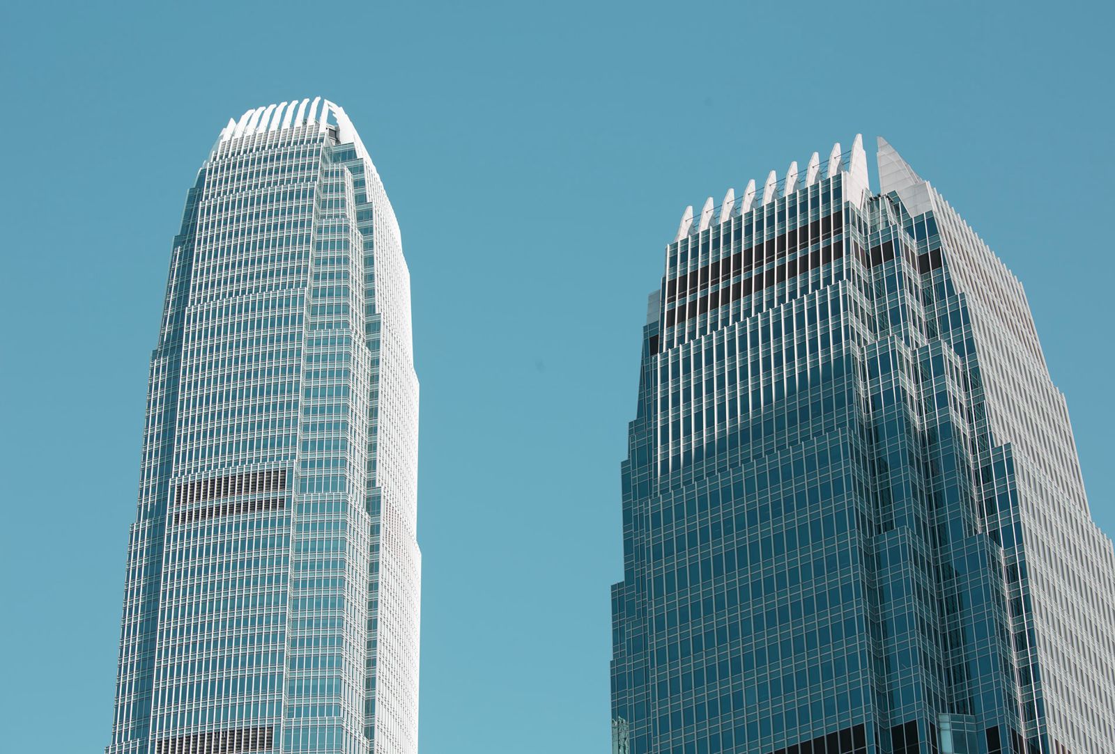
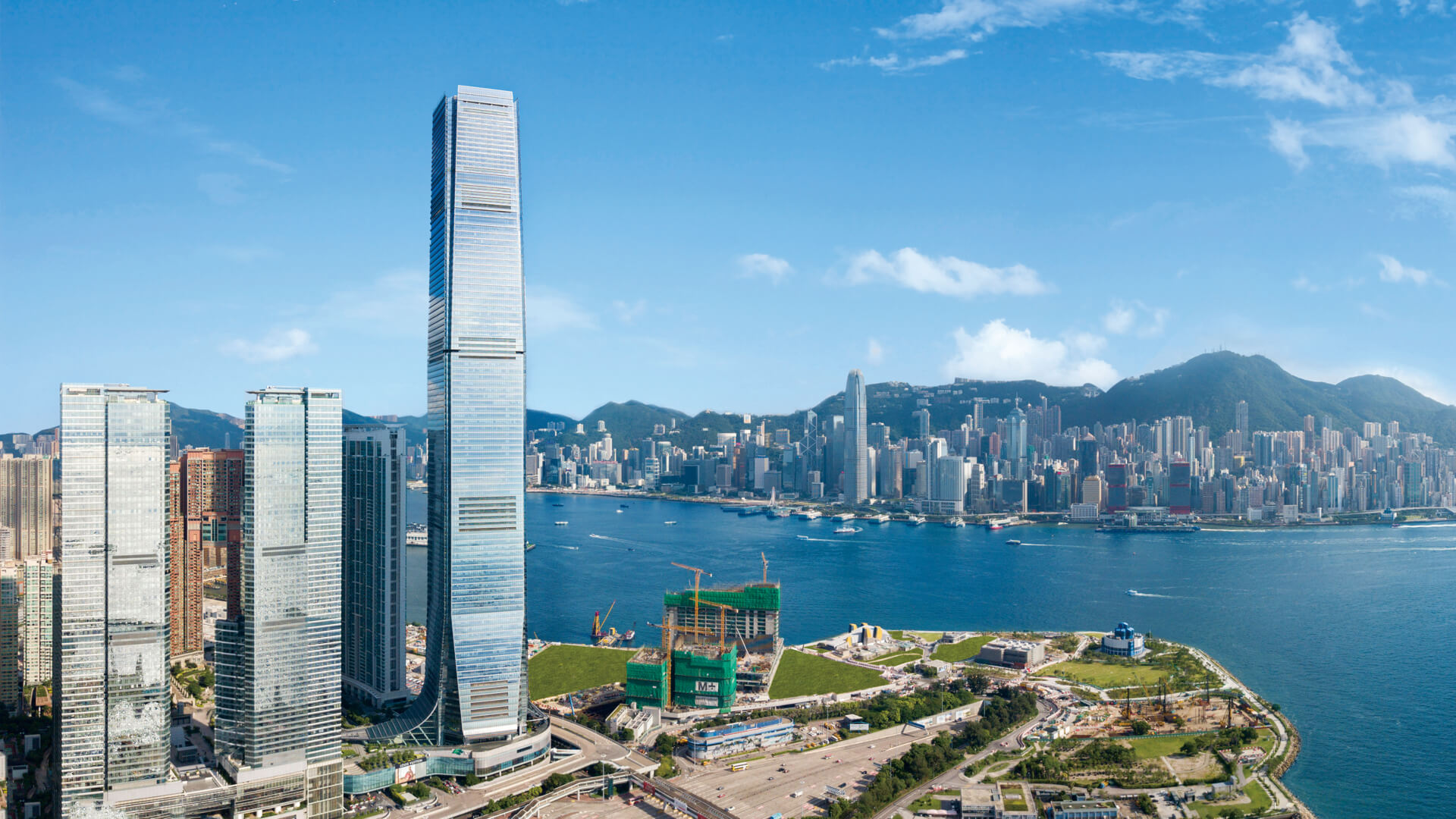
Shanghai IFC (International Finance Centre) is one of the most significant new developments in the Pudong New Area, China’s most important financial and commercial center. The project – three towers, a shopping mall, and a public plaza – is a central element of Pudong’s skyline. Viewed from the Bund, Shanghai’s historic riverfront promenade, the development assumes a distinctive presence among the city’s landmarks.

The towers share a common architectural language. Starting with elegant, rectilinear forms clad in a vertically grained glass-and-stainless-steel curtain wall, the towers are sculpted by shearing off corners and edges, creating crystal-like shafts that gesture toward one another, creating a single composition from two buildings. Where the edges are sliced away, a horizontally grained interior is revealed. In height and arrangement, the two angled towers also respond to their varied urban surroundings.

Almost 80 percent of the office space receives natural light, reducing energy consumption and contributing to a high-quality work environment.

The project includes two mixed-use towers, 48 and 50 stories, each with approximately 140,000 square meters of floor area for office and hotel use. The China headquarters of HSBC occupies more than half of the south tower, which also includes a 290-room Ritz Carlton Hotel with commanding views of the central city. A third tower, 23 stories tall, contains service apartments, complete banquet and conference facilities, a fitness center, and a swimming pool.

Designed by the critically-acclaimed architect Cesar Pelli, the distinctive diamond-like forms of the development stand in luminous splendour, adding a touch of glamour and enchantment to the Huangpu River and Oriental Pearl Tower.

The project’s ground plane is an urban park, extensively landscaped and punctuated with fountains, gardens, sitting areas, and open courts.

A four-level podium houses approximately 55,000 square meters (592,000 square feet) of retail, restaurants, and support spaces for the hotels. Below grade are a cinema complex, retail, a 1,800-space car park, and connections to the subway. Pedestrian connections to the adjoining sites are conveniently provided by tunnels and sky bridges. The project’s ground plane is an urban park, extensively landscaped and punctuated with fountains, gardens, sitting areas, and open courts that integrate with the below-grade retail level.

LACMA Los Angeles County Museum of Art – Los Angeles

LACMA Los Angeles County Museum of Art

Renzo Piano’s LACMA is the largest purpose-built, naturally lit, open-plan museum space in the world.

Architect:
Renzo Piano Building Workshop


Client:
Los Angeles County Museum of Art

Location:
Los Angeles

Year:
2010

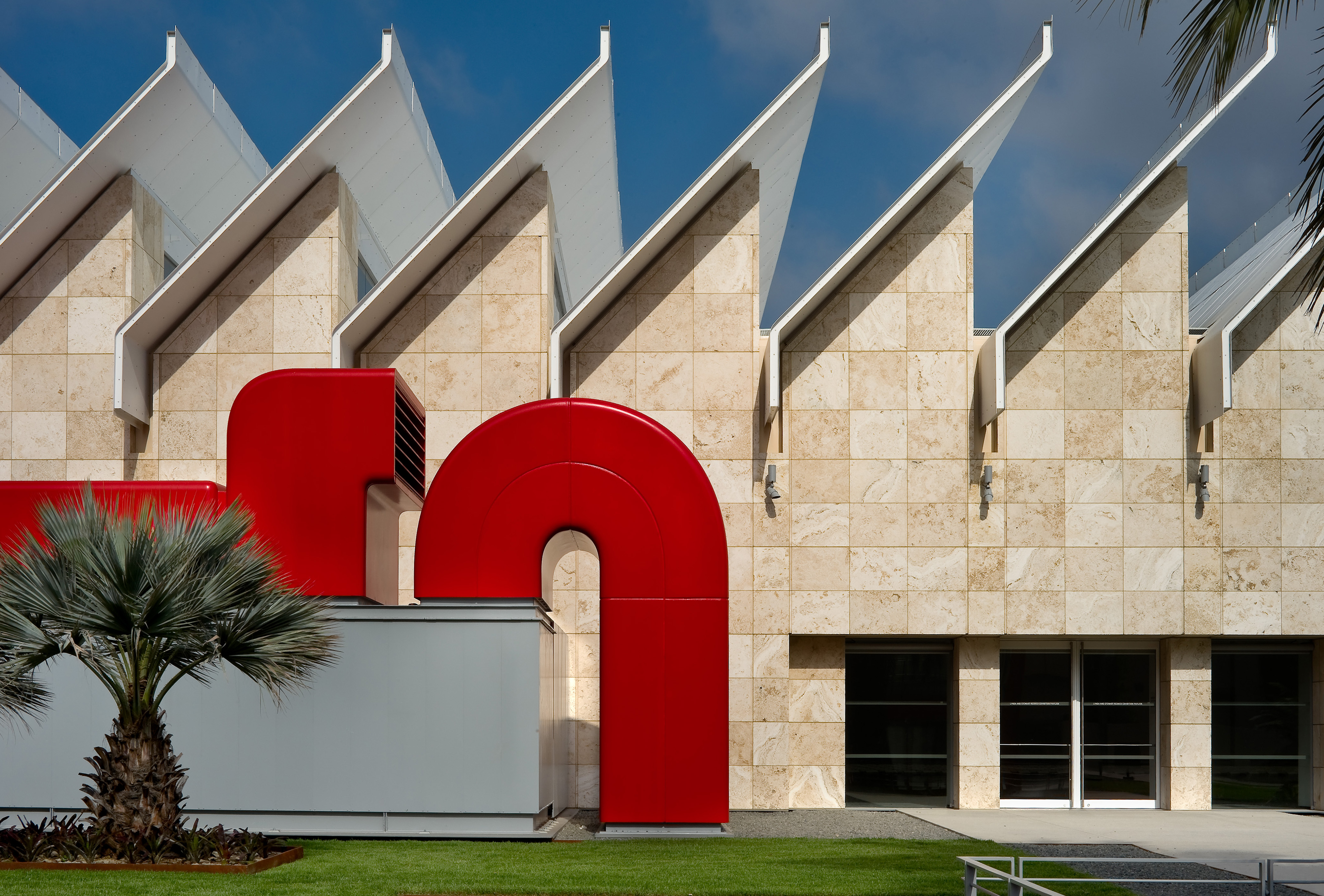
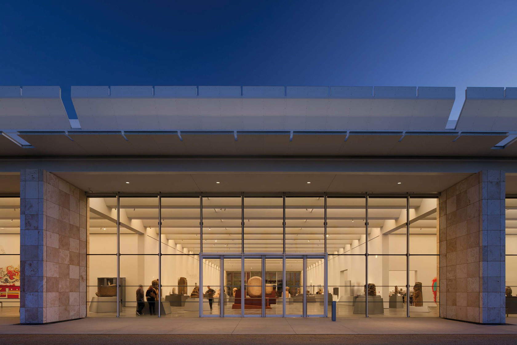
The Resnick Pavilion is a flexible, glass and stone-enclosed structure dedicated to the presentation of art.
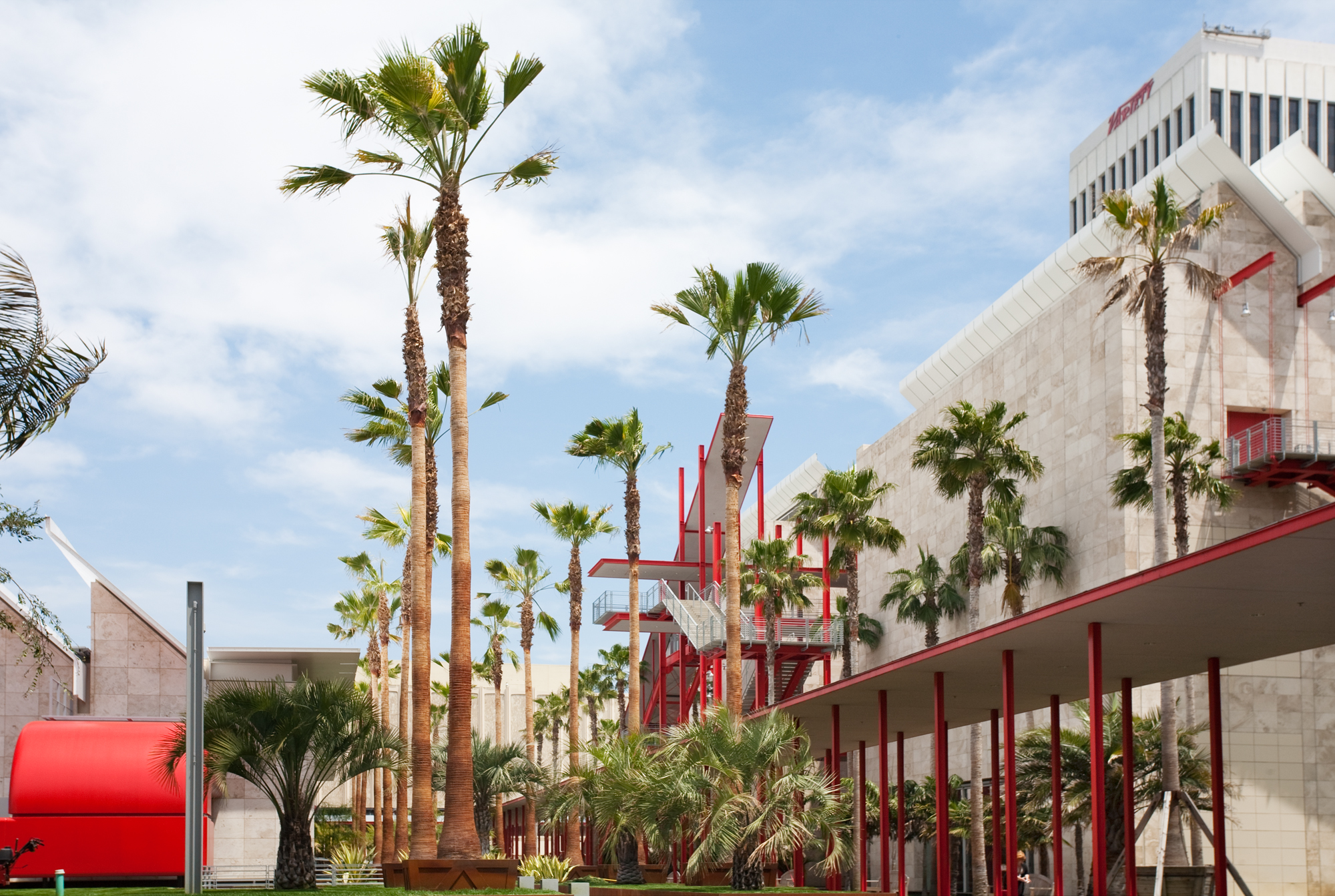
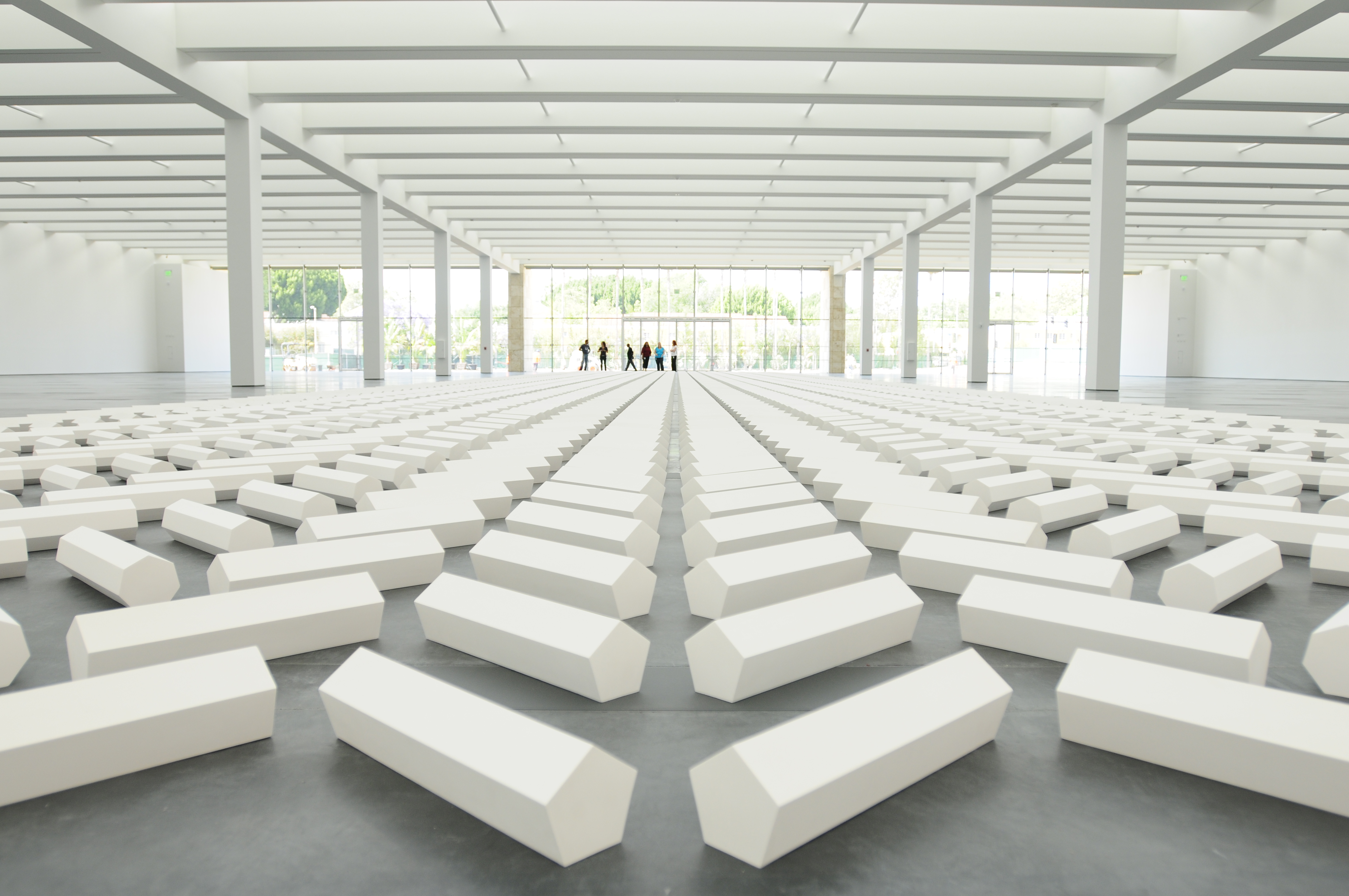
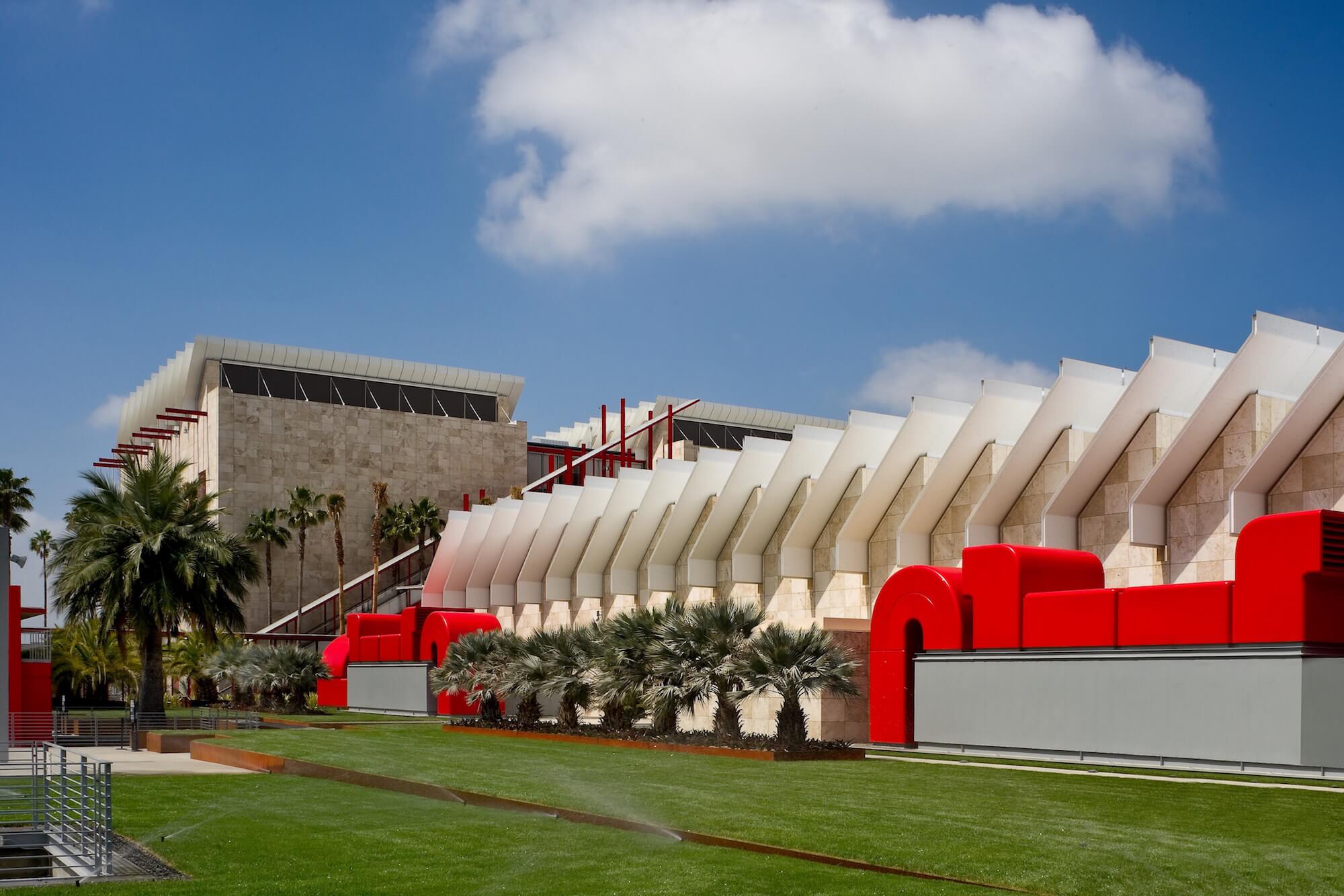
The Broad Contemporary Art Museum is the new centrepiece of the Los Angeles County Museum of Art (LACMA) and the first of a multi-phase museum expansion. Designed by Renzo Piano Building Workshop, the facility includes some of the largest column-free gallery spaces in the U.S. Renzo Piano’s scope of the project for the LACMA was to fuse its scattered buildings into a cohesive campus, with new public spaces, new exhibition spaces and a strong visual identity for the museum.

The second phase of the project for the LACMA was the construction of the Resnick Pavilion. Dedicated to temporary art exhibitions, the 45,000 sq ft (4,180 sq m) Resnick Pavilion was built above the museum’s underground parking, north of the Broad Contemporary Art Museum (BCAM).

The facility includes some of the largest column-free gallery spaces in the U.S.

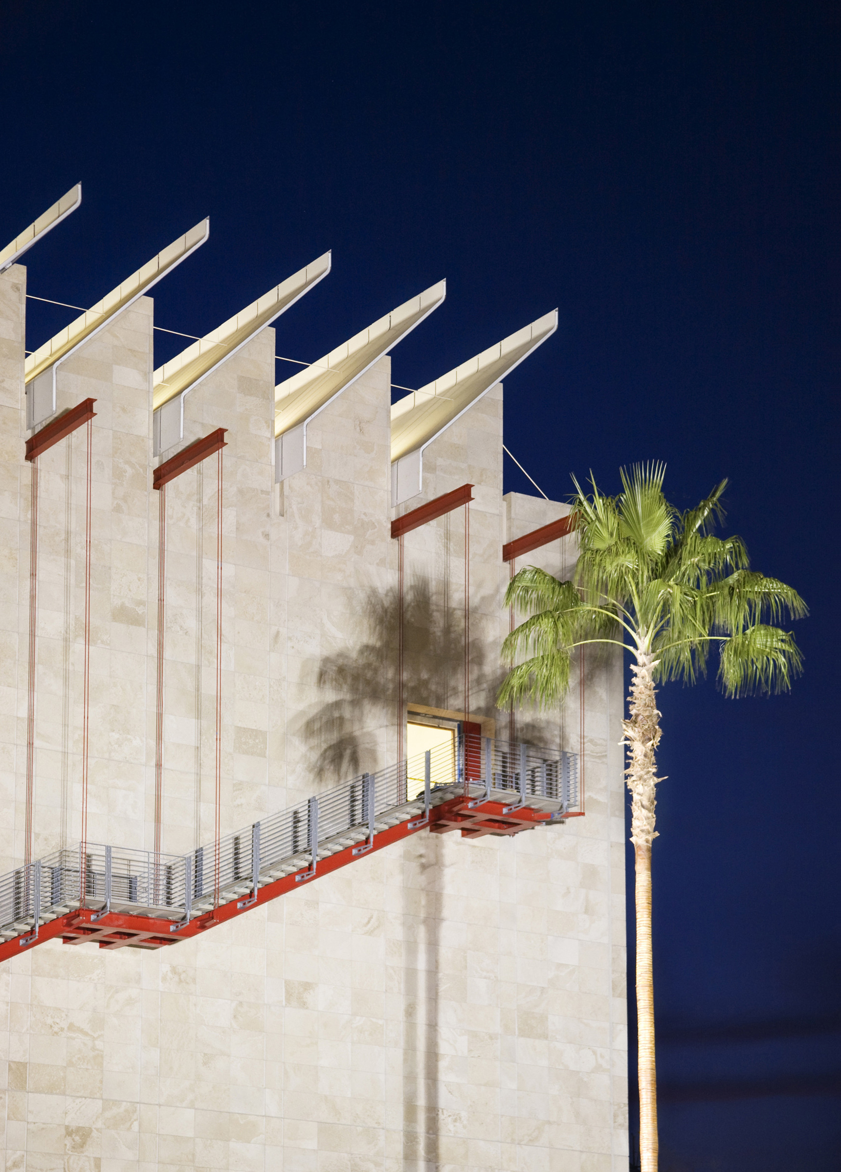
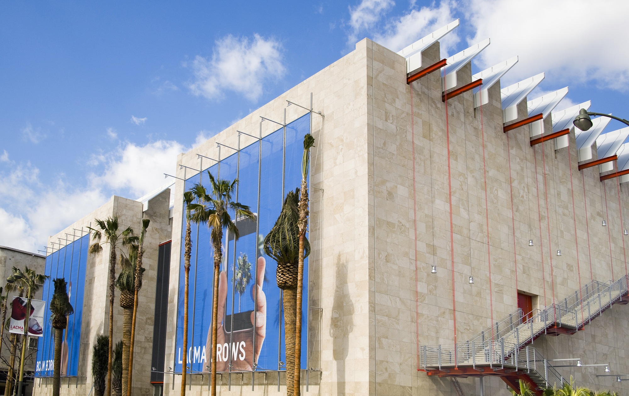
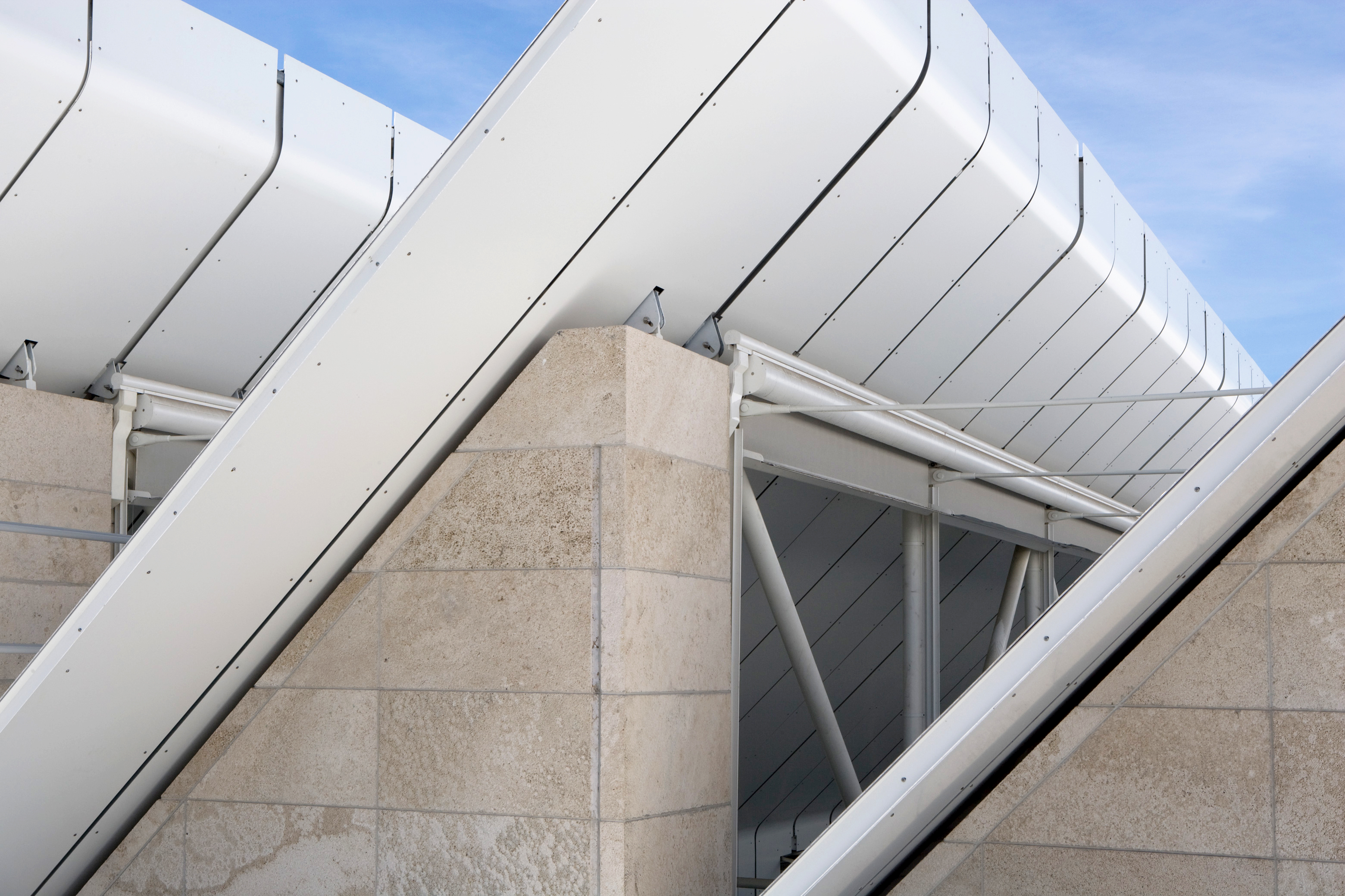
The Resnick Pavilion is a single-storey structure with a simple square plan and it features the same architectural characteristics as BCAM – a glazed saw-tooth roof and travertine stone cladding. Glazed facades open onto the park to the north, and towards BCAM to the south. To optimize interior space, the services are on the outside of the building, creating what LACMA bills as ‘the largest purpose-built, naturally lit, open-plan museum space in the world’.

A system of moveable partitions affords extreme flexibility and versatility in the use of space. A recurring motif around the museum campus is the use of the colour red, punctuating the otherwise restrained travertine facades. At the Resnick, air-handling units and technical rooms are coloured red and are plugged onto the building’s external facades, part of the industrial language of the building.

The Resnick Pavilion dramatically expanded the museum’s exhibition space.

The Resnick Pavilion, a key feature of LACMA’s revitalisation and expansion scheme named ‘Transformation’, dramatically expanded the museum’s exhibition space and also further unified the western half of the museum’s twenty-acre campus. The building is named in honour of long-time patrons Lynda and Stewart Resnick, whose $45 million donation was the lead gift in Phase II of LACMA’s Transformation campaign.

The gridded palm garden by the artist Robert Irwin connects the Piano buildings to the museum’s older structures. A system of light fabric scrims adorns the façade on Wilshire Boulevard thus lending lightness to the building. Created by artist John Baldassari, this installation establishes the visual identity of the museum and creates a relation between the rushing urban street life and the contents of the museum.

Aga Khan Centre – London

Aga Khan Centre

Islamic-inspired gardens are the delight of Maki and Associates’ new Aga Khan Centre.

Architect:
Maki and Associates


Client:
Aga Khan Foundation

Location:
London

Year:
2018

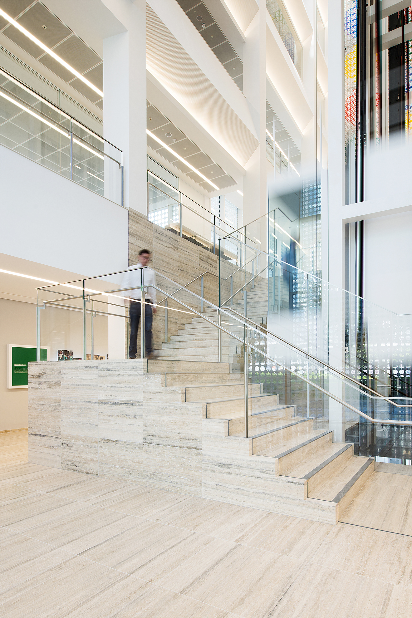
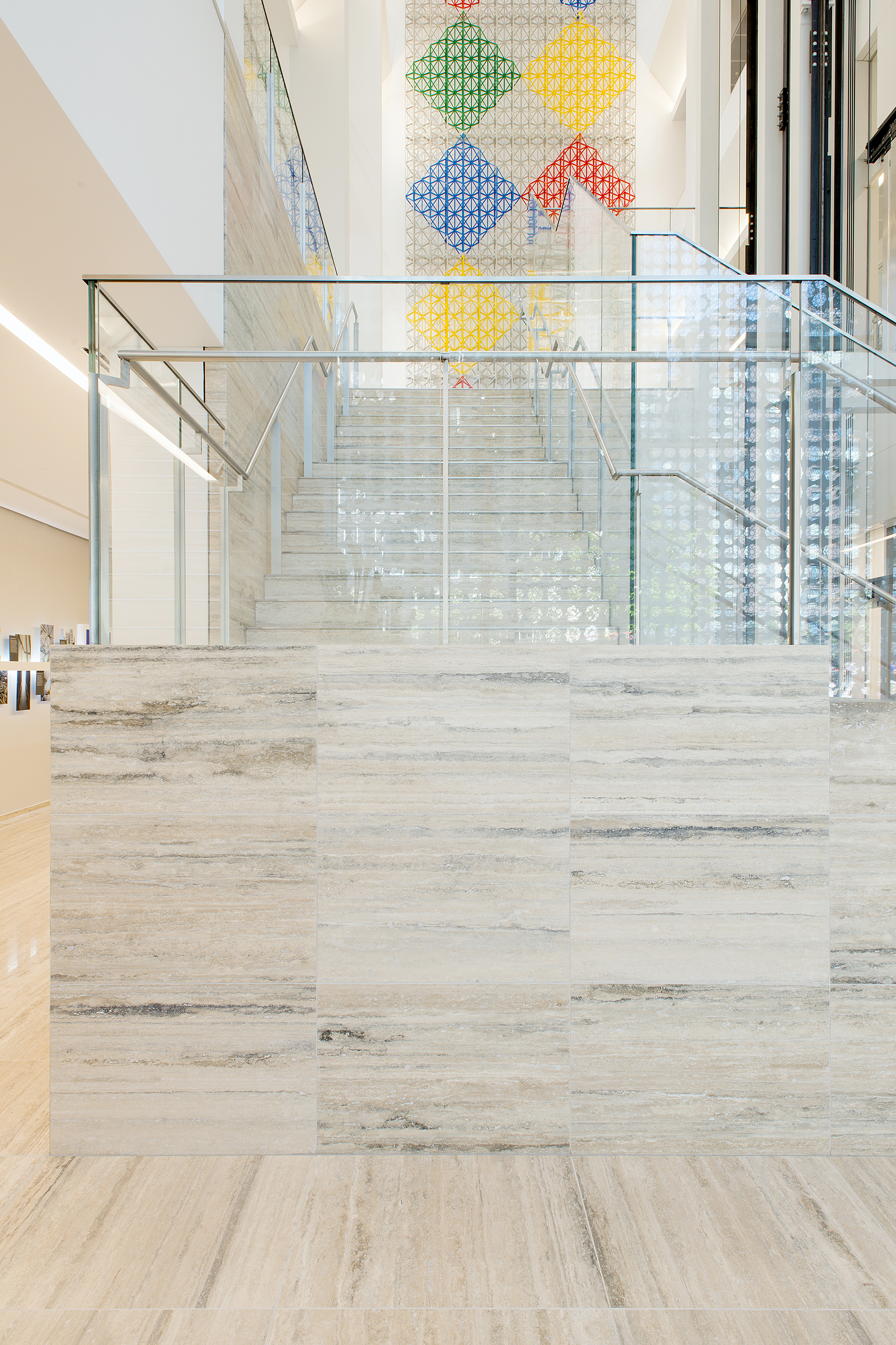
The Aga Khan Centre is a place of education, knowledge, cultural exchange and insight into Muslim civilisations.

Maki & Associates has designed a new London headquarters for the Aga Khan Foundation, the Aga Khan Centre in Kings Cross. The Fumihiko Maki’s architecture practice cut out a series of Islamic courtyards and gardens from a ten-storey block providing offices, a library and exhibition space. The building brings the Institute of Ismaili Studies, the Aga Khan University, the Institute for the Study of Muslim Civilisations and the Aga Khan Foundation UK together, after existing for 40 years in London at various locations, in their joint mission to open up a dialogue and understanding of Muslim cultures.

The building is influenced by Islamic architectural history and uses a small array of timeless materials.

The Aga Khan Centre is a place of education, knowledge, cultural exchange and insight into Muslim civilisations. The building is the UK home for three organisations founded by His Highness Aga Khan IV, the hereditary spiritual leader of the Shi‘a Ismaili Muslims.

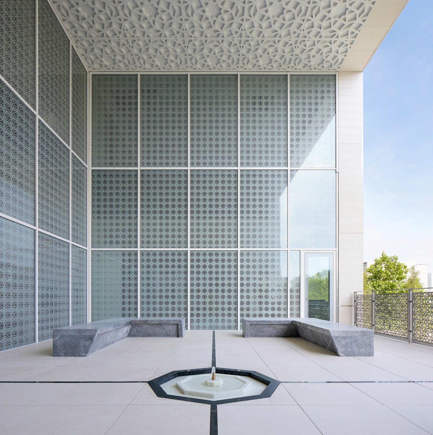
This building is designed to represent the values of openness, dialogue and respect for different viewpoints (pluralism). The architecture incorporates a collection of gardens, courtyards and terraces that provides an insight into the diversity and influence of Islamic landscape design around the world and through history.

The building was designed by Fumihiko Maki, one of Japan’s most distinguished contemporary architects. The Centre is primarily designed for an academic community, with places for students, scholars and staff to share ideas and work together alongside flexible teaching spaces and quiet research areas.

Each roof garden, terrace and courtyard represents a garden from a different region of the Muslim World.

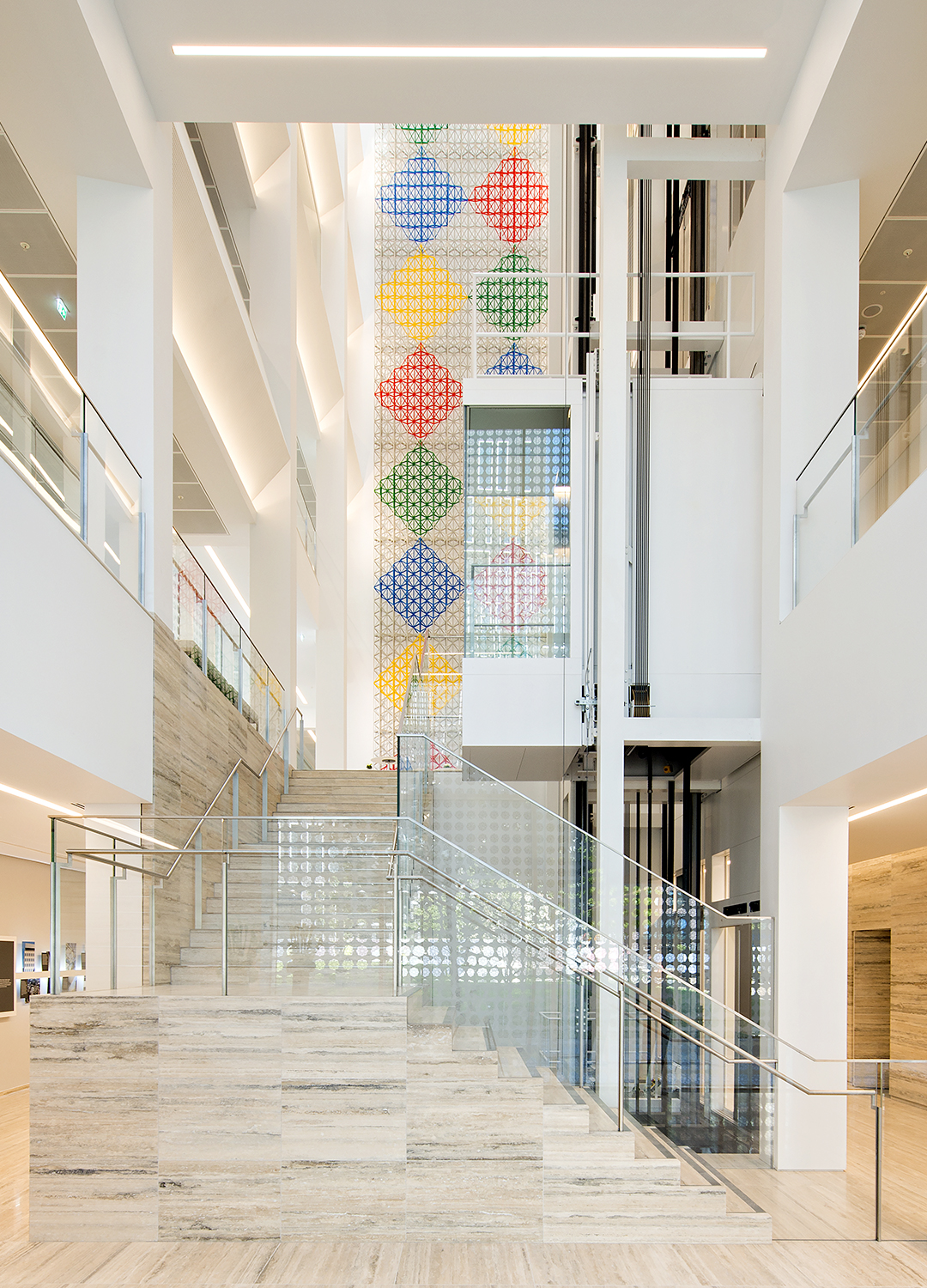
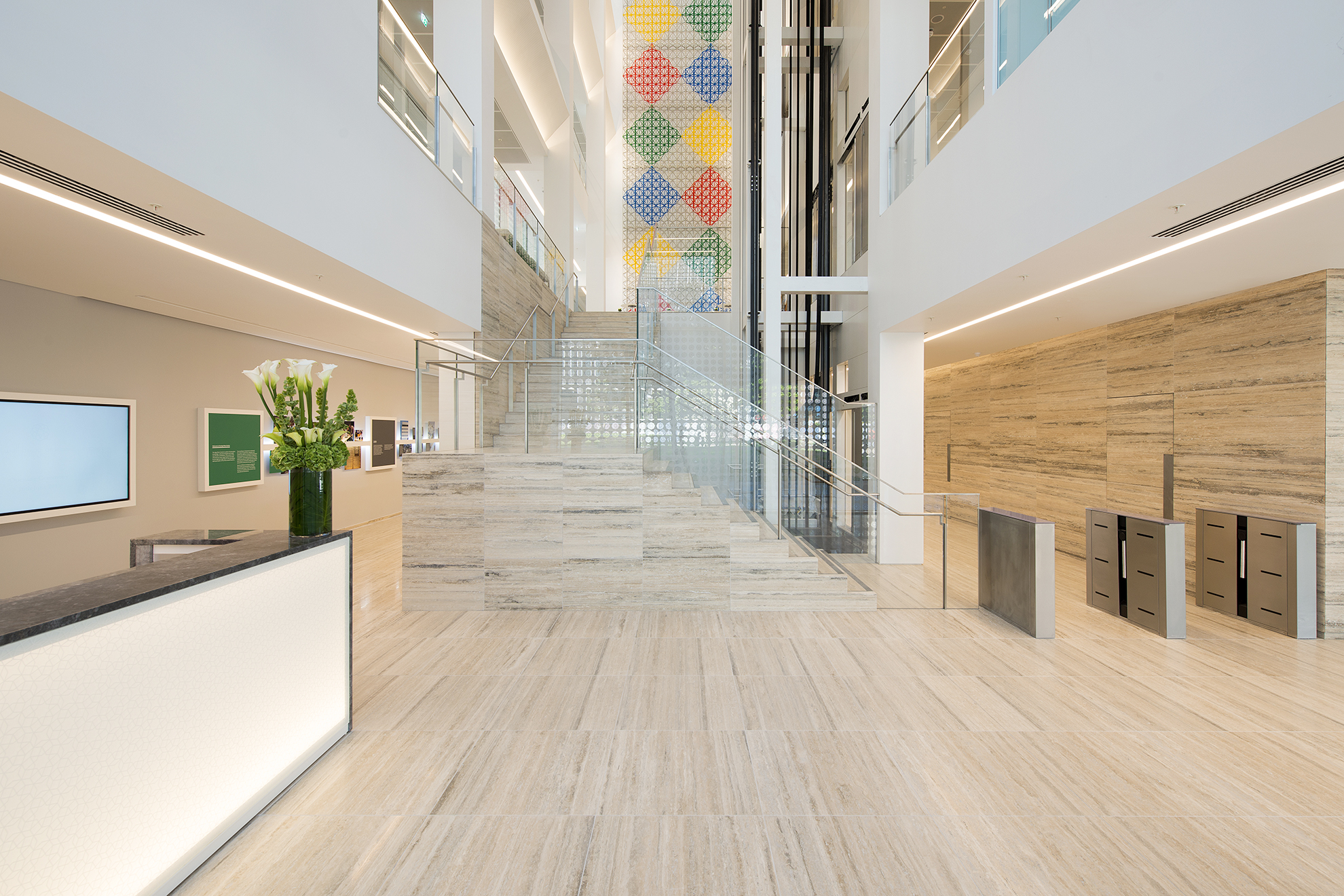
Organised around a nine-storey glazed atrium, the building layout reflects traditional courtyards found in Morocco and Egypt, where private rooms surround common spaces. The atrium is a social and visual hub, bringing light deep into the building. A geometric eight-point star pattern appears on metalwork and windows, casting shadows across the walls. This motif also appears in some of the Centre’s outdoor spaces. Each roof garden, terrace and courtyard represents, through contemporary landscape design, a garden from a different region of the Muslim World.

10 Triton Street – London

10 Triton Street

10 Triton Street is the new flagship building for the on-going success of the whole Regent’s Place development.
Architect:
Farrells

Client:
British Land

Location:
London

Year:
2009

British Land commissioned Sir Terry Farrell to develop a masterplan vision for Regent’s Place.
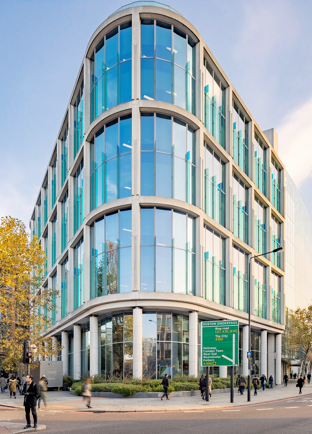
Farrells were commissioned by British Land to prepare a masterplan for the whole of the Regent’s Place estate on the Euston Road which included two office buildings – 10 & 20 Triton Street. The buildings face several listed buildings such as Holy Trinity Church, Great Portland Street station and the White House Hotel and therefore the materials and scale were sensitively considered throughout the design process to complement and reflect the existing contextual aesthetics in the street.

10 Triton Street creates a high value corner frontage for Regent’s Place and is shaped and set back on Osnaburgh Street to open up and frame a vista with Holy Trinity Church, to the new front door of 20 Triton Street, drawing the value of the Euston Road through to the heart of the new development.

The end façade of 10 Triton Street curves smoothly into an open courtyard, flooding natural light into the spacious public space. The project has a strong identity that generates excellent values in the West End of London and British Land were extremely pleased with this project throughout the whole process.

10 Triton Street delivers 120,000 sq ft of high quality, sustainable and flexible accommodation.

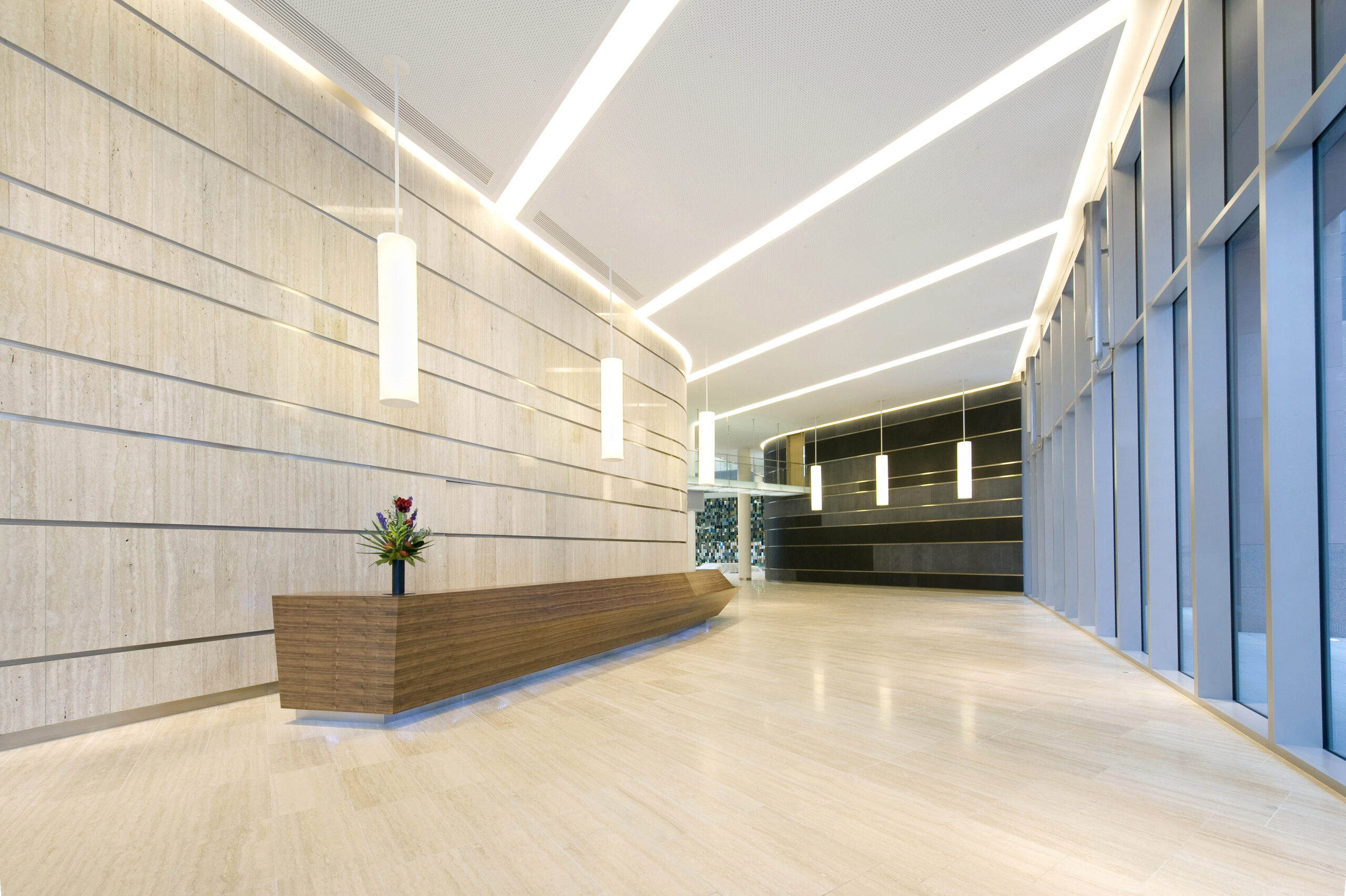
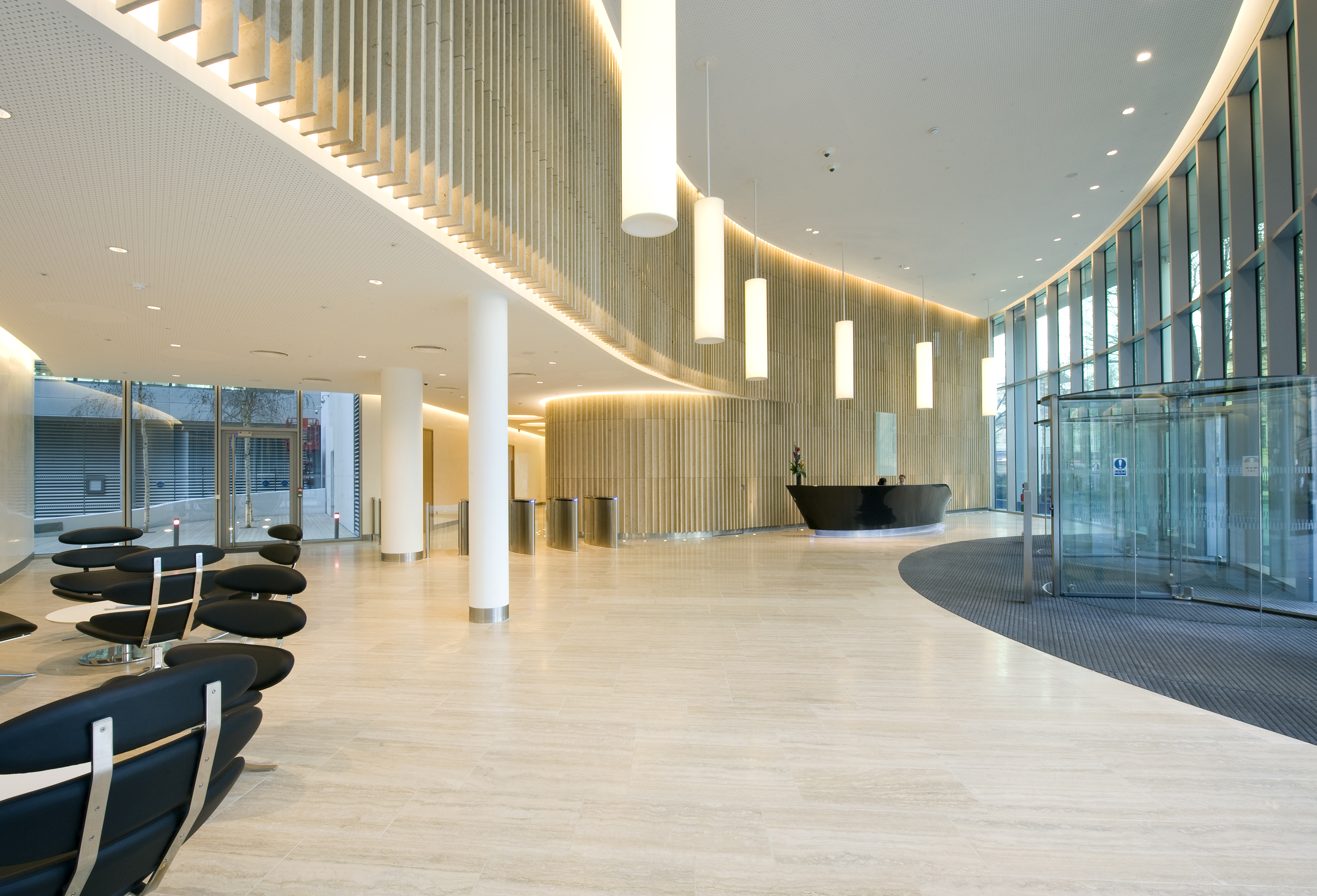
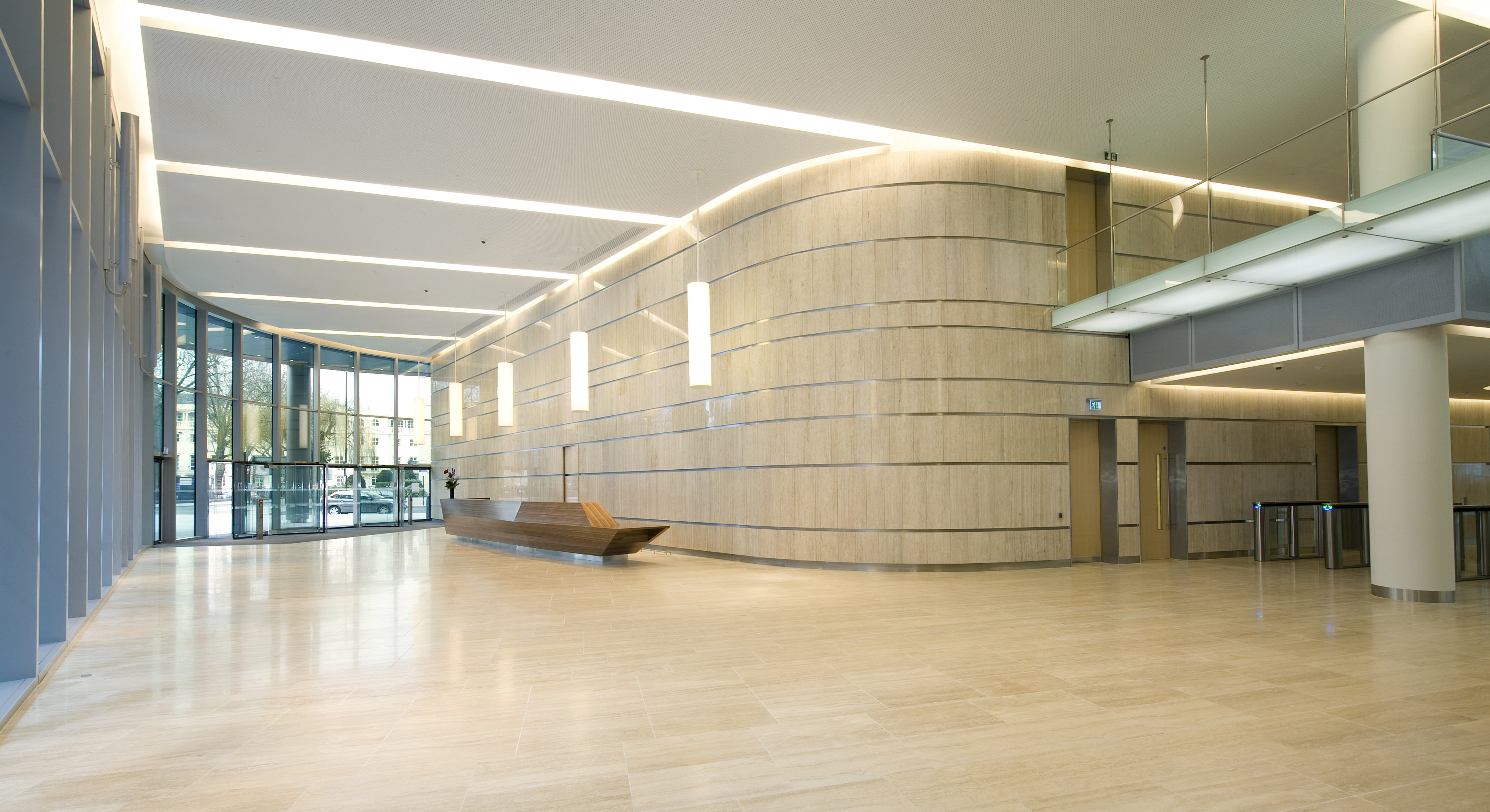
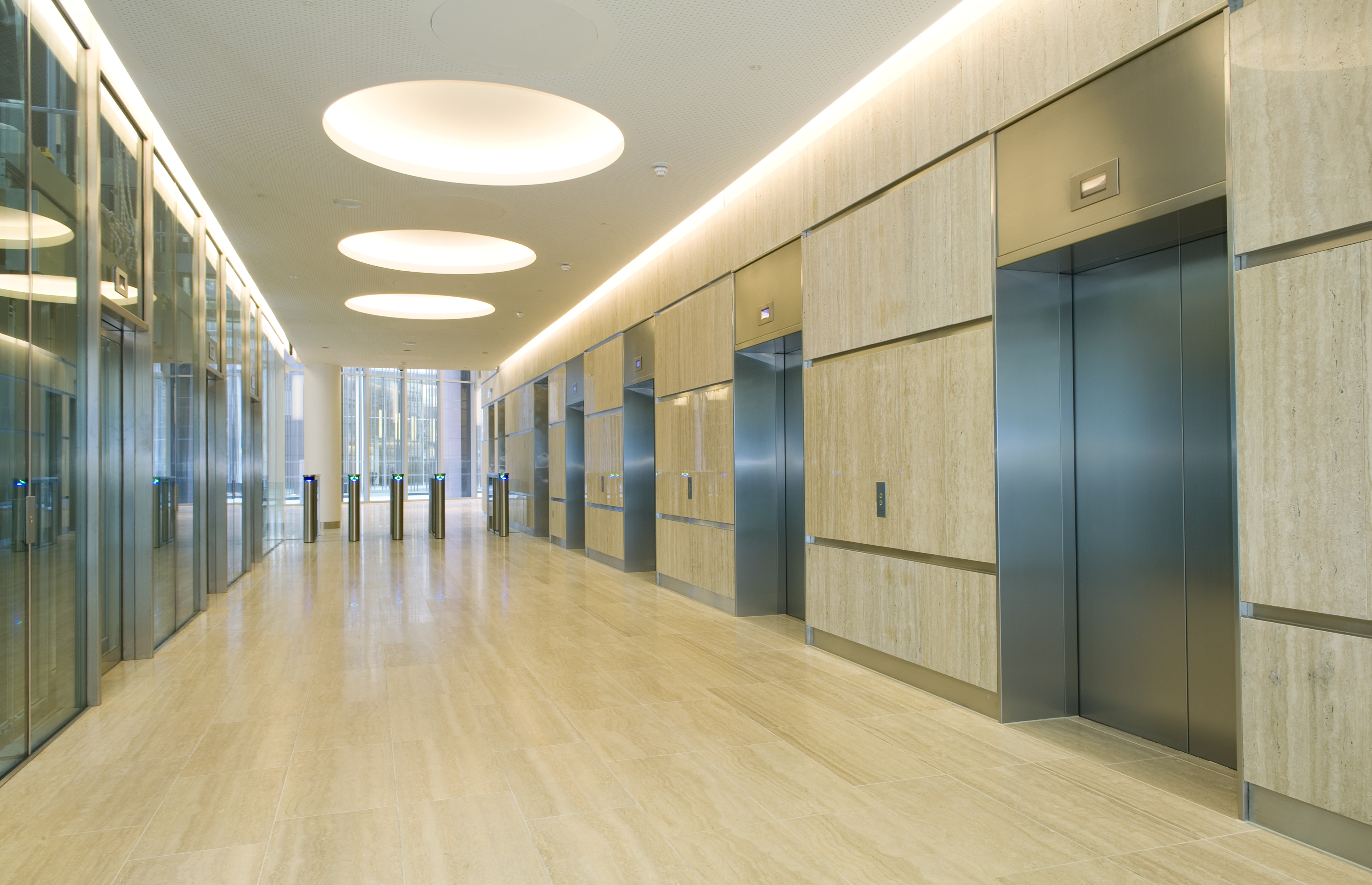
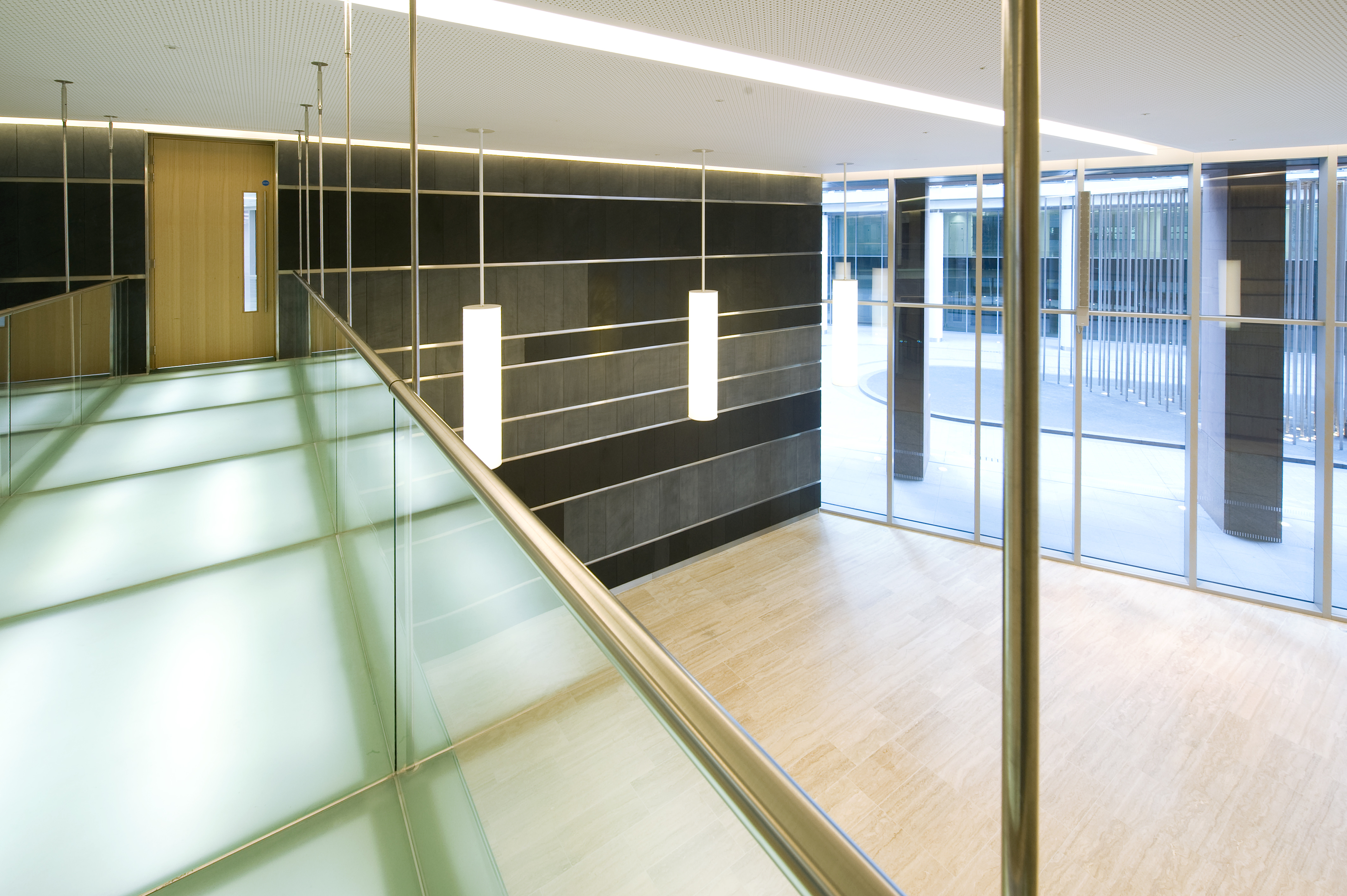
As master planners and architects, Farrells were able to bring the exterior architecture’s philosophy into the interior design of the building. The interiors are finished to a high standard with broad, column-free office spaces; travertine finishes are lavishly employed in the spacious lobby areas, particularly at 10 Triton Street’s soaring, full-height atrium. 10 Triton Street delivers 120,000 sq ft of high quality, sustainable and flexible accommodation for British Land and is the new flagship building for the on-going success of the whole Regent’s Place development.

The Regent’s Place masterplan and development represent the culmination of several years of planning and construction.

Before the masterplan, Regent’s Place was a disconnected commercial enclave. The brief demanded that it become a diverse community, a place to live, work and play and an integrated part of the west end of London. This was achieved by creating high-quality spaces and places between the buildings, and a network of new streets enabling and encouraging linkages to the surrounding area including a new north-south pedestrian route through the masterplan, animated by a new Arts Centre and linking to Fitzrovia via a new at-grade pedestrian crossing over the Euston Road.