IFC International Finance Centre – Shanghai

IFC International Finance Centre

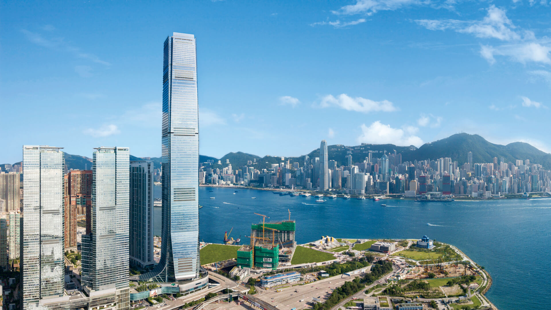
The Shanghai IFC ranks among the largest commercial developments in the Pudong Lujiazui District and serves as a new landmark for the area.

Architect:
Pelli Clarke Pelli Architects

Client:
Sun Hung Kai Properties

Location:
Shanghai

Year:
2011

Designed by the critically-acclaimed architect Cesar Pelli, the distinctive diamond-like forms of the development stand in luminous splendour.

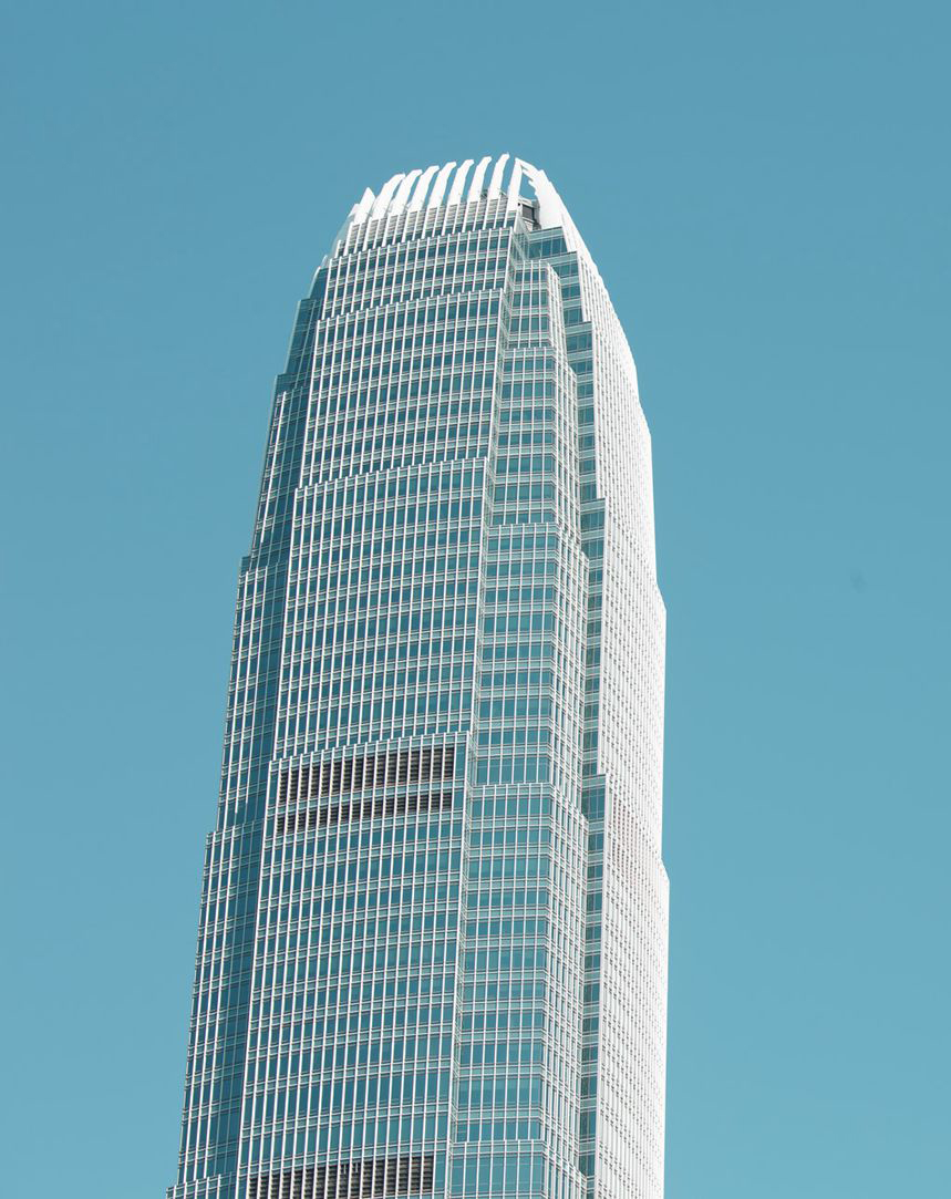
Shanghai IFC (International Finance Centre) is one of the most significant new developments in the Pudong New Area, China’s most important financial and commercial center. The project – three towers, a shopping mall, and a public plaza – is a central element of Pudong’s skyline. Viewed from the Bund, Shanghai’s historic riverfront promenade, the development assumes a distinctive presence among the city’s landmarks.

The towers share a common architectural language. Starting with elegant, rectilinear forms clad in a vertically grained glass-and-stainless-steel curtain wall, the towers are sculpted by shearing off corners and edges, creating crystal-like shafts that gesture toward one another, creating a single composition from two buildings. Where the edges are sliced away, a horizontally grained interior is revealed. In height and arrangement, the two angled towers also respond to their varied urban surroundings.
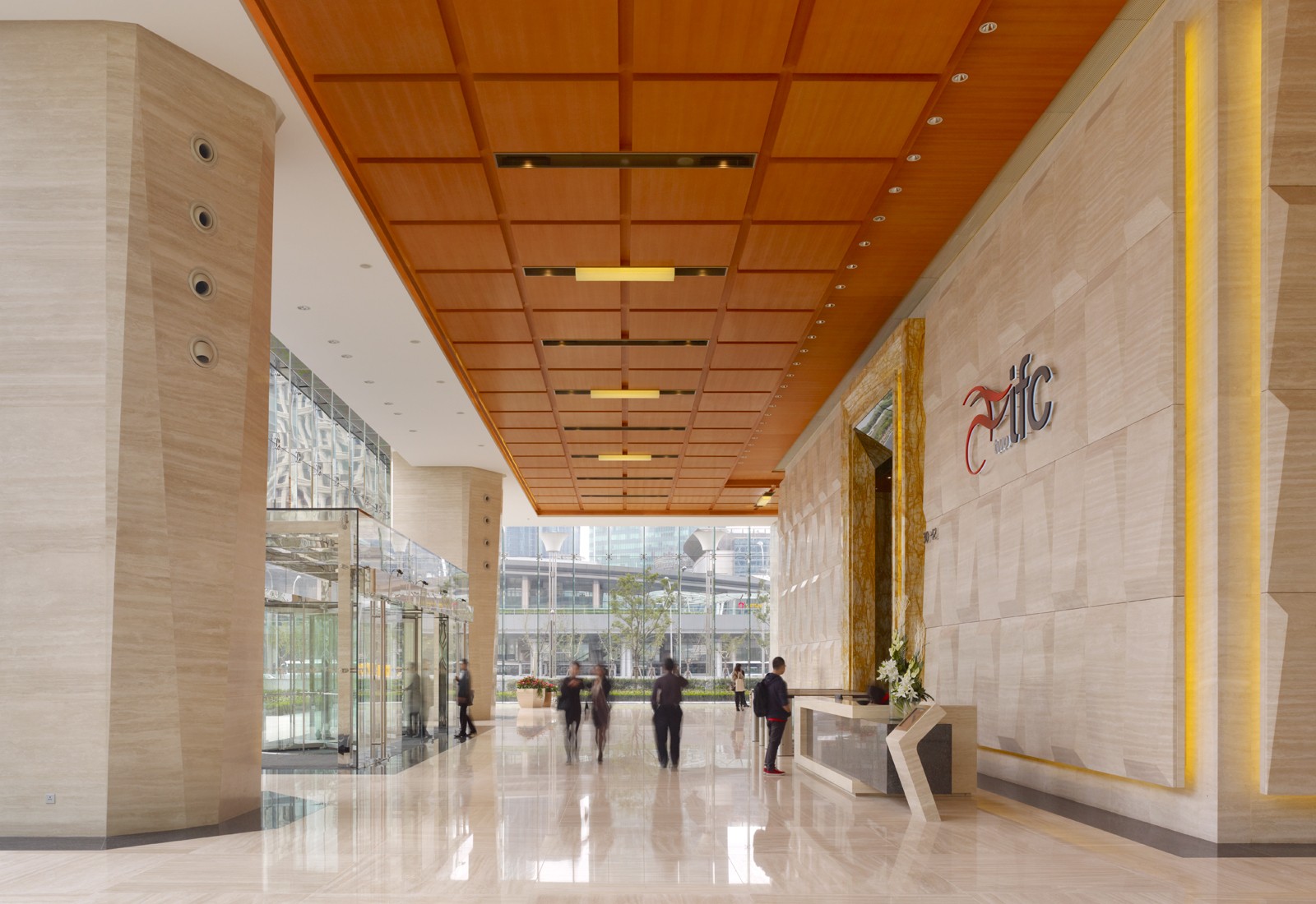
Almost 80 percent of the office space receives natural light, reducing energy consumption and contributing to a high-quality work environment.

The project includes two mixed-use towers, 48 and 50 stories, each with approximately 140,000 square meters of floor area for office and hotel use. The China headquarters of HSBC occupies more than half of the south tower, which also includes a 290-room Ritz Carlton Hotel with commanding views of the central city. A third tower, 23 stories tall, contains service apartments, complete banquet and conference facilities, a fitness center, and a swimming pool.

Designed by the critically-acclaimed architect Cesar Pelli, the distinctive diamond-like forms of the development stand in luminous splendour, adding a touch of glamour and enchantment to the Huangpu River and Oriental Pearl Tower.
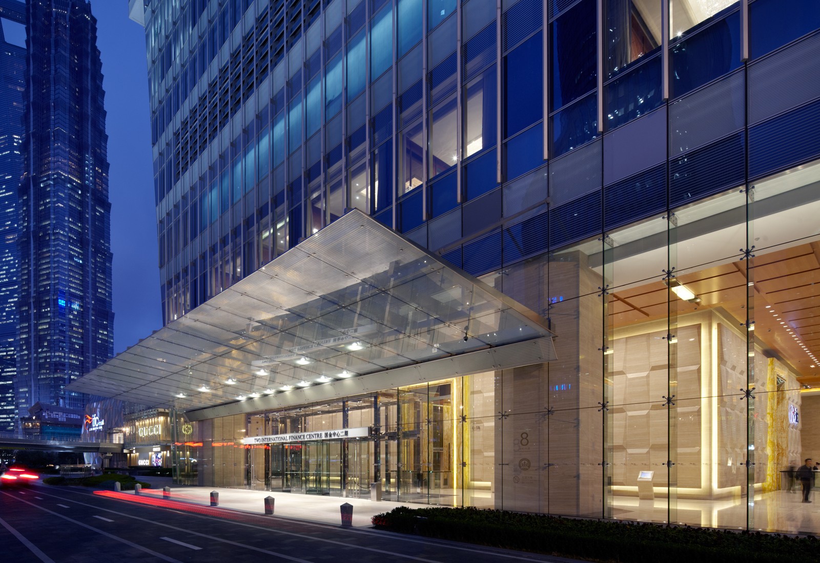
The project’s ground plane is an urban park, extensively landscaped and punctuated with fountains, gardens, sitting areas, and open courts.

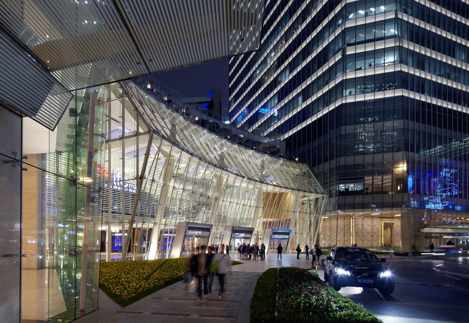
A four-level podium houses approximately 55,000 square meters (592,000 square feet) of retail, restaurants, and support spaces for the hotels. Below grade are a cinema complex, retail, a 1,800-space car park, and connections to the subway. Pedestrian connections to the adjoining sites are conveniently provided by tunnels and sky bridges. The project’s ground plane is an urban park, extensively landscaped and punctuated with fountains, gardens, sitting areas, and open courts that integrate with the below-grade retail level.

LACMA Los Angeles County Museum of Art – Los Angeles

LACMA Los Angeles County Museum of Art

Renzo Piano’s LACMA is the largest purpose-built, naturally lit, open-plan museum space in the world.

Architect:
Renzo Piano Building Workshop


Client:
Los Angeles County Museum of Art

Location:
Los Angeles

Year:
2010

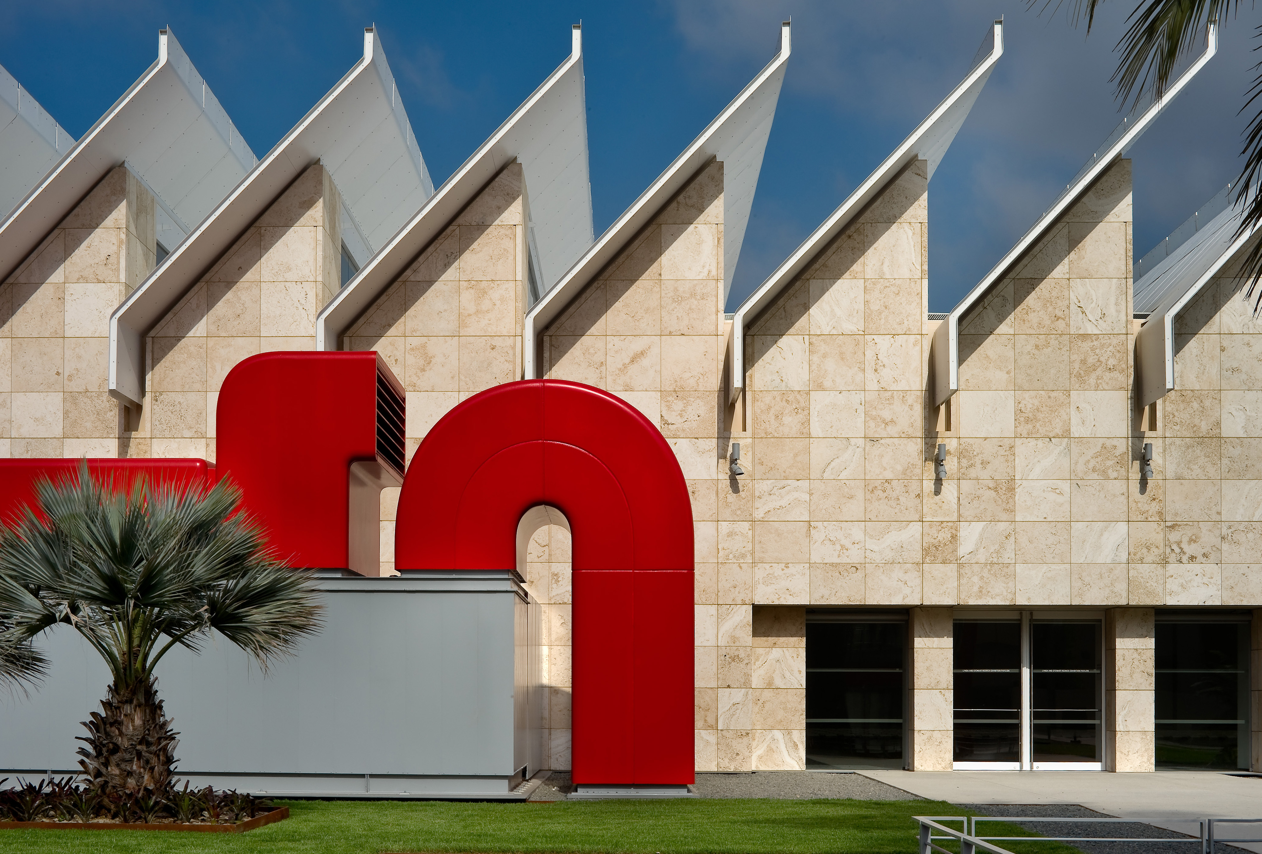
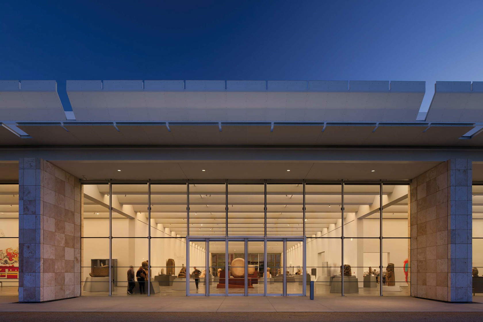
The Resnick Pavilion is a flexible, glass and stone-enclosed structure dedicated to the presentation of art.

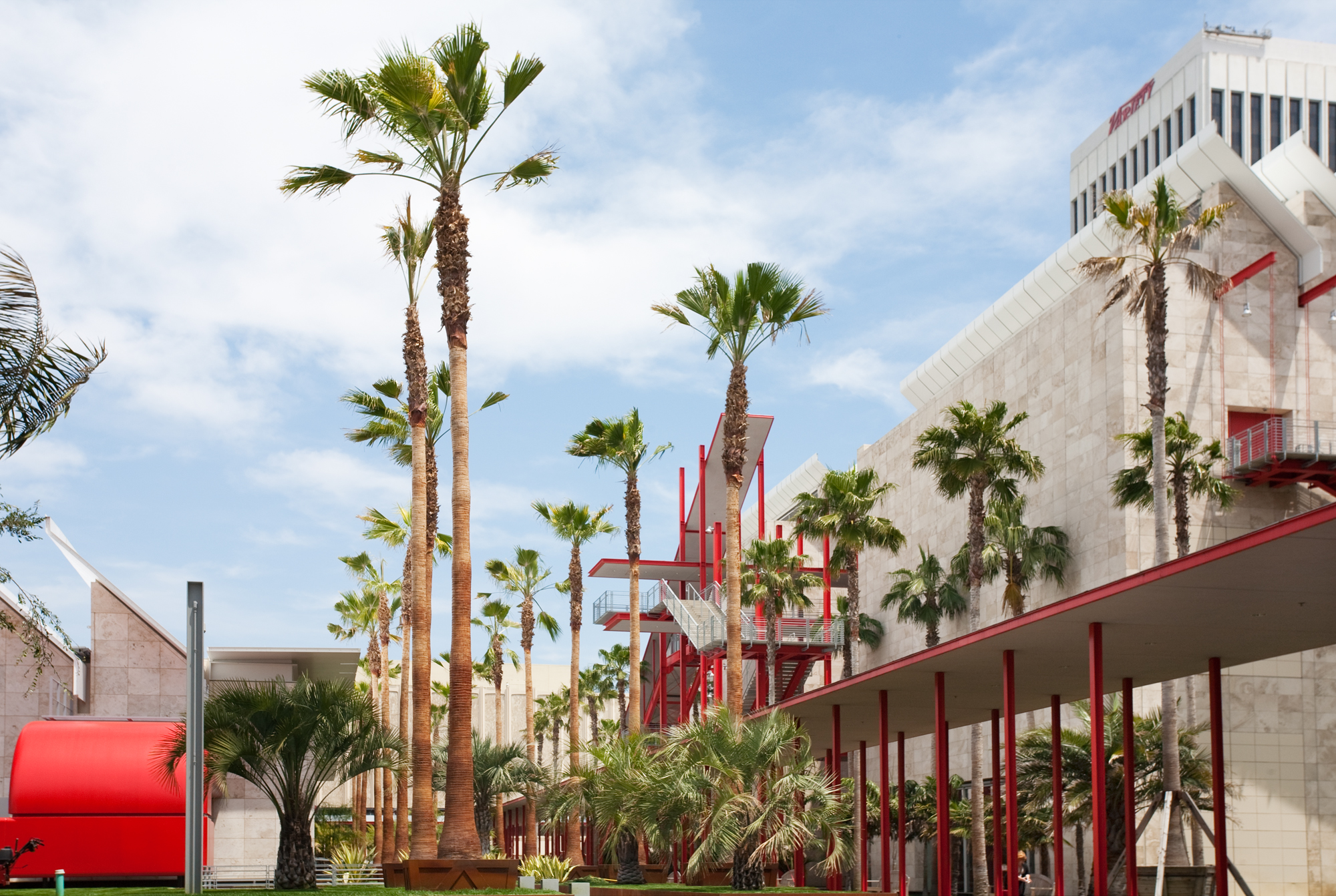
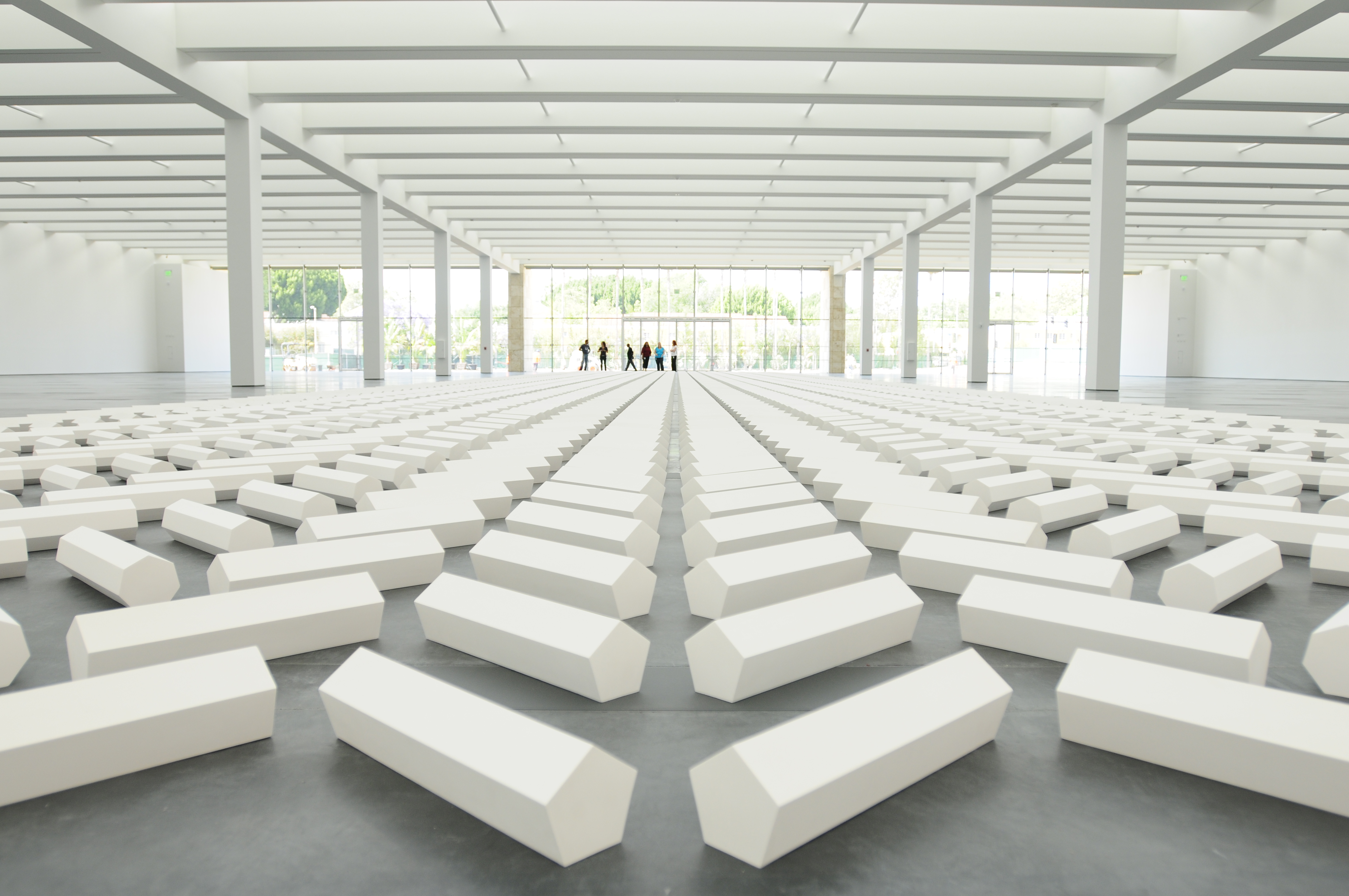
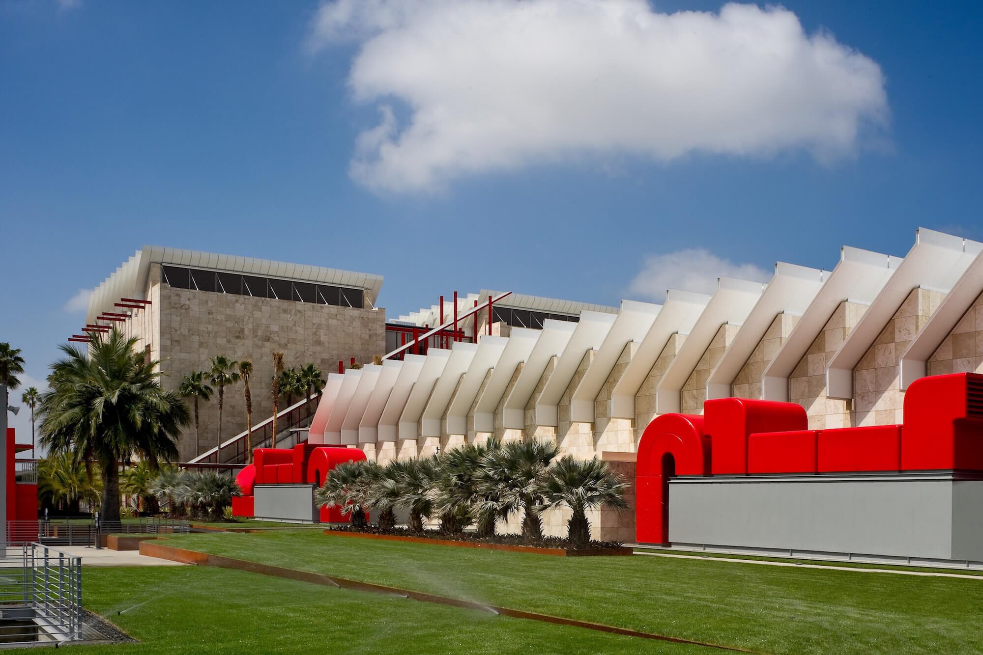
The Broad Contemporary Art Museum is the new centrepiece of the Los Angeles County Museum of Art (LACMA) and the first of a multi-phase museum expansion. Designed by Renzo Piano Building Workshop, the facility includes some of the largest column-free gallery spaces in the U.S. Renzo Piano’s scope of the project for the LACMA was to fuse its scattered buildings into a cohesive campus, with new public spaces, new exhibition spaces and a strong visual identity for the museum.

The second phase of the project for the LACMA was the construction of the Resnick Pavilion. Dedicated to temporary art exhibitions, the 45,000 sq ft (4,180 sq m) Resnick Pavilion was built above the museum’s underground parking, north of the Broad Contemporary Art Museum (BCAM).

The facility includes some of the largest column-free gallery spaces in the U.S.

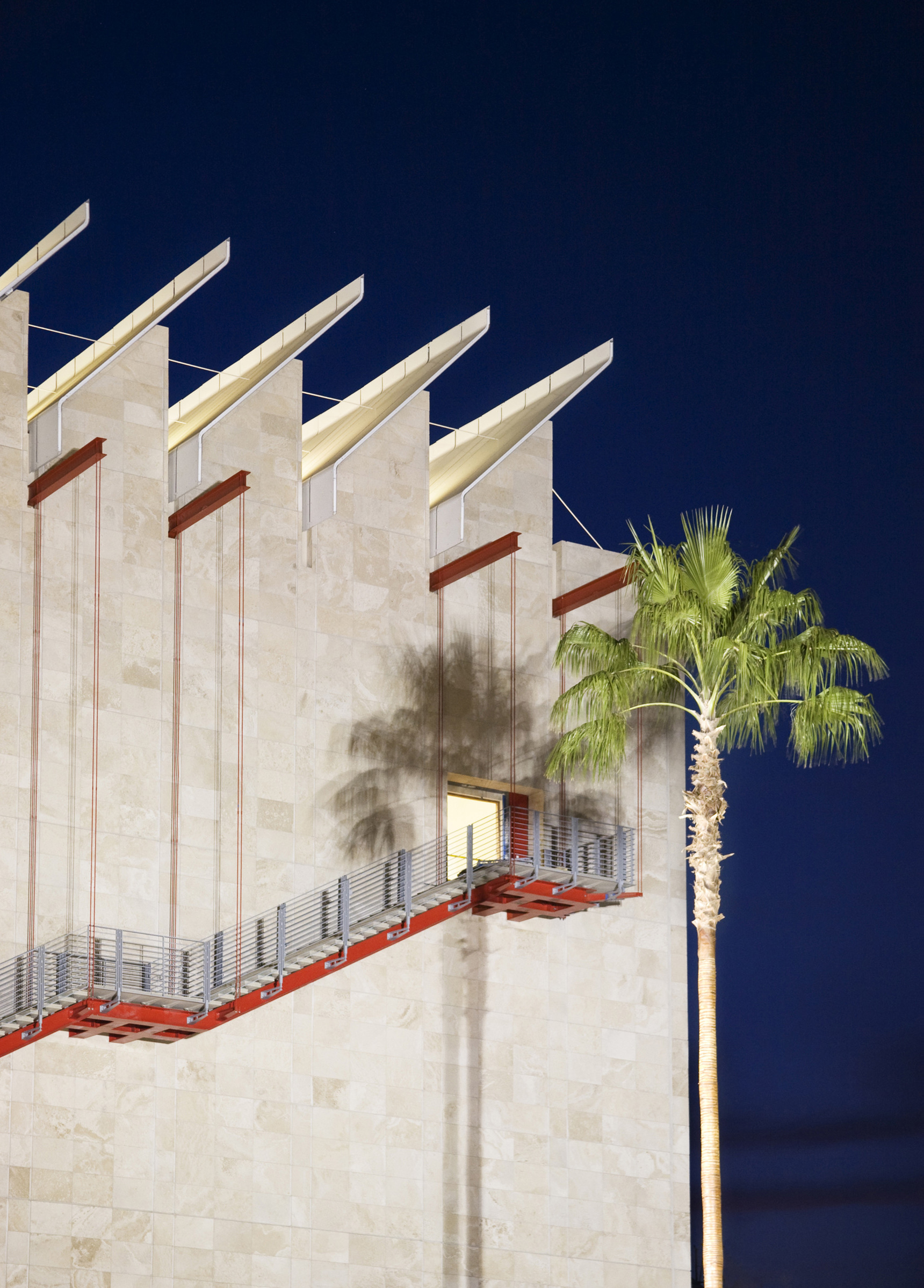
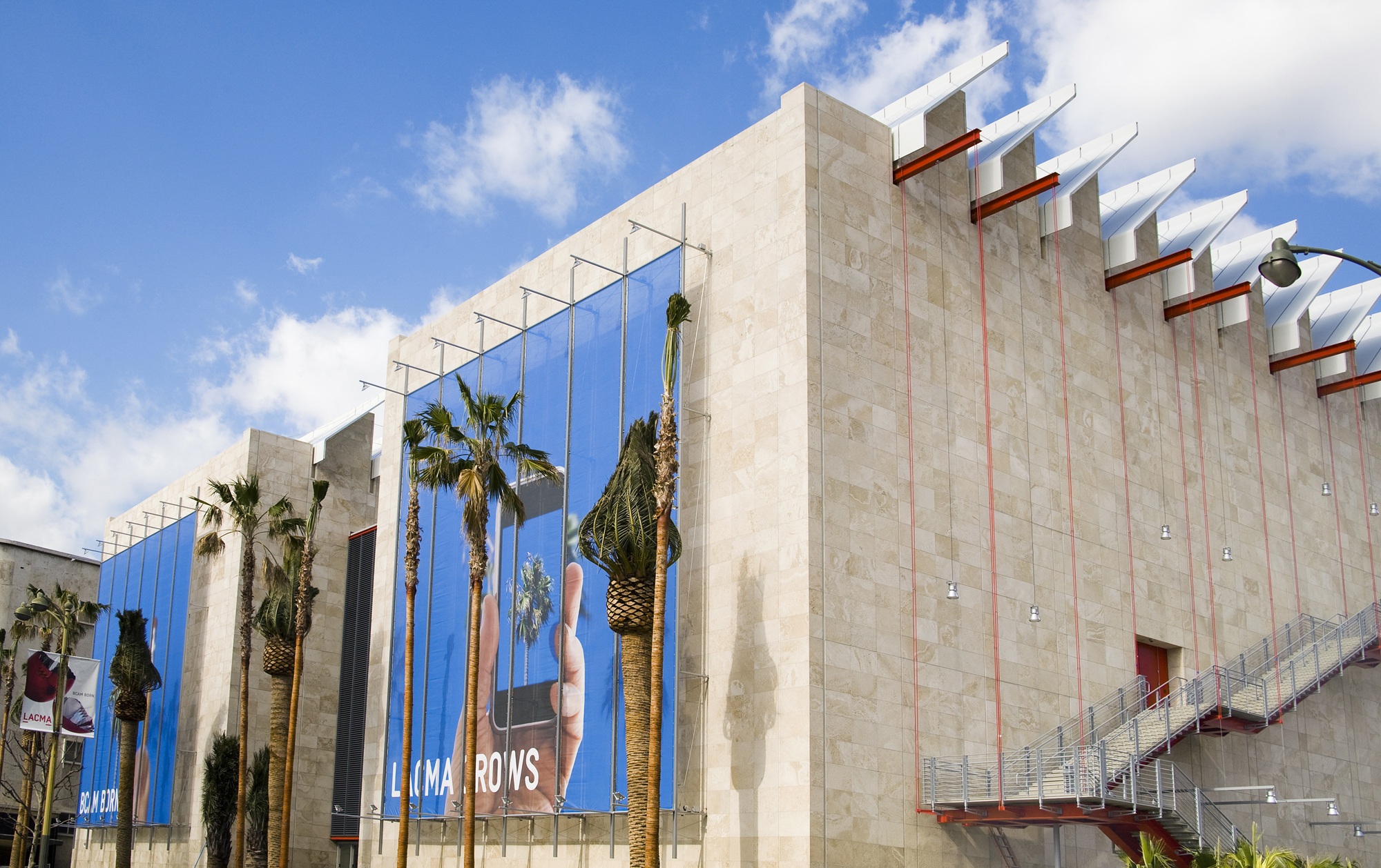
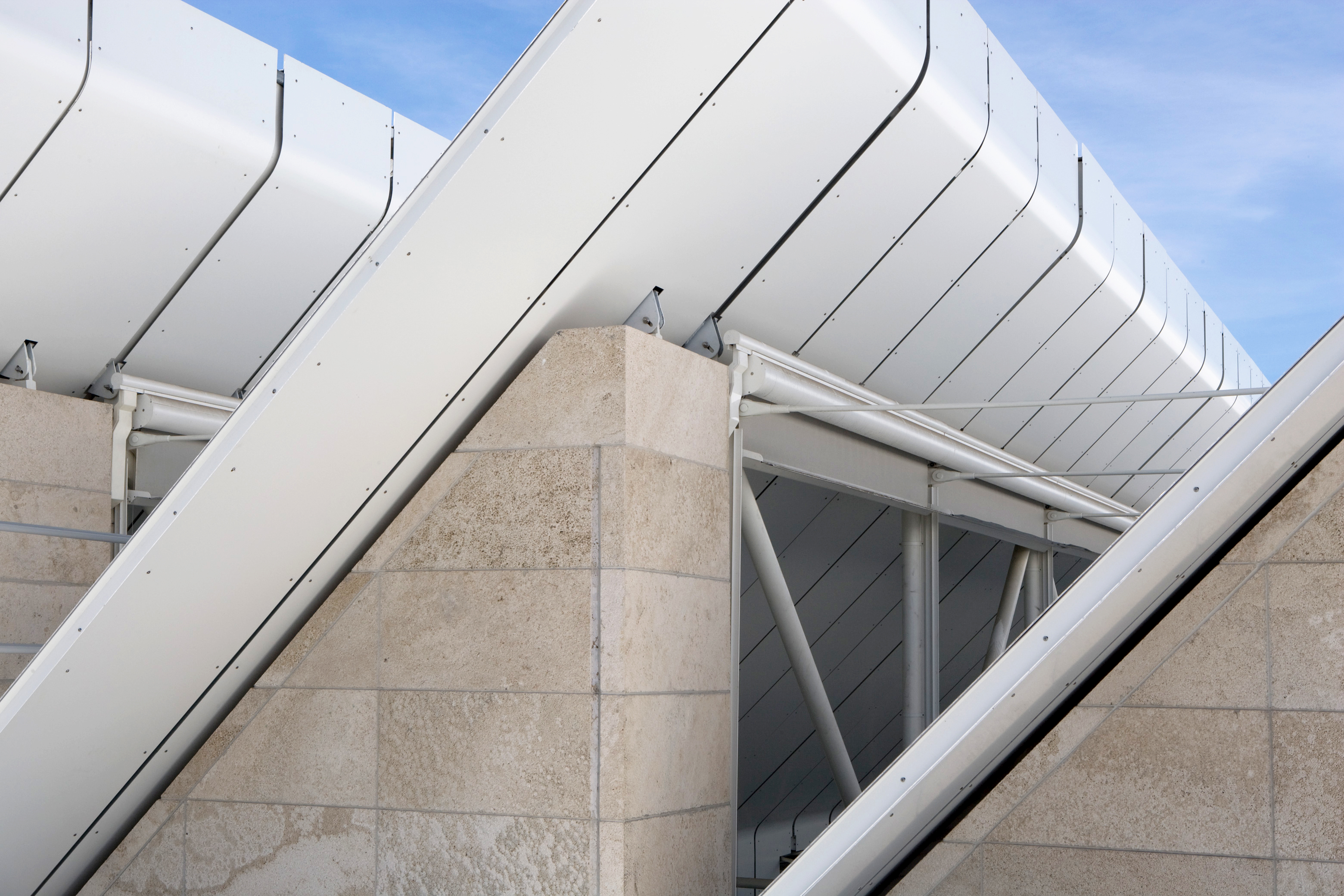
The Resnick Pavilion is a single-storey structure with a simple square plan and it features the same architectural characteristics as BCAM – a glazed saw-tooth roof and travertine stone cladding. Glazed facades open onto the park to the north, and towards BCAM to the south. To optimize interior space, the services are on the outside of the building, creating what LACMA bills as ‘the largest purpose-built, naturally lit, open-plan museum space in the world’.

A system of moveable partitions affords extreme flexibility and versatility in the use of space. A recurring motif around the museum campus is the use of the colour red, punctuating the otherwise restrained travertine facades. At the Resnick, air-handling units and technical rooms are coloured red and are plugged onto the building’s external facades, part of the industrial language of the building.

The Resnick Pavilion dramatically expanded the museum’s exhibition space.

The Resnick Pavilion, a key feature of LACMA’s revitalisation and expansion scheme named ‘Transformation’, dramatically expanded the museum’s exhibition space and also further unified the western half of the museum’s twenty-acre campus. The building is named in honour of long-time patrons Lynda and Stewart Resnick, whose $45 million donation was the lead gift in Phase II of LACMA’s Transformation campaign.

The gridded palm garden by the artist Robert Irwin connects the Piano buildings to the museum’s older structures. A system of light fabric scrims adorns the façade on Wilshire Boulevard thus lending lightness to the building. Created by artist John Baldassari, this installation establishes the visual identity of the museum and creates a relation between the rushing urban street life and the contents of the museum.

Aga Khan Centre – London

Aga Khan Centre

Islamic-inspired gardens are the delight of Maki and Associates’ new Aga Khan Centre.

Architect:
Maki and Associates


Client:
Aga Khan Foundation

Location:
London

Year:
2018

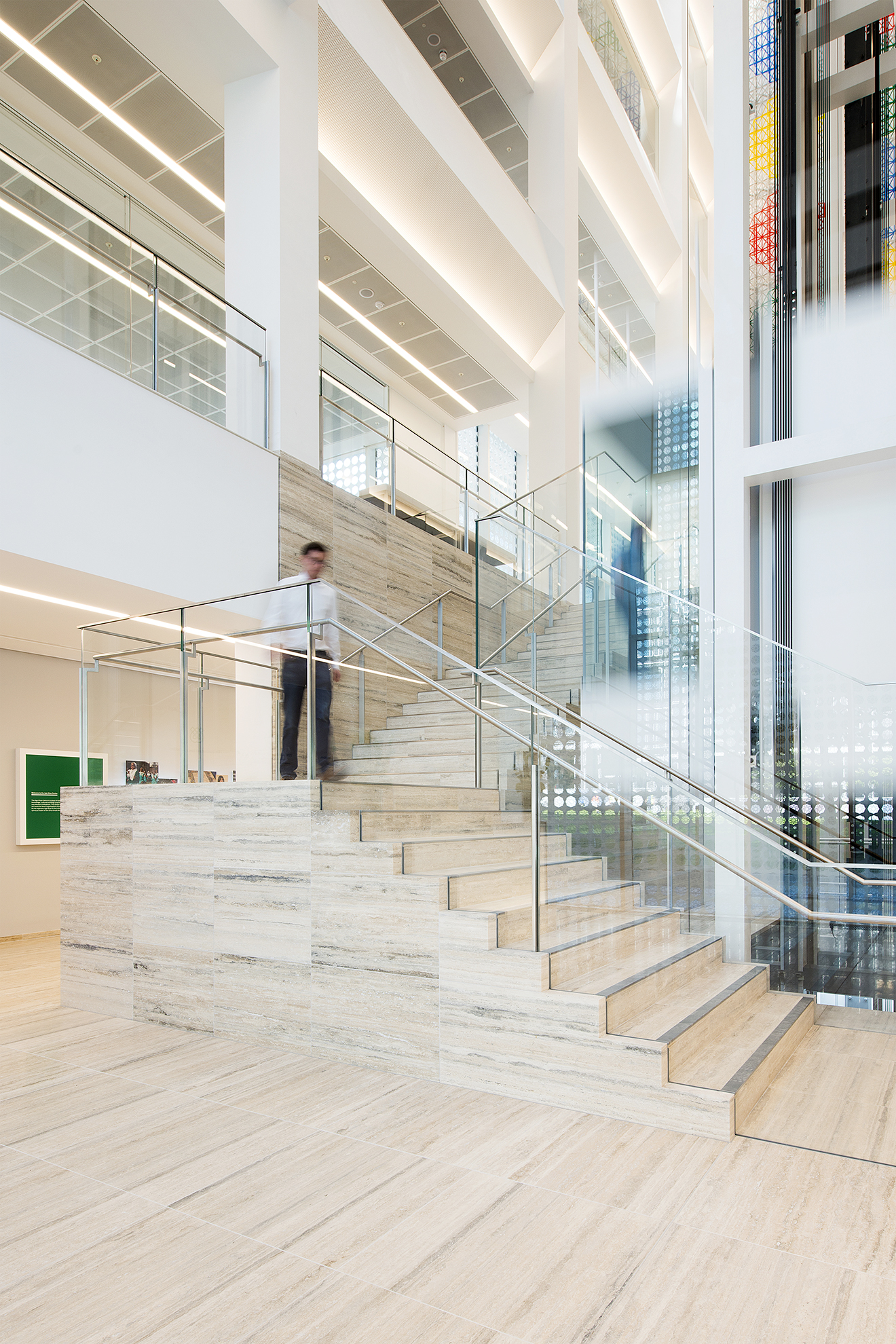
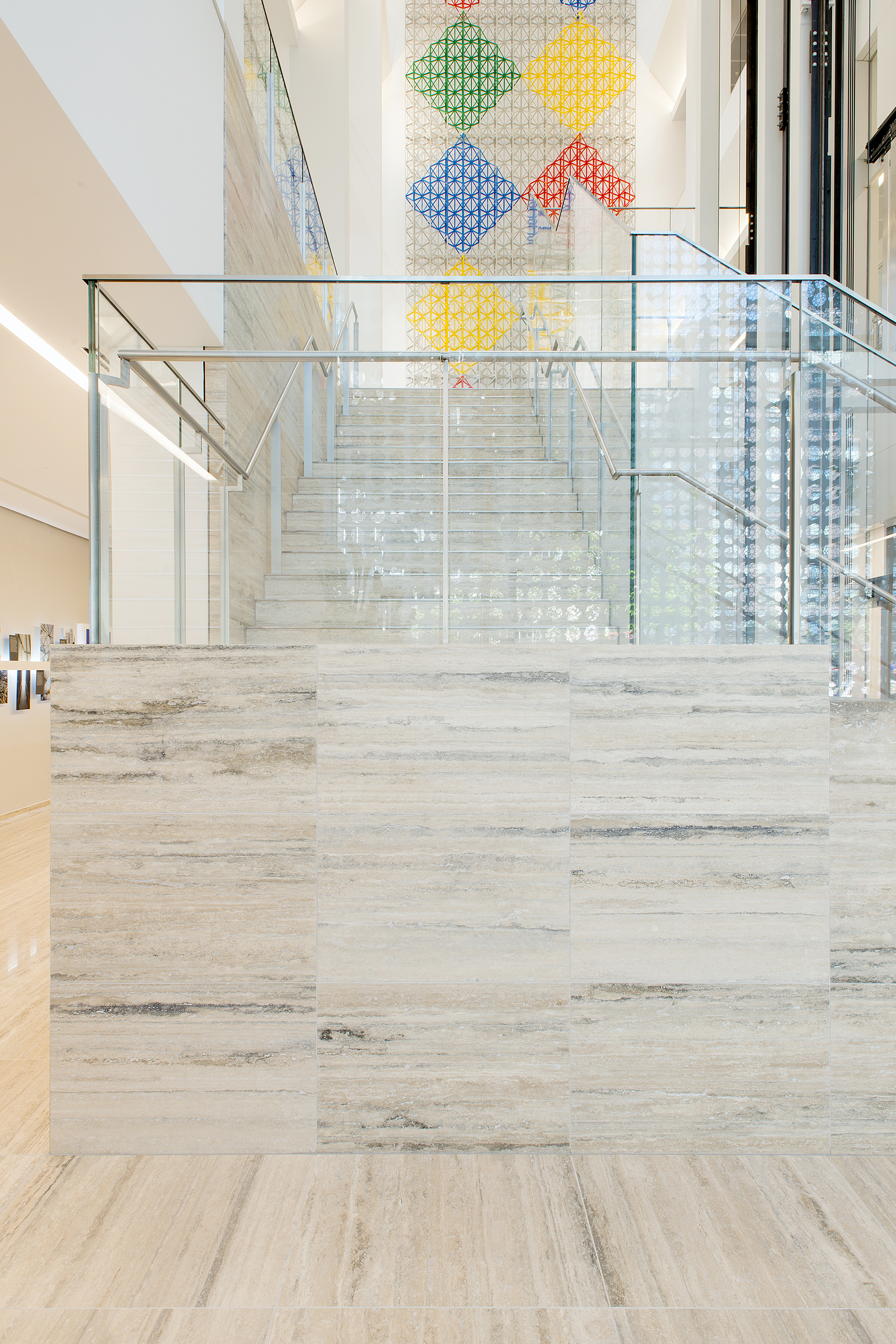
The Aga Khan Centre is a place of education, knowledge, cultural exchange and insight into Muslim civilisations.

Maki & Associates has designed a new London headquarters for the Aga Khan Foundation, the Aga Khan Centre in Kings Cross. The Fumihiko Maki’s architecture practice cut out a series of Islamic courtyards and gardens from a ten-storey block providing offices, a library and exhibition space. The building brings the Institute of Ismaili Studies, the Aga Khan University, the Institute for the Study of Muslim Civilisations and the Aga Khan Foundation UK together, after existing for 40 years in London at various locations, in their joint mission to open up a dialogue and understanding of Muslim cultures.

The building is influenced by Islamic architectural history and uses a small array of timeless materials.

The Aga Khan Centre is a place of education, knowledge, cultural exchange and insight into Muslim civilisations. The building is the UK home for three organisations founded by His Highness Aga Khan IV, the hereditary spiritual leader of the Shi‘a Ismaili Muslims.

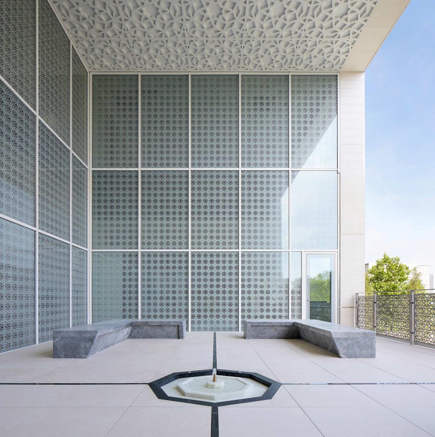
This building is designed to represent the values of openness, dialogue and respect for different viewpoints (pluralism). The architecture incorporates a collection of gardens, courtyards and terraces that provides an insight into the diversity and influence of Islamic landscape design around the world and through history.

The building was designed by Fumihiko Maki, one of Japan’s most distinguished contemporary architects. The Centre is primarily designed for an academic community, with places for students, scholars and staff to share ideas and work together alongside flexible teaching spaces and quiet research areas.

Each roof garden, terrace and courtyard represents a garden from a different region of the Muslim World.

Organised around a nine-storey glazed atrium, the building layout reflects traditional courtyards found in Morocco and Egypt, where private rooms surround common spaces. The atrium is a social and visual hub, bringing light deep into the building. A geometric eight-point star pattern appears on metalwork and windows, casting shadows across the walls. This motif also appears in some of the Centre’s outdoor spaces. Each roof garden, terrace and courtyard represents, through contemporary landscape design, a garden from a different region of the Muslim World.

10 Triton Street – London

10 Triton Street

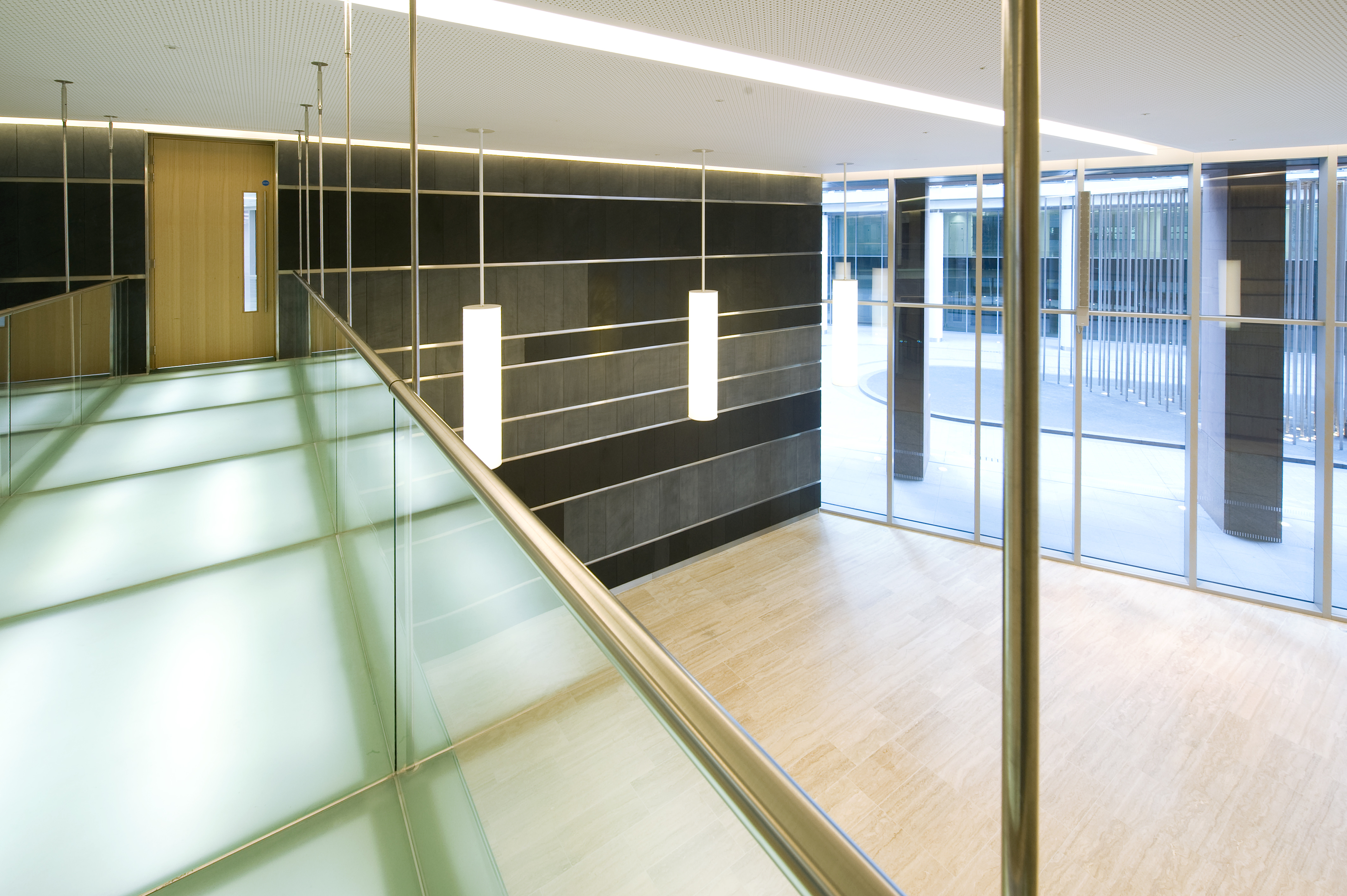
10 Triton Street is the new flagship building for the on-going success of the whole Regent’s Place development.

Architect:
Farrells

Client:
British Land

Location:
London

Year:
2009

British Land commissioned Sir Terry Farrell to develop a masterplan vision for Regent’s Place.

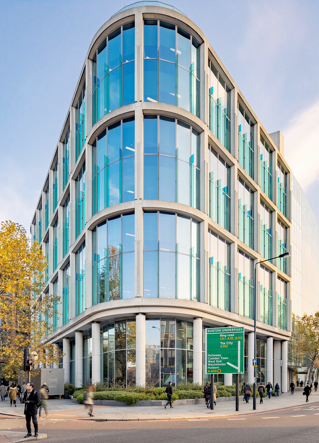
Farrells were commissioned by British Land to prepare a masterplan for the whole of the Regent’s Place estate on the Euston Road which included two office buildings – 10 & 20 Triton Street. The buildings face several listed buildings such as Holy Trinity Church, Great Portland Street station and the White House Hotel and therefore the materials and scale were sensitively considered throughout the design process to complement and reflect the existing contextual aesthetics in the street.

10 Triton Street creates a high value corner frontage for Regent’s Place and is shaped and set back on Osnaburgh Street to open up and frame a vista with Holy Trinity Church, to the new front door of 20 Triton Street, drawing the value of the Euston Road through to the heart of the new development.

The end façade of 10 Triton Street curves smoothly into an open courtyard, flooding natural light into the spacious public space. The project has a strong identity that generates excellent values in the West End of London and British Land were extremely pleased with this project throughout the whole process.

10 Triton Street delivers 120,000 sq ft of high quality, sustainable and flexible accommodation.

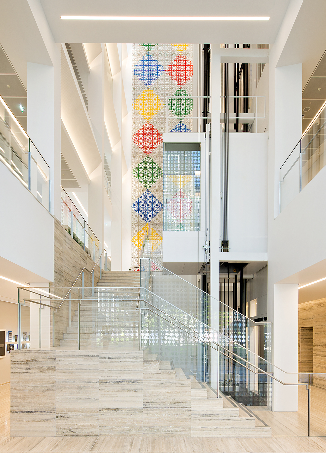
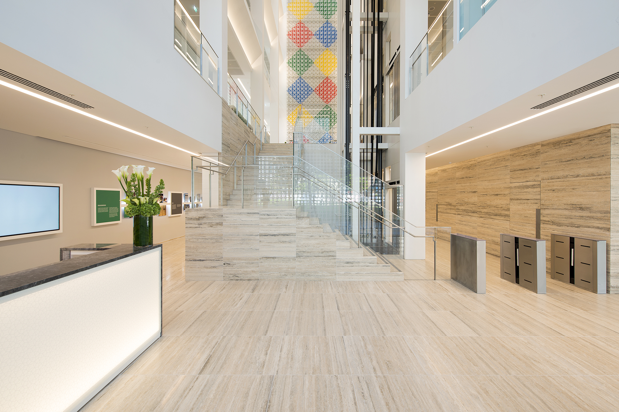
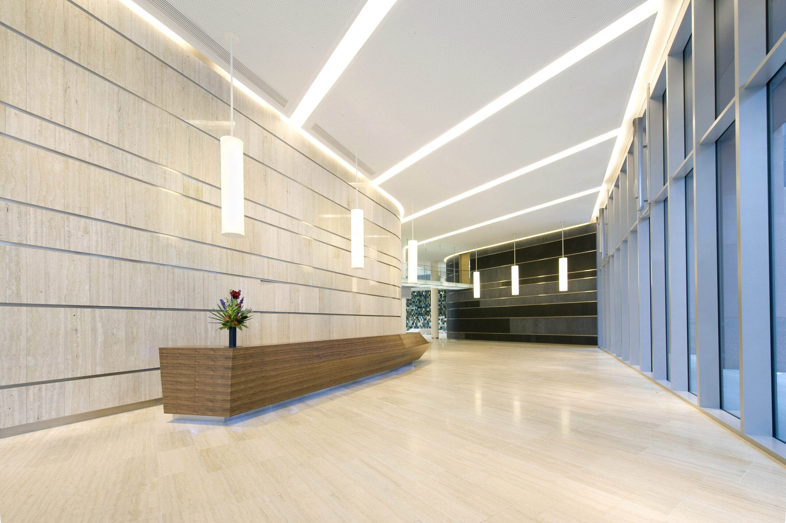
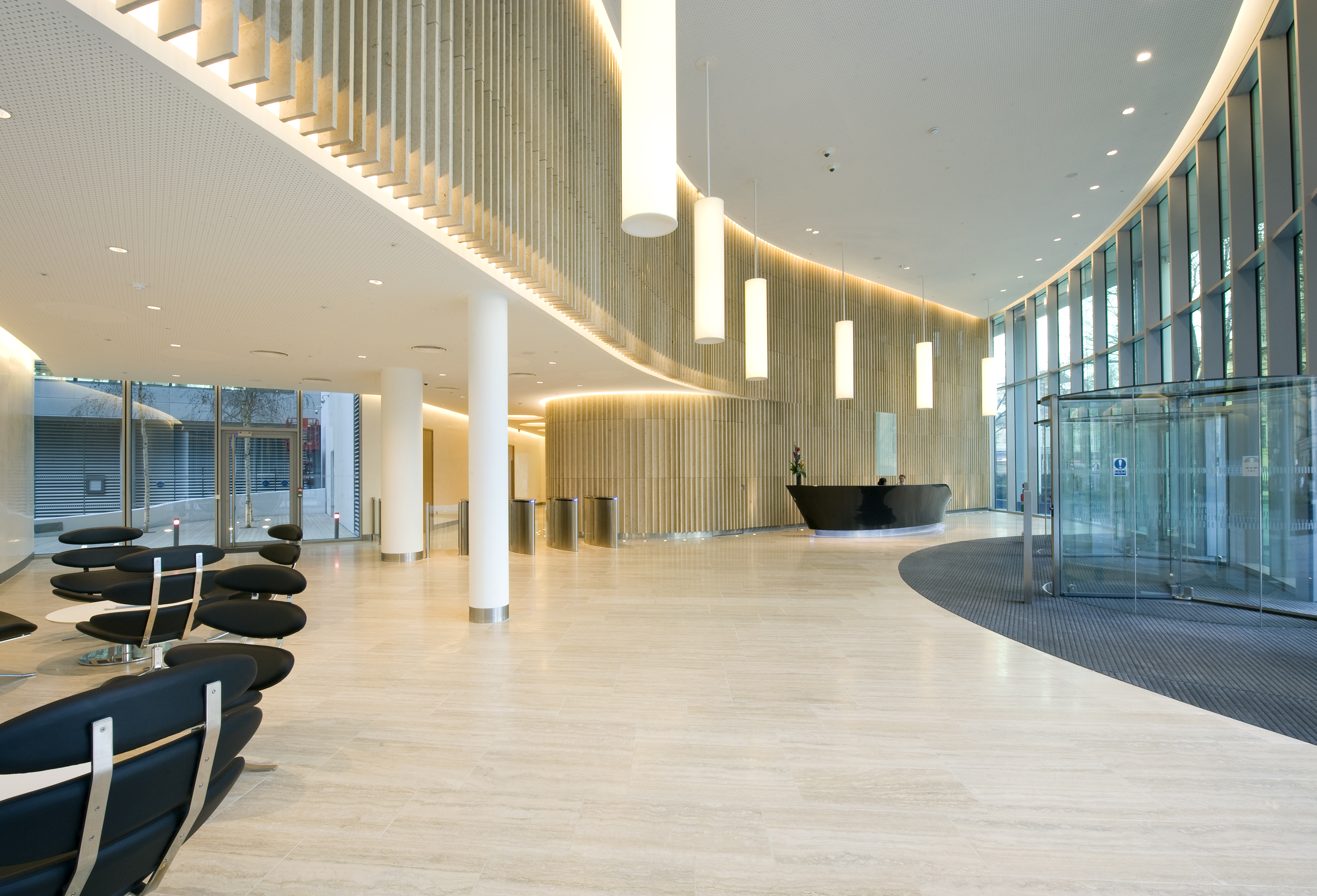
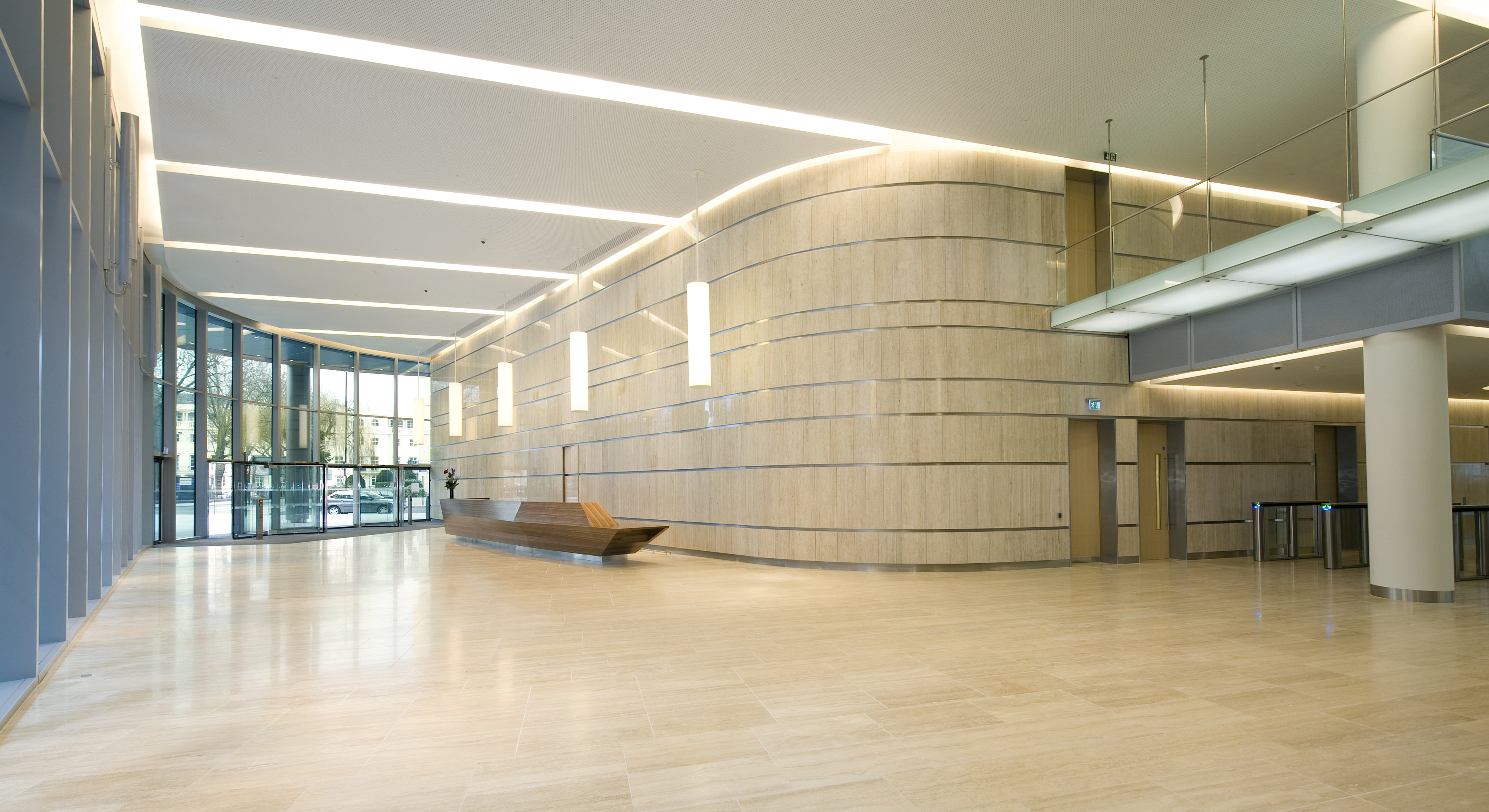
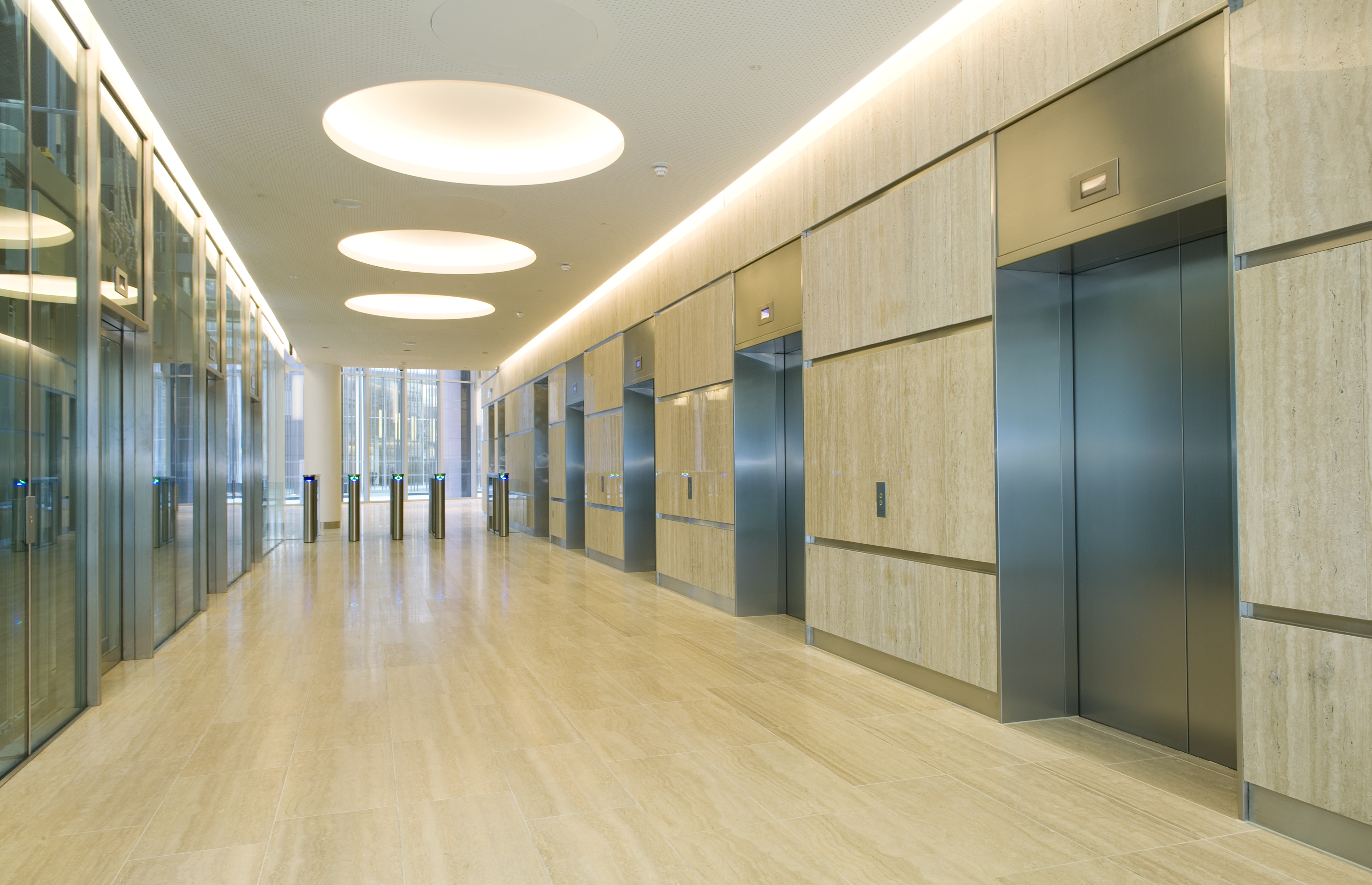
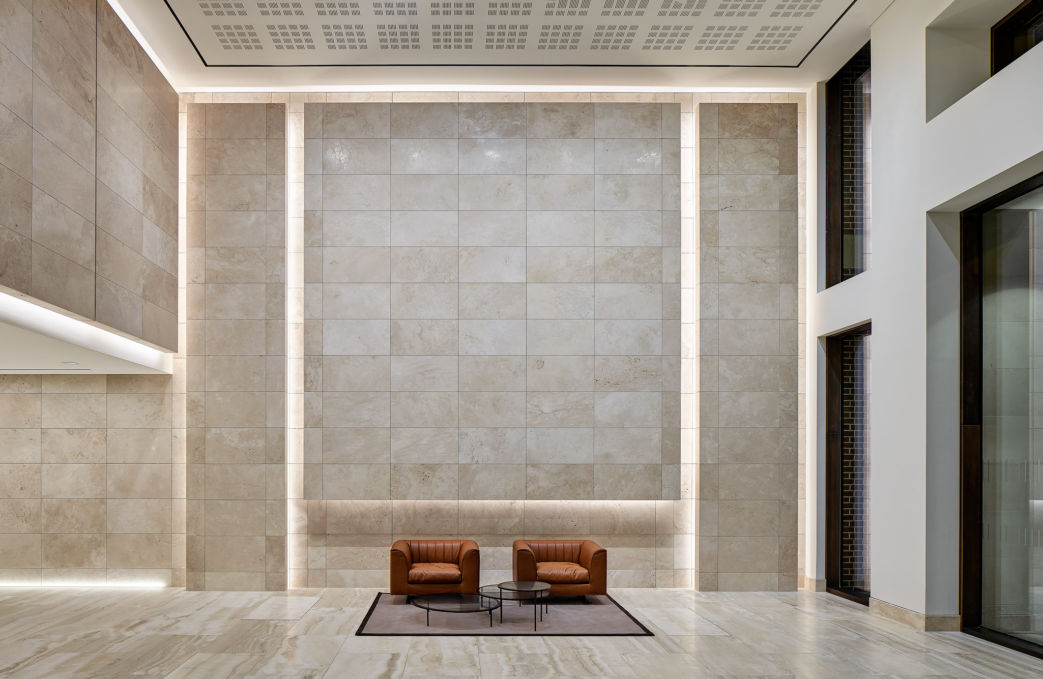
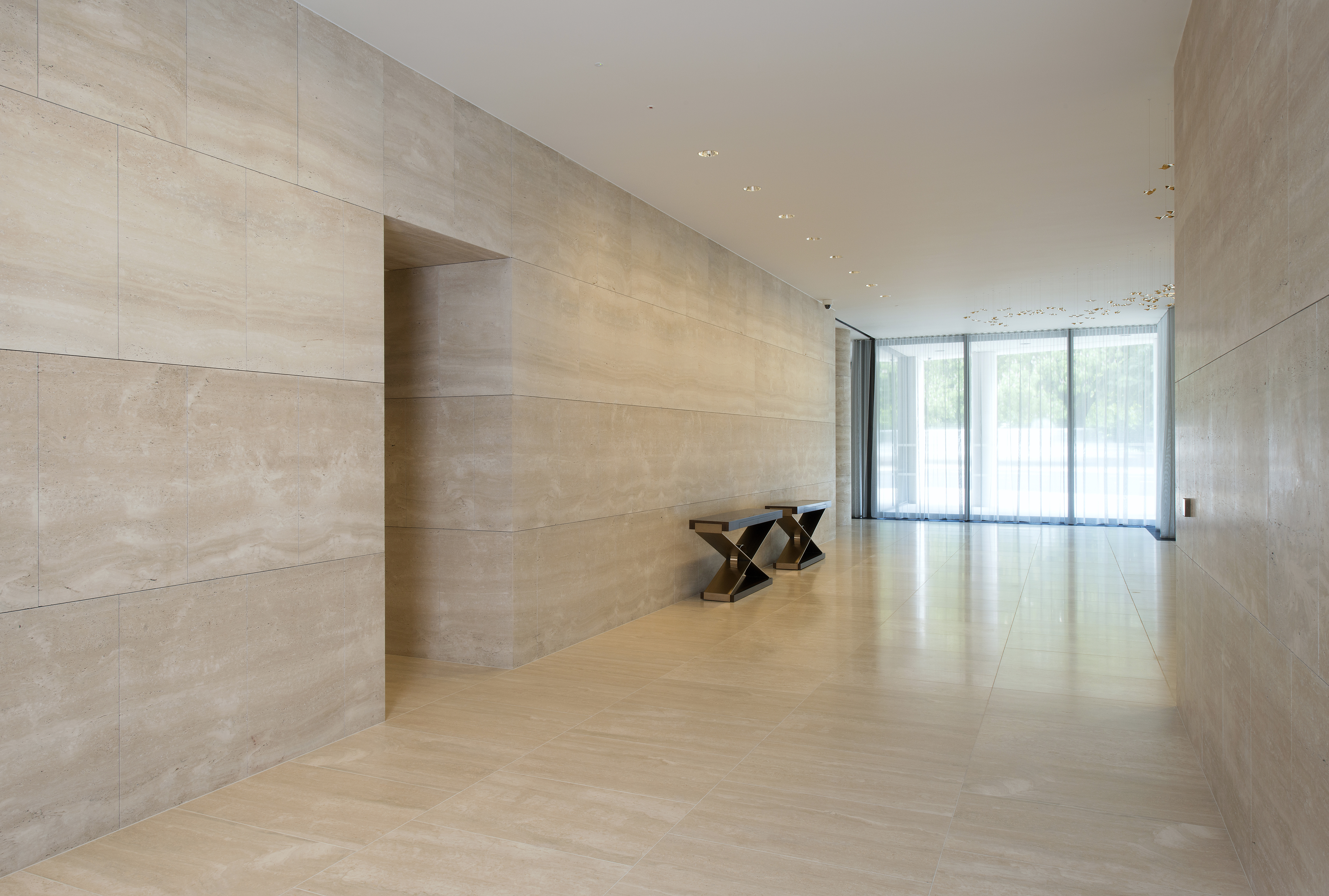
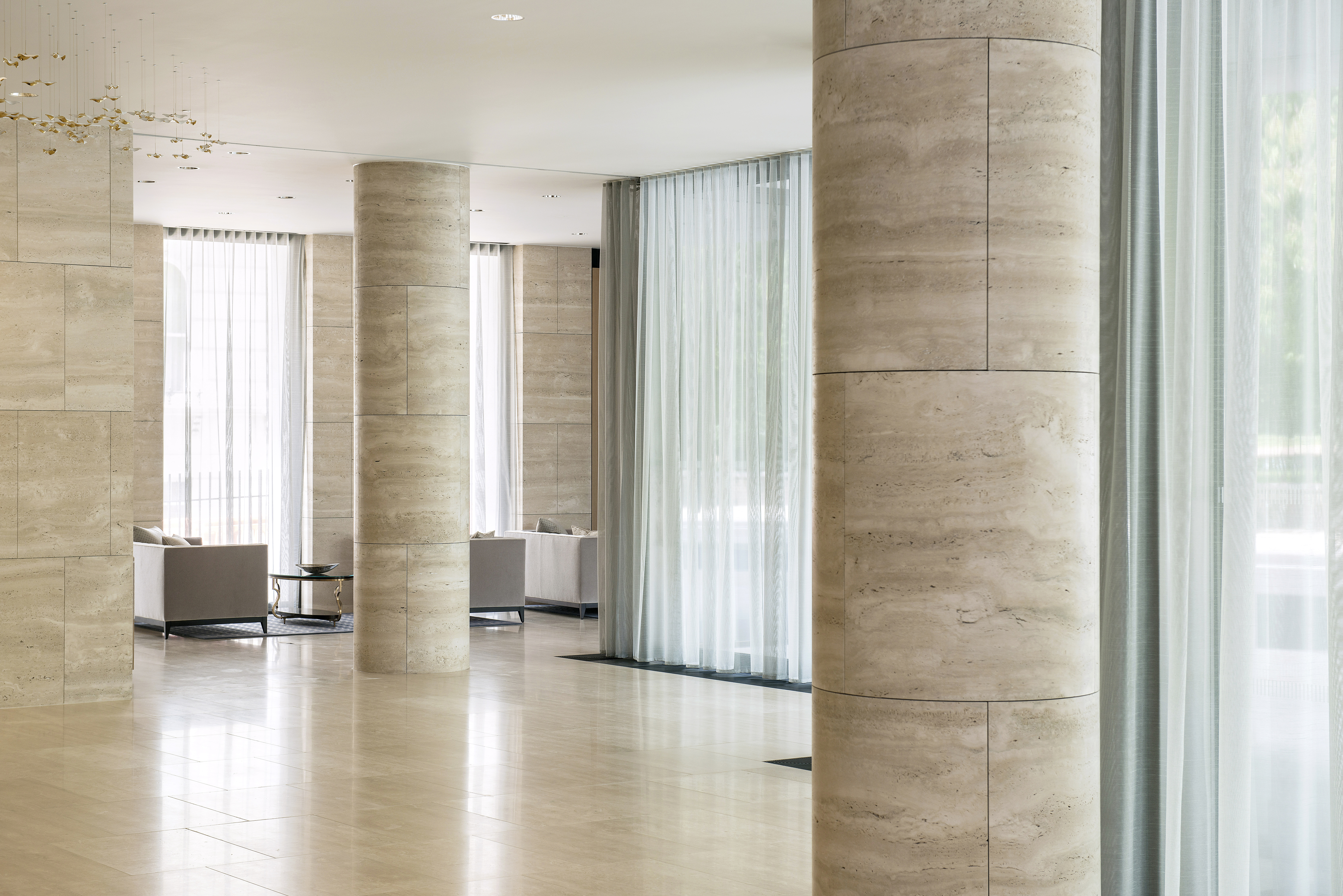
As master planners and architects, Farrells were able to bring the exterior architecture’s philosophy into the interior design of the building. The interiors are finished to a high standard with broad, column-free office spaces; travertine finishes are lavishly employed in the spacious lobby areas, particularly at 10 Triton Street’s soaring, full-height atrium. 10 Triton Street delivers 120,000 sq ft of high quality, sustainable and flexible accommodation for British Land and is the new flagship building for the on-going success of the whole Regent’s Place development.

The Regent’s Place masterplan and development represent the culmination of several years of planning and construction.

Before the masterplan, Regent’s Place was a disconnected commercial enclave. The brief demanded that it become a diverse community, a place to live, work and play and an integrated part of the west end of London. This was achieved by creating high-quality spaces and places between the buildings, and a network of new streets enabling and encouraging linkages to the surrounding area including a new north-south pedestrian route through the masterplan, animated by a new Arts Centre and linking to Fitzrovia via a new at-grade pedestrian crossing over the Euston Road.

Navona – Joseph Dirand

Navona

Dirand’s pieces hold an aura similar to that of large architecture.

Architect:
Joseph Dirand

Client:
Molteni&C

Location:
Miami

Year:
2018

Joseph Dirand tackles furniture as self-standing objects.

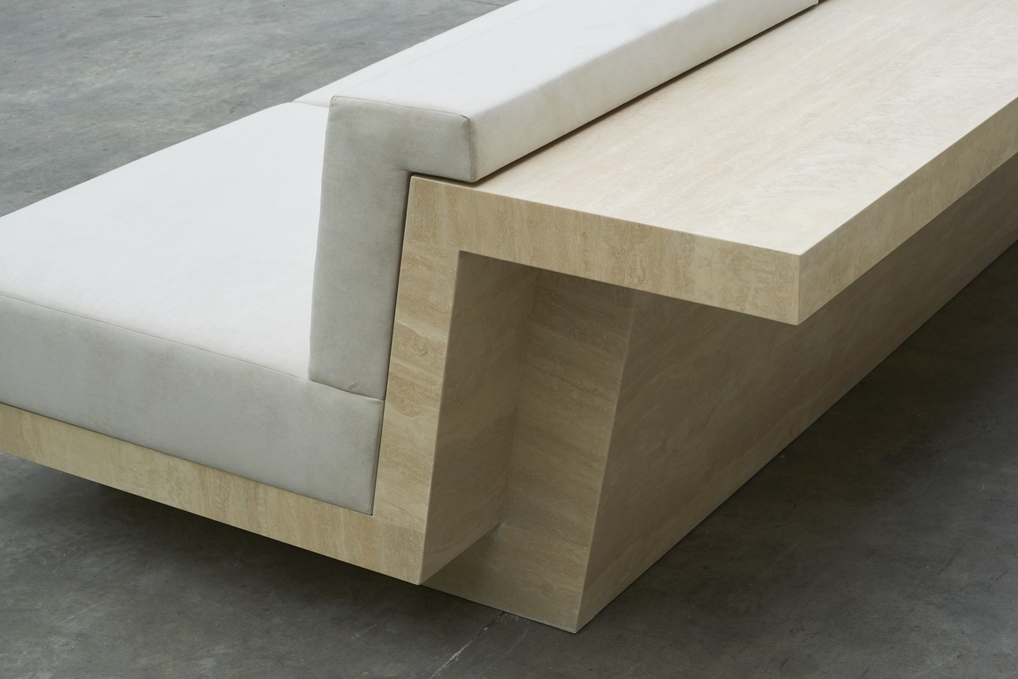
Working in collaboration with iconic Italian brand Molteni&C, Paris-based designer Joseph Dirand was tasked with creating the furniture for The Surf Club. Inspired by the Miami club’s décor, Dirand designed a series of special custom-designed travertine furniture – almost all made-to-order – that features simple and elegant lines. The designer carefully selected our Navona Travertine for his Navona Sofa, a piece of veined stone furniture that has the ability to make the surrounding space even more architectural.
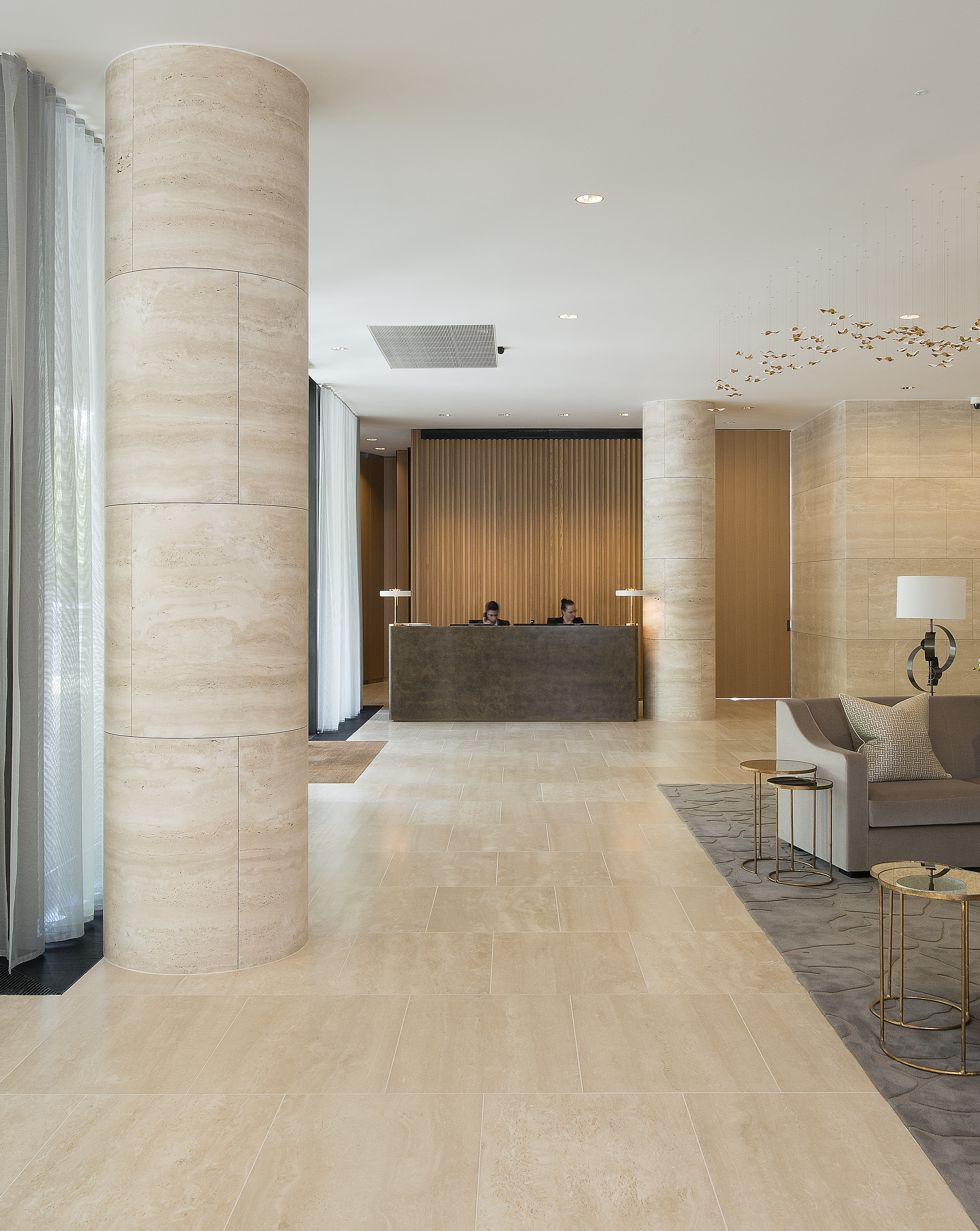
Trained as an architect, Joseph Dirand is an interior designer who draws his inspiration from modernist architecture. He tackles furniture as self-standing objects. Deprived of a given context of existence or preconceived environment, each design is given a strong personality and a solemn monumentality. Dirand’s pieces hold an aura similar to that of large architecture: an affective force generated by the tension of the materials, the physical presence, the narratives they embed.
Dirand works closely with the finest craftspeople, allowing for a wide versatility in the choices of material stone, copper, stone, precious woods, and bronze – all backed-up by the insistent excellency of their implementation.

10 Molesworth Street – Dublin

10 Molesworth Street

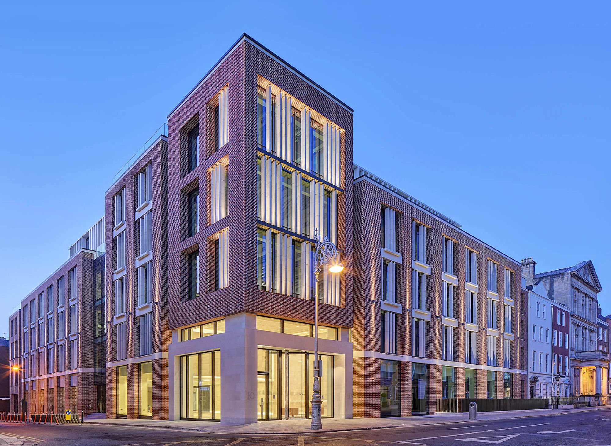
A subtle landmark office building in the heart of Dublin’s business and cultural life.

Architect:
Henry J. Lyons

Client:
IPUT

Location:
Dublin

Year:
2018

The quality of design is reflected in the combination of contemporary architecture with superior craftsmanship and meticulous attention to detail.

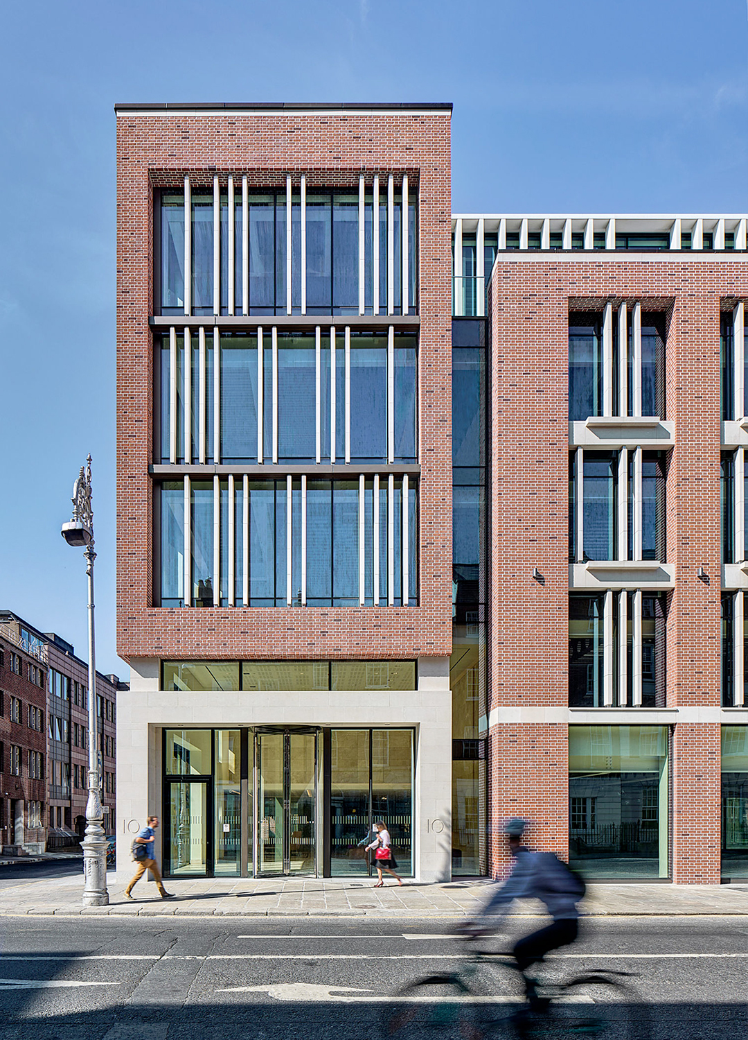
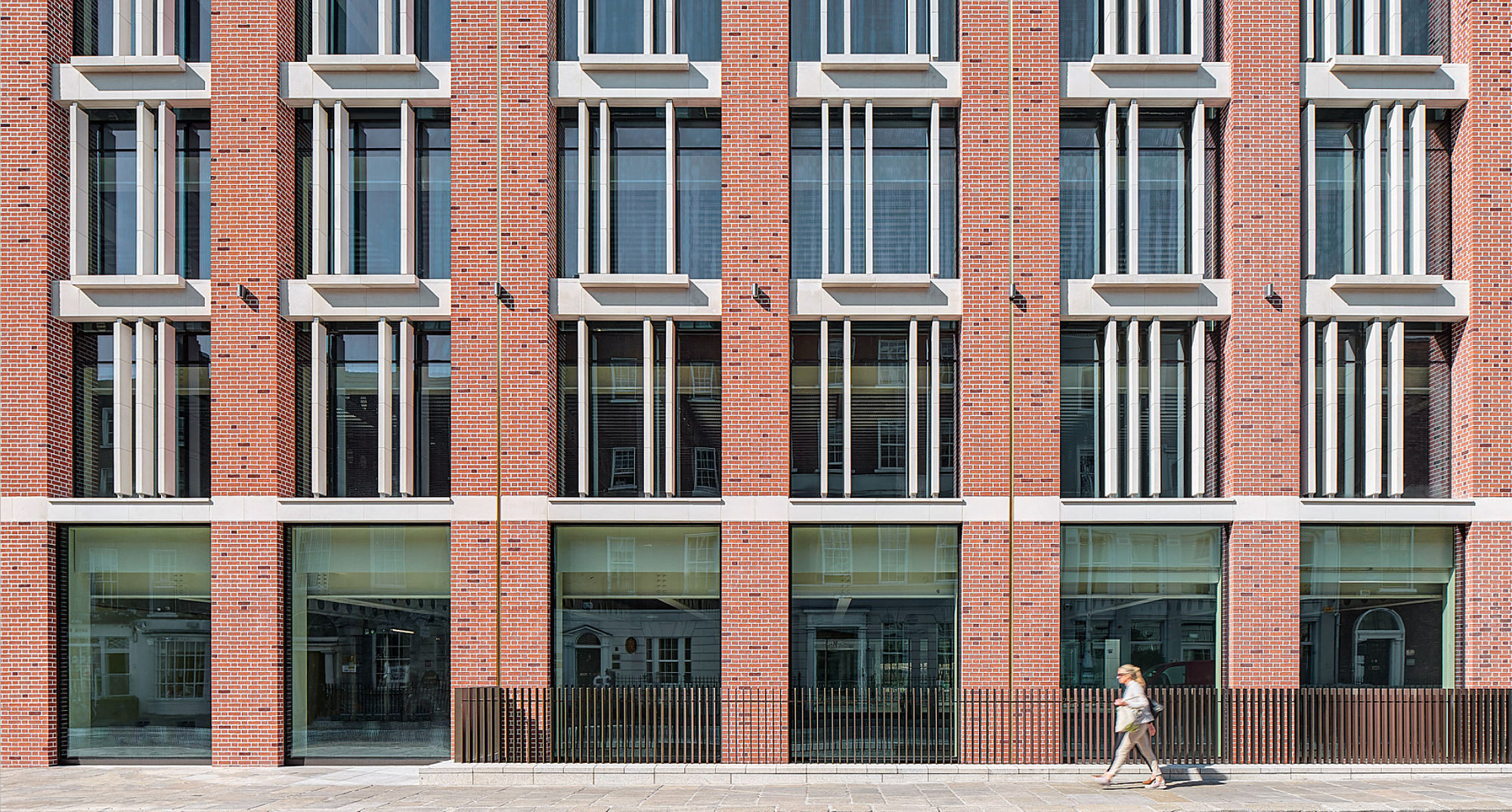
This Henry J. Lyons’ project for developer IPUT is a subtle landmark office building in the heart of Dublin’s business and cultural life. The design combines contemporary architecture with superior craftsmanship and meticulous attention to detail to produce a unique building finished to exceptionally high standards.

10 Molesworth Street is a sensitive and contemporary response to the remarkable streetscape in which it sits in the epicentre of Dublin’s Georgian and commercial core. Completed in 2018, this six-story above double-basement corner building adds a landmark office building with a heavily landscaped garden at its heart.

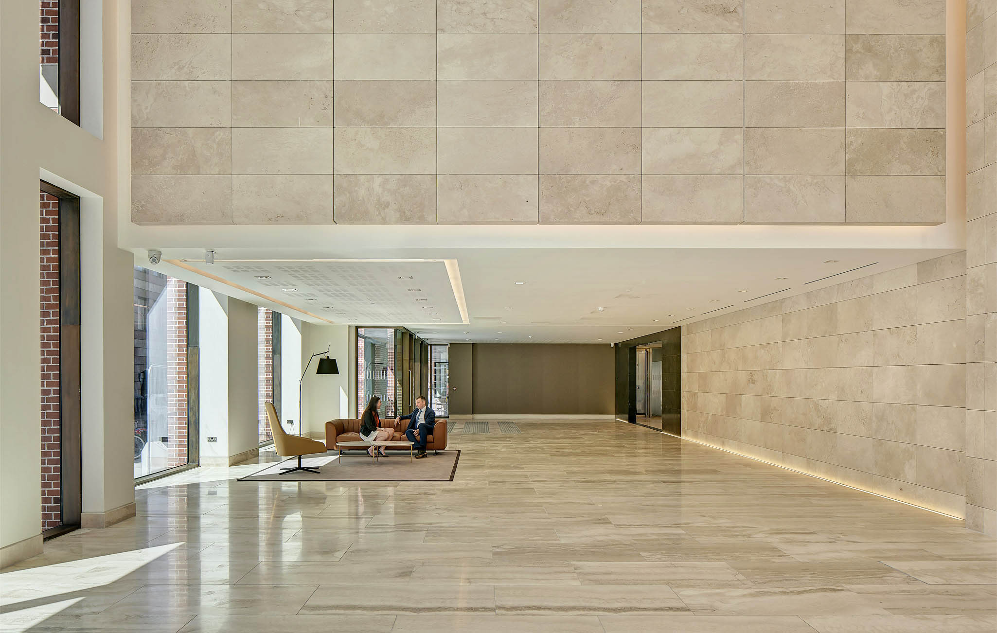
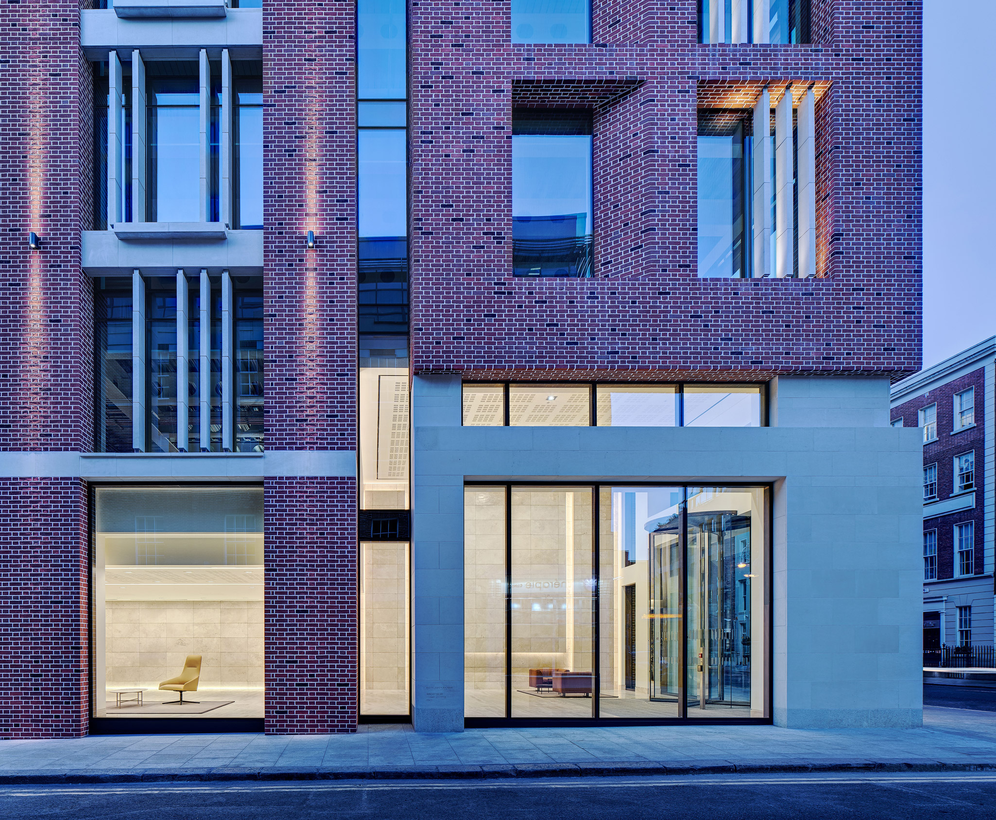
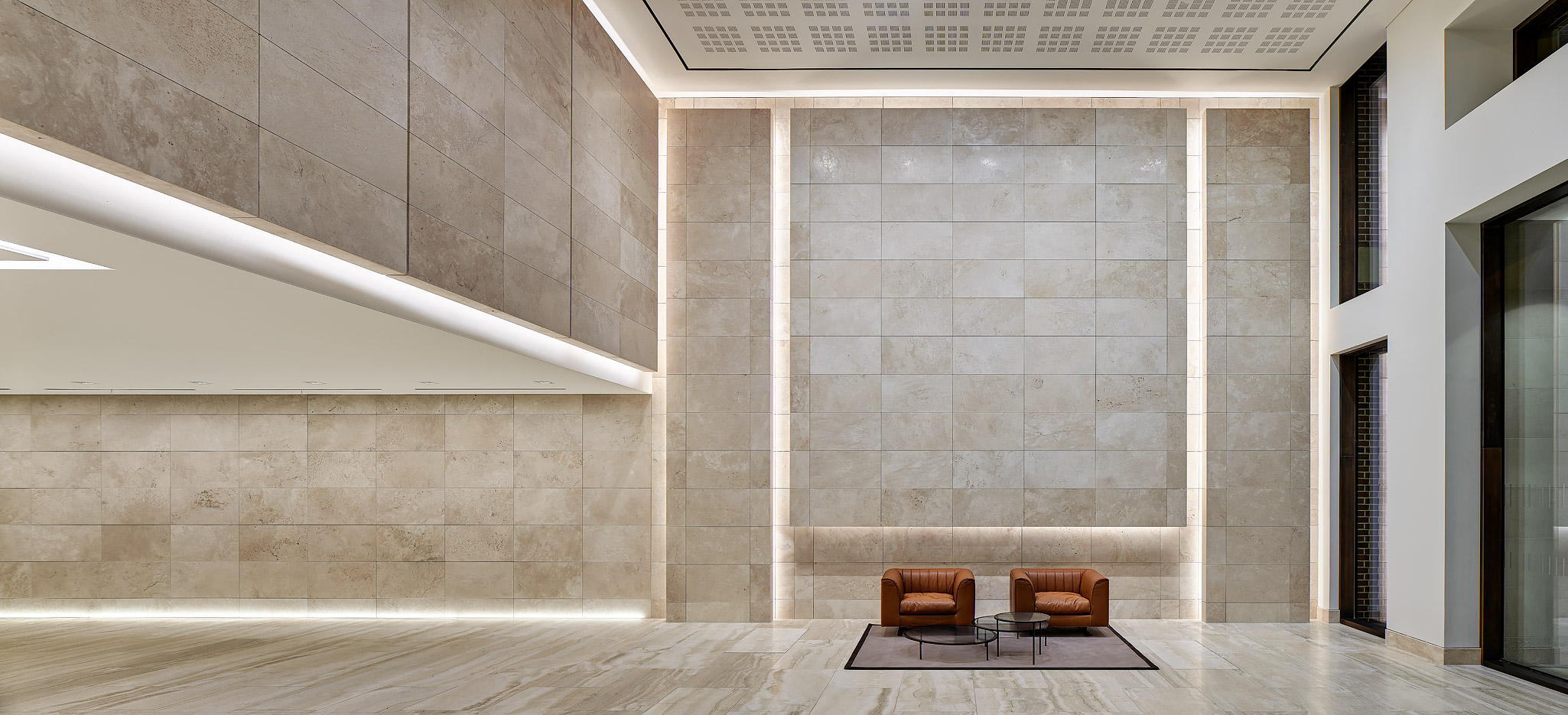
The site is located on the corner of Molesworth Street and South Frederick Street and forms part of the vista which terminates with Leinster House. The striking double height entrance is framed by full height, floor-to-ceiling windows and features a carefully composed texture of finely honed travertine pavements and cladding.

Highest environmental credentials.

10 Molesworth Street is the first new office building in Ireland to target LEED Platinum standard with BER A3 building energy rating. The emphasis on sustainability and energy efficiency in the design of the building, underwritten by LEED accreditation, ensures that building occupiers can minimize both operational costs and environmental impact.

Responding sensitively to the historic context.

The new building has been carefully composed to respond sensitively to the rhythm, texture and variety of the historic context. This new development has been designed to reflect its prestigious environment and the rich heritage of the surrounding area.

A natural advantage.

The L-shaped block is carved out in response to its immediate context and provides natural light to lower-level accommodation via lightwells and glazed atrium. At roof level, terraces provide generous roof gardens for occupants allowing panoramic views of the city. The private landscaped gardens and terraces provide a unique outdoor amenity with unrivalled views towards Leinster House, Government Buildings, the Mansion House and further around the city.

One Kensington Gardens – London

One Kensington Gardens

London’s most exclusive residential developments designed by David Chipperfield Architects and delivered by Sir Robert McAlpine.

Architect:
David Chipperfield Architects

Client:
De Vere Estates

Location:
London

Year:
2015

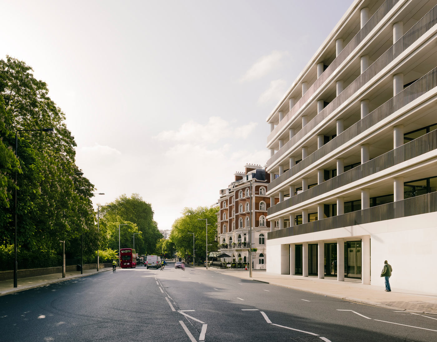
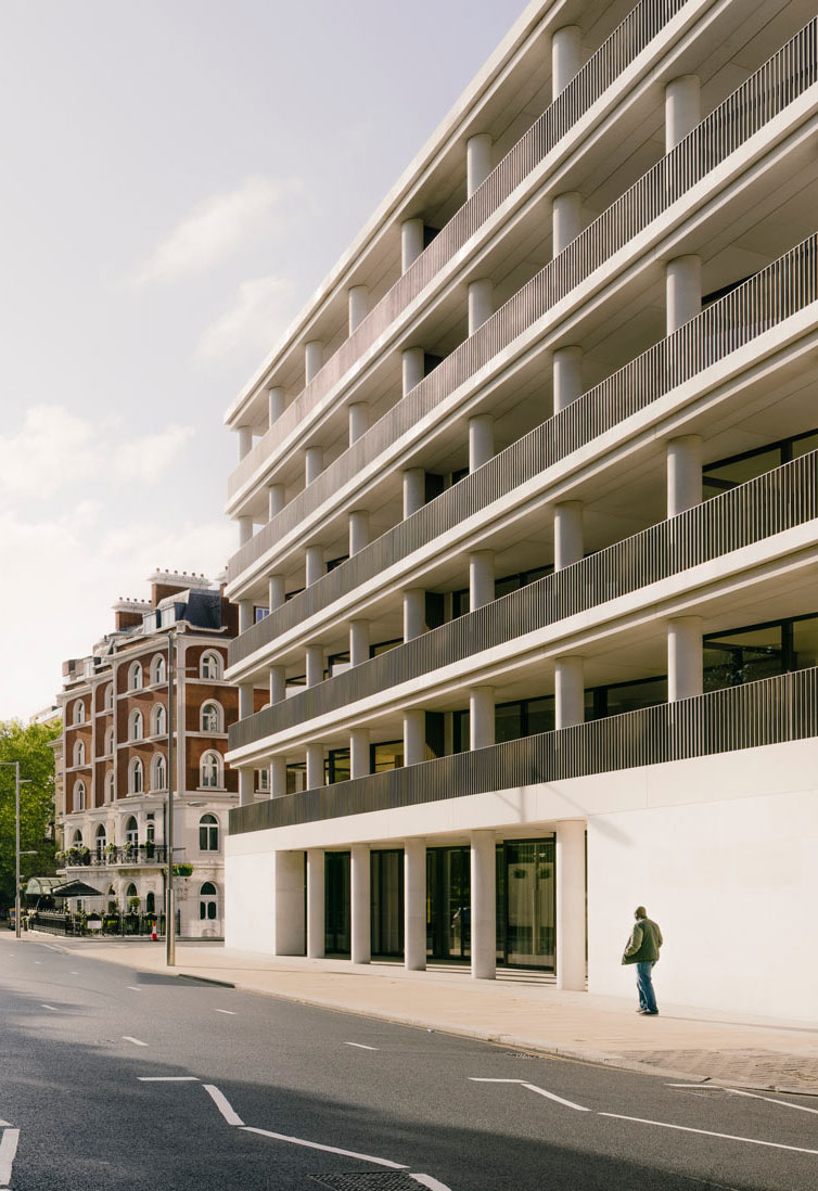
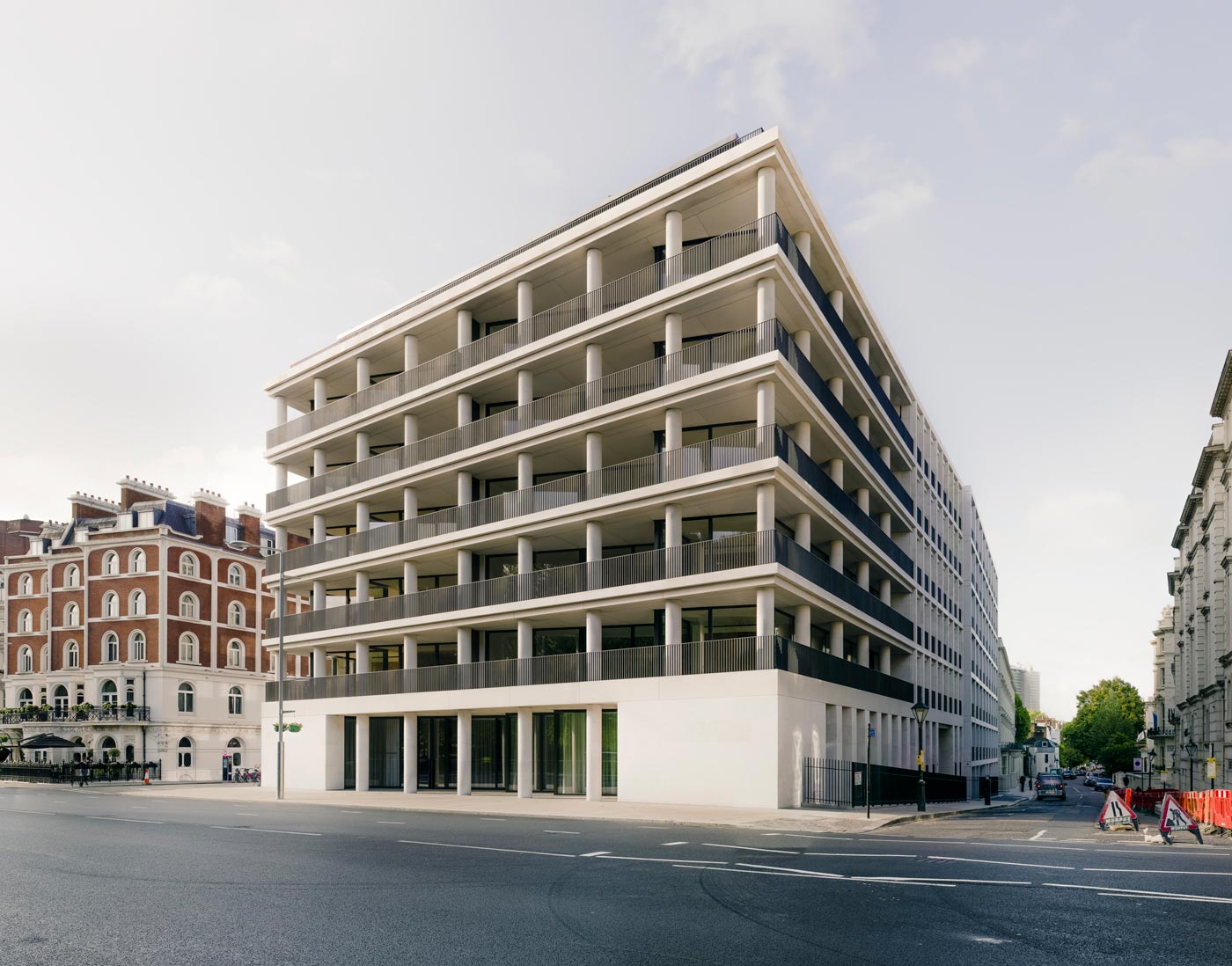
Bearing the unmistakable hallmark of David Chipperfield, One Kensington Gardens establishes itself as an exclusive residential area in the capital of London.

The One Kensington Gardens residential development in London is located on a prominent site facing Kensington Gardens, bounded by Victoria Road and De Vere Gardens. The project comprises 97 high-quality residential units and includes the internal reorganisation of the existing site and three new buildings facing Kensington Road, Victoria Road, and Canning Passage respectively. It also involves the reuse and incorporation of the nineteenth-century terraced house façades along Victoria Road and De Vere Gardens, which sit within the Royal Borough of Kensington and Chelsea’s De Vere Gardens Conservation Area.

A high-end apartment complex designed according to the minimalist tenets of pure and straight lines.

The project is a single development broken down into six buildings; three new buildings and three that include the re-use of the nineteenth-century façades. The new buildings follow the massing and heights of the original terrace. A grand open loggia wraps around the apartments facing Kensington Gardens. On either side of the loggia, the façades of the new buildings intensify in rhythm and architectural language as they approach the historic façades. Internally, a series of courtyards connected by a continuous passage link the various buildings. Whilst not publicly accessible, the courtyards provide the surrounding apartments with natural light and a visual connection to an internal garden.

An collection of 97 luxury apartments situated in the heart of London’s illustrious Royal Borough.

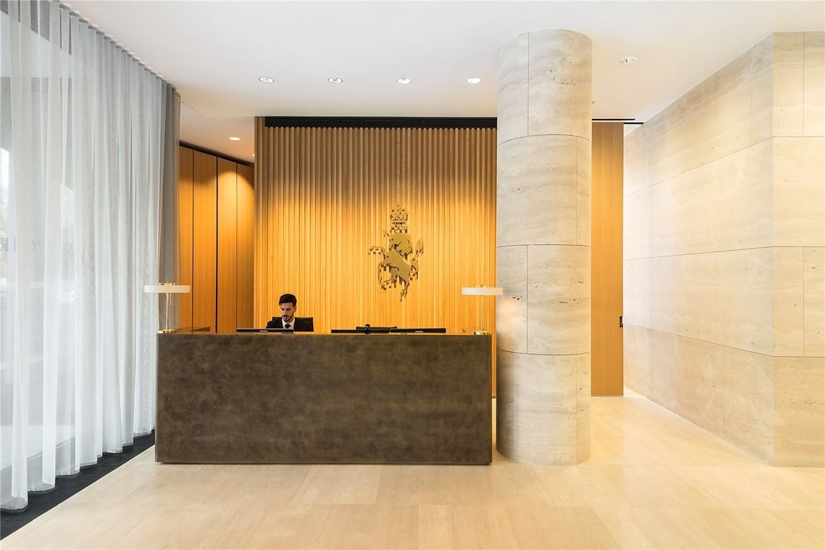
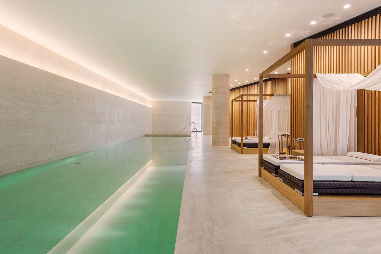
The apartments themselves vary in size, differentiated primarily through their position within the development – 29 of the apartments are within the three new buildings and 68 are located behind the retained façades. Residents benefit from a 24-hour dedicated concierge, valet parking, health spa, 25m indoor swimming pool, a private health and fitness centre, sauna and steam room, in addition to private treatment rooms.

House of the Infinite – Cadiz

House of the Infinite

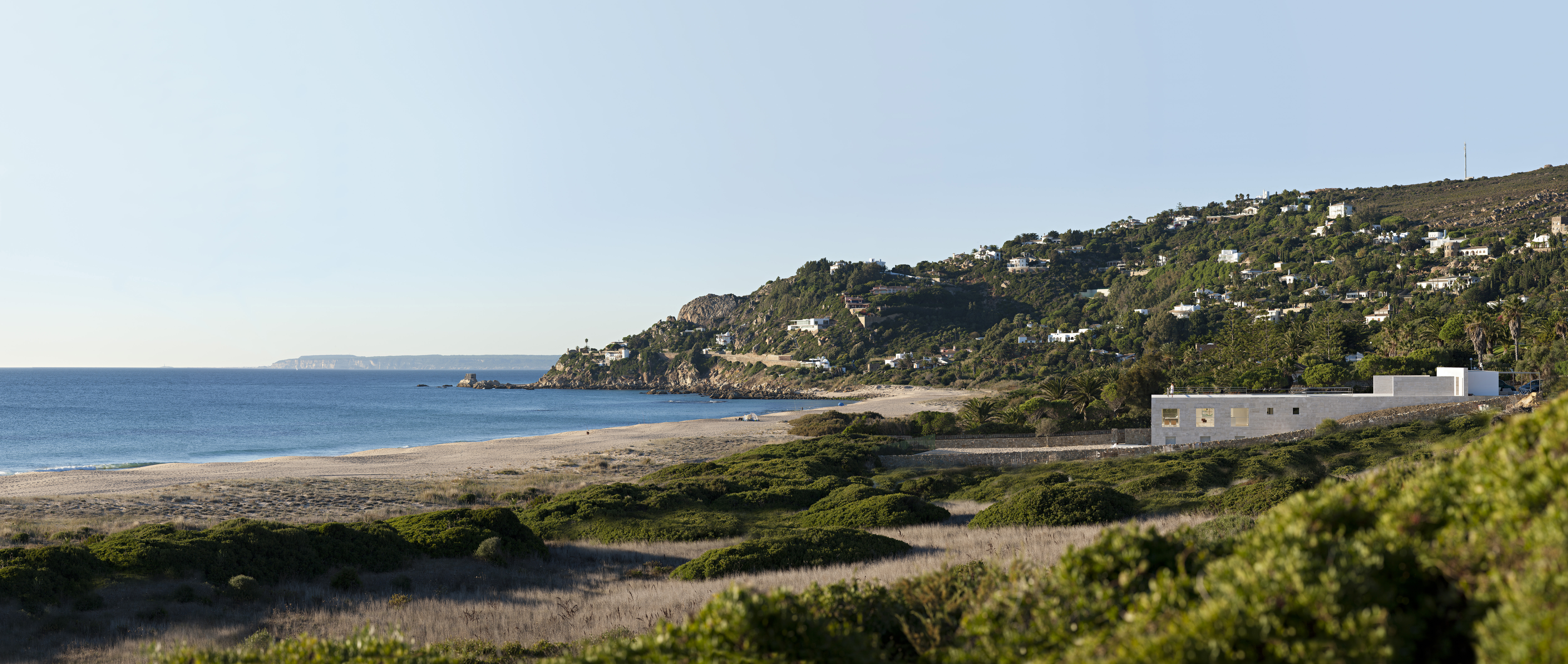
A house that emerges from the sand as a stone platform.

Architect:
Alberto Campo Baeza

Client:
Private

Location:
Cadiz

Year:
2014

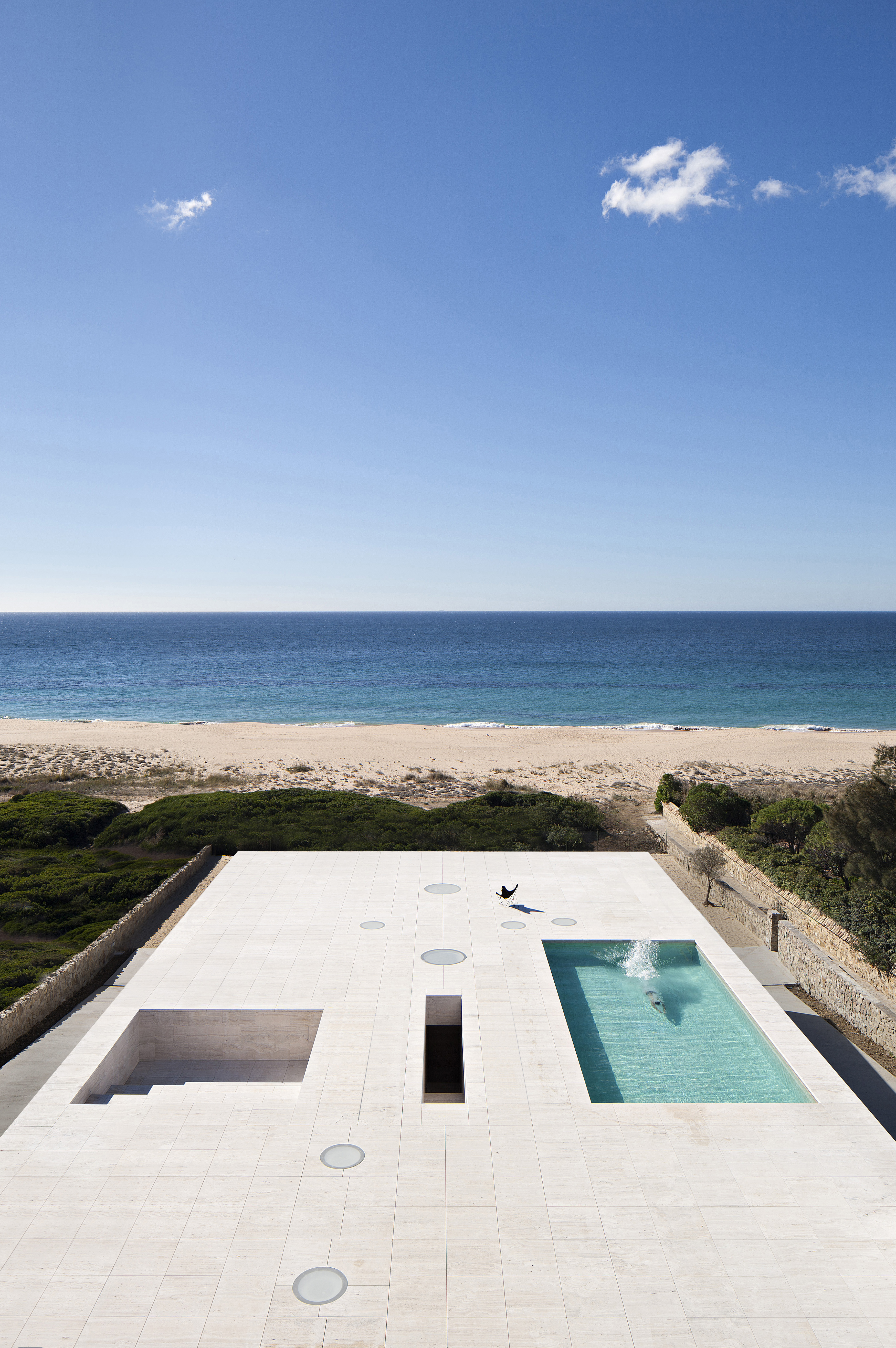
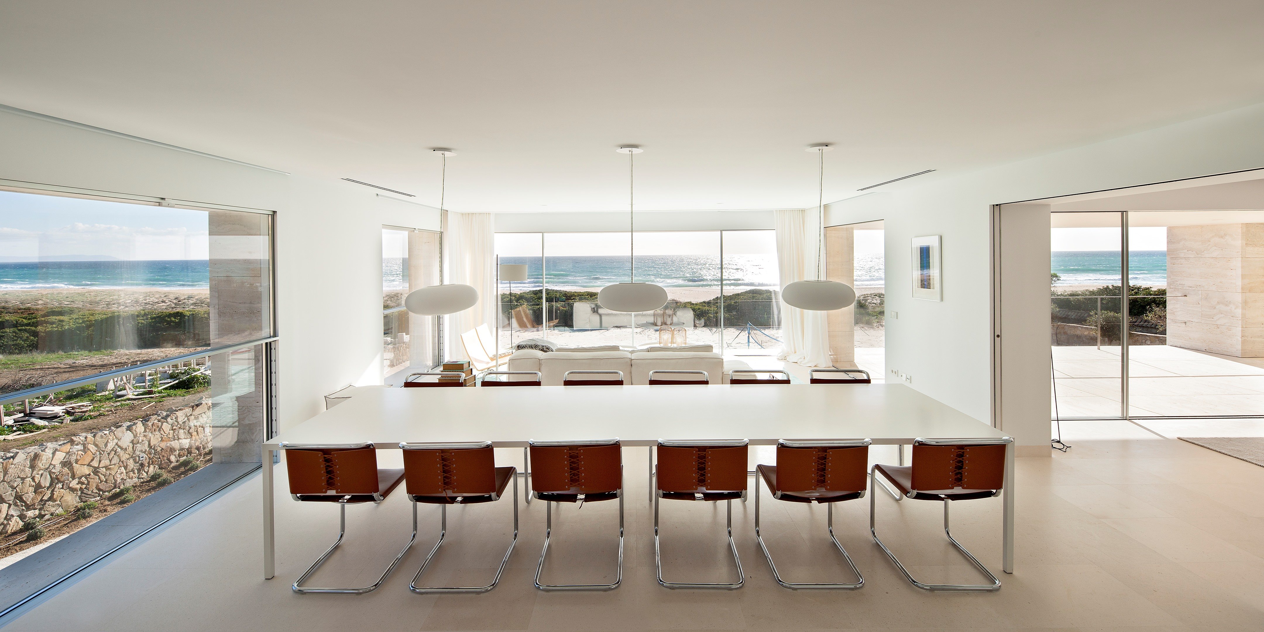
In Cádiz Alberto Campo Baeza have built an infinite plane facing the Atlantic Ocean.

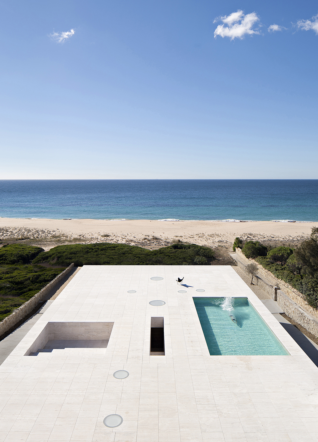
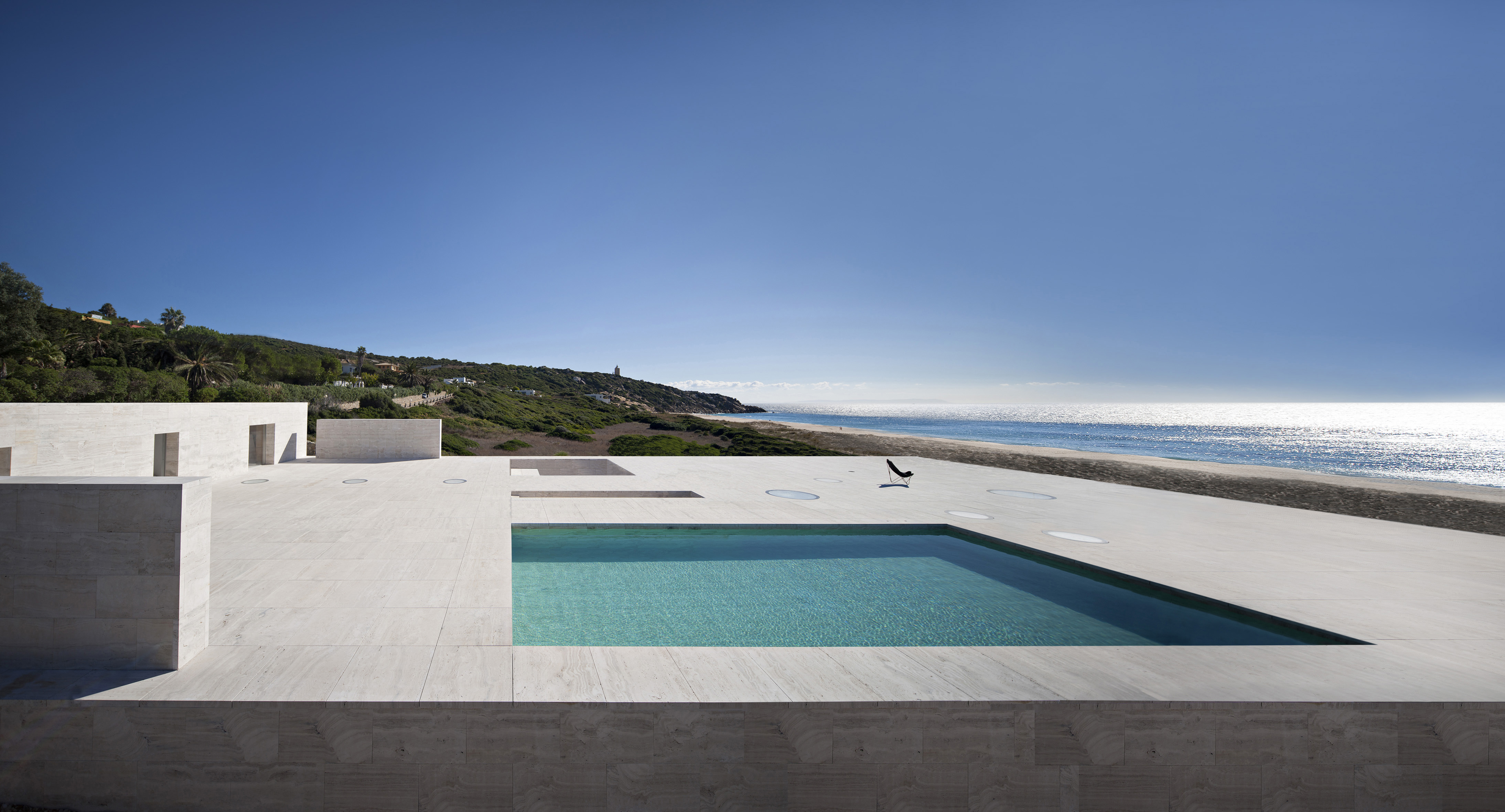
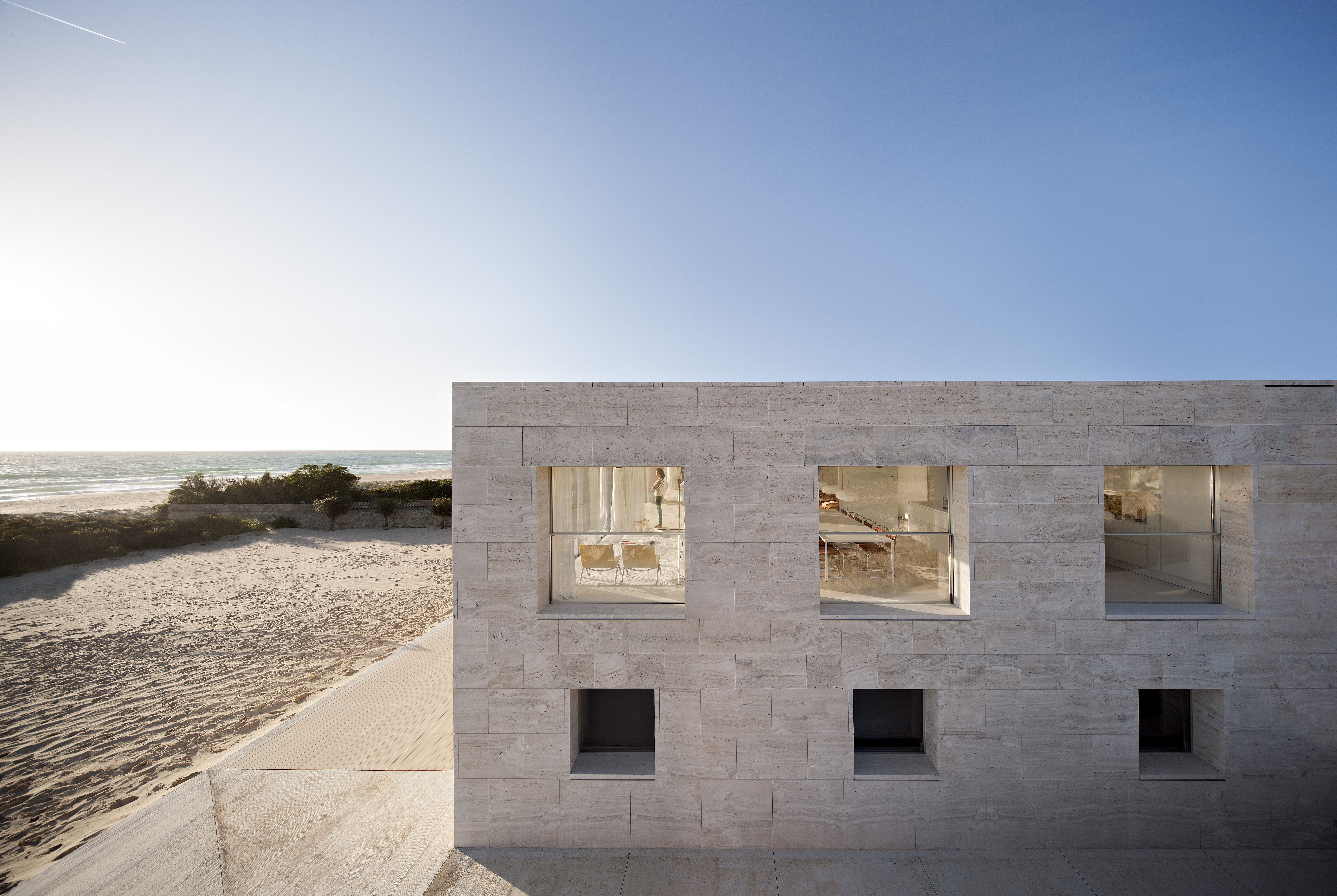
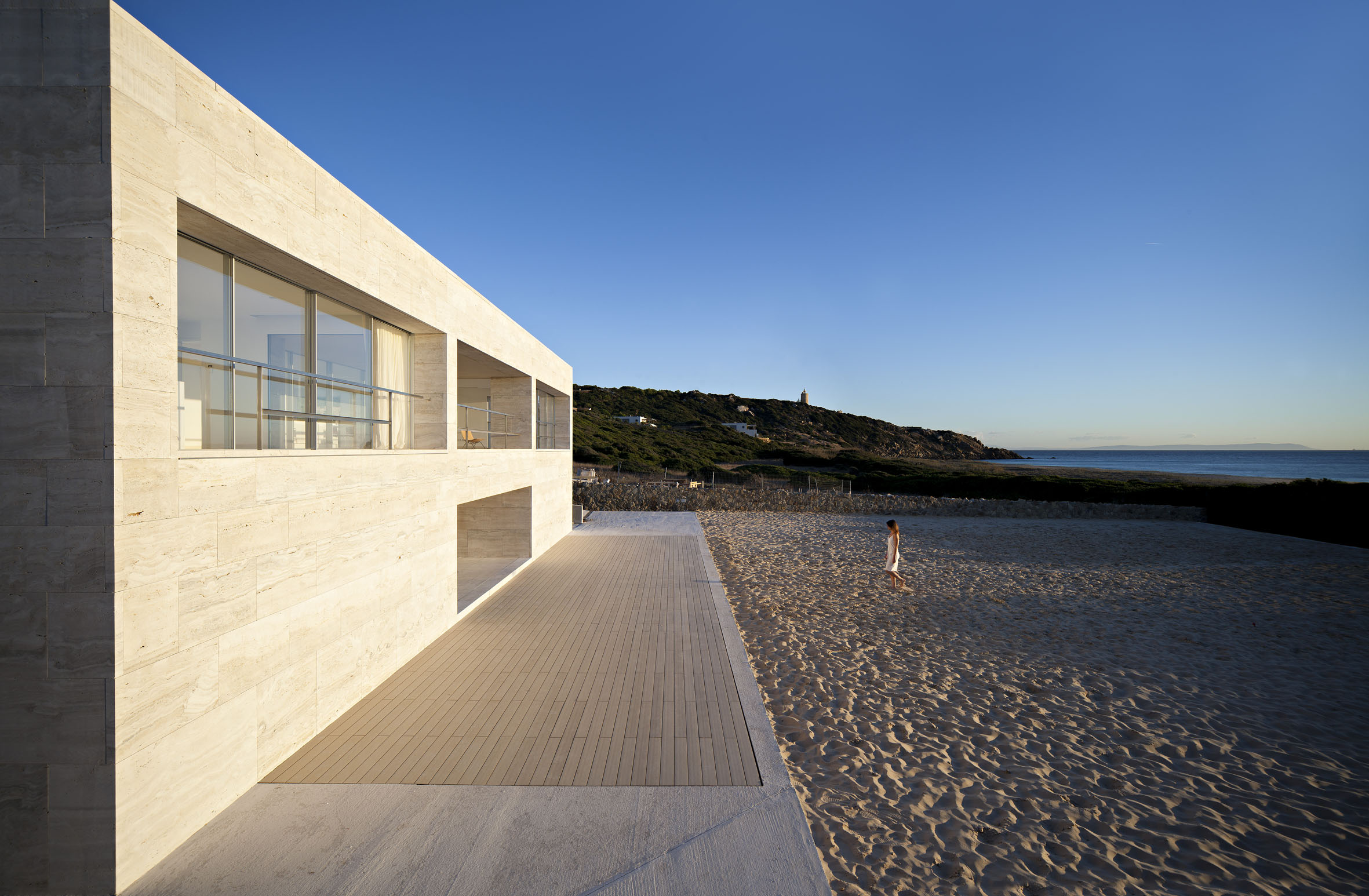
At the very edge of the waters of the Atlantic Ocean, where the sea unites the new and the old continent, emerges a stone platform built in Roman Travertine as if it were sand. To materialize this elevated plane, which is the main living room of the house, Alberto Campo Baeza built a large box with 20 meters of frontage and 36 meters deep. And under those first 12 meters he excavated two floors in the solid rock to develop the whole living space.

The platform is distinguished by the presence of a panoramic pool and several slits in the floor, which form skylights for the stairs below leading outside. Strong winds that rage on this stretch of land are contrasted by three imposing walls whose only purpose is to split the air flow and guarantee the right breeze for those enjoying the panorama from the terrace or diving into the pool.

Bolonia, the ruins of the fishing factories where the Romans produced garum and built temples to their gods a handful of centuries ago, is just a stone’s throw away. In their honour Alberto Campo Baeza have built the House of the Infinite, an infinite plane facing the infinite sea.

A wonderful travertine altar that owes much to Rembrandt and Curzio Malaparte’s house on Capri.

The name Cadiz comes from Gadir, the Arabic word for fortress. Its port, which dates back to Phoenician times, long before Christopher Columbus and Amerigo Vespucci came along, is the point where the Mediterranean Sea and the Atlantic Ocean meet, and as such is a place of great symbolic significance.

The house was built on the beach and stretches out towards the sea like a podium. The inspiration, Campo Baeza explains, came from a 1655 etching by Rembrandt entitled Christ Presented Before the People, the architect was fascinated by the clean horizontal line running through the centre of the scene. But this villa also shows the influence of Curzio Malaparte’s legendary villa in Capri, designed by Adalberto Libera in dialogue with the writer. The design project took its cue from these two references.

A place of worship to which the gods descend to interact with people.

The aim was to create a timeless place in which to escape from the world and contemplate the sea. Or rather,
to create something the Greeks called temenos (τεμενος), Campo Baeza adds, a place of worship “to which the gods descend to interact with people”.

There is something classical – a reminder of Roman times – about the way in which the rooms of the house are laid out and communicate with one another. And this is perhaps no coincidence, considering that for a long period the Andalusian port was a “sentinel” of the Roman Empire.

New Court Rothschild Bank – London

New Court Rothschild Bank

New Court, Rothschild London HQ, by OMA.

Architect:
Ellen van Loon, Rem Koolhaas, OMA

Client:
Rothschild Bank

Location:
London

Year:
2011

OMA’s new home for Rothschild is the most exciting addition to the ‘City-scape’ in years.

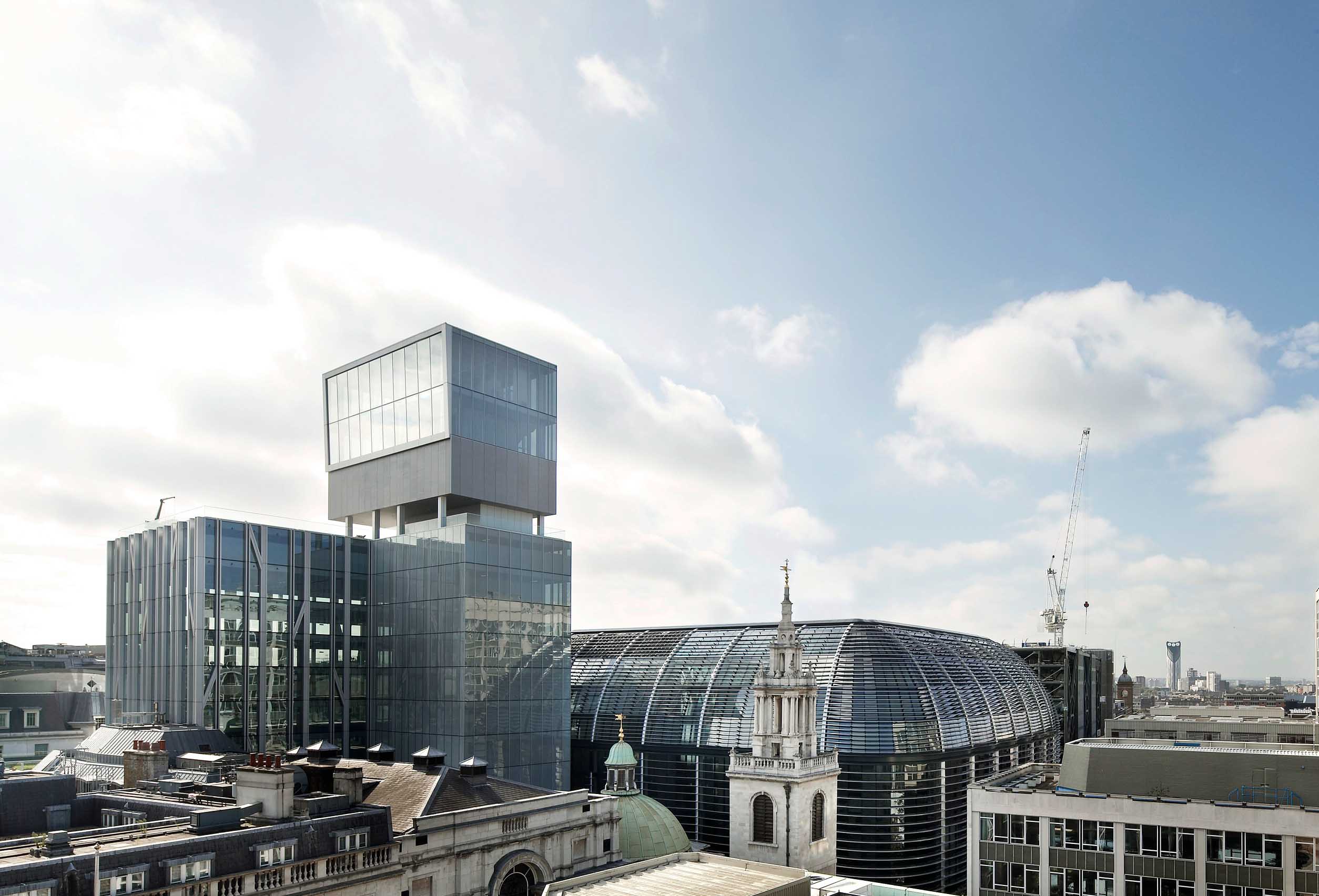
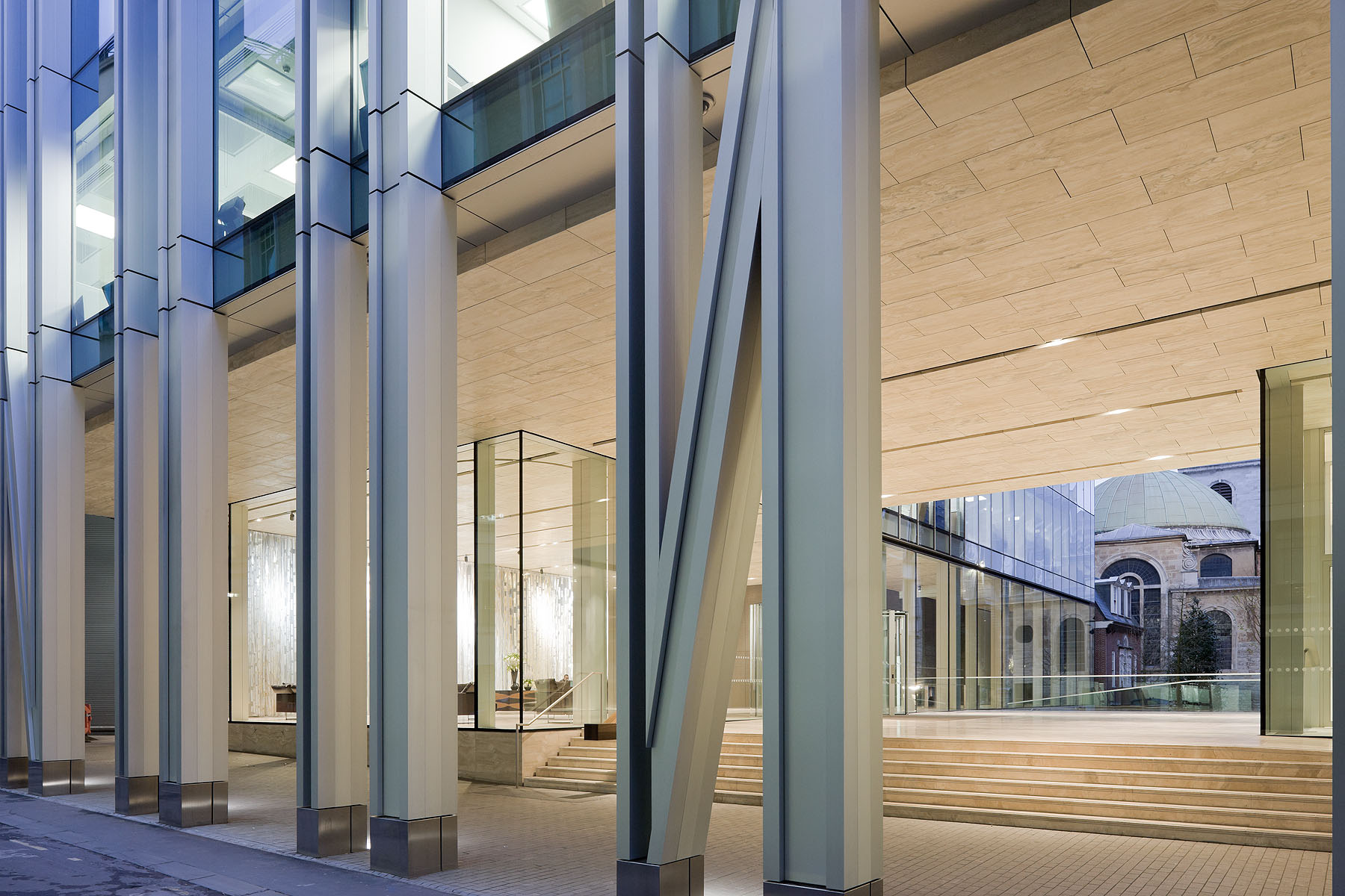
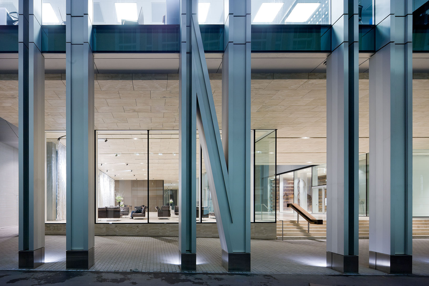
OMA’s design for New Court is the fourth iteration of Rothschild’s London headquarters, all of them built on the increasingly dense and architecturally rich site on St. Swithin’s Lane, a narrow medieval alley in the heart of the City. The building offers the opportunity to reinstate a visual connection between St. Swithin’s Lane and St. Stephen’s Walbrook. Instead of competing as accidental neighbours, the church and New Court forms a twinned urban ensemble, an affinity reinforced by the proportional similarity of their towers.

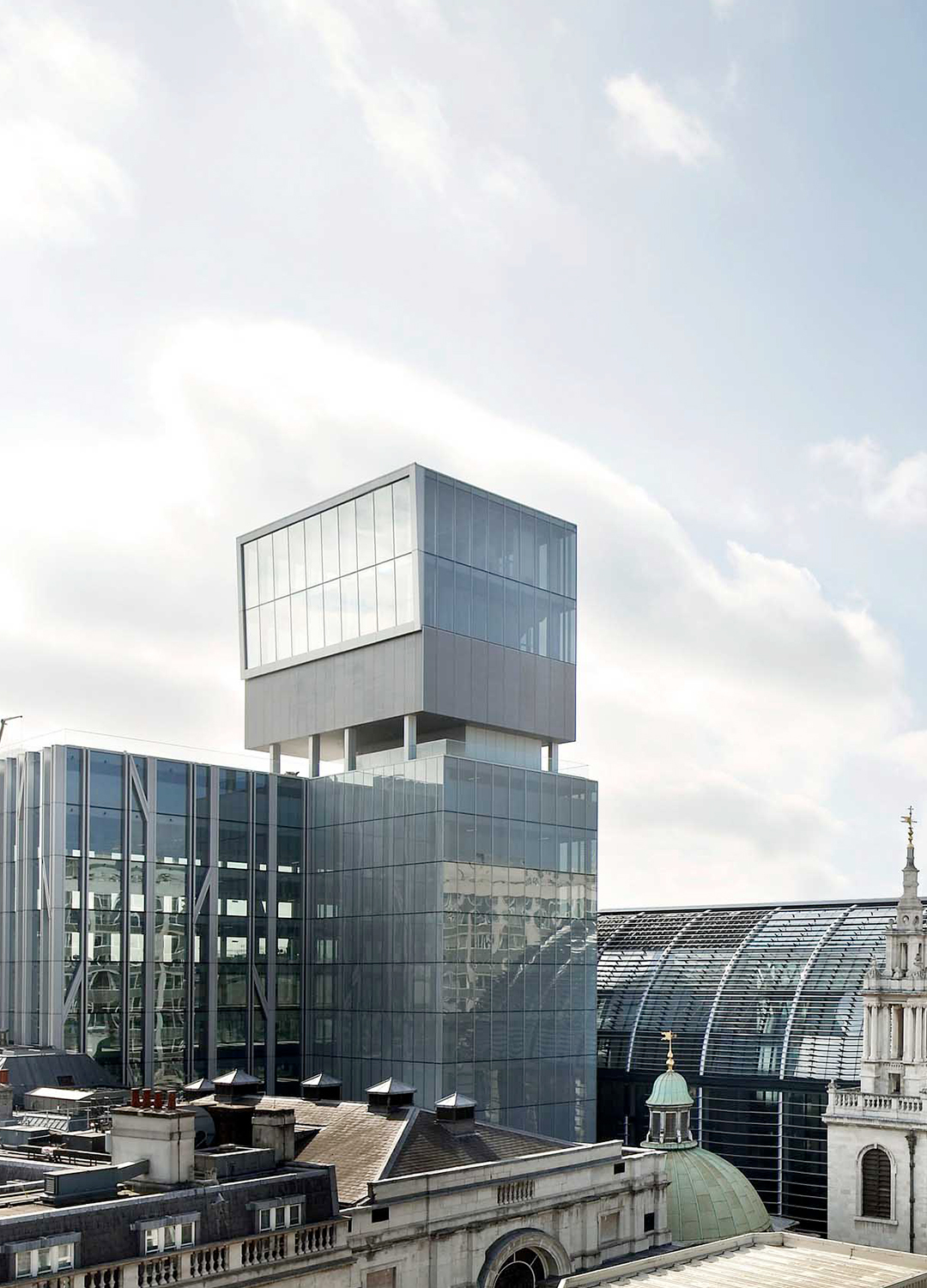
New Court is made up of a central cube of ten efficient and flexible open-plan office floors – which facilitate views over St. Stephen’s and the surrounding City – linked to four adjoining annexes, with meeting rooms, enclosed offices, vertical circulation, reception areas, and a staff cafe and gym. The top of this central cube features a landscaped roof garden with outdoor meeting areas. This in turn is overlooked by an adjacent Sky Pavilion – a small tower with three double-height storeys peering out over the city – which houses meeting and dining rooms and a multifunctional panorama room with extraordinary and unfamiliar views across the City, including St. Paul’s Cathedral.

The new building unites all of Rothschild’s London staff in one location for the first time in decades. A reading room and space for displaying the family’s archive ground the new building in the bank’s illustrious history. Through the reconnection of two precious open spaces in the City – the courtyard of New Court and the churchyard of St. Stephen’s Walbrook – the new New Court promises to transform St. Swithin’s Lane.

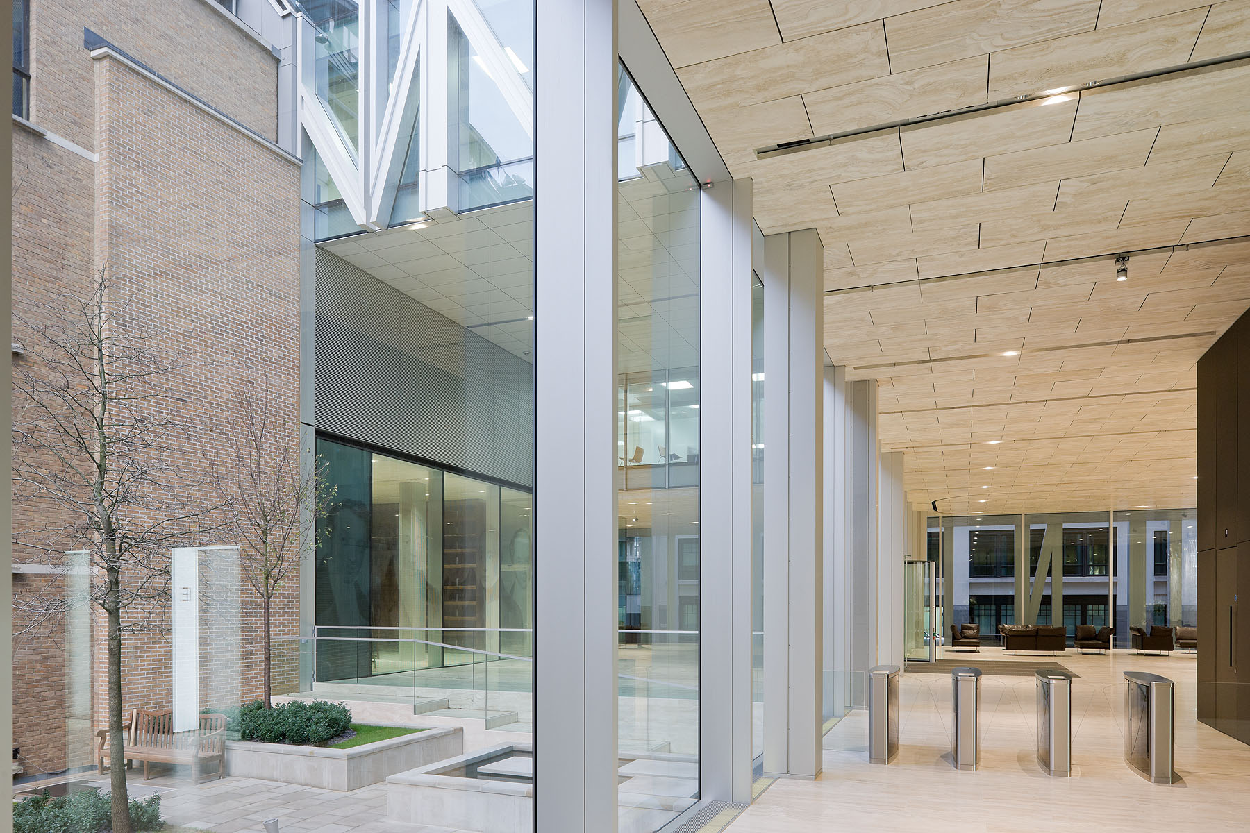
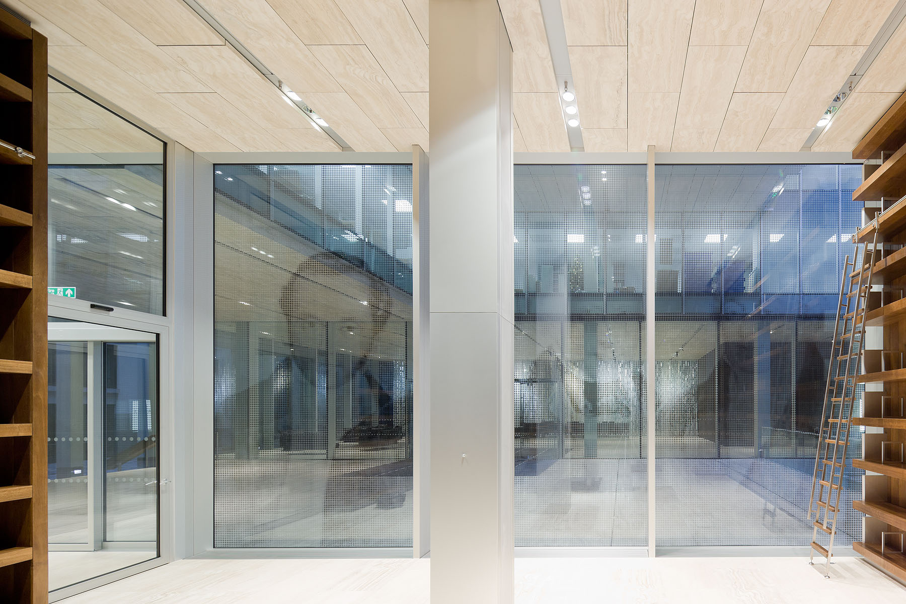
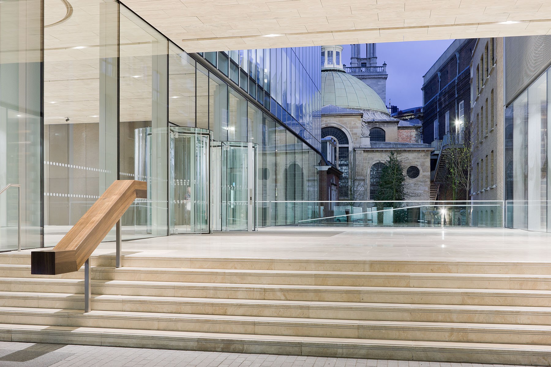
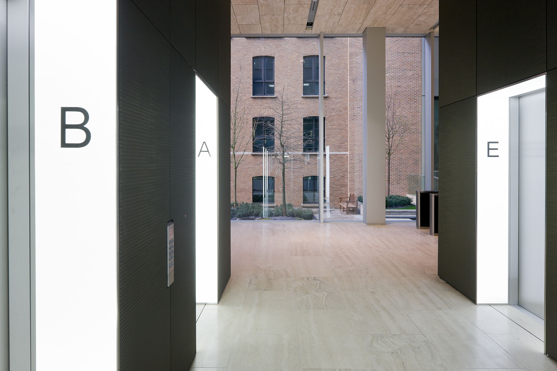
The travertine of the courtyard extends inside the glazed reception area and creates a vertiginous blurring of up and down.

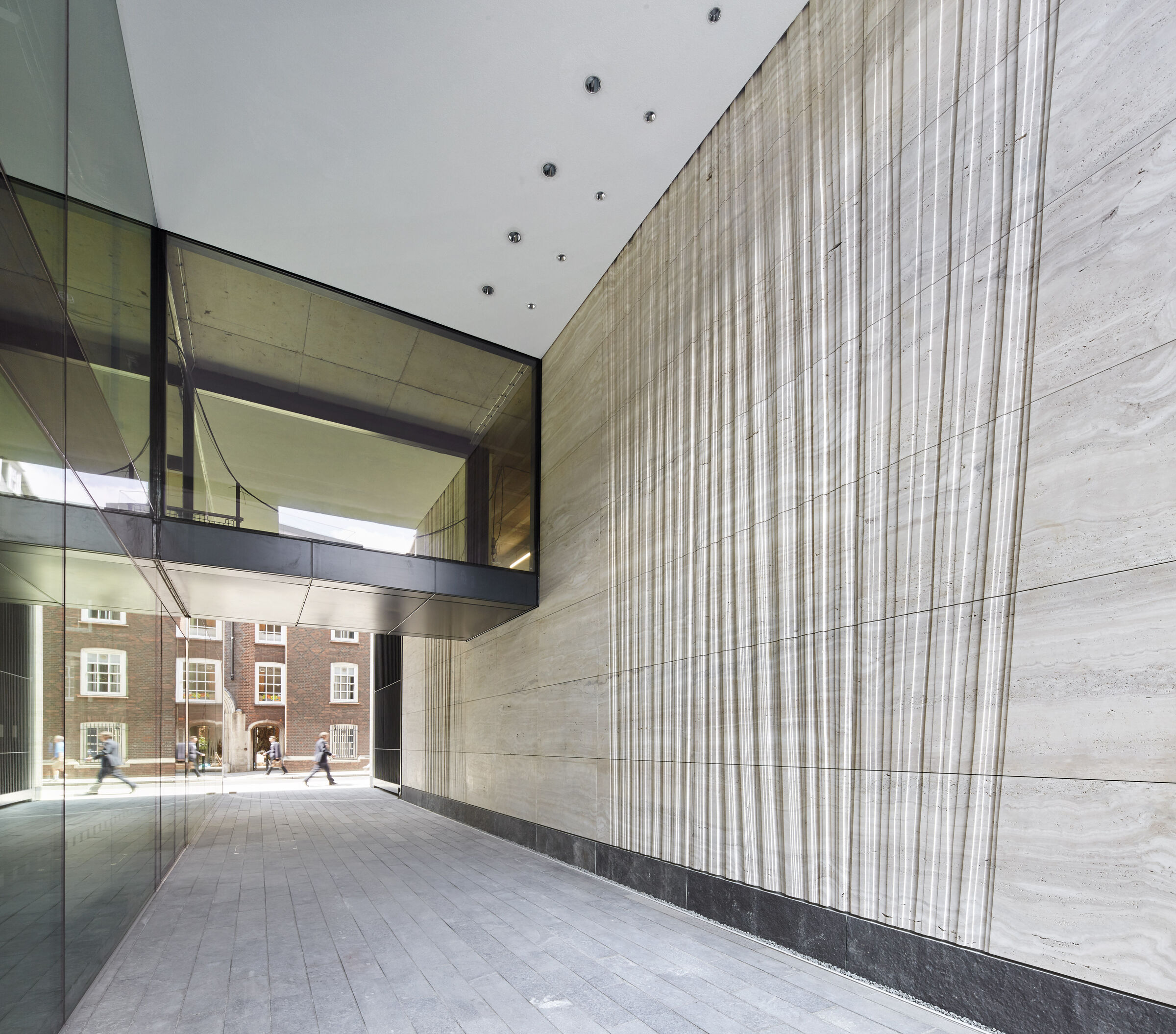
At street level, the entire cube is lifted to create generous pedestrian access to the tall glass lobby and a covered forecourt that opens a visual passage to St. Stephen’s Walbrook and its churchyard – creating a surprising moment of transparency in the otherwise constrained opacity of the medieval streetscape. The travertine floor and the travertine suspended ceiling of the courtyard extend inside the glazed reception area creating an impressive mirroring effect.

The OMA-designed HQ for the Rothschild Bank is one of the six buildings shortlisted for the 2012 Stirling Prize

The shortlist for the prestigious 2012 RIBA Stirling Prize celebrates the best of new British architecture. The shortlist features six exceptional and completely different buildings from across the country which will now go head to head for architecture’s highest accolade and a £20,000 prize from the Royal Institute of British Architects (RIBA).

The seemingly simple yet highly innovative London Olympic Stadium, the thoughtful and intimate Maggie’s Cancer Centre in Glasgow, the stunningly original Hepworth Wakefield gallery in Yorkshire, the beautifully detailed and rule-breaking Sainsbury Laboratory for plant science in Cambridge, the New Court Rothschild Bank in London that rises high whilst opening new views at street level, and the crafted and careful reincarnation of the Lyric Theatre on a small suburban site in Belfast are all in the running for the 2012 RIBA Stirling Prize.

40 Chancery Lane – London

40 Chancery Lane

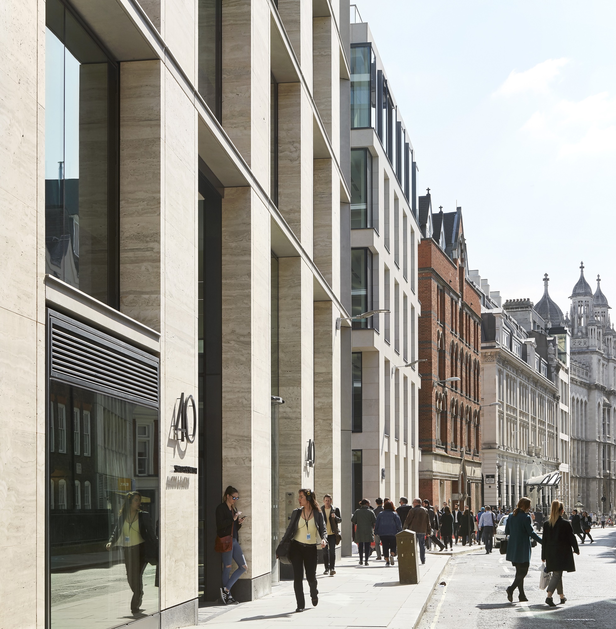
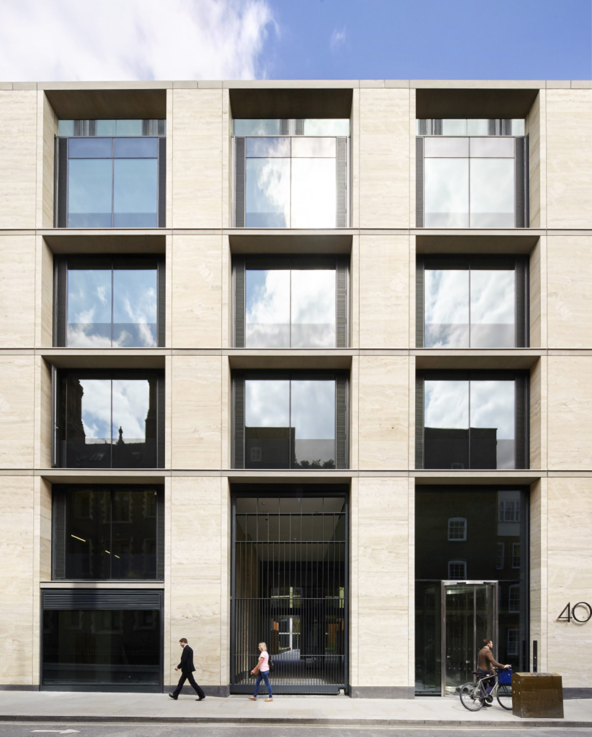
An elegant Travertine-clad complex of connected office blocks.

Architect:
Bennetts Associates

Client:
Derwent London

Location:
London

Year:
2015

A welcome landscaped space in a dense urban location.

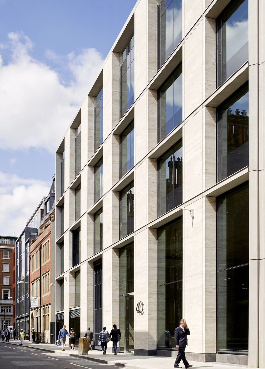
This project for developer Derwent London – an elegant Travertine-clad complex of connected office blocks – draws on the urban character of the local area and retains an existing 19th Century building on Took’s Court. The 40 Chancery Lane building is located in the City of London’s ‘midtown’, on a large corner site close to Chancery Lane station. Several existing, dilapidated structures were replaced with a ‘U’-shaped series of connected office blocks, surrounding a rear courtyard.

The Bennetts Associates’ design creates a mix of new office and retail space in the City. The historic street pattern of narrow passages leading to open spaces and courts is reinforced by a landscaped courtyard with a gated entrance off Chancery Lane. Located on a prominent corner site within the Chancery Lane Conservation Area, the scheme has been designed to respect adjacent listed buildings and to acknowledge surrounding scale, materiality and key views.

40 Chancery Lane will be the new London home for globally renowned advertising agency Saatchi & Saatchi, which is part of the Publicis Groupe. Working closely with Saatchi & Saatchi, Jump Studios has taken the 100,000 sq. ft, seven storey blank canvas provided by this Bennetts Associates’ designed and created a bespoke and welcoming workspace that evokes the spirit of Saatchi & Saatchi as soon you enter the building.

It set challenging targets for sustainability.

This is an extremely well-considered and resolved development, responding and exploiting the complex nature of the mix of uses: the brief, the courtyard space, and the retained building; while, at the same time, realising an elegant design and a sustainable energy solution.

The Category A design provides high-quality, flexible office space and achieved a BREEAM Offices 2008 rating of ‘Excellent’. It set challenging targets for sustainability, with innovative passive plasterboard chilled ceilings, exposed thermal mass and opening windows, to achieve significant carbon reductions compared with a more typical speculative office development.

40 Chancery Lane wins RIBA London and RIBA National awards 2017.

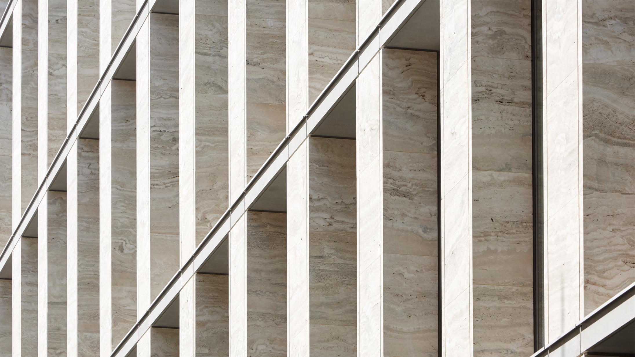
The jury admired the elegant travertine-clad façade and appreciated the way the scale reduced on Cursitor Street. The innate variation in any natural material and the need for relative consistency, both visually and in terms of technical performance, meant that managing the stone was extremely important. This was achieved by several visits to both quarry and stone processing works over the course of the project.