Broadgate Circle – London

Broadgate Circle

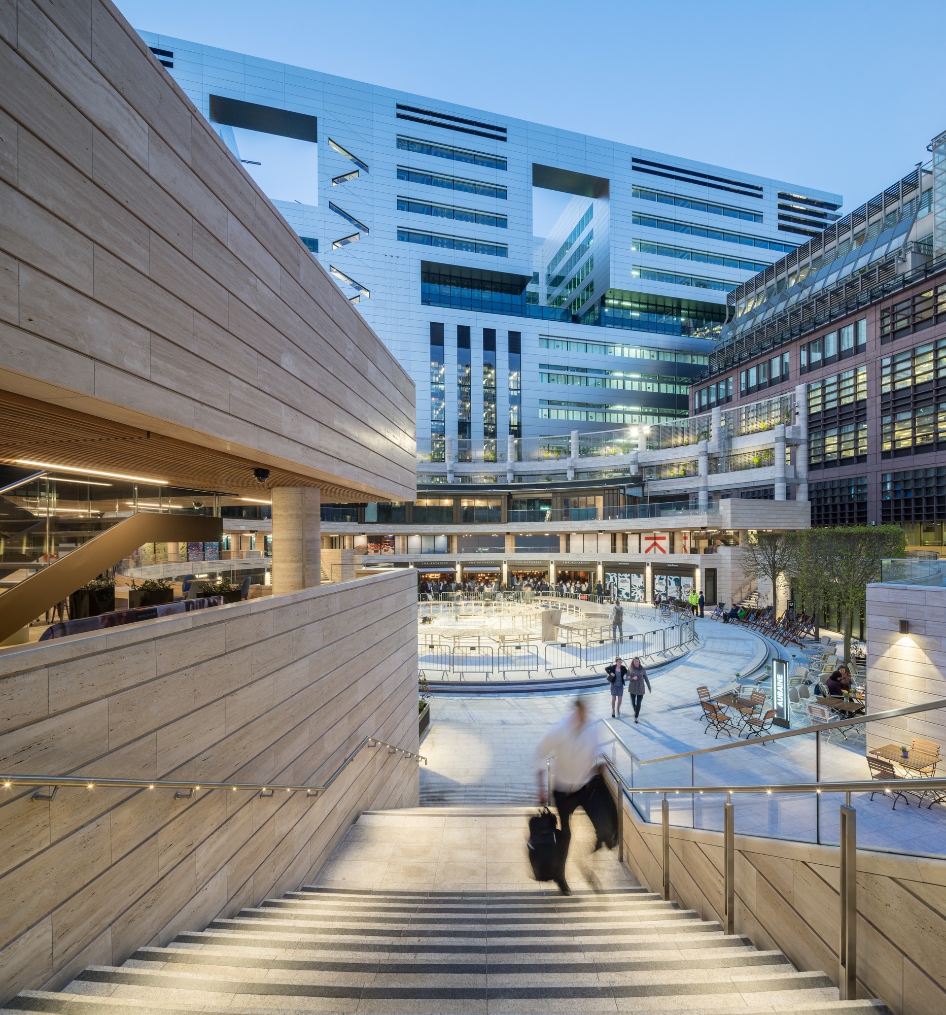
Broadgate Circle has been transformed into the most vibrant and iconic open space in the City of London.

Architect:
Arup Associates

Client:
British Land Company PLC

Location:
London

Year:
2015

The Circle is the Jewel in the Crown of the City of London.

Arup’s historic involvement in Broadgate, which began with the design of the original campus buildings in 1985, continues with the recent Broadgate Circle redesign, bringing it back to life as the most vibrant and iconic open space in the City of London. The Circle has been transformed into a new civic hub at the heart of the Broadgate Estate. The changes dramatically improve and enrich the retail, civic and social amenity at Broadgate, whilst enhancing the original qualities of the Circle.

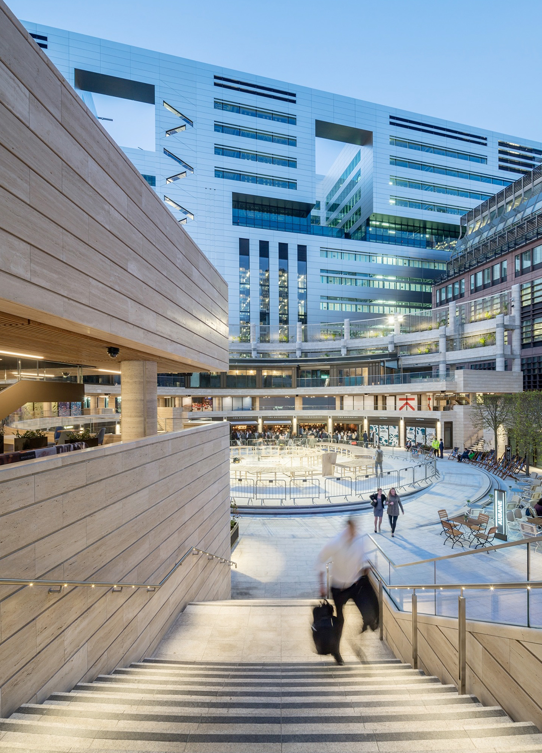
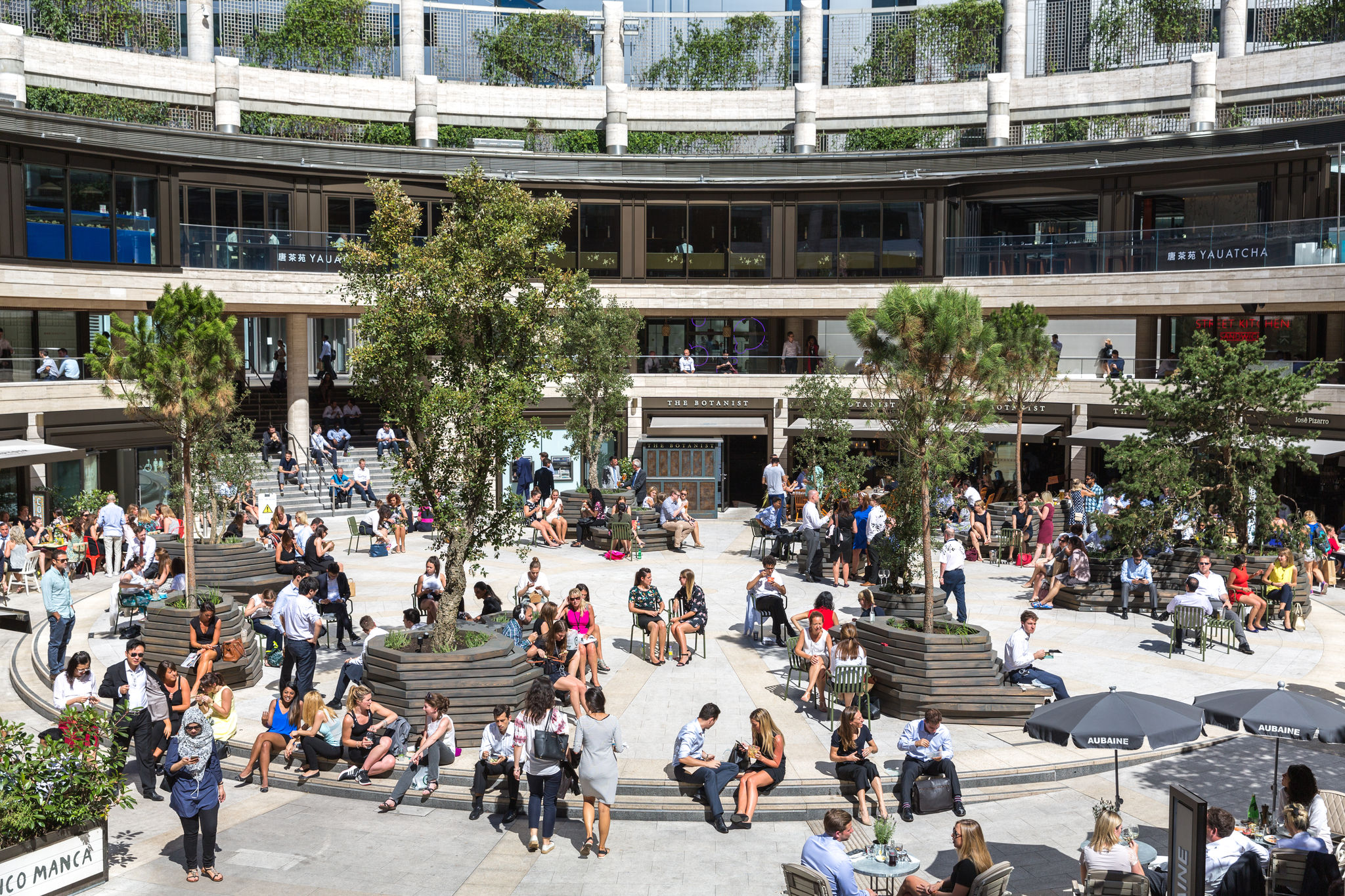
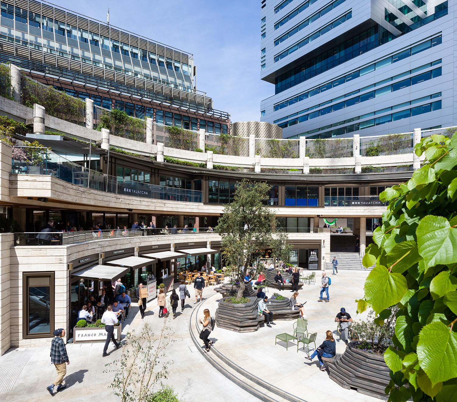
The Broadgate Estate is located in the north east corner of the City of London. This frenetic and active environment is complemented by the regenerated Circle which is now a bustling place for people gathering and social interaction. The project integrates multiple functions including civic space, performance and events space, restaurants, cafes and bars all united by clear and direct circulation routes.

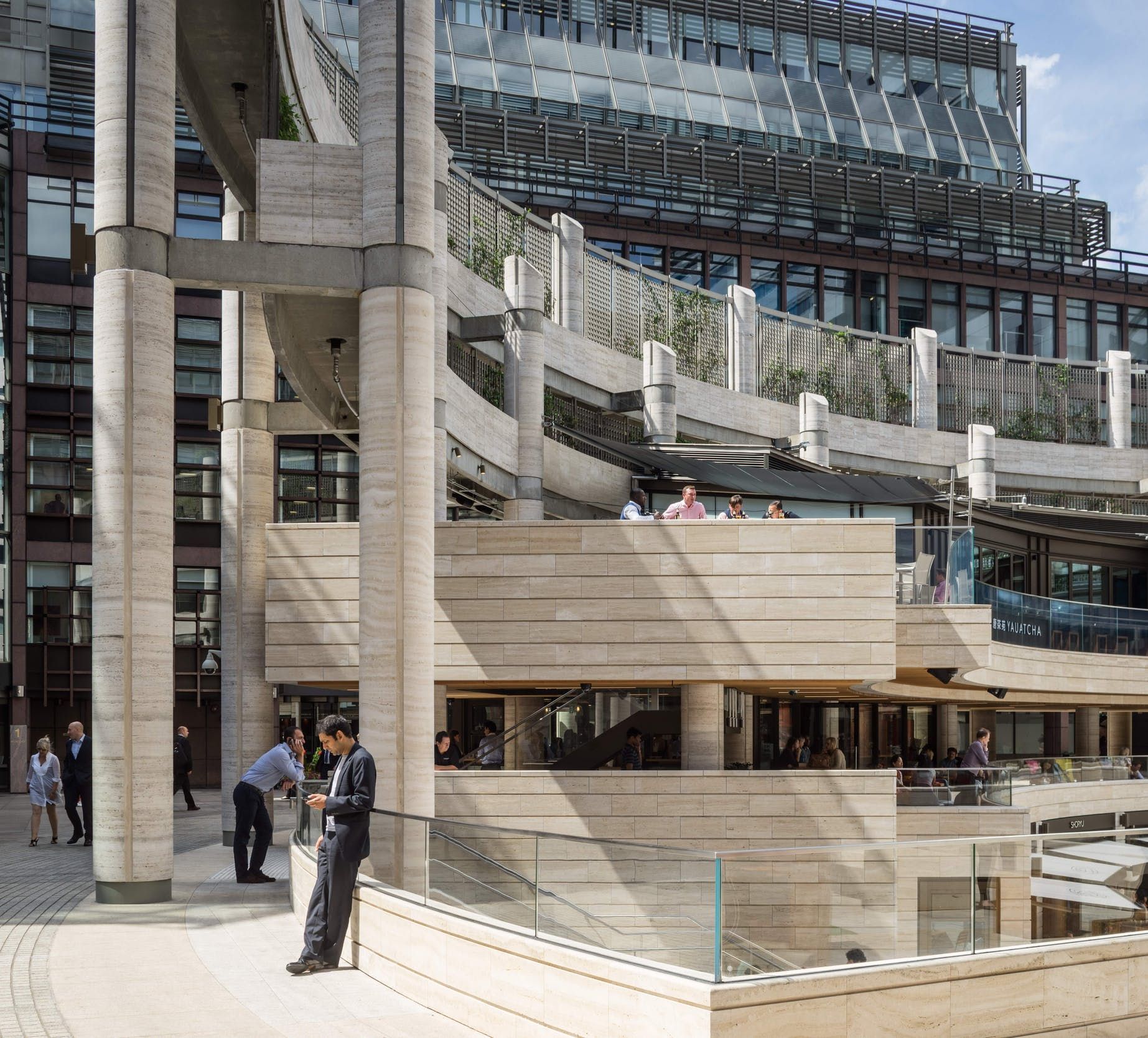
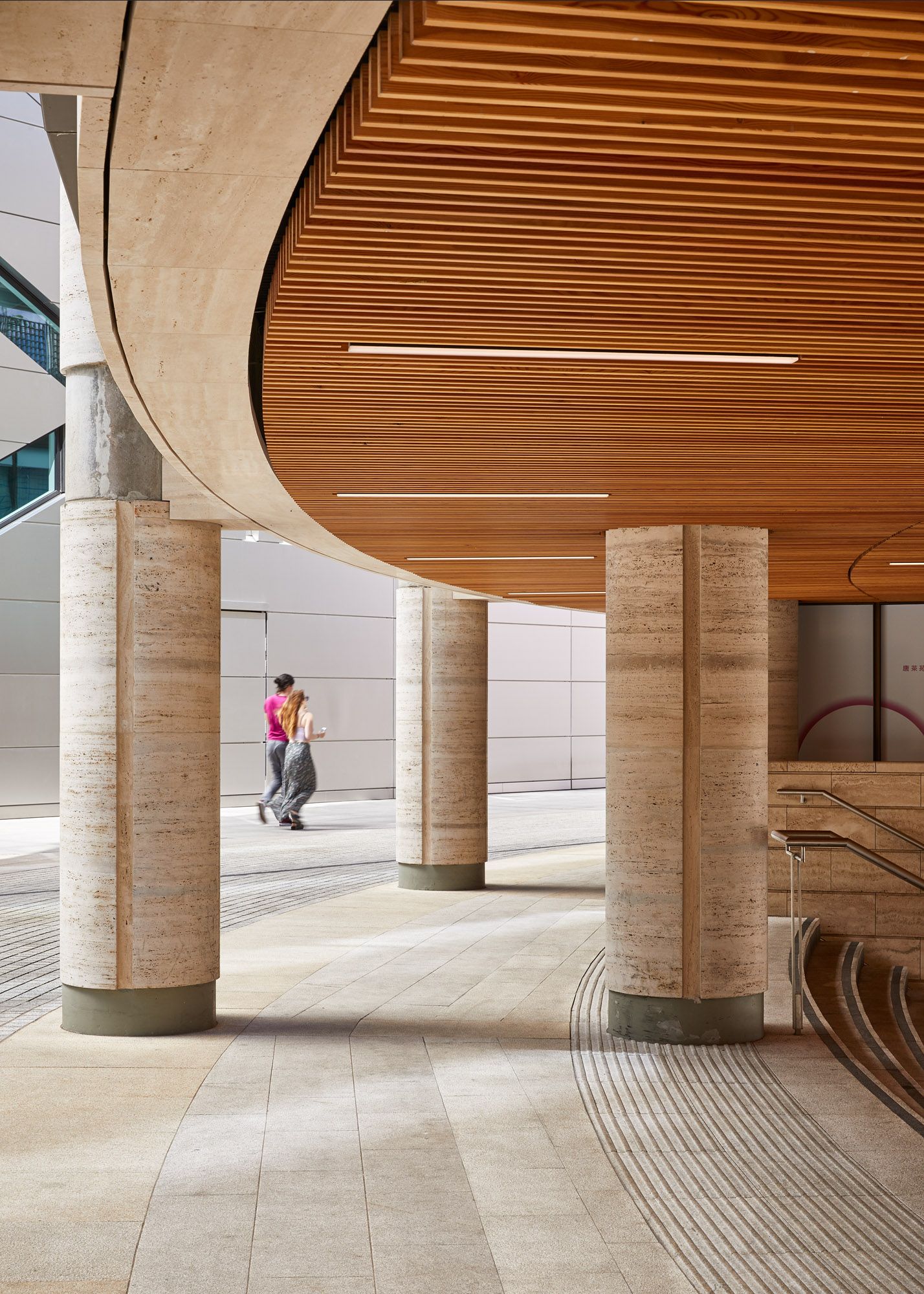
The 4,150m2 circular space of the famous colonnade structure – formed by 54 travertine columns – has been maintained, while three new double-width staircases have been added to provide access between the upper and lower levels. Beneath the colonnade sits the scheme’s reconstructed first floor restaurant. The triple aspect unit has been widened and the first floor now cantilevers over the colonnade with a new structure designed to transfer the loads back to the original columns.
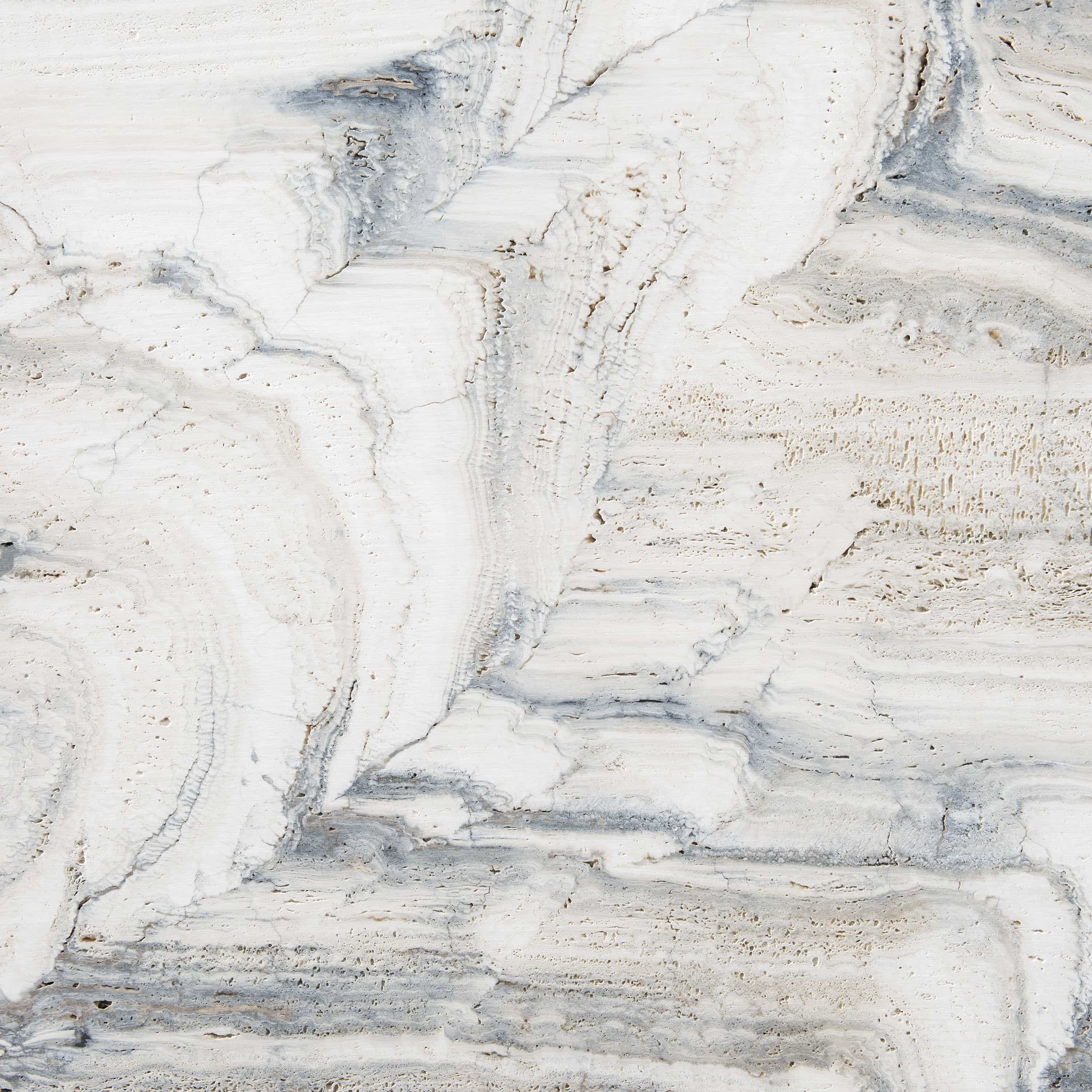
One of the best examples of the travertine use in the UK.

The famous colonnade structure, designed by Arup in 1988 and formed of 54 travertine columns rising to an impressive 14m in height, have been maintained. The Circle is one of the best examples of the travertine use in the UK. The architectural detail and workmanship of the stone with interfacing materials is exemplary.

Bronze anodised aluminium and Siberian larch have been used to complement the travertine, and this simple and elegant materials palette enhances the elegance of the Circle’s form and geometry.
Flexible design.

The Circle is designed to facilitate an eclectic and varied mix of events including musical performances, pop up retail, theatre, cinema screenings, outdoor sports, etc. The drainage, lighting, planting and maintenance infrastructure are fully-integrated, enabling the space to be transformed effortlessly from function to function, day to night. The lighting is also integrated into the handrails of the terraces and decks. Projection technology is integrated into the design of the perimeter columns to enable images to be projected onto the Arena floor.
ExxonMobil Energy Center – Houston

ExxonMobil Energy Center

The ExxonMobil Energy Center is designed to embody the company’s commitment to leading technology and engineering while showcasing its heritage, people and leadership.

Architect:
Pickard Chilton

Client:
ExxonMobil

Location:
Houston

Year:
2014

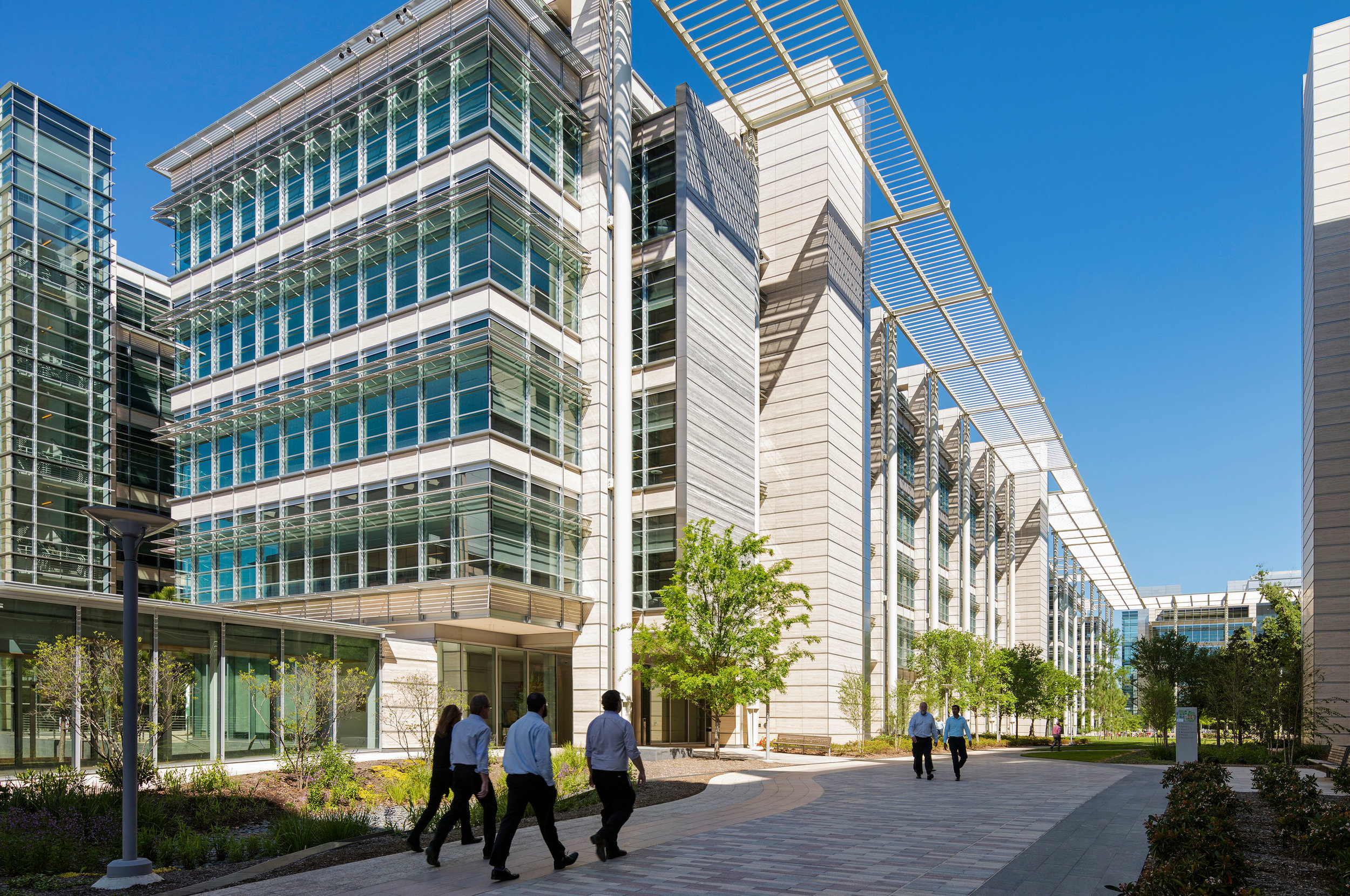
ExxonMobil’s state-of-the-art campus north of Houston serves as home to its Upstream, Downstream, Chemicals and XTO Energy companies and accommodates more than 10,000 employees and visitors.

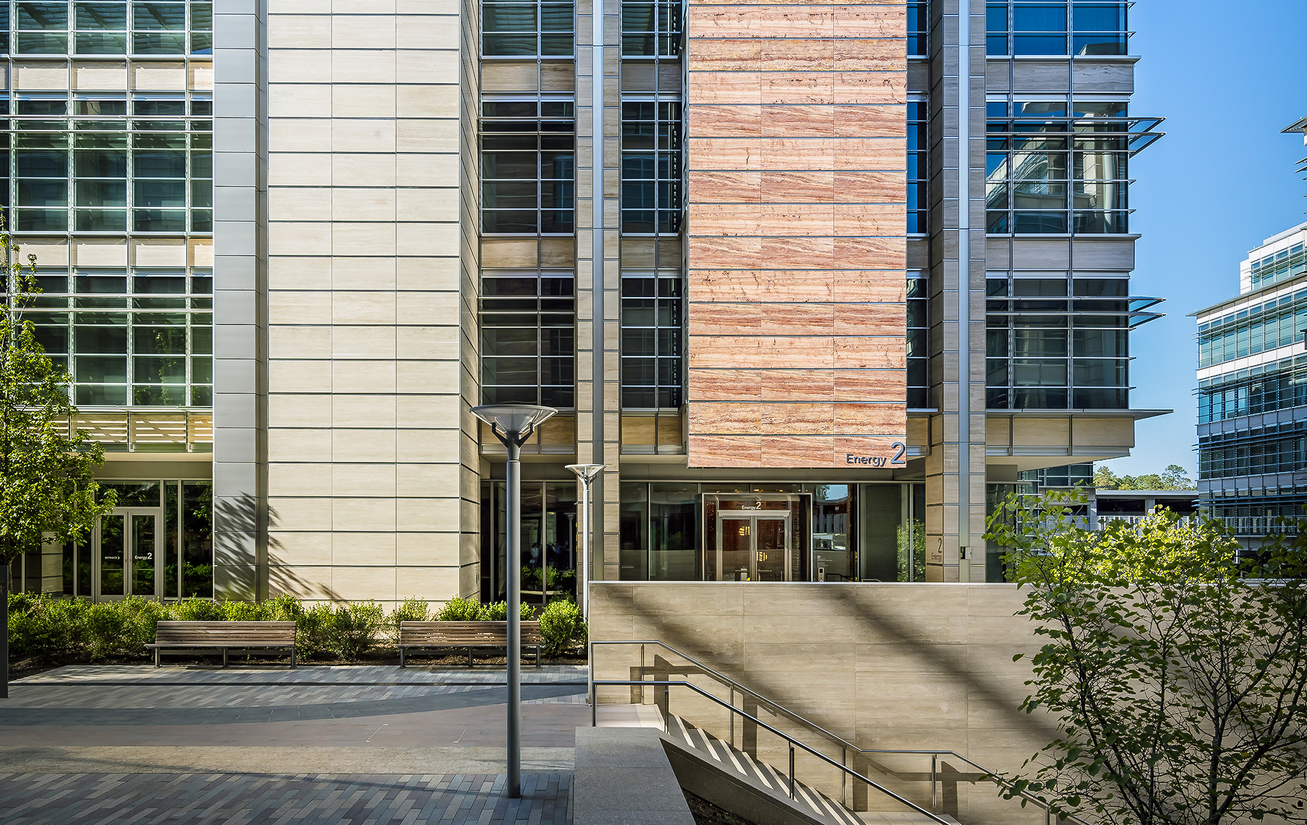
ExxonMobil’s state-of-the-art campus north of Houston serves as home to its Upstream, Downstream, Chemicals and XTO Energy companies and their associated service groups. The facility opened in 2014 and accommodates more than 10,000 employees and visitors. The iconic jewel of the campus, the Energy Center is designed to embody the company’s commitment to leading technology and engineering while showcasing its heritage, people and leadership. It serves as the front door of the campus, reception for dignitaries and visitors and space for training as well as larger community events.

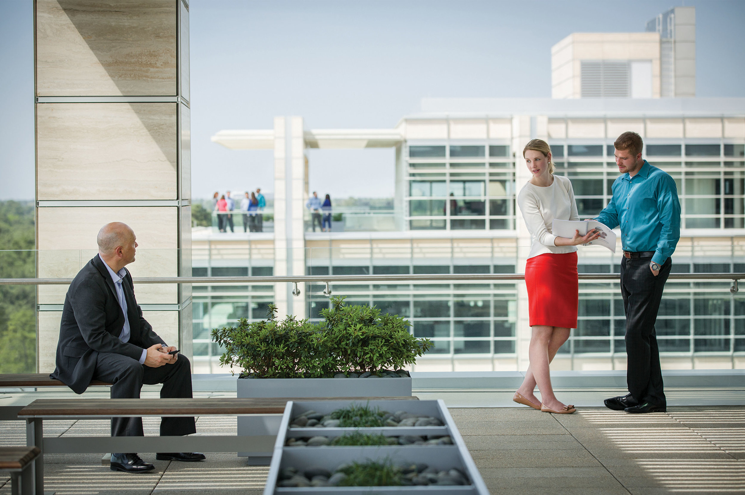
The campus is located in Spring, Texas, on 385 wooded acres immediately to the west of Interstate Highway 45, approximately 25 miles from the cultural vibrancy of downtown Houston. By bringing many global functional groups together, the campus provides employees with the tools and capabilities needed today, and in the future, to achieve business objectives and accelerate the discovery of new resources, technologies and products. It was designed to foster improved collaboration, creativity and innovation and enhance the company’s ability to attract, develop and retain the top talent in the industry.

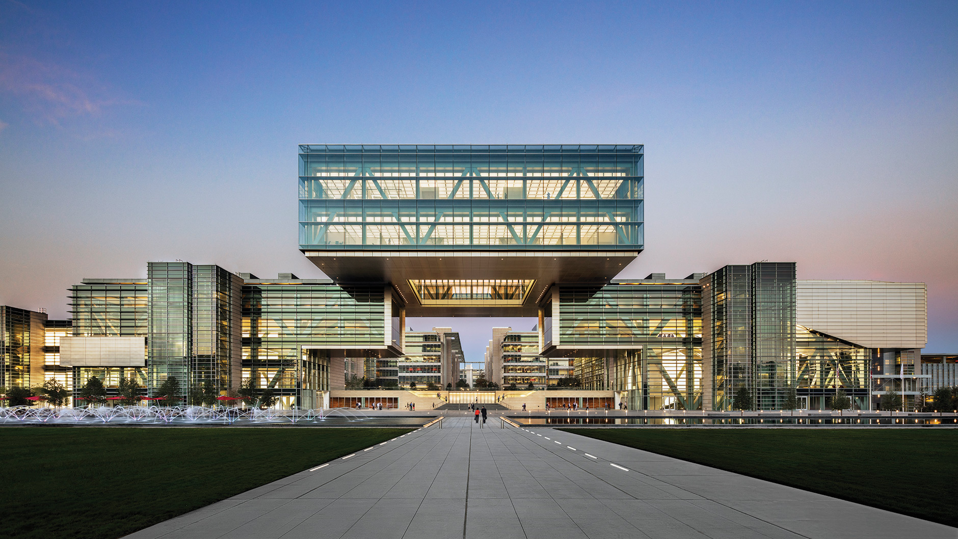
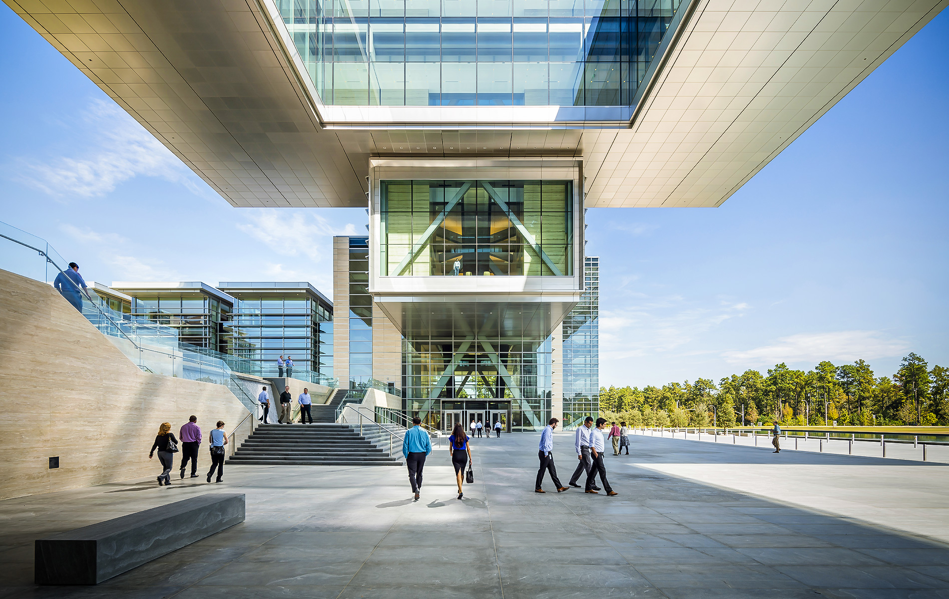
The Energy Center’s main feature is a 10,000-ton floating Cube.

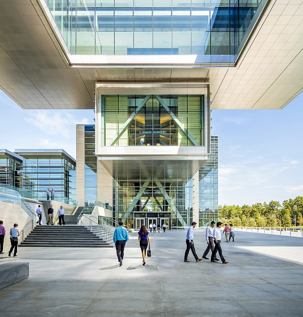
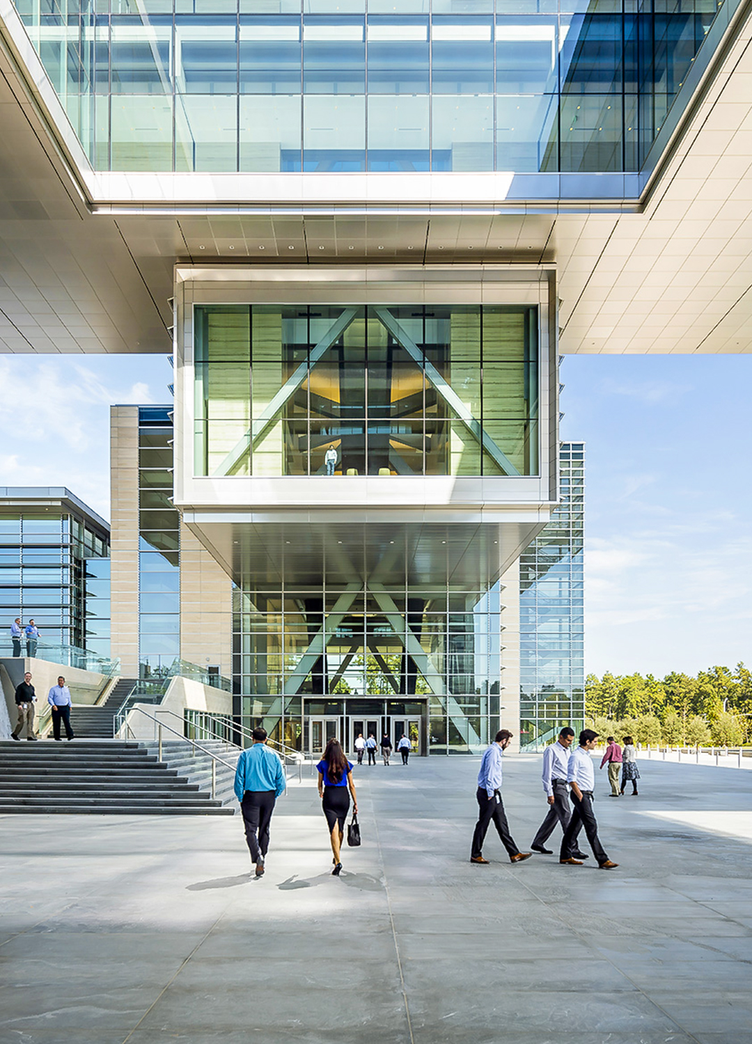
The Energy Center’s main feature is a 10,000-ton floating Cube that appears to hover above the plaza below. The Cube offers spectacular views back to the campus and out over the wooded campus. Two multi-story atria located in the wings create gathering spaces for visitors and employees. Monumental stairs and escalators cascading openly through the space, and glass elevators at the facade, lead people through the Energy Center and up into the Cube.

The Cube itself is shaped like a wide bridge with a square hole punched into its middle, offering views in all directions. It is raised 80 ft. above ground and suspended between two cantilevered supports on opposite wings. It will serve as the campus’s front gate

The campus was constructed to the highest standards of energy efficiency and environmental stewardship.

The campus was constructed to the highest standards of energy efficiency and environmental stewardship. Its design incorporates extensive research into best practices in building and workplace design through extensive benchmarking of the world’s top academic, research, and corporate facilities. Sustainability touches all aspects of the campus including energy and water efficiency, land management, building and facilities programs, and transit. The site was designed for and obtained Gold level certification with the United States Green Building Council’s (USGBC) Leadership in Energy & Environmental Design (LEED) standard.

Other firms working on the Exxon Mobil campus include Gensler’s Houston office (interior and architect of record), Houston-based PDR (campus programmer and workplace interior architect) and Hargreaves Associates (landscape architect), which has offices in San Francisco, Cambridge and New York.

Grupo Arca – Guadalajara

Grupo Arca Showroom

Esrawe Studio carves quarry-like landscape for Guadalajara stone showroom.

Architect:
Esrawe Studio

Client:
Grupo Arca

Location:
Guadalajara

Year:
2019

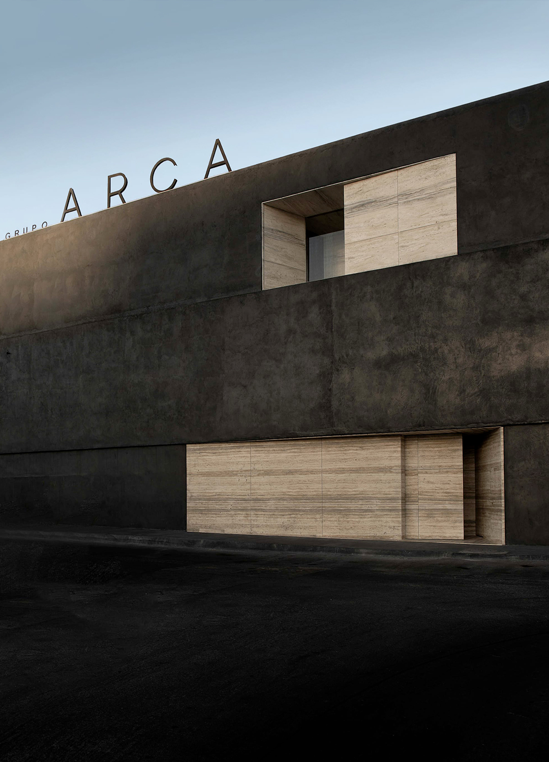
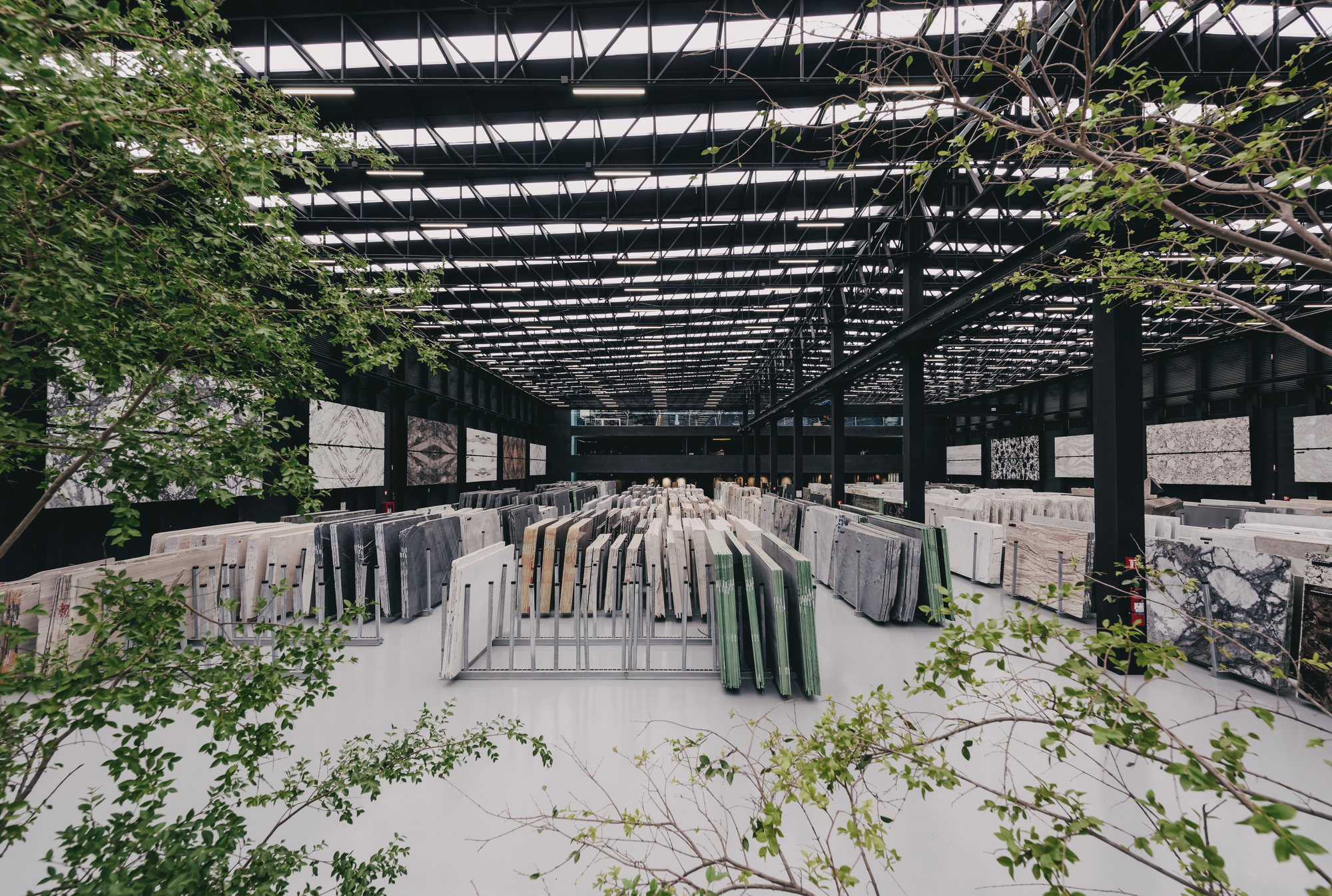
Monolithic blocks of stone mimic man-made quarry landscapes for Grupo Arca’s showroom and cultural centre.

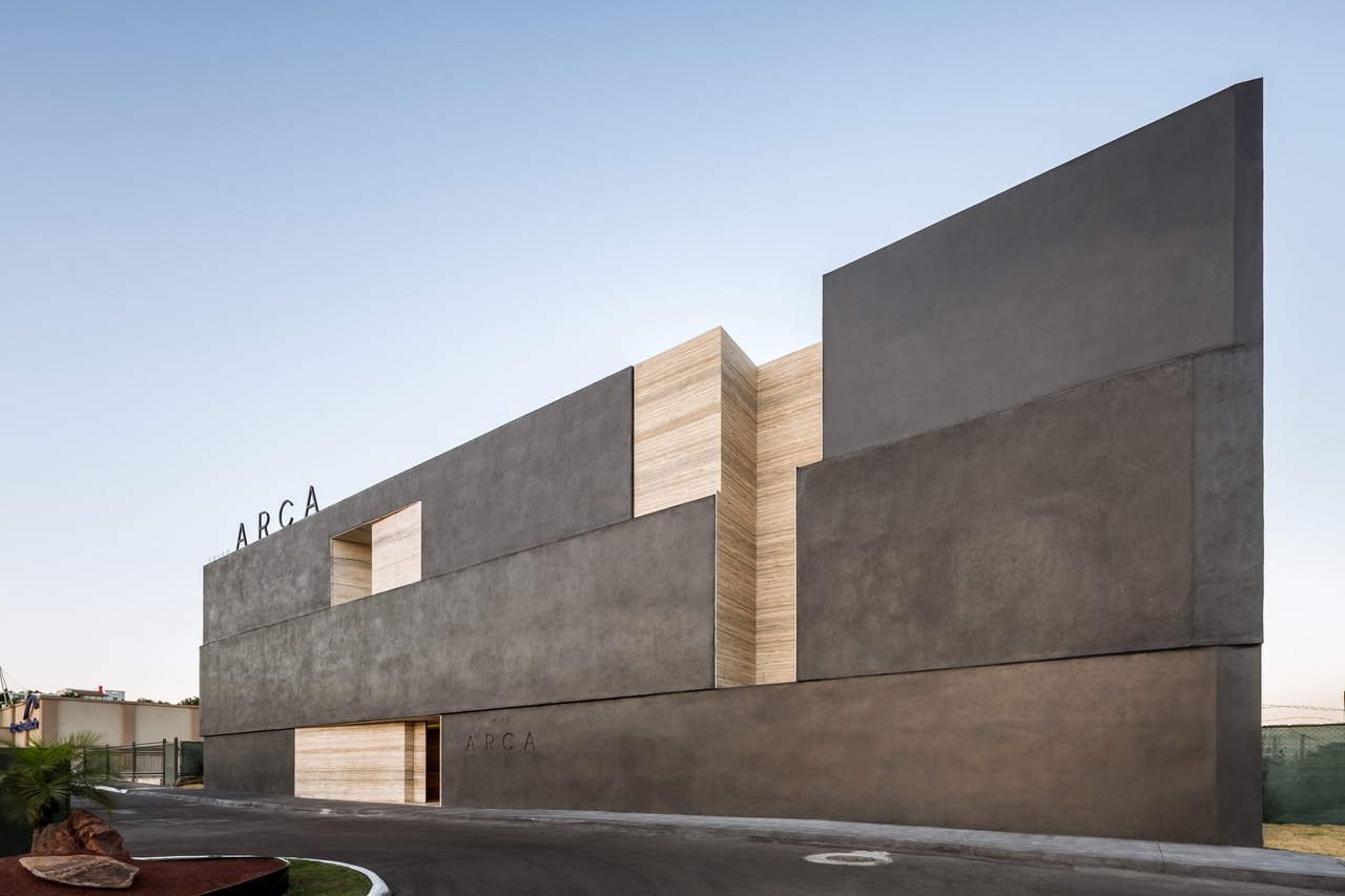
Monolithic blocks of stone mimic man-made quarry landscapes for Grupo Arca’s showroom and cultural centre in Guadalajara, Mexico, designed by Esrawe Studio. The complex is designed to promote culture and education over business transactions, with a focus on Mexican architecture, design and fine arts.

A quarry is the evidence of man’s action on nature; a manufactured landscape created in search of raw materials. The nature of this landscape nourishes the concept behind the Grupo Arca’s showroom and warehouse. Rectangular cut-outs on the building’s facade reveal a layer of ocean blue travertine underneath the black concrete exterior cladding.

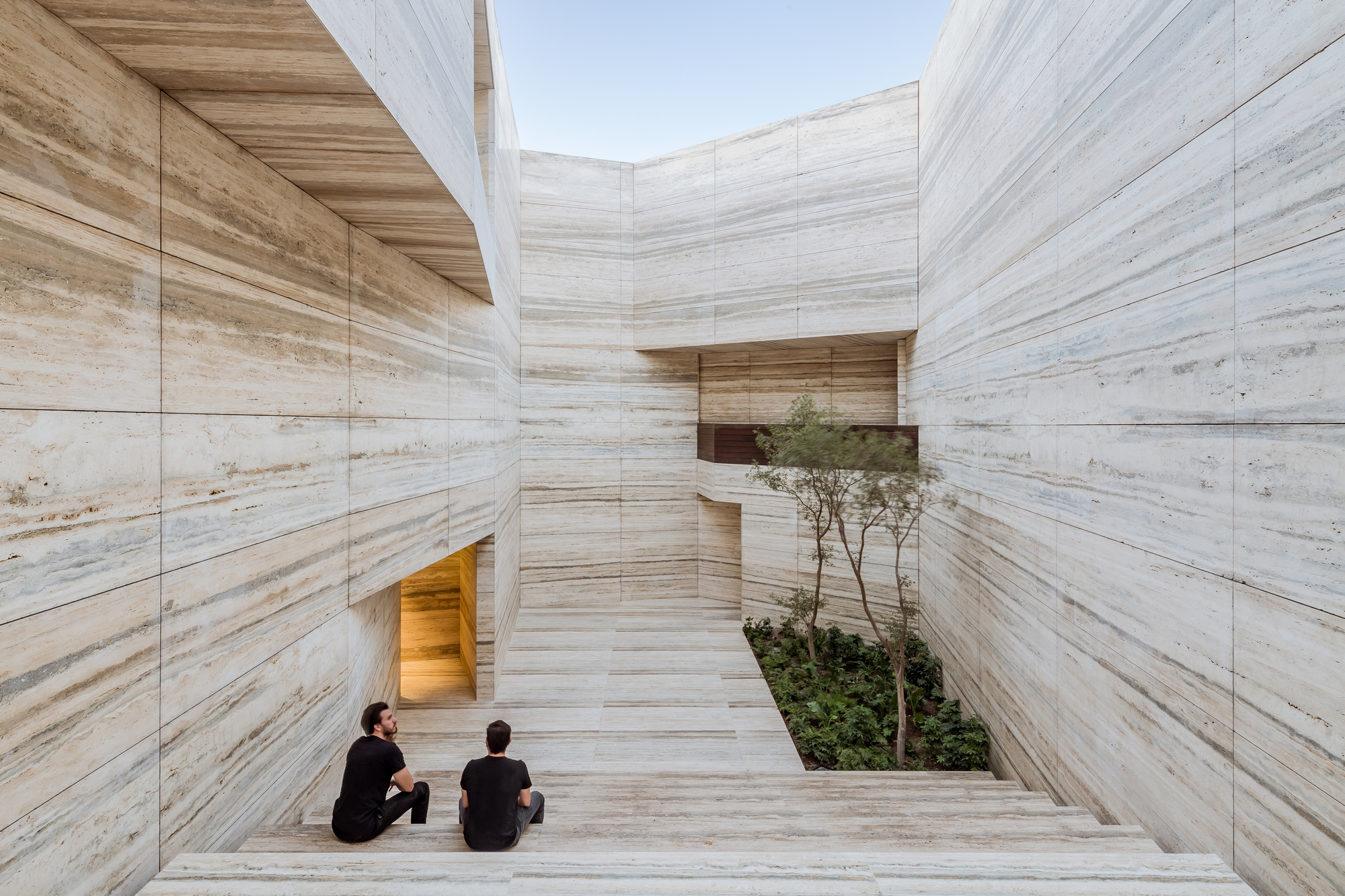
Visitors access the building through a small opening in the monolithic facade and are led down a narrow corridor to the central internal courtyard. The access in the monolithic facade links the visitor with the monumental central space, the Agora.

The building is divided functionally and physically into two universes: the quarry and the warehouse.

The building is divided functionally and physically into two universes. Two separate volumes that are woven and related to each other: the universe of the quarry, which houses the Agora, the Design Center, the cafeteria, and the multipurpose room, and the warehouse, which acts as a container and distribution center, a translucent and neutral space framed in the background by a forest that links us again with the origin of matter.

A double-height space at the rear is planted with trees, separating the two buildings. Unlike the stone used in the main building, the warehouse is designed as a neutral space to shift the focus onto the material collections available to buy inside.

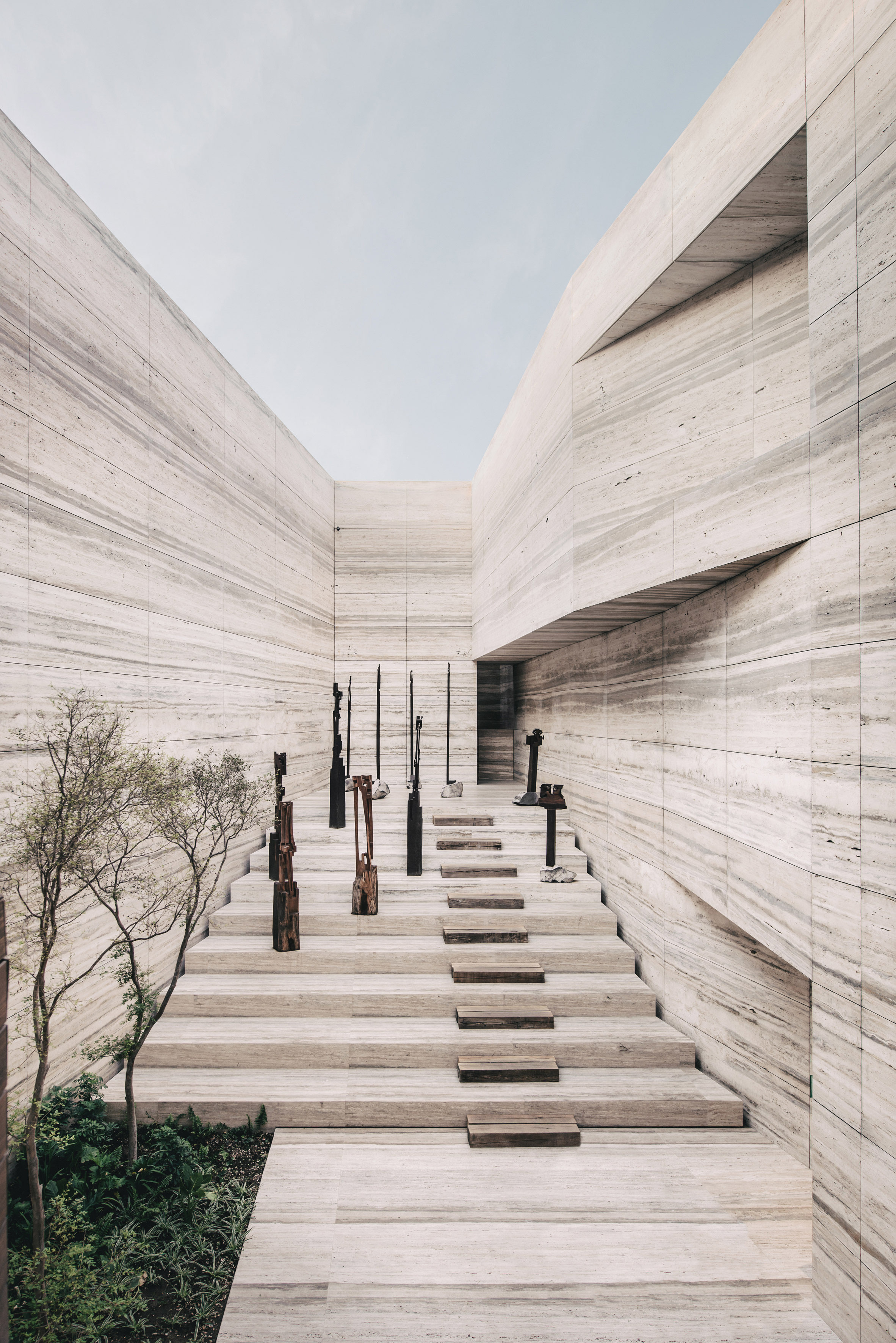
The sculptural walls allude the “manufactured landscape” of quarries.

Called the Forum, its walls are lined with the same travertine from the facade, designed to create the sensation of being inside an excavated space. “The character of the quarry is defined by the material,” said the studio. “The monolithic expression and the monumental scale of it makes it a one of a kind experience.

“Mexican sculptor Jorge Yazpik was invited to exhibit his artwork in the Forum for the showroom’s opening night.
The space will be lent to various cultural events over the year including exhibitions, lectures and film screenings to build a connection with the arts scene in Guadalajara.

The Surf Club – Miami

The Surf Club

Richard Meier reimagines the world’s most iconic private club.

Architect:
Meier Partners

Client:
Four Seasons

Location:
Miami

Year:
2018

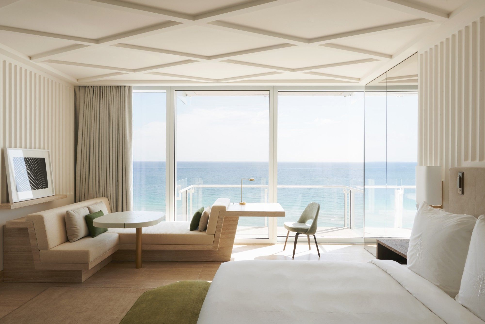
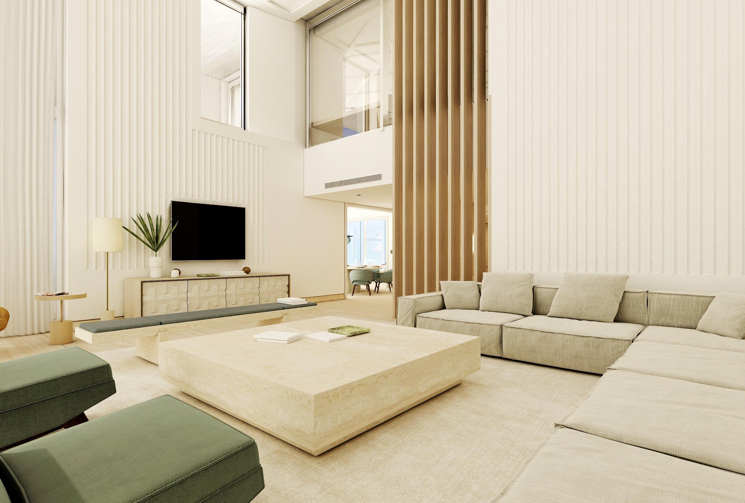
Richard Meier’s iconic visual vocabulary merge with idyllic interiors designed by Joseph Dirand.

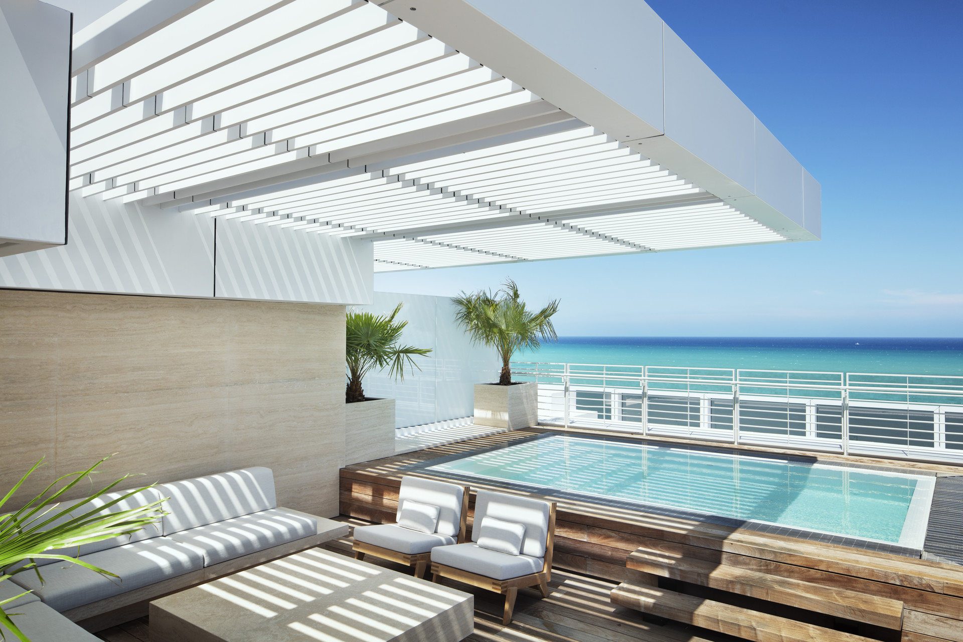
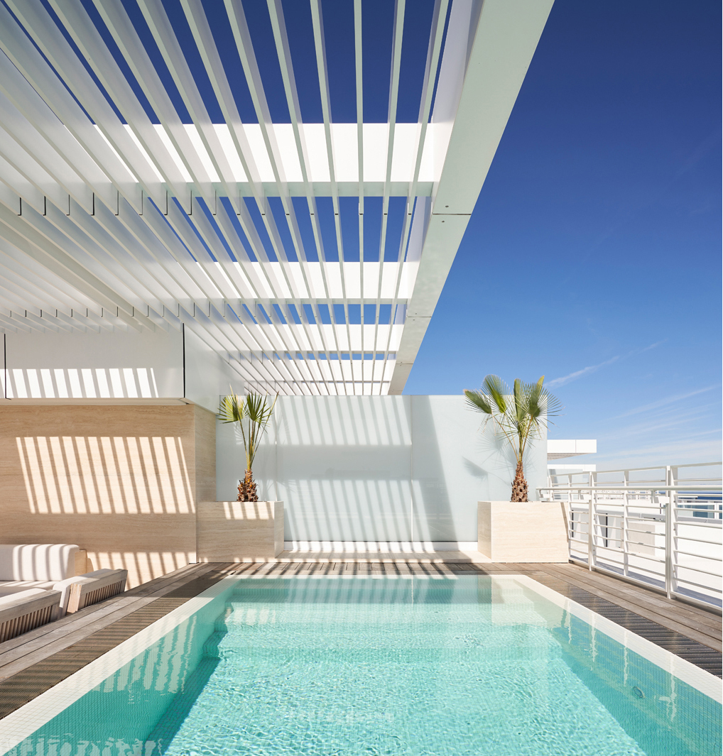
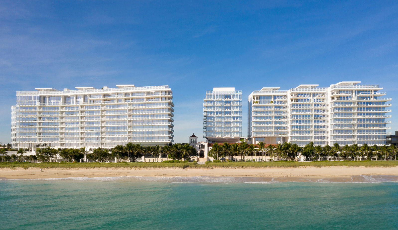
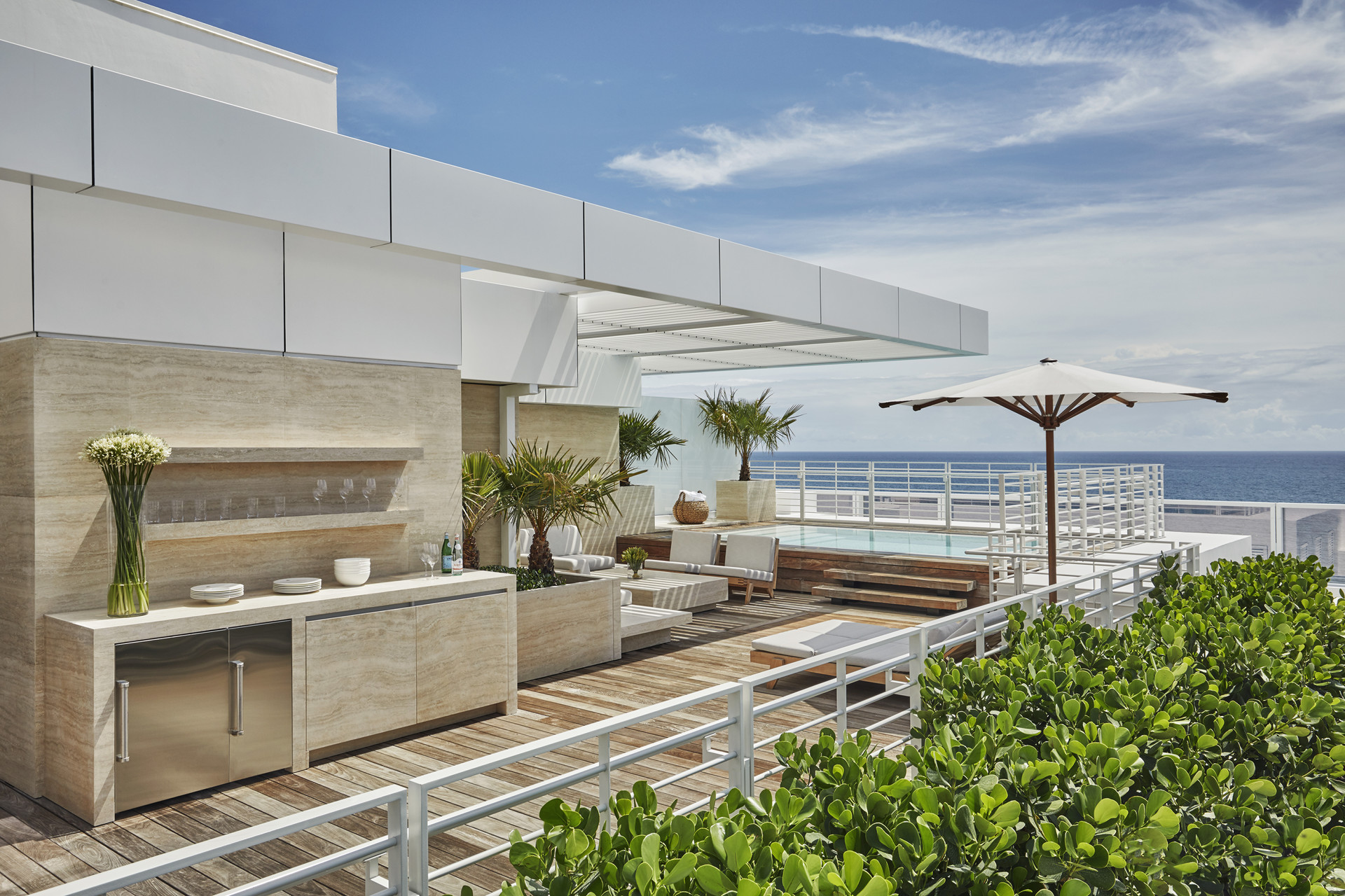
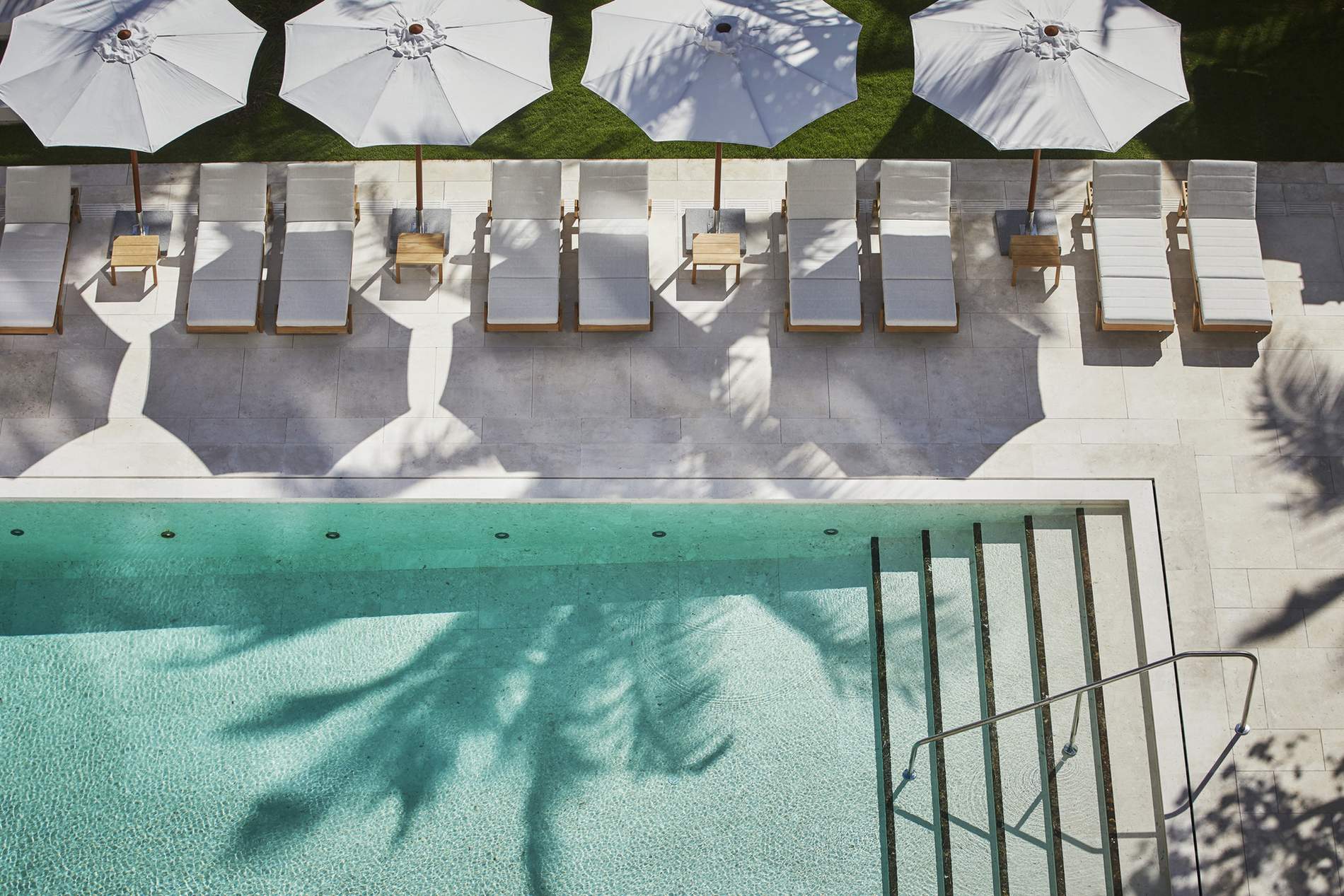
The legendary Surf Club in Surfside, Florida, was founded in 1930 by Harvey Firestone as a private membership club. The Surf Club development include a new Four Seasons Hotel rising from the center of the Club’s original exterior courts, while two 12-story residential buildings located to the North and to the South of the historic Surf Club buildings flank the hotel. The design also incorporates additional programming including a private membership club, two restaurants, four swimming pools, a state-of-the-art spa and fitness center, more than 40 beach cabanas, and an expansive park and oceanside gardens. The design for the buildings utilizes Richard Meier’s clear and iconic visual vocabulary while the idyllic interiors are designed by Parisian architect and designer Joseph Dirand.

A harmonious dialogue between historic and modern architecture creates a spectacular destination on a prime oceanfront site.

The main challenge of the project was to harmonize the relationship between the existing courtyard typology of the historic Surf Club and the new vertical buildings of the residential and hotel complex surrounding the Surf Club. This is achieved through the careful calibration of architectural proportions, the consistent introduction of natural light throughout the complex, the establishment of visual corridors connecting old and the new buildings, and the purposeful juxtaposition of the modern materials used for new construction with the historic treatment deployed in the renovation of existing Surf Club structures.

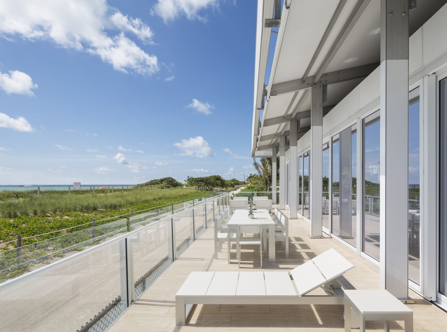
Natural light, visual corridors and open spaces up to the water.

The Surf Club boasts 965 feet of Atlantic oceanfront on a 9-acre site, and the entire project is organized to maximize the views and recreational opportunities provided by this extraordinary amenity. Three new buildings have been harmoniously integrated into the historic Surf Club architecture through the careful orientation of communal spaces to the surrounding landscapes and waterscapes, culminating in a main courtyard that opens out to the beach and ocean with a swimming pool and a series of water terraces.